The groovy video look

strfkr1.jpg

Under Water/In Air.

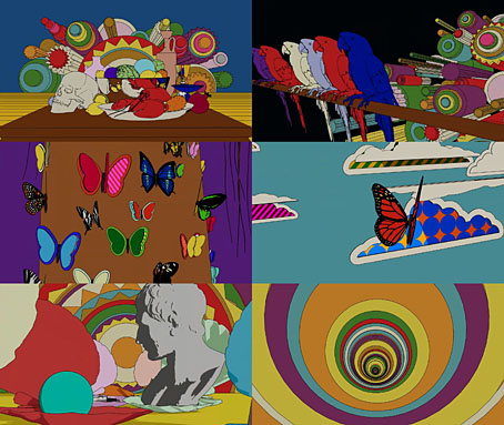
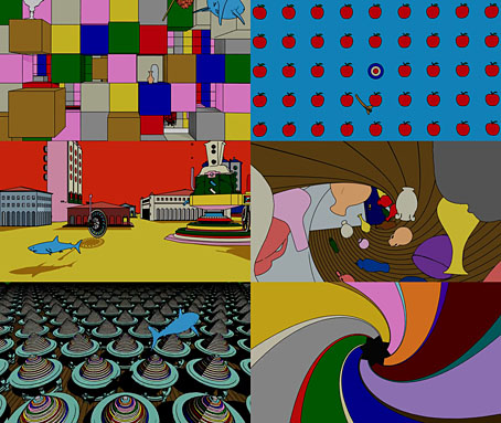
This recently-released video for Under Water/In Air by Starfucker (or STRFKR, as they often have to style themselves) is an animated production by Edward Carvalho-Monaghan, an artist whose visuals may be seen to similar effect in an earlier animation for Starfucker’s Armatron. Carvalho-Monaghan’s artwork has appeared on a number of the group’s record sleeves, including the latest album, Parallel Realms, which combines a Surrealist dose of the visual style that I refer to as the groovy look with the kind of impossible architecture popularised by MC Escher. Armatron, meanwhile, features more architecture in what may be borrowings from Giorgio de Chirico.

strfkr2.jpg

Armatron.

I lost interest in music videos years ago, I’d much rather listen to the music than have to experience it as a soundtrack to some director’s attempt to illustrate a song with visual novelty. But animated music videos are easier to take, in part because the pairing of animation with music goes back to the earliest days of the medium. The Starfucker videos have had me wondering how much video or animation might suit the “groovy” definition if you went looking for it. And by this I mean following the limits defined by my earlier post which is predominantly concerned with heavy outlines and flat, bold colours rather than quasi-psychedelic effects. I don’t have the time just now to start searching for other examples but The Beatles’ Yellow Submarine is the Ur-text in this department, and the film’s influence may be found in both Carvalho-Monaghan animations.

air.jpg

Sing, Sang, Sung.

One other music video that does come to mind is for Sing, Sang, Sung by Air, directed by Mrzyk & Moriceau. The colour palette is desaturated but the rest of the graphics are definitely in the groovy zone, with the video as a whole coming across like a Surrealist take on those endlessly scrolling, mutating computer games. When the black ball reaches its destination you’re tempted to watch it all again.

(Under Water/In Air tip via Scotto Moore’s This Newsletter Cannot Save You.)

Previously on { feuilleton }
The groovy look
Tadanori Yokoo animations
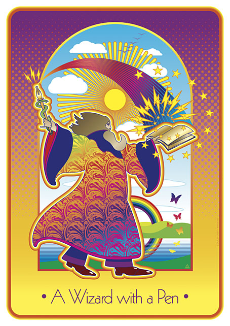
A Wizard with a Pen

wizard.jpg

The wizard is Mr Alan Moore who celebrated his 70th birthday last month. This piece is my contribution to Alan Moore: Portraits of an Extraordinary Gentleman, a birthday book put together by Smoky Man, curator of the Alan Moore World blog:

This 150-page volume contains short essays, memories and portraits by 50+ contributors including Gary Spencer Millidge (cover), Iain Sinclair (foreword), Peter Hogan (afterword), Paul Gravett, Russell Willis, John Coulthart, Koom Kankesan, Gene Ha, Zander Cannon, Hilary Barta, Jacen Burrows, Eduardo Risso, Hunt Emerson, and more…

100% of the net profits proceed from this book are to be donated to the NGO Doctors Without Borders. (more)

The book is a print-on-demand production via Amazon so anyone interested in a copy should click the above link which will direct you to a regional outlet. I’d have preferred the printing to have avoided Bezos’s feudal empire but the decision wasn’t mine to make.

As for the artwork, after spending the past couple of years looking for examples of the style I refer to as “the groovy look” I’d been itching to do something similar myself. Alan happens to enjoy this look as well—see all those Promethea covers, especially the one for issue 16 which nodded to Peter Max. Alan also likes the Beatles’ psychedelic years so my portrait is a riff on the Yellow Submarine art style: small head, big feet, and the same Kabel typeface they used for the film titles. The garment pattern is the Art Nouveau wallpaper design by André Morisset that I resurrected last year, and which I’ve been using in another project that’s yet to see the light of day. More about that later.

Previously on { feuilleton }
32 Short Lucubrations Concerning Alan Moore
Voice of the Fire by Alan Moore
The Blake Video
The Cardinal and the Corpse
Mapping the Boroughs
Art is magic. Magic is art.
Alan Moore: Storyteller
Alan Moore: Tisser l’invisible
Dodgem Logic #4

Return to Pepperland

ys1.jpg

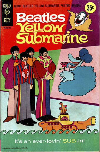
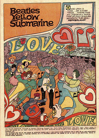
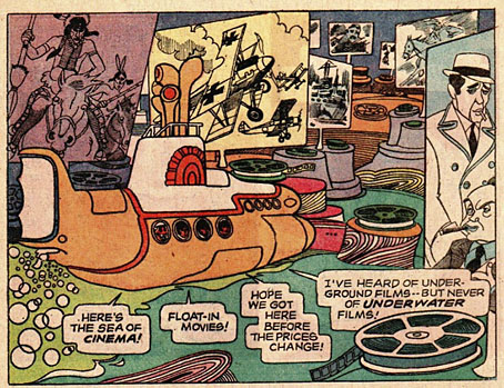
Another candidate for the small list of comics drawn in the groovy style (or a diluted version of the same), the first comic-book adaptation of Yellow Submarine was a single 64-page issue published by Gold Key in February 1969. Low-quality copies have been circulating for years on fan sites but there’s now a copy available here with the pages scanned at a higher resolution. Whatever the quality, the cheap paper doesn’t help the artwork, but for a cash-in this isn’t a bad adaptation. The background details don’t always keep up with Heinz Edelmann’s invention but artist José Delbo maintains the character style of the animation throughout, while the script by Paul S. Newman pads out the missing song sequences with additional japes and bad puns. I’ve seen claims that the story is based on an early draft of the film script but can’t say whether this is true or not. There are a few notable deviations from the film, however, such as additional seas—The Sea of Consumer Products, The Sea of Cinema—and an extra character, Rita the Meter Maid, who looks nothing like a British traffic warden of the 1960s.

ys3.jpg

The last time I mentioned this comic I also referred to a more recent adaptation by Bill Morrison which had been commissioned, partly drawn then inexplicably cancelled. Morrison’s pages were superior to the Gold Key adaptation in their design and their fidelity to the animation style of the film so it’s good to see that the various licence-holders have allowed him to complete his work. The book was published by Titan for Yellow Submarine‘s 50th anniversary in 2018.

ys3.jpg

Previously on { feuilleton }
The groovy look
The South Bank Show: The Making of Sgt Pepper
The Sea of Monsters
Tomorrow Never Knows
Yellow Submarine comic books
A splendid time is guaranteed for all
Heinz Edelmann
Please Mr. Postman
All you need is…

The art of John Alcorn, 1935–1992

alcorn16.jpg

Ad art for Seventeen magazine, August 1970.

Another member of the Groovy Set, John Alcorn was a very prolific illustrator and designer whose career included a period at Milton Glaser and Seymour Chwast’s Push Pin Studios. Alcorn’s art predates the groovy look, and also extends beyond it, but since I have a taste for this quasi-psychedelic style all the examples here are from the late 1960s/early 1970s. An overview of Alcorn’s career may be found in John Alcorn: Evolution by Design, a book edited by Stephen Alcorn and Marta Sironi which was featured at 50 Watts. And since I keep referring back to it, I’ve added some updates to the original groovy post.

alcorn12.jpg

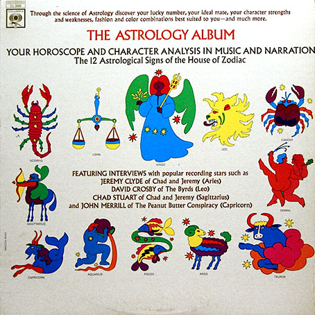
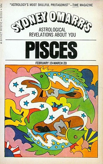
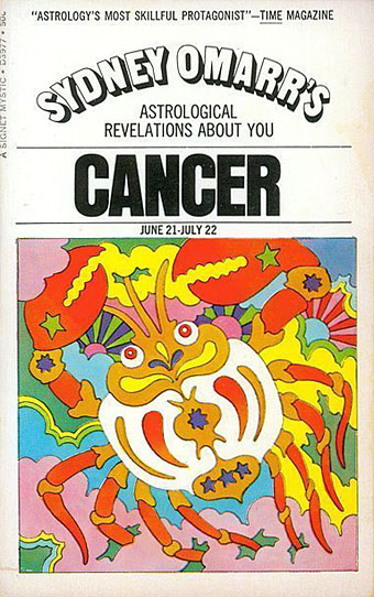
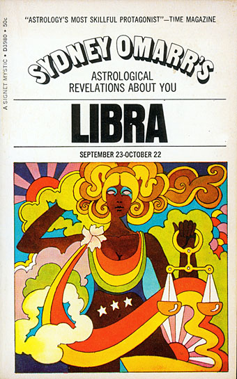
The Astrology Album, 1967.

From an astrological album to astrological covers for Sydney Omarr’s books, 12 of which were published by Signet in 1969.

alcorn04.jpg

alcorn05.jpg

alcorn06.jpg

Continue reading “The art of John Alcorn, 1935–1992”

The South Bank Show: The Making of Sgt Pepper

sbs1.jpg

Here come the anniversaries again, driven by nostalgia and the imperatives of corporations to flog you another version of that thing you already own. Anniversaryism grew out of the CD reissue boom, with one of the first significant incidents being the debut release on CD of The Beatles’ Sgt Pepper album in 1987. This week you can walk into a shop and buy the album yet again in a variety of formats, the 50th anniversary now coinciding happily for legions of accountants with the current boom in overpriced vinyl.

sbs2.jpg

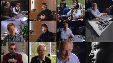
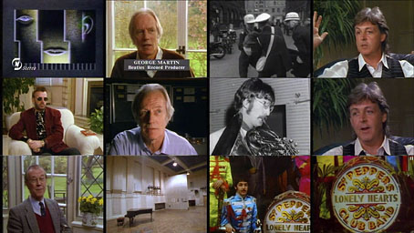
This post is complicit, of course, just as Frank Zappa and The Mothers Of Invention were complicit in reinforcing Sgt Pepper‘s status as a cultural monument even while carping at it; satirists always end up attached to what they attack. The latest round of retrospective attention had me wondering whether Alan Benson’s excellent South Bank Show documentary about the making of the album was on YouTube. It isn’t (but it is available elsewhere), probably because there’s a documentary in the new Sgt Pepper box set that seems to be the same film. The South Bank Show documentary was broadcast in the UK in 1992 for another anniversary, the year being the 25th since the album’s release. This is one of those television productions crafted to deliver maximum content with a minimum of fuss, so there’s no hyperactive editing, and no pointless Reactions To The Great Work from minor pop celebrities. Paul McCartney, George Harrison and Ringo Starr are all present to discuss the creation of the music, from the first song of the sessions, Strawberry Fields Forever, through to A Day In The Life. In the film’s real coup, George Martin sits at a mixing desk in the Abbey Road studio pulling faders up and down to show how the songs were pieced together; he also explains how some of the album’s more unusual effects were produced. The film runs just under 50 minutes, and it’s notable that nearly all the songs being discussed are by John Lennon even though this is an album dominated by Paul McCartney’s voice, and the initial concept was McCartney’s. Watch it here.

Previously on { feuilleton }
Lyrical Substance Deliberated
The Fool album covers
The Sea of Monsters
Tomorrow Never Knows
Yellow Submarine comic books
A splendid time is guaranteed for all
Heinz Edelmann
Please Mr. Postman
All you need is…