Walter Crane’s Household Stories

crane01.jpg

The ideal follow-up to yesterday’s post would have been David Wheatley’s 1979 film for the BBC’s Omnibus series dramatising the life and works of the Brothers Grimm. This week was the two hundredth anniversary of the publication of the Grimm’s Children’s and Household Tales; I’ve never seen Wheatley’s Grimm film which—for the moment—remains unavailable.

There are, of course, plenty of illustrated editions of the Grimm’s collections although the dark tenor of the stories means these have never been as popular as Hans Christian Andersen’s tales. The Internet Archive has editions by Arthur Rackham, Robert Anning Bell and Rie Cramer, as well as a later, more stylised edition by German illustrator Albert Weisgerber whose plates can be seen at 50 Watts. Weisgerber brings some of the darkness to the fore, as in the drawing which shows Gretel about to push the wicked old woman into the oven.

crane02.jpg

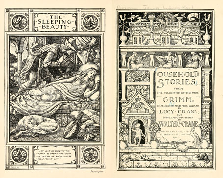
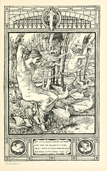
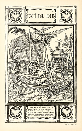
Walter Crane’s edition of Household Stories was first published in 1881. I’ve always liked the Pre-Raphaelite quality of Crane’s drawings so I favour this book over some of the other British editions. I love the house-shaped title page, and the way he embellishes the borders with details from the stories. The vignettes are as varied and inventive as you’d expect from a man who wrote a study of decorative art.

As for the stories, they can seem surprising today when the more popular Andersen fairy tales have become the versions most people know, and those mainly from anodyne film and TV adaptations. Looking at the Grimm books is like hearing older recordings of familiar folk songs (and the Perrault versions are older still): Cinderella is Aschenputtel, Little Red Riding-Hood is Little Red Cap, Snow White is Snow Drop, and so on. Walter Crane’s edition, translated by his sister, Lucy, contains 52 stories, just less than a quarter of the number in the final Grimm collection. William Morris admired Crane’s drawing of the Goose Girl enough to have it enlarged for a tapestry design. The scanned book can be browsed here or downloaded here.

crane03.jpg

Continue reading “Walter Crane’s Household Stories”

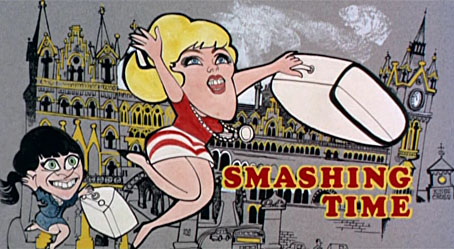
Smashing Time

st1.jpg

Writing about the late Lynn Redgrave last year I picked out this film as a career highlight despite not having seen it for a very long time. Watching it again recently was an interesting experience, not least for the way it connects to more recent points of obsession, none of them evident the first time round.
st2.jpg

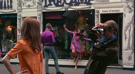
Carnaby Street antics.

Smashing Time was directed by Desmond Davies in 1967, and the direction is as perfunctory as you’d expect from someone whose career before and after was mostly for television. Of more interest is the script by George Melly, a bisexual jazz singer, writer, and lifelong evangelist for Surrealist art. This was Melly’s first job as a screenwriter and he seems an odd choice. He was 41 at the time, and his portrayal of Swinging London and its denizens is often typical of the acerbic older generation’s view of the younger groovers. It’s never as cynical as the Private Eye crowd but without Melly’s humour the tone might seem patronising. That said, it was the satire magazine that originated the names of the two lead characters, Brenda (Rita Tushingham) and Yvonne (Lynn Redgrave) being Private Eye‘s names for Queen Elizabeth and Princess Margaret respectively. The story is a simple one of the pair coming to London from the north of England in search of “a smashing time”, and, in Yvonne’s case, an attempt to make it big somehow. Misadventures ensue.
st3.jpg

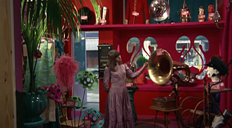
Brenda in the Too Much boutique.

Along the way there are digs at avant-garde artists, lecherous men, greedy pop promoters and wealthy boutique owners. Melly leavens his barbs with yet another example of the Lewis Carroll influence on late-60s culture. One of the scenes takes place in the Jabberwock Gallery, while Jabberwocky-derived character names appear throughout: Tom Wabe (Michael York), Charlotte Brillig, Mrs Gimble (the always wonderful Irene Handl), Bobby Mome-Rath (Ian Carmichael), Jeremy Tove. There’s also an Alice Boojum, and a band named The Snarks (real-life psych band Tomorrow) who don’t get to play, unfortunately. Tomorrow, who appear in the final party scene, are the sole connection with the genuinely hip London of 1967. Everything else we see is the Sunday supplement view of the city with Carnaby Street, shots of Chelsea and a dishevelled Camden. The raucous finale is staged at the top of that bright new landmark of 1960s London, the Post Office Tower.
st4.jpg

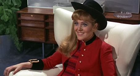
Yvonne begins her pop career.

My childhood enthusiasm was obviously taken with the film’s superficial qualities—there are so many songs it’s almost a musical—whereas now I’m impatient with the laboured slapstick but enjoy all the peripheral stuff. Many of the documentary shots of streets away from the centre are a reminder of how shabby and grimy the capital really was at that time, as was the rest of Britain when there was still a century of industrial soot on the walls. I also realise I’d missed the double-meaning of the title: “smashing time” isn’t only a modish phrase for an enjoyable experience but a nod to the way Brenda and Yvonne cause havoc wherever they go. The jabs from an older musician at brainless pop culture would have annoyed some but Yvonne’s hit song, I’m So Young (which is actually very good), has lyrics which resonate today:

I can’t sing but I’m young
I can’t do a thing but I’m young
I’m a fool
But I’m cool
Don’t put me down

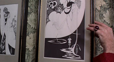
Lynne Redgrave is fantastic as Yvonne, completely convincing in a part that requires her to be loud, selfish and petulant without ever being too obnoxious. She also wears a different wig in nearly every scene. Among other moments of note there’s some fleeting gay humour with a pair of waiters camping it up in the Sweeney Todd pie shop (as does Murray Melvin in another scene). And there’s also an incident which, being an Aubrey Beardsley obsessive, I have to draw attention to:
st5.jpg

Was this the first appearance of Beardsley’s work in cinema? The V&A exhibition which began the Beardsley revival had taken place only a year before, and I can’t think of any examples earlier than this. The William Morris wallpaper is a fitting touch as well.

Reservations aside, this is a film I could watch more often than “properly” psychedelic fare like Wonderwall. For a snapshot of the period, it’s still a smash, baby.

Previously on { feuilleton }
Lynn Redgrave, 1943–2010
Through the Wonderwall
Deutsche Kunst und Dekoration #7

dkd07-01.jpg

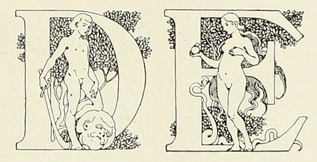
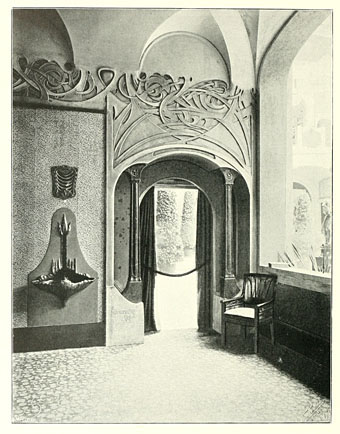
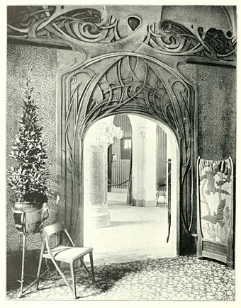
Continuing the delve into back numbers of Deutsche Kunst und Dekoration, the German periodical of art and decoration. Volume 7 covers the period from October 1900 to March 1901 and features a set of ornamental capitals throughout this edition designed by Karl Lürtzing, part of a presentation of typefaces in the Art Nouveau style. The figures in Lürtzing’s alphabet all seem to be Biblical or mythological (as with David and Eve above) although some are easier to decipher than others. Volume 6 paid a visit to the Exposition Universelle in Paris and there’s a few more examples from that event here, along with further examinations of the best in German art and design. As usual, anyone wishing to see these samples in greater detail is advised to download the entire volume (which comprises over 300 pages) at the Internet Archive. There’ll be more DK&D next week.

dkd07-02.jpg

Remarkable interiors by Richard Riemerschmid.

dkd07-03.jpg

Continue reading “Deutsche Kunst und Dekoration #7”

Will Bradley’s Fringilla

bradley1.jpg

Title spread.

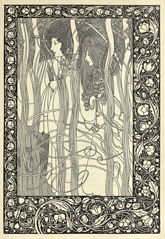
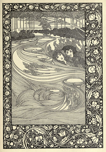
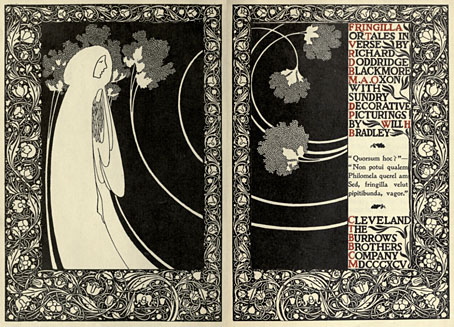
Like Marcus Behmer, another Beardsley follower from the Internet Archive, Will Bradley‘s work has been featured here before and should be familiar to anyone interested in illustrators of the 1890s. As well as being one of the great American illustrators, Bradley was also a very accomplished and successful practitioner of what we now call graphic design, and you see some of his design sensibility at work in these pages which illustrate RD Blackmore’s “tales in verse”, Fringilla (1895). The page borders are in the William Morris style which Beardsley imitated for Le Morte Darthur; Aubrey dropped this kind of heavy decoration when he moved to other books but Bradley made the borders his own for a while, using them in unlikely places such as adverts for that new-fangled transport device, the bicycle.

bradley2.jpg

Pausias and Glycera.

The Internet Archive also has A Booklet of Designs by Bradley, a collection of motifs and very cartoony advertising illustrations from 1914. As art it’s a lot less worthwhile than Frangilla but for anyone interested in early design methods it’s worth a look for the insight it offers into how things were done in the days of scissors and paste.

bradley3.jpg

Kadisha.

Elsewhere on { feuilleton }
The illustrators archive

Previously on { feuilleton }
Bradley does Beardsley

Esquisses Décoratives by René Binet

exposition1.jpg

The work of French architect and designer René Binet (1866–1911) has been featured here before with one of his most famous creations, the monumental gate he designed for the Paris Exposition Universelle of 1900. Philippe Jullian in his 1974 book about the exposition, The Triumph of Art Nouveau, calls the gate the “Porte Binet” and also notes that it was referred to as “the Salamander” for its resemblance to the salamander stoves of the period.

binet1.jpg

The reference to nature is apt, albeit for a different reason, since it was Ernst Haeckel’s Kunst-Formen der Natur which Binet used as inspiration for his designs, the encrustation on the gate being based on Haeckel’s studies of shell forms. This influence was developed four years later in Binet’s Esquisses Décoratives, a series of speculative designs which applied Haeckel’s work to architecture and interior design as a whole; the Porte Binet can be seen on the title plate above and the print there seems to have been either signed by or dedicated to Haeckel.

Art Nouveau design is usually thought of in terms of the curvaceous style derived from Alphonse Mucha and others, but there were several designers of the period looking to nature for inspiration in a way which went beyond William Morris’s application of plant forms to flat surfaces. Binet’s lamp designs below show how Haeckel’s sea-life could be transmuted into enclosures for electric lights. These designs hint at a direction which went unexplored in the 20th century; the Art Nouveau style was steadily vulgarised after the Exposition Universelle until it was replaced altogether by the development of Art Deco following the First World War. Binet went on to design the extension of the Paris department store, Printemps, but his huge Art Nouveau atrium was later destroyed by fire.

binet2.jpg

There aren’t many examples of Binet’s designs on web pages, the ones here are from this Flickr set and a vintage print seller. There is a recent study of Binet’s work available, however, René Binet: from Nature to Form by Olaf Breidbach. For an idea of how an entire city based on Haeckel might look, we have Schuiten and Peeters’ imaginary metropolis of Blossfeldtstad whose “Vegetalistic” architecture was featured in an earlier post.

Previously on { feuilleton }
Le Palais de l’Optique, 1900
Exposition Universelle films
Exposition jewellery
Exposition Universelle catalogue
Exposition Universelle publications
Exposition cornucopia
Return to the Exposition Universelle
The Palais Lumineux
Louis Bonnier’s exposition dreams
Exposition Universelle, 1900