Minotaure, 1933–1939

minotaure35.jpg

Art by Diego Rivera for the Mexican supplement in Minotaure no. 13.

I was tempted to title this one Minotaure! since I’ve been searching for copies of the magazine in question for many years. I’m certain I went looking in all the usual sources last year in the run-up to the Surrealist centenary, without success. Anyway, here they all are at last, a complete run of one of the major Surrealist periodicals.

Minotaure was notable for a number of reasons, first among them the publisher, Albert Skira, whose resources enabled the production of a very desirable item, with good design, colour prints in each issue, and plenty of photos and other artwork throughout. The Surrealist publications of the 1920s had been historically important but all of them were monochrome documents with few pictures and few pages. Minotaure had the production values of a quality magazine and an impressive roster of artists and writers to fill each issue. Skira and editor E. Tériade originally intended their periodical to cover a wide range of art, past and present, but with most of the early contributors being members of André Breton’s Surrealist circle the magazine quickly became a showcase for Surrealist art and theorising. The first issue featured a cover by Pablo Picasso, with more Picasso artwork inside. Subsequent issues had covers by leading Surrealist artists–Dalí, Ernst, Magritte, Masson–which captured the movement at a time before Breton’s persistent expulsions hollowed out the original group. Breton writes in nearly all the issues but was forbidden from using Minotaure as a political platform (the previous Surrealist journal had been the very political Le Surréalisme au service de la révolution), a restriction he kept to. His manner was often dictatorial but he always had an eye for the main chance, or the bonne chance in this case.

The written contents of Minotaure are mostly in French but the pictorial matter is worth seeing even if much of it is very familiar today. Among the written highlights are two essays by Salvador Dalí, the first on the “edible” nature of Art Nouveau architecture, with an emphasis on the work of Gaudí; the second about Pre-Raphaelite painting. It’s understandable that Dalí would be attracted by the meticulous realism of early Millais and William Holman Hunt but I didn’t know his essay included an analysis of Hunt’s The Hireling Shepherd, a painting I look at every time I’m in the Manchester Art Gallery. Elsewhere there are articles about automatism, mediumship, the decalcomania technique in painting, the esoteric symbolism of the alchemists, naive or untutored art, and plenty of single-page items and visual novelties. Photography by Man Ray and Brassaï is a recurrent feature. Skira’s magazine established a template which the two American Surrealist periodicals of the 1940s, View and VVV, did their best to follow. Now that Minotaure is freely available I’ll be waiting impatiently for complete runs of its followers to turn up somewhere.

(Note: some of the copies linked below have had their colour prints removed.)


Minotaure no. 1 (1933)

minotaure01.jpg

Cover art by Pablo Picasso.

minotaure02.jpg

minotaure03.jpg


Minotaure no. 2 (1933)

minotaure04.jpg

Cover art by Gaston-Louis Roux.

Continue reading “Minotaure, 1933–1939”

Led Zeppelin IV: Jimmy Page versus Little Bo-Peep

lz4.jpg

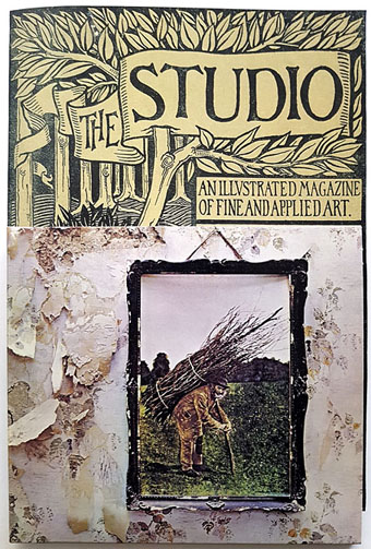
Background graphics by Aubrey Beardsley, 1893.

You’d think by now that everything would be known about an album with a Godzilla-sized cultural footprint like Led Zeppelin IV. I certainly thought so until last week when I turned up the source of something that the more obsessive Zepp-heads have been pondering for years. If this puts a bustle in your hedgerow then read on.

symbols.jpg

Led Zeppelin’s fourth album has been around now for half a century which means there really is a lot known about every detail of its production. Mysteries that used to confound friends of mine when we were teenagers have long been solved, questions such as what the hell the four symbols assigned to each member of the group actually signified; not only do we know the origin and meaning of those symbols, the enigmatic “Zoso” sigil chosen by Jimmy Page has an entire website dedicated to its various manifestations. We know where the photo on the cover was taken (Birmingham), and why the sleeve is devoid of identification (Page was annoyed with the press reaction to the previous album); we know that the hermit painting inside the gatefold is based on the Tarot card by Pamela Colman Smith, and we also know a great deal about the writing and recording of Stairway To Heaven. Erik Davis logged much of this in his 33 1/3 study of the album, and while he examines the band symbols in some detail he doesn’t say much about the rest of the hand-written inner sleeve beyond this comment:

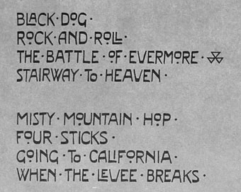
Is there a meaning to the nifty Arts and Crafts typeface that Page lifted for the Stairway To Heaven lyrics on the other side of the sleeve? Or just a vibe?

The source, if not the meaning, of this script has been intriguing Zeppelin fans for many years, but I wasn’t aware of this until I happened to be reading the Wikipedia entry about the album and found myself equally intrigued. The game was afoot, Watson.

soh1.jpg

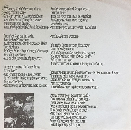
It makes them wonder: the hand-lettered lyrics.

A persistent question you see in fan circles is “What font was used to create X?” People will ask this question even when the design is a one-off, like Syd Mead’s logo for Tron, or something that’s obviously been lettered by hand. Led Zeppelin IV is an album guaranteed to raise the “What font?” question because the lyrics of the group’s most famous song, Stairway To Heaven, cover an entire side of the inner sleeve. On one of the fan forums I was reading someone was eager to identify “the font” because they wanted to apply the words to a bedroom wall. Many more people must have copied out those lyrics since 1971; I once had to do this myself for a female friend who was so besotted with Jimmy Page that she wanted the lyrics in a frame on her own bedroom wall.

tracks.jpg

According to the Wikipedia entry, Page revealed the source of the lettering to be an issue of The Studio, the British art and design magazine which helped launch Aubrey Beardsley’s career and did much to develop and promote the Art Nouveau style in the 1890s. I’m very familiar with The Studio, many posts here refer to it, and I happen to have a complete collection of issues downloaded from the journal archive at Heidelberg University. Seeing the magazine mentioned in this context immediately made me want to find the design that Page had adopted, but before I started flicking through thousands of pages I looked around to see if any of the Zepp-heads had tried searching for the magazine themselves. Evidently not; all the discussion I’ve seen about the inner sleeve tends to recycle the Wikipedia entry, nobody seems to have bothered looking for copies of the magazine. Okay then…

Continue reading “Led Zeppelin IV: Jimmy Page versus Little Bo-Peep”