Weekend links 756

crane.jpg

A Diver (no date) by Walter Crane.

• At Worldbuilding Agency: The first part of a long interview with Bruce Sterling concerning “the pursuit of deliberate oxymorons as a creative strategy, worldbuilding in the context of history and futurity, Berlusconi on the moon and more”. With questions from Paul Graham Raven, and my cover art for Bruce’s Robot Artists and Black Swans.

• “With its focus on the 1970s career of Leonard Rossiter and its mordant metaphysics of the moist, Sophie-Sleigh Johnson’s Code: Damp might just be the most original book yet to emerge from Repeater publishing,” says Tim Burrows.

• “A definitive guide to the work of William S Burroughs’ on screen.” It’s a guide but it’s hardly definitive when there’s no mention of the four films Burroughs made with Anthony Balch.

• A catalogue of lots at the forthcoming After Dark: Gay Art and Culture online auction. Homoerotic art, photos, etc, also historic porn and a few garments worn by Divine.

• New music: Jay recommends the high-grade motorik en espanol dance-rock of Sgt Papers; Topology Of A Quantum City by Paul Schütze; Overtones by Everyday Dust.

• This week’s obligatory Bumper Book of Magic entry: Ben Wickey at Alan Moore World talks about his work on the book’s Great Enchanters comic strips.

• At Dennis Cooper’s it’s Malcolm Le Grice’s Day. Le Grice’s death was announced earlier this month.

• At The Wire: The magazine’s contributors’ charts showing their favourite music of the past year.

• A new website for the Sanborn Fire Maps and their decorated title pages.

• Mix of the week: DreamScenes – December 2024 at Ambientblog.

• At Public Domain Review: Albert Kahn’s autochromes.

Burroughs Called The Law (1960s) by William S. Burroughs | Language Is A Virus From Outer Space (Live) (1984) by Laurie Anderson | Burroughs Don’t Play Guitar (1996) by Islamic Diggers

The Japanese Sandman, a film by Ed Buhr

js1.jpg

I upgraded my DVD of David Cronenberg’s Naked Lunch to blu-ray recently. The film is one of my favourites in the Cronenberg oeuvre even though its connection to the novel is minimal at best. After watching it again I was thinking (not for the first time) that one way to adapt either Naked Lunch or any of the books in the “Nova Trilogy”—The Soft Machine, The Ticket That Exploded, Nova Express—would be to commission ten or twenty very different film-makers to adapt portions of the novel in whatever manner they chose. The resulting short films could either be run in sequence or cut together to make a meta-film which, if nothing else, would be closer to the disjointed structure of William Burroughs’ early novels than the semi-biographical narrative that Cronenberg delivered .

js2.jpg

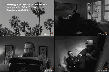
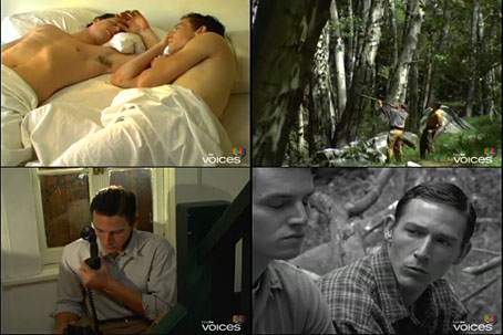
Which brings us to The Japanese Sandman, a 12-minute film made by Ed Buhr in 2008 which turned up recently on YouTube. Buhr’s short is a dramatisation of passages from the letters that Burroughs wrote to Allen Ginsberg in 1953, in which Burroughs recounts his experiences in Panama while searching for the yage vine, a plant which yields the hallucinogen known as ayahuasca. Narrator John Fleck is a decent Burroughs mimic (although the real Burroughs pronounced “Panama” with a distinct drawl at the end, more like “Panamawww”), and since Burroughs’ own words provide the text of the piece the film is closer to Burroughs’ books than many other short films. Black-and-white scenes in Panama rooms alternate with a colour sequence where Burroughs recalls a doomed love affair with a boy in the St Louis of the 1930s. It’s gratifying to see someone draw attention to an aspect of Burroughs’ writing that’s often ignored, the persistent thread of melancholy and regret for lost time/lost people which runs through so many of his novels. It’s a side of the fiction that would also have to be accounted for in any longer adaptation of Burroughs’ work.

Elsewhere on { feuilleton }
The William Burroughs archive

The art of Denton Welch, 1915–1948

welch04.jpg

Symbolist Figure (1946).

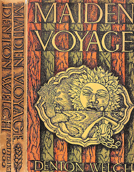
The visual art, that is, not the novels and short stories. Last month I finally got round to reading Denton Welch’s first two novels, Maiden Voyage (1943) and In Youth is Pleasure (1945). Finally, because I’ve known Welch’s name for a long time, mostly via William Burroughs—who dedicated The Place of Dead Roads to him—and John Waters—who often lists In Youth is Pleasure as one of his favourite novels. This was also the book that Burroughs favoured, and he wrote an introduction for a US reprint in 1983. At first glance, Welch would seem a surprising choice for the pair: the protagonist in each book is a thinly fictionalised avatar of the author—he’s even named Denton Welch in the first—an effete upper-middle-class English teenager who hates his school and most of the people he meets, and who spends as much time as possible wandering alone, looking for affordable antiques and any old buildings that may be of interest. The homosexual undercurrents in each book generate persistent tensions which are an obvious attraction for many readers, even though nothing is ever stated overtly and there’s no hand-wringing over unrequited passions. Welch’s boys are most passionate about the things they collect, and their determination to be left alone to pursue their interests when all the adults around them are trying to push them in different directions. Having been a similar school-hating, art-obsessed, introverted teenager, if I’d read In Youth is Pleasure when I was the same age as the beleaguered Orvil Pym it would have made a huge impression.

welch07.jpg

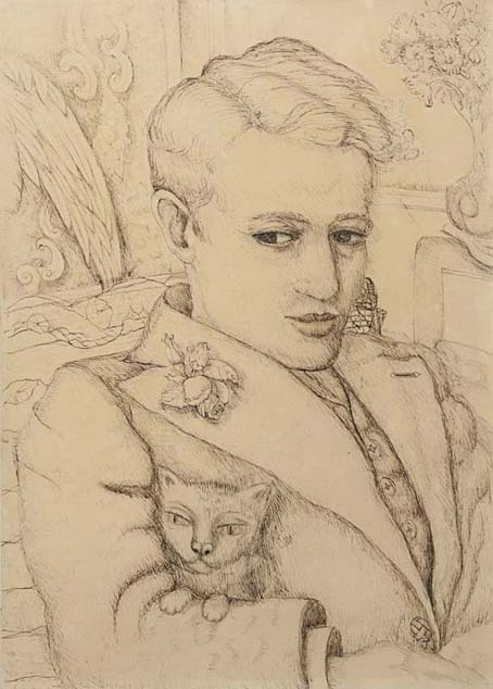
Self-portrait With Cat.

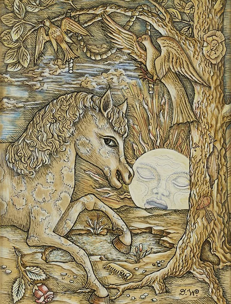
Art was the interest that Welch most wanted to pursue but it’s the writing for which he’s remembered. Few people have good things to say about his drawings and paintings but there’s a strange quality to many of them that I like, an atmosphere of menace that lurks beneath the often naive renderings. I was surprised how gloomy and claustrophobic many of them are. The refined sensibilities in the novels lead you to expect something lighter, frivolous even, like the paintings and illustrations of his contemporary, Rex Whistler, or other artists of the Neo-Romantic school of the 1930s. In fact looking at Whistler’s work again, it’s the Whistler style I most expected even though it’s unfair to compare the two. Welch and Whistler shared a taste for pictorial decoration, and a blithe indifference to the avant-garde trends of the day, but Whistler was a formidable talent, the kind of successful illustrator that Welch could only dream of being. (That said, both artists were commissioned by Shell for the company’s poster series showing views of Britain.) Yet lack of ability sometimes takes an artist into places that a professional wouldn’t reach. Whistler would have given us a perfect cat, not the strange creatures with almost human faces that Welch liked to draw. I’m curious to know which, if any, contemporary artists Welch preferred. His diaries are now earmarked for a future reading.

A Voice Through A Cloud: Discovering Denton Welch

welch05.jpg

Hadlow Castle, Kent (1937).

welch06.jpg

Horse and Moon (1943).

welch03.jpg

Continue reading “The art of Denton Welch, 1915–1948”

Talking time: Cabaret Voltaire interviews

cabs1.jpg

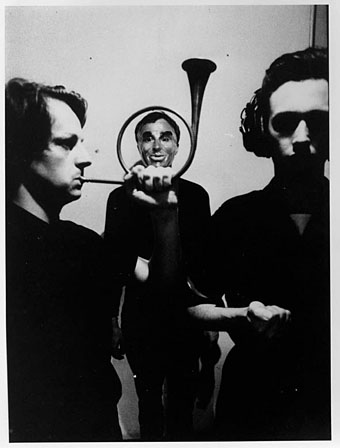
Cabaret Voltaire, circa 1981. Left to right: Richard H. Kirk, Chris Watson, Stephen Mallinder.

…A few brief facts. CV came about from a mutual interest in producing “sound” rather than “music”, a few years ago, making very rare live appearances from time to time. Now an interest has developed in the band, we are playing live more frequently instead of just recording. CV dislike the sick commercialism which pervades most “contemporary music”.

At the moment we are working on a basis which involves two types of performance. A “set” which consists of songs, and a set which is completely improvised, lasting from 20 minutes to “x” number of hours. CV also use films + slides as lighting in live performance. A CV concert is like a bad acid trip; CV want to create total sensory derangement. MIT UND OHNE POLITIK, UNVERNUNFTIGKEIT.

INFLUENCES — “anything which is unacceptable”.

The band’s line up is —
RICHARD – Guitar, Clarinet, Tapes, Vocals.
MAL – Bass, Electronic Percussion, Lead Vocals.
CHRIS – Electronics, Tape, Vocals.

Early band correspondence with a German fanzine

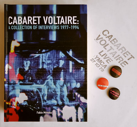
Another week, another book of music talk. Cabaret Voltaire: A Collection of Interviews 1977–1994 was published two years ago but I only just discovered it as a result of my recent cycling through the Cabs’ discography. I’ve never been a great reader of music books yet here I am with three of them devoted to this particular group. Fabio Méndez’s collection joins Cabaret Voltaire: The Art of the Sixth Sense, the first Cabs book from 1984, in which Mick Fish and D. Hallberry interrogate Kirk and Mallinder about their progress to date; and Industrial Evolution, a reprint of the Sixth Sense interviews plus newer ones appended to Fish’s memoir about life in the Cabs’ home town of Sheffield during the 1980s. The Méndez collection is the most substantial of the three, gathering articles from fanzines, magazines and newspapers, and translating into English many pieces from European publications.

cabs2.jpg

Badges not included.

As with Coil, I’ve always liked hearing what Kirk, Mallinder and Watson had to say. There was a fair amount of historical intersection between the two groups, Cabaret Voltaire having been a part of the first wave of Industrial music along with Throbbing Gristle, 23 Skidoo (whose records were produced by TG & CV), Clock DVA and the rest; later on the Cabs were part of the Some Bizzare stable along with Soft Cell, Coil, Einstürzende Neubauten and others. One of the interviews in Méndez’s book is from Stabmental, a short-lived fanzine edited in the early 1980s by a pre-Coil Geoff Rushton/John Balance. The zine ended its run with a cassette compilation, The Men With The Deadly Dreams, which included two exclusive recordings by Chris Watson and Richard Kirk. Watson’s piece, which applies cut-up theory to a radio news broadcast, is a good example of Cabaret Voltaire’s engagements with William Burroughs’ speculations about electronic media. Further examples of cut-up theory may be found in the group’s lyrics and in the video material they created, initially for use as projections while playing live, then later for their music videos which were in the vanguard of the form in the early 1980s.

A lot of the things we do tend to get glossed over. We’ll talk to anyone. We do loads of interviews with fanzines.

Unidentified group member, 1980

582 pages of interviews with a group that never had any kind of popular success is more information than most people would ever want or need. But as with Nick Soulsby’s Coil book, Méndez is doing future historians a service by resurrecting material from scarce and ephemeral sources. The post-punk period from 1978 to 1982 was a uniquely fertile musical moment, especially in Britain. For a few years absolutely anything seemed possible, with much of the wilder activity being logged and discussed in fanzines like Stabmental which usually had a limited circulation (often distributed by mail order) and a print run of a few hundred copies at most. The British music press also covered this scene, of course, but only up to a point, especially when the music was pushing the boundaries of the possible or the commercially acceptable. Méndez’s book emphasises the differences between the music-press approach—where the article is often as much about the writer as the group itself—and the fanzine interview which tends to be a list of questions with a small amount of contextual commentary. Fanzines were a circumscribed medium but they had advantages over the music papers; sincerity, for a start, allied with genuine enthusiasm and fewer of the tics that made reading the music press each week such a chore. The small publications weren’t always free of the bad habits of the weeklies but there was less of the journalistic posturing, the ignorant dismissal of whole areas of music, and the relentless snark and sarcasm which you’ll find thriving today on social media. The drawbacks of the fanzines were mostly about quality; fact-checking was often non-existent. Méndez’s book is littered with footnotes that log the errors present in the transcripts.

Which bands are influential on your music?
Chris: “Can, Neu!, Kraftwerk, Captain Beefheart…especially Can have influenced us.”

Spex magazine interview, 1980

Questions about influence are a common feature of any interview with creative people. Chris Watson’s reply is the first example I’ve seen of the Cabs mentioning so many German groups, as well as Captain Beefheart. A recurrent theme of these interviews concerns the group’s unusual trajectory, a career which evolved through a series of changes in direction that weren’t always predictable. The trio had started out in 1974 as resolute non-musicians and sound-collage provocateurs with Dadaist intentions; the music-making took time to develop. By the late 1970s the group that now called itself Cabaret Voltaire had become a more disturbed and disturbing counterpart to Sheffield’s other electronic music ensemble, The Human League. When Chris Watson departed in 1981 Kirk and Mallinder joined the Some Bizzare roster and followed the League to Virgin Records where a substantial advance helped the pair upgrade their equipment, launch their own independent music and video label, Doublevision, and record some of their best work.

Continue reading “Talking time: Cabaret Voltaire interviews”

Glaser goes POP

glaser1.jpg

The purchase of big art and design books requires careful consideration round here, what with shelf space being stressed in multiple ways. (One of the shelves bearing the heavier volumes sags alarmingly.) But this one was recommended to me by a couple of people, and I’d also had a book token hanging around unused for over a year so here we are.
glaser2.jpg

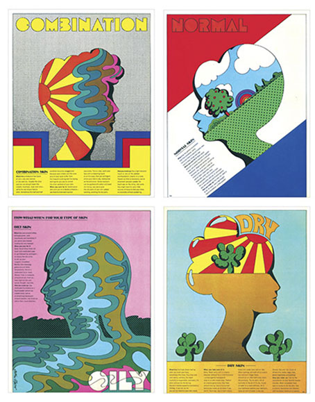
Skin types for Seventeen magazine, 1967.

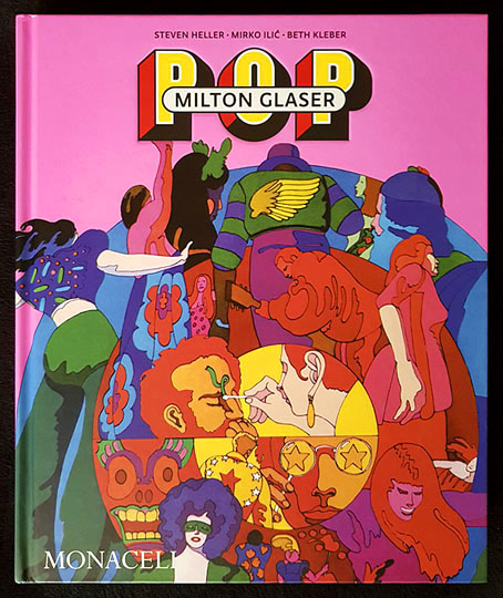
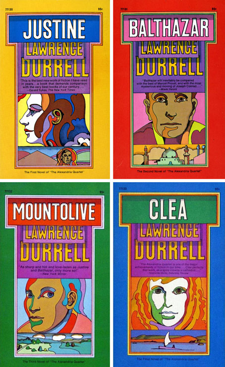
Milton Glaser: POP is a copiously-illustrated 288-page study of the work produced by Milton Glaser and his colleagues at Push Pin Studio, with an emphasis, as the title and cover art suggests, on the company’s prime decade of the 1960s. The book was compiled and edited by the redoubtable Steven Heller, together with Mirko Ilic and Beth Kleber, and presents an overview of Glaser’s remarkable career as designer and illustrator. Glaser was an exceptionally versatile artist, something which has often made appraisal of his career a difficult business. You could easily choose ten of his book or album covers from the many examples assembled by Heller and co., and all would look like the work of different people.
glaser3.jpg

The Alexandria Quartet by Lawrence Durrell; Pocket Books, 1969. I’d much rather have this set than my Faber collection which packages the four books into an unwieldy brick.

Matters are further complicated by the often collaborative nature of the work at Push Pin, and the fact that designers and illustrators aren’t always given credit for their commissions. In the past I’ve gone looking for Glaser’s work then given up when I seemed to be encountering designs that weren’t by him at all. In addition to demonstrating Glaser’s range, Heller, Ilic and Kleber have done everyone a service by showing unused illustrations and crediting work that was previously debatable. Some years ago I wrote a post about the uncredited cover art for the first budget sampler album, The Rock Machine Turns You On (1968), an entry which didn’t manage to resolve the issue of whether or not the cover art was Glaser’s work. It turns out it was by him after all, collage being one of the techniques he employed from time to time.
glaser5.jpg

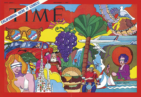
TIME magazine gets groovy. A fold-out cover from 1969.

On a more personal level, Glaser’s versatility and multi-disciplinary approach is encouraging if you find yourself being led in a similar direction. Designer-illustrators are no longer as rare as they used to be, but illustrators, like many fine artists, still tend to develop a favourable style which they then stay with year after year. Illustrators who change their style according to their mood, or the nature of the brief, or a desire to experiment, remain in the minority. Glaser’s illustration ranges more widely than any other artist I’ve seen, from realistic pen-work and watercolour sketches, through bold, stylised designs, to complete abstraction. He could also be playful and frivolous in a manner you can’t imagine from some of his more serious contemporaries, while also being adept enough at illustrating children’s stories that he might easily have spent his career doing this alone.
glaser4.jpg

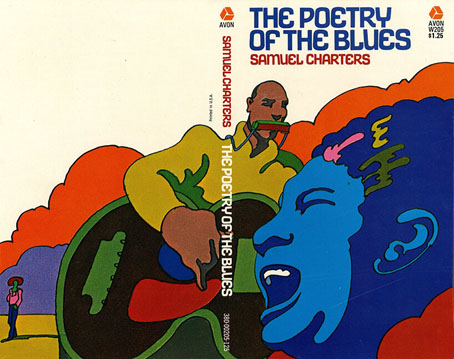
Avon Books, 1970.

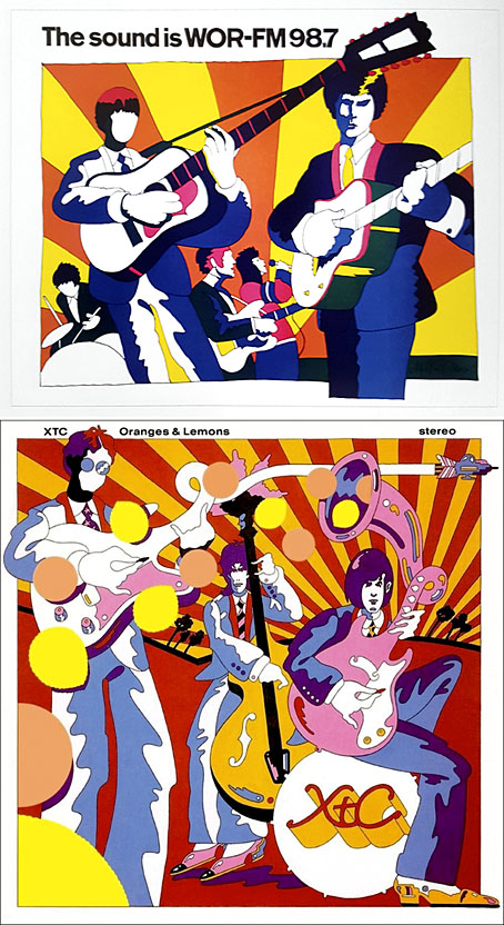
But the main attraction of Milton Glaser: POP for this reader is the focus on all those bold graphics, especially the commissions that reworked the emerging psychedelic styles for the commercial sphere. The cover illustration is emblematic of many other examples. This drawing first appeared in a New York magazine supplement in 1967 to accompany an article about LSD, before being reused on the dustjacket of Tom Wolfe’s book about Ken Kesey and friends, The Electric Kool-Aid Acid Test. Glaser and his colleagues at Push Pin were prime exponents of something I’ve taken to calling “the groovy look“, a term I reserve for commercially oriented quasi-psychedelic art. This isn’t meant to be a serious label, it’s a private term that I used to attach to anything resembling the art styles seen in the Yellow Submarine feature film. Serious or not, the label persists when I continue to feel the need for a suitable descriptor for this type of art. “Psychedelic” is the most common label (and one which obviously suits Yellow Submarine) but it seems inappropriate when discussing magazine adverts for household products or illustrations in children’s books. Steven Heller prefers the term “Pop”, but this strikes me as too loose, risking confusion with the many varieties of Pop Art which seldom resemble the vivid, stylised creations of Glaser et al. Pop would also seem misapplied as a description for commercial art when Pop Art was all about the appropriation (ironic or otherwise) of commercial iconography. If you start to label a swathe of commercial art as Pop along with the gallery art that was borrowing from it then the term becomes so diffuse it loses its meaning. The “groovy style” had a long reach, and evolved beyond the decade it was born in. Plenty of examples may be found in the early 1970s by which time Pop Art (in the gallery sense) had lost its momentum.
glaser6.jpg

Above: Glaser ad art, 1966. Below: Dave Dragon’s cover art for XTC, 1989.

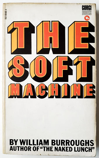
I’ll no doubt return to this question, especially when I’ve just done something in the groovy style myself. (You’ll have to wait a few months before you see the results.) In the meantime there’s a lot to enjoy in this book. I haven’t yet mentioned Glaser’s unused promotional art for the Saul Bass feature film, Phase IV, or the many typeface designs that Glaser created with his associates, and the way one of them—Baby Fat—is used on the cover of the first UK paperback of The Soft Machine. I think this was the first William Burroughs book I ever bought, and it’s been sitting on my shelves all this time without my realising it was a Glaser production. That’s how it often is with graphic designers; they shape our world almost as much as architects do yet their specific influence isn’t always recognised.
glaser7.jpg

Corgi Books, 1970.

And by coincidence, the latest post at The Daily Heller is about a Glaser exhibition tied to the publication of the book. If you’re in New York it’ll be running for the next two weeks.

Previously on { feuilleton }
The groovy look
Milton Glaser album covers