The weekend artists, 2012

barnes.jpg

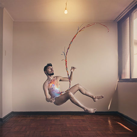
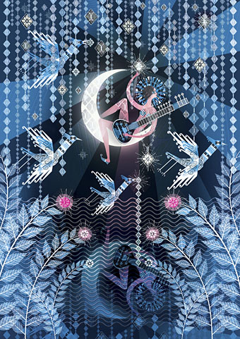
Lucy in the Sky with Diamonds (2012) by Lesley Barnes. She also has peacock wrapping paper.

The most popular post of the year was one I made last December featuring all the artists whose work had appeared throughout 2011 in the weekend links posts. (The surge of views occurred early in January when it was linked on Stumbleupon.) Since I’ve been away this week there aren’t any links so here’s a retrospective of things that caught my eye in 2012.

durette.jpg

Heartsick (2011) by Kelly Durette.

jacobsen.jpg

Self-portrait by Jon Jacobsen from his Home series.

tintenfisches.jpg

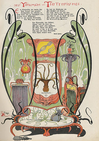
Der Triumph des Tintenfisches from Meggendorfer-Blätter (c. 1900). Via Beautiful Century.

kuhlman.jpg

Two Grove Press covers by Roy Kuhlman. From Arden Kuhlman Riordan’s Pinterest page collecting her father’s cover designs.

ulian.jpg

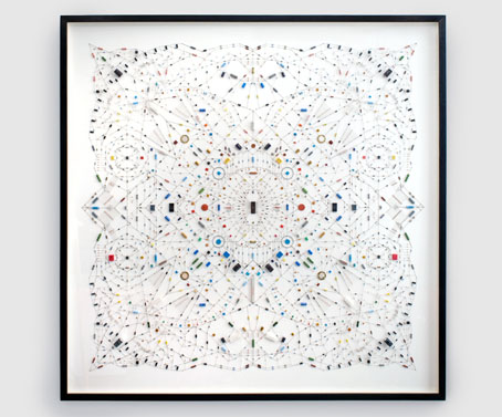
Technological mandala 02 (The beginning) (2012) by Leonardo Ulian.

Continue reading “The weekend artists, 2012”

Weekend links 110

janke.jpg

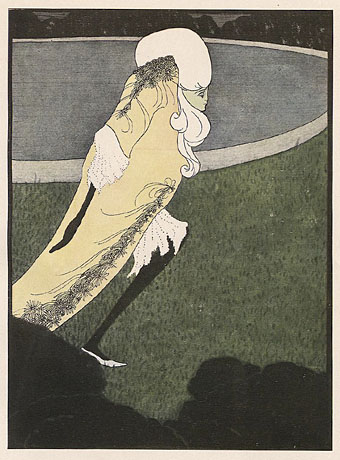
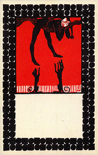
Til Eulenspiegel by Urban Janke. From Twenty Postcards of the Wiener Werkstätte at 50 Watts.

Rorschach Audio by Joe Banks is “essential reading for everyone interested in air-traffic control, anechoic chambers, artificial oxygen carriers, audio art, bell-ringing, cocktail parties, cognitive science, communications interference, compost, the death penalty, Electronic Voice Phenomena, evangelism, evolutionary biology, experimental music, ghosts, the historiography of art, illusions of sound and illusions of language, lip-reading jokes, nuclear blast craters, predictive texting, singing hair, sonic archives, sound design, steam trains, tinnitus, the Turing Test, Victorian blood painting, visual depth and space perception, ultrasonic visual music, ventriloquism, voices and warehouse fires and robberies.”

• “Freud did not understand female sexuality. Klimt did. Klimt’s women please themselves. The realization that women have an independent sexual life was an insight in art.” Eric Kandel discusses his new study The Age of Insight: The Quest to Understand the Unconscious in Art, Mind, and Brain, from Vienna 1900 to the Present.

• Three new books already mentioned here receive further attention: Stan Persky on Christopher Bram’s Eminent Outlaws : The Gay Writers Who Changed America. | Matthew Aquilone on Paul Russell’s The Unreal Life of Sergey Nabokov. | Karin L. Kross on the new translation of the Strugatsky’s Roadside Picnic.

The creative writing moment/movement baffles me and it intrigues me. What does it signify, all this creative longing? And why through language? Specifically fiction, poetry, memoir? […] The crazy part of it is that we are breeding professional, competent, homogenised writers who will go on to teach writing that is professional, competent and homogenised. The intriguing part of it is whether this movement towards creativity and self-expression is really the start of a kind of Occupy – that it could be dangerous and confrontational, not homogenised at all.

Dangerous? But then they won’t get published and win awards and get film deals and… Jeanette Winterson prepares to teach creative writing at Manchester University.

The Underground New York Public Library is a visual library featuring the Reading-Riders of the NYC subways.

Hob by No Man: “Constructed from soundtrack noises from both version of Quatermass and the Pit.”

Stephen Thrower talks about his soundtrack music for The Erotic Films of Peter De Rome.

John Waters surprises everyone by hitchhiking across the US.

• Sounds & the City: An interview with Julia Holter.

The Dead Dream of the Dirigible.

Meditation (1979) by Edward Artemyev.
Tom Phillips album covers

phillips00.jpg

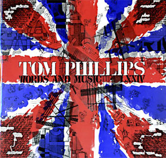
Words and Music (1975) by Tom Phillips.

Two related posts is coincidence, three is a series. Earlier posts from the past couple of weeks looked at album covers created by designers better known for their work in other areas. Tom Phillips is a British artist, writer and composer who I continue to insist is one of our greatest living artists, a figure of singular intelligence, invention and versatility whose lack of grandstanding has never raised his profile to, say, the Hockney level. Phillips’ involvement with the music world, both as composer/librettist, and his oft-cited position as Brian Eno’s art teacher in the 1960s, have led to the creation of a handful of record and CD covers from the mid-70s on. Before we get onto those I’ll note that Phillips has a piece in the latest edition of Eye magazine where he reviews a book of postcards from the Wiener Werkstätte. I happen to have a review in the same issue looking at a republished Kenneth Anger study.

Words and Music above has a January 1975 release date although the cover clearly states “LXXIV” in Phillips’ customary stencil lettering. The pressing was limited to 500 copies and doesn’t seem to have been reissued since which means that copies for sale command excessive prices. Side A comprises recordings of Phillips’ compositions while on the flip the artist/author reads extracts from A Humument, the treated book/experimental novel which is not only his most celebrated work but a project whose influence permeates all of the Phillips oeuvre, including the sleeve art.

phillips01.jpg

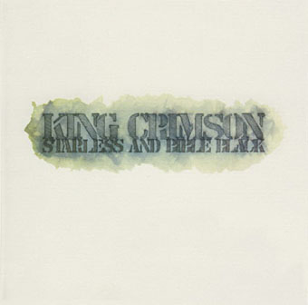
Starless and Bible Black (1974) by King Crimson.

phillips02.jpg

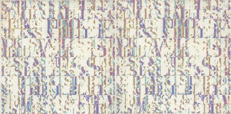
A year before Words and Music, Phillips created the cover art for this King Crimson album, and he’s also credited with the design. The fractured stencil lettering on the gatefold interior resembles similar effects in some of Phillips’ paintings while on the back cover there’s a tiny extract from A Humument bearing the enigmatic phrase “this night wounds time”. I’ve wondered for years how this cover came about: Robert Fripp often selects the art for King Crimson’s covers so was Phillips his choice as artist/designer? Or was it a result of the Fripp and Eno connection? If anyone knows the answer, please leave a comment.

Continue reading “Tom Phillips album covers”

Ver Sacrum, 1903

vs-1903-01.jpg

Concluding the series of posts about Ver Sacrum, the art journal of the Viennese Secession. The volume of issues for 1903 continues the bi-monthly format from the previous year only this time the calendar supplement is at the end of the volume. This was the last year for the journal, unfortunately, not least because the Secession had run its course, having perhaps proved its point in providing an alternative to the prevailing trends in Austrian art and design. Koloman Moser, Alfred Roller and Josef Hoffmann left to found the Wiener Werkstätte while Gustav Klimt, who again has an issue devoted to his drawings, went on to paint some of his most famous pictures, including The Kiss.

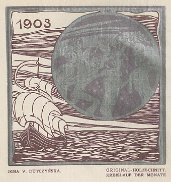
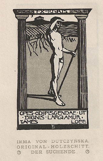
Ver Sacrum certainly ended on a high note. Most of the issues for 1903 contain woodcuts by a variety of artists with some superb examples of the form. For once there’s work by women—Irma von Dutczynska, Nora Exner and Hilde Exner—there’s more strange art from Marcus Behmer, and also a translated extract from the memorial book written by Arthur Symons following Aubrey Beardsley’s death in 1898. As before, anyone wishing to see more can browse all 498 pages or download the entire volume here.

vs-1903-02.jpg

vs-1903-03.jpg

Continue reading “Ver Sacrum, 1903”

Koloman Moser posters

moser2

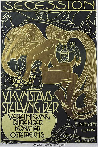
Secession poster (1899).

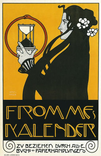
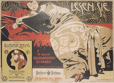
Since I’ve been delving over the past year into the fin de siècle culture of Germany and Austria, the name of Koloman Moser (1868–1918) has kept recurring. This is partly because of Moser’s associations with the Viennese Secession and the Wiener Werkstätte, of course, but I’ve made a point of drawing attention to his work since it’s struck me as some of the most remarkable being produced anywhere in Europe during the period 1895–1910. Moser’s poster designs are a good example of his authority as an artist and graphic designer who quickly evolved from Mucha-derived Art Nouveau flourishes to a degree of stylisation that was incredibly advanced for the early 1900s. The graphics of Moser and fellow artist/design Alfred Roller point the way to Art Deco twenty years later, and also to the psychedelic era whose poster artists eagerly borrowed motifs, figures and lettering designs from Moser, Roller, Mucha and others.

moser3

Frommes Kalender poster (1899).

Wikimedia Commons has a generous sampling of Moser’s work that shows his incredible versatility in a variety of media. The Secession designers, and Moser in particular, and memorialised in Paul Shaw’s typeface design, Kolo.

moser8

Illustrierte Zeitung poster (1900).

Continue reading “Koloman Moser posters”