Virgil Finlay’s magazine illustrations

finlay1.jpg

The Time Machine by HG Wells; Famous Fantastic Mysteries, August 1950.

This one will be popular, I’m sure. One of the recent uploads at the Internet Archive is a massive collection of Virgil Finlay’s interior illustrations from the magazines that published most of his work—Weird Tales, Famous Fantastic Mysteries, Amazing Stories, etc, etc—together with the astrological illustrations he created later in his career, plus other material, including a few pieces that never appeared in print. Pencil drawings, lithographs and hundreds of meticulous renderings in ink on paper or scratchboard; 1888 illustrations in all. Whoever put the haul together has been much more thorough than I’d have expected. Rather than a stash of random drawings you get 10 separate folders (best appreciated in the cbz format; see the note below) with each illustration tagged with the name of the story it was illustrating, and the date of publication. The contents are a mix of reproductions from later reprints, together with cropped pages from magazine scans. Taken together, this must comprise almost all of Finlay’s published work excluding his magazine covers and other paintings.

finlay3.jpg

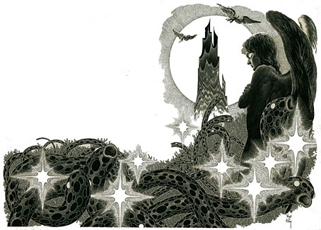
Earth’s Last Citadel by Henry Kuttner and CL Moore; Fantastic Novels Magazine, July 1950.

Virgil Finlay (1914–1971) can be a frustrating artist for anyone who admires his work. He was massively prolific, and maintained a high level of quality for almost 40 years; but his interior illustrations were often printed on pulp stock, the kind of paper that offers the worst kind of print reproduction, and which darkens and eventually crumbles into dust unless it’s carefully stored. Descriptions of his illustrations often note that his drawing style evolved to compensate for the deficiencies of the printing but much of his artwork was very finely rendered, and I’m not sure his minute stipple effects would have printed any better (or worse) than the traditional cross-hatching which he used from time to time. His drawings have at least been well-served by reprint collections, where the white art paper makes his striking compositions leap off the page. Inevitably, the best of these—Gerry de la Ree’s seven-volume collection from the 1970s, and a four-volume set from the 1990s—are all out of print. The sheer quantity of illustrations also presents a problem for any reprint collection: what to include…or leave out? All of which is a roundabout way of saying that this accumulation of his interior art may be unauthorised, and even frowned upon by some, but it benefits Finlay by keeping his work in circulation and showing the full range of his career.

finlay5.jpg

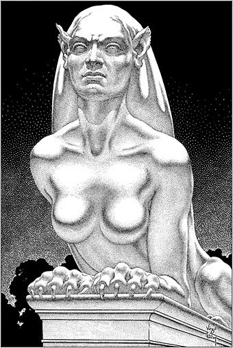
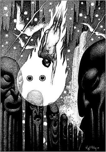
The Faceless God by Robert Bloch; Weird Tales, May 1936.

With 1888 illustrations to choose from, picking out a representative selection is a hopeless task, so what you see here are a few favourites. I said that Finlay maintained a high level of quality but there are unsuccessful Finlays, especially in the early years when his style was still evolving. (It should be noted that he was in his early twenties when he was creating pieces such as these. His errors are a lot less grievous than mine were at the same age.) One of the hallmarks of the Finlay style is a frequent use of photo-reference, especially for faces, and it’s the disjunction between faces and bodies which occasionally jars. Disparities between the size or angle of a head and a body are common in photo-collage but you don’t expect to see them in a drawing. Occasionally the disparities worked for him, as in his illustration for The Faceless God by Robert Bloch, a drawing that so impressed HP Lovecraft that he responded with a short poem praising both picture and artist. The reference images used for his later work are much more seamlessly integrated, and in the 1940s and 50s he seemed to be using posed models as frequently as the illustrators for the big American magazines.

finlay4.jpg

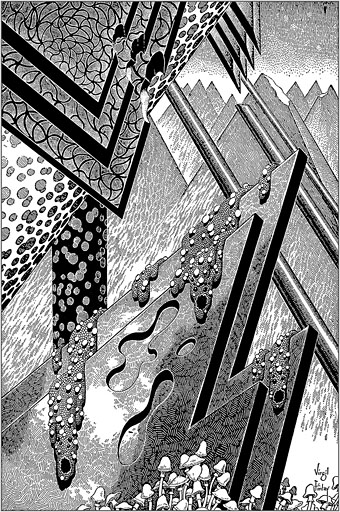
The Man Who Mastered Time by Ray Cummings; Fantastic Novels Magazine, March 1950. Remove the fungi from this illustration and you’d have an almost abstract image.

Regarding cbz or cbr files: these are simply folders filled with jpegs or pngs which have been zipped then given a new suffix. They can be browsed using a suitable comics-reader application; I use Simple Comic for the iMac and ComiCat for the tablet. The files can also be opened with any unzipping software to give you access to the images inside. I find these files so much easier to use than pdfs, especially for image-heavy publications, that I’ve taken to exporting pdf pages as jpegs then zipping a folder of the images into a cbr. One of the advantages of the cbr format is that the readers allow you to extract an image without unzipping the whole file. The only drawback with the Finlay files is that ComiCat doesn’t let you see the file name the way that Simple Comic does.

finlay6.jpg

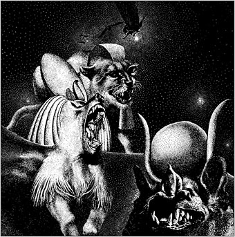
Full Moon by Talbot Mundy; Famous Fantastic Mysteries, February 1953.

Elsewhere on { feuilleton }
The illustrators archive
The Lovecraft archive

Previously on { feuilleton }
Virgil Finlay’s Tarzan
Virgil Finlay’s Salomé
The monstrous tome

Weekend links 616

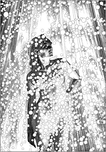
finlay.jpg

Illustration by Virgil Finlay for The Face in the Abyss by A. Merritt; Famous Fantastic Mysteries, October 1940.

• “The pier was completely outside of the gallery system, which David loved of course. People were just working on the walls, nothing was for sale, nothing could really be bought, although people were coming in and trying to chip things off the walls.” Cynthia Carr on the love letters and legacy of David Wojnarowicz.

• “In pursuit of Pure Form, the Polish artist known as “Witkacy” would consume peyote, cocaine, and other intoxicants before creating pastel portraits.” Juliette Bretan on the artful intoxications of Stanislaw Ignacy Witkiewicz.

• Kino Kyiv: Christopher Silvester compiles a list of notable Ukrainian films. I’ve not seen all of these but Shadows of Our Forgotten Ancestors is a great favourite.

Onscreen for nearly the entire runtime, [Laura Dern] pulls off the remarkable feat of being in total control of a scenario organized by undermining her identity, obliterating her characterization, and so scrambling the distinction between Nikki and Susan that one eventually comes to view Inland Empire not as a maze to exit, a puzzle to solve, an ouroboros to gawk at, but rather as both a generalized treatise on the enigma of acting and a very specific, exquisitely perverse mash note to one of Lynch’s most formidable collaborators.

Nathan Lee on Laura Dern, David Lynch and Inland Empire. I’ve always thought Dern’s exceptional performance might have been recognised more widely if Lynch hadn’t filmed most of it on low-grade video.

• New music: Golden Air by Sun’s Signature, a new project from Elizabeth Fraser and Damon Reece.

• Miranda Remington explores The Strange World of…Stomu Yamash’ta.

• Steven Heller’s font of the month is Boucan.

• At Dennis Cooper’s: Labyrinthine.

Labyrinth (2010) by Chrome Hoof | Labyrinths (2018) by Jonathan Fitoussi / Clemens Hourrière | The Seventh Labyrinth (2019) by Pye Corner Audio

Ray Harryhausen’s swords and sorceries

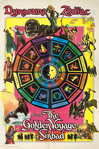
golden1.jpg

It was the 1970s: promoting Sinbad with a Zodiac poster for the blacklight brigade.

Last month I took advantage of the recent Indicator sale to buy blu-rays of a couple of favourite Ray Harryhausen films, together with Indicator’s reissued box of the three Harryhausen Sinbad features: The 7th Voyage of Sinbad (1958), The Golden Voyage of Sinbad (1973), and Sinbad and the Eye of the Tiger (1977). I’m very familiar with these films but hadn’t seen them for many years. Watching them again made me realise for the first time what perfect examples they are of sword-and-sorcery cinema even though you never see them classed as such. I’ve been reading sword-and-sorcery fiction for almost as long as I’ve been watching Ray Harryhausen films but this rather obvious insight hadn’t occurred to me before, no doubt because I’d always regarded the Sinbad cycle as Arabian Nights fantasies in the manner of The Thief of Bagdad. The 1940 version of the latter happened to be a Harryhausen favourite which prompted his decision to film an Arabian adventure following his monster-on-the-rampage pictures of the 1950s. He subsequently asked The Thief of Bagdad‘s composer, Miklós Rózsa, to score The Golden Voyage when Bernard Herrmann was unable to do so.

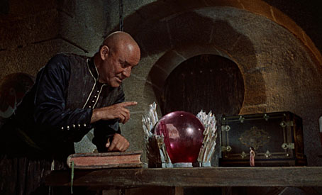
seventh.jpg

Sokurah (Torin Thatcher) with a shrunken Princess Parisa (Kathryn Grant).

The 7th Voyage is at least based on the original Sinbad tales but the second and third films have little to do with The Arabian Nights beyond Sinbad’s persona and a handful of cultural references. If you swapped the Arabian names for invented ones then you’d be even closer to the stories of Clark Ashton Smith and his colleagues at Weird Tales than the films already are. Smith’s sorcery-infused fiction is the key here even though his stories are light on sword-play. The sight of a shaven-headed Torin Thatcher as Sokurah, the duplicitous magician in The 7th Voyage, was so strongly reminiscent of one of Smith’s many sorcerers—he even looks a little like Virgil Finlay’s depiction of Dwerulas from The Garden of Adompha—that I couldn’t help but watch the films this time as though they were adaptations of Smith’s fantasies. In The 7th Voyage the similarity is most evident in the scene where Sokurah demonstrates his powers to the caliph by temporarily turning a handmaiden into a serpent-woman, and the later scenes in Sokurah’s underground fortress. Smith and his cohorts in the pulp magazines were of course refashioning elements from The Arabian Nights and from other legends so none of this should be surprising. The 7th Voyage may take some of its scenes from The Arabian Nights but the story establishes the template which the sequels follow, with Sinbad pitted against a magic-wielding adversary.

Continue reading “Ray Harryhausen’s swords and sorceries”

Byam Shaw’s illustrated Poe

shaw01.jpg

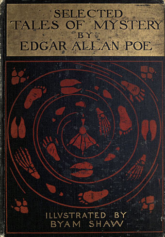
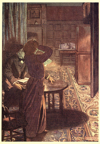
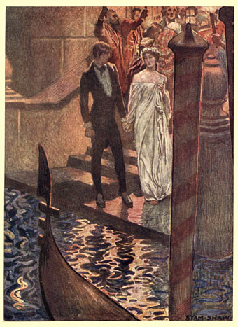
There’s always more Poe. Selected Tales of Mystery was published in 1909, and is one of several illustrated editions produced by British artist Byam Shaw (1872–1919), a painter like Frederick Simpson Coburn who was better suited to the one-off canvas than the illustrated text. There ought to be a term for this kind of illustration—”The Easel School”, perhaps—in which all the techniques and staging of the academic artist are applied to stories or novels, techniques which too often lead to a succession of well-painted figures gesticulating to each other in well-painted rooms. The canvas painter in the first years of the 20th century was also subject to the limitations of print technology which at the time could only reproduce a narrow range of colours.

shaw02.jpg

William Wilson

The question of how best to illustrate a story using realism rather than stylistisation has been a recurrent one recently with regard to a commission of my own. I’ll be discussing this later but something that occurred to me while considering the issue was that illustrators today have access to a visual vocabulary derived from cinema that didn’t really exist until the 1920s. An artist like Byam Shaw would never think to depict a scene from a very high or very low angle, even though high- and low-angle views of dramatic scenes had been familiar to theatre audiences for many centuries. (He does use a high angle for A Descent into the Maelström but so do most artists who illustrate that particular story.) Virgil Finlay’s 1952 illustration for The Tell-Tale Heart is a cinematic view with its combination of flattened perspective and deep focus. In the same issue of Fantastic there’s an illustration by Gaylord Welker that could be a still from any film noir of the 1940s.

shaw03.jpg

The Gold Bug

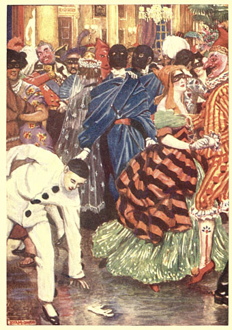
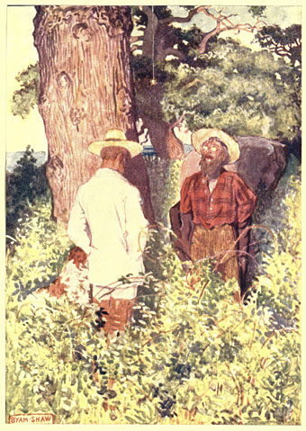
Reservations aside, Shaw’s Poe is worth a look if only to see which moments he chooses to highlight from each of the stories…or those he doesn’t. One of the problems with illustrating a popular writer like Edgar Allan Poe is that you have the choice of attempting to compete with other artists by illustrating the same scene as everybody else or you avoid the obvious moments in favour of something new. Shaw had an advantage in working without the burden of precedent but his climax for The Masque of the Red Death is overwhelmed today by our acquaintance with Harry Clarke’s definitive illustration. The most original thing about the Shaw edition is its cover, with a trail of human and animal footprints spiralling into a maelström towards…what? A webbed foot? This curious design suggests a set of illustrations that the contents don’t deliver.

shaw04.jpg

The Fall of the House of Usher

shaw05.jpg

The Assignation

Continue reading “Byam Shaw’s illustrated Poe”

Dugald Stewart Walker’s Rainbow Gold

dsw01.jpg

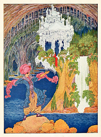
Kubla Khan by Samuel Taylor Coleridge.

The illustrations of Dugald Stewart Walker (1883–1937) have been featured here on several occasions but this is a book of his that I’d missed until now. The Internet Archive has a huge trove of illustrated editions but the illustrators aren’t always credited on the website pages so you either have to rely on chance discovery or search for books by their titles.

dsw22.jpg

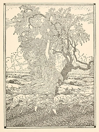
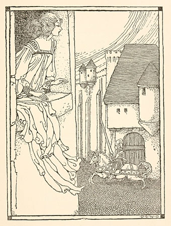
Rainbow Gold: Poems Old and New Selected for Boys and Girls (1922) is a collection compiled by Sara Teasdale that was illustrated throughout by Walker’s full-page drawings and many smaller vignettes. Not all of the poems are given the full-page treatment so some of the omissions are disappointing. I’d liked to have seen what he could do for Yeats’s The Song of Wandering Aengus, for example.

dsw02.jpg

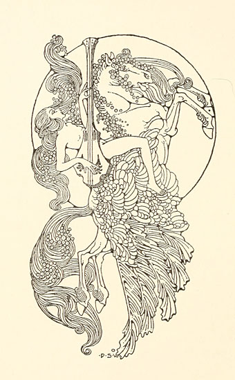
There’s a Virgil Finlay-like quality to a few of these illustrations that I hadn’t noticed in Walker’s art before: the stars in the Israfel drawing, the same kinds of tiny nested circles that Finlay favoured, and dots stippled in white that must have been applied with paint rather than ink. Finlay would have been the right age to have been given (or shown) Walker’s drawings when he was a child which makes me wonder if they exerted a minor influence.

dsw03.jpg

“When the hounds of spring” by Algernon Charles Swinburne.

dsw04.jpg

The Lady of Shalott by Alfred Tennyson.

Continue reading “Dugald Stewart Walker’s Rainbow Gold”