The Blake Video

blake.jpg

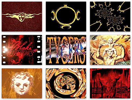
More from the website update. One of the pages buried in the site is an appendix to my design for Angel Passage, a William Blake-themed CD by Alan Moore and Tim Perkins that was released on Steven Severin’s Re: label in 2001. In addition to designing the CD I also created a video accompaniment for the sole performance of the piece at the Purcell Room in London in February of that year. The old web page showed screen shots of the video, and very small ones at that, so as well as updating the page itself I’ve replaced the thumbnails with the original shots.

The video was created in a rush five days before the performance, and only finished the night before I departed for London, so was rather lazily done in places. I’d just taken delivery of a new G4 Power Mac without which I wouldn’t have been able to do any video editing at all. Raw material was artwork scanned from books plus a stack of VHS tapes, including a TV documentary about Blake that provided a few relevant shots of contemporary London. Another essential component was a borrowed video player that could play both VHS and MiniDV cassettes, as well as connect to the computer. The assembled footage was recorded to a MiniDV master cassette which I still have somewhere although I’ve no idea whether it’s still viewable, and have no way to watch it in any case. Those MiniDV players had a tendency to mysteriously render their tapes unplayable which I think may have happened to my tape when I came to try and archive it after the performance. This is fitting in a way, Alan was always adamant that the music-based readings he was doing at this time were one-off events, and the video was only intended to augment the reading, not be watched away from the performance. Copies of the CD still circulate so the work hasn’t vanished altogether. Alan and Tim collaborated on three readings in this series, together with two earlier outings, The Birth Caul and (with David J) The Moon And Serpent Grand Egyptian Theatre Of Marvels. We’re overdue a reissue of the entire Moon and Serpent discography.

Previously on { feuilleton }
William Blake in Manchester

Heaven and Hell calendar

heavenhell00.jpg

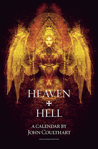
Painting from the poster art for The Highbury Working (2000) by Alan Moore & Tim Perkins.

Unlike last year, this year’s CafePress calendar arrives on time, its creation being eased by the fact that it’s a reworking on an earlier version. The idea with the previous Heaven & Hell calendar had been to alternate various pieces of infernal Cradle of Filth artwork with contrasting imagery; as things turned out I had more offerings for Hell than for Heaven—no surprise there—so the reality wasn’t very satisfying.

This year I’ve managed to fill out the Heaven sequence with more recent works, all of which have been slightly adjusted to fit the square page ratio required by CafePress. So even though these are old pieces many of them are unique to this printing. Larger copies of the pages may be seen here while the CafePress purchase page is here. As always, my thanks to everyone who buys these things.

And as before, the calendars for previous years are now available all year round; see the full range here. Note that this means you need to select January as the starting month if you want the months to run for a single year only.

heavenhell01.jpg

JANUARY: Variation of the poster art for Angel Passage (2001) by Alan Moore & Tim Perkins.

Angel Passage was Alan and Tim’s album about the life and work of William Blake. I designed the CD, a poster, and also produced a video for the multi-media performance of the piece at the Purcell Room, London, in February 2001.

heavenhell02.jpg

FEBRUARY: Cover for Bitter Suites To Succubi by Cradle of Filth (2001).

My first piece of Cradle of Filth art. I was a little surprised when working on this that they really did want the wings and horns; Dani loved that kind of imagery. I was even more surprised when this cover was subsequently showcased in an entire window in Tower Records’ main London shop in Piccadilly.

Continue reading “Heaven and Hell calendar”

In print

magazines1.jpgBattling through the Xmas post, two new volumes arrived here this week, from Black Velvet and Black Dog Publishing respectively. First up was Serpenti & Scale, the Italian edition of Snakes & Ladders by Alan Moore and Eddie Campbell. This has been available for some time in English, of course. The translated version features some of my artwork for the Moon and Serpent CDs by Alan and Tim Perkins in the lengthy interview section that precedes Eddie’s comic strip. Thanks to Smoky Man for that.
Inevitably overshadowing this was 100 Years of Magazine Covers which author Steve Taylor very graciously had sent to me. A heavyweight book in all senses of the word, with a solid cover, thick paper stock and tremendous design by Neville Brody. Taylor navigates the overcrowded field of 20th-century magazine design with great skill, managing to cover all the principal areas of magazine as news medium, fashion journal, literary forum and vehicle of cultural transgression, whether that be the Sixties’ underground, Seventies’ punk or the disparate worlds of gay life and feminism. Illustrations range from the elegance of early Collier’s and Vogue to the garish incoherence of today’s celebrity rags such as Heat. Given such a broad field of study there are bound to be omissions; I would have liked to have seen something from the New Worlds of the late-Sixties, for example, and maybe one of the Non-Format covers for The Wire. But they got Lilliput in there which is pretty impressive considering that magazine now seems to be largely forgotten. Essential stuff.

Previously on { feuilleton }
It’s a pulp, pulp, pulp world
A few thousand science fiction covers
Vintage magazine art II
Neville Brody and Fetish Records
View: The Modern Magazine
Vintage magazine art
Oz magazine, 1967–73

The lost art of sleeve design

stickyfingers.jpg

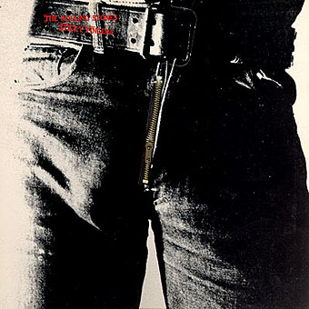
Listening to the Rolling Stones’ Sticky Fingers recently had me musing about the great cover design by Andy Warhol, probably his most well-known after the first Velvet Underground album. The music may sound better than it ever did in the Seventies but CD reissues can’t reproduce the brilliant sleeve which included a real metal zipper on the front of the jeans. The Seventies were the golden age of cover design, popular music had evolved considerably since Sgt. Pepper and the “album as artform” meant that bands were searching continually for new ways to exploit the medium of the record sleeve. Gatefold sleeves became commonplace, then expanded into multiple foldout affairs; expensive gimmicks like the Stones’ zipper arrived pretty swiftly and there were other striking novelties like the first Faust album, a clear vinyl record, in a clear plastic sleeve.

Significantly, Warhol’s Velvet Underground design was also a) gimmicky, with its peel-able banana skin, and b) similarly phallic-oriented, as the banana beneath the skin was a pink one. (Original copies of this album are easy to spot in shops since they’re nearly always missing the skin). Joe Dallesandro is supposed to be filling out the trousers on the Stones’ album, a refreshingly homoerotic moment in the often resolutely sexist world of rock graphics. Nice of the Stones to be so daring but then Jagger at least didn’t mind dancing along the boundaries of sexuality in Performance and it was about this time that they were playing their scurrilous rent boy song, Cocksucker Blues. It’s also quite a macho image, of course, and aggressively sexual, so they get to have their cock cake, and eat it, as it were.

Fancy album sleeves fell out of fashion somewhat when punk came in but there were still things like the first Durutti Column album with its sandpaper sleeve intended to destroy the records it was stored with. I was fortunate to be able to do some vinyl design when I was starting out in the early eighties, even if I wasn’t allowed to design anything quite so elaborate. Some of the designs for the Alan Moore and Tim Perkins CDs take advantage of different booklet arrangements but it’s not the same as having all that space to play with. Now that music is thoroughly digital the visual component is reduced even further. A 300 x 300 pixel image in iTunes is a poor substitute for the tactile (and erotic…) pleasures of the album as artefact.

Elsewhere on { feuilleton }
The album covers archive