Psychedelic vehicles

further.jpg

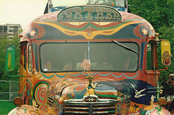
Further: the second version of Ken Kesey’s Merry Prankster bus.

The word psychedelic, like surreal before it, slipped from its original meaning through appropriation. Humphrey Osmond’s neologism was first coined in drug-related correspondence with Aldous Huxley in 1957 and was specifically intended to describe the “mind-manifesting” quality of the hallucinogenic drug experience. The drug-inspired art and music which came after the experiments of the Fifties quickly assumed a gaudy and chaotic aspect derived from the intense visual abstractions of LSD trips. Huxley in The Doors of Perception (1954) rejected these fractal visions as trivial and distracting—he was more concerned with the deeper spiritual revelations—but a new way of seeing in a new era required a new label. Art and design which is vivid, florid, multi-hued and quite often incoherent is where the term psychedelic is most commonly applied today.

Of the three vehicles here, only Ken Kesey’s bus can be regarded as psychedelic in Osmond’s sense, this being the renovated school bus which travelled the United States in the mid-Sixties dispensing free LSD to those it met along the way. These events were recounted in Tom Wolfe’s The Electric Kool-Aid Acid Test (1968) and the creators of last year’s Milk, Gus Van Sant and Dustin Lance Black, have a film in preparation based on Wolfe’s book. Milk was a film about gay rights campaigner Harvey Milk, and Ang Lee (director of Brokeback Mountain) has a new film of his own due shortly, Taking Woodstock, which concerns Elliot Tiber, the gay organizer of the Woodstock Festival of 1969. Both stories bracket the psychedelic era. Is this coincidence or do I detect something in the air? But I digress….

porsche.jpg

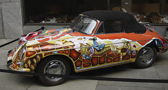
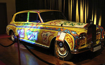
For the chaotic and decorative nature of the psychedelic style, look no further (so to speak) than Janis Joplin’s 1965 Porsche. I saw this in 2005 at Tate Liverpool when it was touring with the Summer of Love exhibition of psychedelic art. One of  Joplin’s very last recordings before her death in 1970 was a birthday song for John Lennon so it’s perhaps fitting that the third vehicle here is Lennon’s lavish Rolls-Royce. His 1965 limousine came originally in black livery but two years later he decided he wanted it painted like a gypsy caravan. There’s a great page about the car here including details of its decoration, created in consultation with Marijke Koger of Dutch design group The Fool.

rolls.jpg

In a small way these three vehicles encapsulate the psychedelic period, from optimistic, proselytising origins following the revelations of hallucinogenic drugs to decline into a mannered, highly-commercialised graphic style. Ken Kesey died in 2001 but his second bus is still active while the cars are now museum pieces. Perhaps the real psychedelic spirit prevails after all.

See also: George Harrison’s Mini Cooper

Previously on { feuilleton }
Dutch psychedelia
The art of LSD

Aleister Crowley on vinyl

ac1.jpgThe appearance of occultist Aleister Crowley on the sleeve of Sgt Pepper is well-documented—here he is looking rather grainy on my CD insert—although I always forget which of the Beatles it was who put him in the list of “people that we like”. I’d guess John Lennon who would have appreciated Crowley’s obscene poetry, copious drug intake and ability to consistently épater la bourgeoisie.
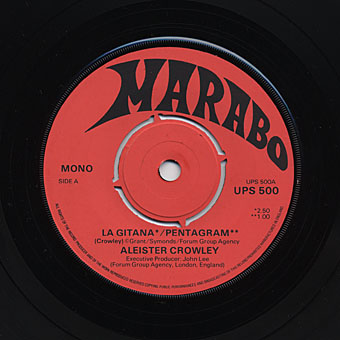
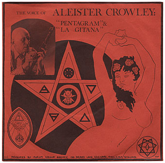
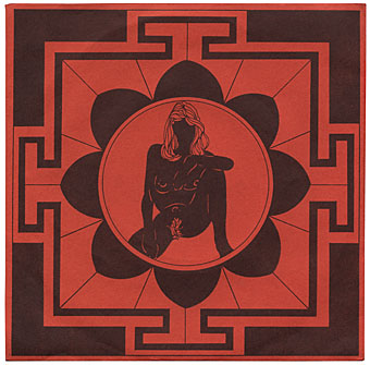
Less well-known is what I presume must be the first outing for Crowley’s voice on this rare undated single from the mid-Seventies. Along with the cassette tapes I discussed earlier, this was another item turned up during a recent clearout of household junk. I’ve yet to see a detailed description of the origin of these Crowley recordings. I have the first CD pressing and haven’t looked at later editions so can’t say whether they contain more information about what are supposed to be wax cylinder recordings copied to acetates. The first complete collection of the recordings was a vinyl release produced by David Tibet in a limited edition in 1986. I was among those that ordered a copy.

ac4.jpg

The Marabo single features two of the same recordings, of course, albeit in slightly poorer quality. (And I love the way it has a removable centre, as though it might well end up in a jukebox.) One feature of the continual reissuing of Crowley the recordings is that sound quality has improved over the years. The versions of The Pentagram and La Gitana on YouTube sound better than the ones on my CD. The occult resonance of Crowley’s voice (which always reminds me of Winston Churchill) have inevitably made it a popular sampling source. In the pre-sampling era 23 Skidoo and Psychic TV (both with David Tibet) used loops of the Enochian Calls. Bill Laswell later took to using samples on his ambient releases, while the most recent CD version includes an entire disc of ambience with Crowley’s voice subjected to digital processing.

ac2.jpg

The sleeve art for the single was by Steffi Grant, occultist wife of occultist Kenneth Grant, and it’s possible the pair sing backing vocals on the less-than-compelling B-side, a soft rock number entitled Scarlet Woman by Chakra. The song is credited to “Ponton/Ayers/Grant/Magee” so even if one or other of the Grants didn’t sing they helped with the lyrics. It should be noted that Mrs Grant’s artwork is often better than these illustrations and does much to enliven her husband’s volumes of occult philosophy. Some of their work was also featured in the seven-volume encyclopedia, Man, Myth and Magic, which featured Kenneth among the staff of consultants.

ac3.jpg

Before anyone asks: no, the single isn’t for sale. I’ve sold a lot of old vinyl over the past few years but I’m keeping this particular item. I know a couple of unreleased recordings by Chakra exist; if anyone has further information about the group, please leave a comment.

Update: Jok posted a link which resolves the mystery. It was indeed Kenneth Grant on backing vocals.

Previously on { feuilleton }
Old music and old technology
The Man We Want to Hang by Kenneth Anger
The art of Cameron, 1922–1995
Austin Osman Spare

Aubrey Beardsley’s musical afterlife

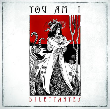
dilettantes.jpg

Dilettantes by You Am I (2008). Illustration and design by Ken Taylor.

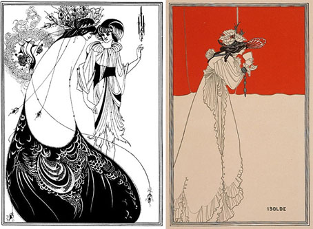
Dilettantes is the eighth studio album from Australian band You Am I which is released this week sporting a very creditable Beardsley pastiche by illustrator Ken Taylor. Sleevage has more details about the creation of the CD package, including preliminary sketches. Those familiar with Beardsley’s work may see in the cover drawing references to The Peacock Skirt and the colour print of Isolde. I like the way Beardsley’s peacock has been exchanged for a more suitably antipodean lyrebird. This isn’t Beardsley’s only influence in the musical world, of course. A few more examples follow.

beardsley1.jpg

left: The Peacock Skirt from Salomé (1894); right: Isolde (1895).

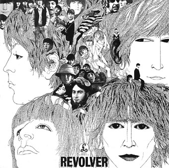
revolver.jpg

Revolver cover by Klaus Voorman (1966).

The over-familiarity of Klaus Voorman‘s collage/drawing for the cover of Revolver by The Beatles tends to obscure its Beardsley influence but that influence is certainly present in the stylised faces, the figure details and the rendering of the hair. The Beatles themselves were enthused enough with Aubrey to put his face among the pantheon of “people that we like” on the sleeve of Sgt. Pepper a year later. I’d thought for a while that Voorman might have been inspired by the landmark Beardsley exhibition which ran at the V&A in London from May–September 1966. Some correspondence with Raymond Newman, author of Abracadabra, a book about the album, disabused me of that when Raymond confirmed that Voorman in 1966 had already been a Beardsley enthusiast for a number of years.

As well as being possibly the first Beardsleyesque album cover, I wonder whether this was also the first major album release to drop the name of the artist from the front of the sleeve.

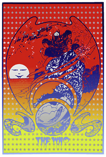
see_for_miles.jpg

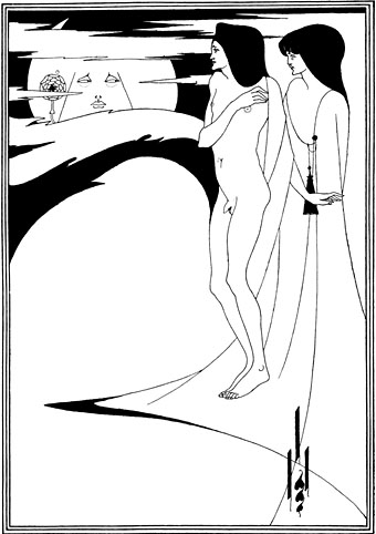
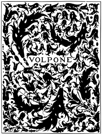
Everyone went psychedelic in 1967, even tough mods like The Who. This Hapshash and the Coloured Coat promo poster for I Can See For Miles (incidentally my favourite Who song) is one of Hapshash’s more overt Beardsley borrowings. The sun (or moon) in the background is a variation on Beardsley’s The Woman in the Moon from Salomé (the face is Oscar Wilde’s) while Pete Townshend’s florid sorcerer’s cloak owes much to Aubrey’s incredible cover design (blocked in gold on the book) for Volpone.

beardsley2.jpg

The Woman in the Moon (1894).

volpone.jpg

Volpone (1897).

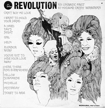
revolution.jpg

From the sublime to the ridiculous. Cathy Berberian was the mezzo-soprano wife of avant garde composer Luciano Berio, with a long career as a singer of serious classical and contemporary classical works. Her rendition of Berio’s Thema (Omaggio a Joyce)–an electroacoustic setting of the “Sirens” prelude from Ulysses–was one of the tracks on the 1967 electroacoustic compilation Electronic Music III discussed here in April. She also had a separate career as an operatic interpreter of pop music and this collection of Beatles songs dates either from 1968 or 69, depending on which source you choose to believe. Whatever the year, the designer pulled off a decent enough copy of the Revolver sleeve. For a taste of the Berberian style, there’s a sample here. And if you’re desperate for the entire album, this page has a copy.

I’m sure this doesn’t exhaust the Beardsley influence in sleeve design, there must be others between 1968 and 2008. Once again, if you know of any further examples, please leave a comment.

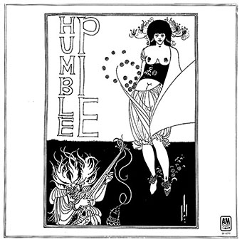
humble_pie.jpg

Humble Pie by Humble Pie (1970).

Update: Added Humble Pie’s self-titled third album. The illustration this time is Beardsley’s own, The Stomach Dance from Salomé.

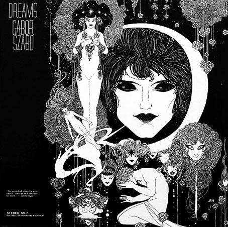
szabo.jpg

Dreams by Gabor Szabo (1968). Design by David Stahlberg.

Update 2: Therese discovered this great sleeve for an album by the Hungarian jazz guitarist. Closer in style to John Austen’s illustrations for Hamlet 1922) but Austen’s use of black-and-white at the time was very influenced by Beardsley’s work.

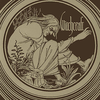
witchcraft.jpg

Witchcraft by Witchcraft (2004).

Update 3: Another addition, the debut album from Swedish metal band Witchcraft which uses Beardsley’s Merlin vignette from the Morte Darthur. Thanks to Cyphane for the tip.

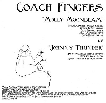
coach_fingers.jpg

Molly Moonbeam by Coach Fingers (2007).

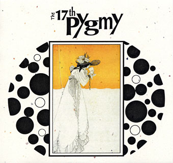
17th_pygmy.jpg

Ballade Of Tristram’s Last Harping by The 17th Pygmy (aka 17 Pygmies) (2007).

Update 4: Added a couple of new discoveries. The 17th Pygmy album apparently includes further Beardsley pieces in its booklet while the Coach Fingers single also has a label featuring designs by Beardsley’s contemporary, Sidney Sime.

isoud.jpg

La Beale Isoud at Joyous Gard. (1894).

flowers.jpg

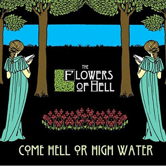
Come Hell Or High Water by The Flowers of Hell (2009).

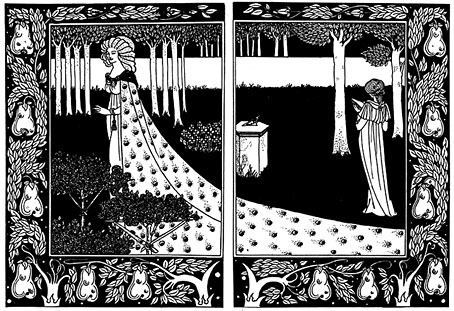
Update 5: Added the Flowers of Hell cover which is based on La Beale Isoud at Joyous Gard. from Le Morte Darthur. The band also has a video which works variations on the same picture.

procol.jpg

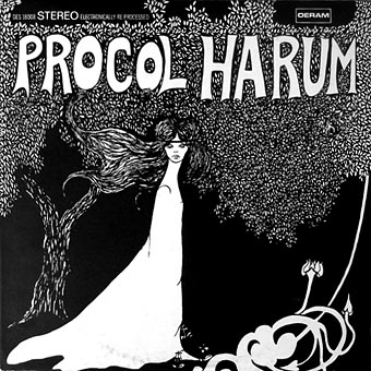
Procol Harum by Procol Harum (1967).

Update 6: Another one I’d missed, Procol Harum’s debut album doesn’t have a credit for the cover art which is perhaps just as well since it doesn’t stand comparison with some of the works above. The same artwork appeared on later reissues when the album was re-titled A Whiter Shade of Pale.

Elsewhere on { feuilleton }
The album covers archive
The Aubrey Beardsley archive
The illustrators archive

The Look presents Nigel Waymouth

granny1.jpg

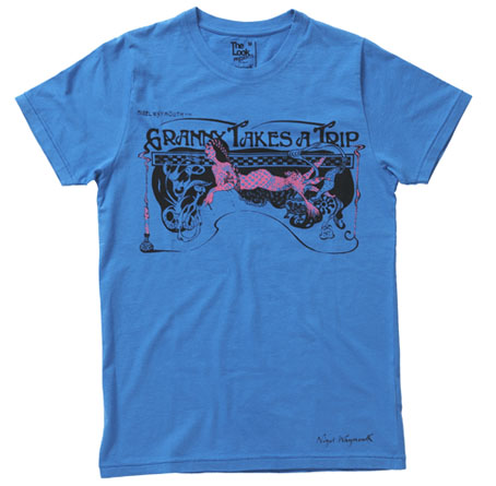
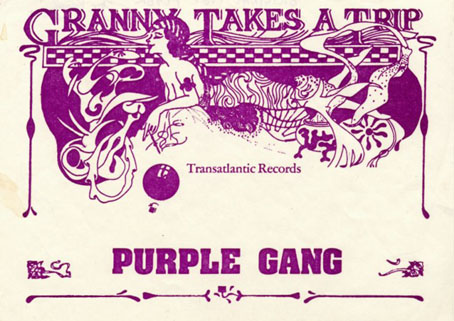
This delightful piece of Art Nouveau-inflected grooviness is one of the new T-shirts designed by Nigel Waymouth for The Look via Topman. Waymouth, as some readers here may know, was part of Hapshash & the Coloured Coat in the late Sixties, London’s leading group of psychedelic poster artists. In addition to design, Waymouth and Sheila Cohen opened the legendary Kings Road boutique Granny Takes A Trip (named after its stock of antique clothes) in 1966. That shop’s fame inspired a one-off single by Stockport group The Purple Gang in 1967 which the BBC banned for alleged drug references, although the trip in question concerns an elderly woman journeying each year to Hollywood. Waymouth’s flyer for the single, of which the shirt design is a variant, can be seen below.

The Look Presents Nigel Waymouth – in-store and online at Topman from Friday August 8

“Sepia tints and flouro tones…darkly psychedelic graphics for the 21st Century…”

Nigel Waymouth is a legend of British rock fashion and design.

Not only did he found the wild 60s Kings Road boutique Granny Takes A Trip (whose ever-changing shop design attracted the likes fo the Rolling Stones, The Beatles, Anita Pallenberg, Brigitte Bardot and Marianne Faithfull), but his graphic design company Hapshash produced eye-popping designs, posters and record sleeves for the The Who and Jimi Hendrix.

Original Hapshash artwork is highly prized in collector circles and Granny’s clothes are seriously sought-after on the vintage market. Now Nigel Waymouth makes his re-entry into fashion via The Look Presents – http://thelookpresents.com – with a contemporary t-shirt range reflecting the original Granny’s aesthetic by delving into decadent psychedelia replete with sepia tints and flouro tones.

The first five t-shirts are available in-store and online at Topman from August 8, with the launch party on August 14 at the George and Dragon in Shoreditch.

The Look Presents Nigel Waymouth is the second collection from the creative hub formed by author Paul Gorman and Soho boutique owner Max Karie. Our first, a collaboration with rock & roll brand Wonder Workshop, proved a great success earlier this summer and this autumn we launch The Look Presents Priceless, a menswear capsule collection with couturier to rock royalty Antony Price.

The shirts are priced £20 each. I rarely wear T-shirts on their own but I’ll probably have to get one of these, for the associations if nothing else.

granny2.jpg

Previously on { feuilleton }
The New Love Poetry
Dutch psychedelia
Family Dog postcards
The 14-Hour Technicolor Dream revisited

Dutch psychedelia

psych.jpg

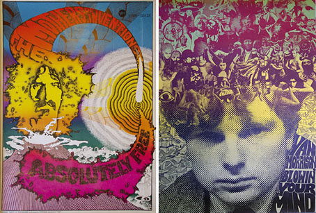
left: Absolutely Free by Theo van den Boogaard (1967).
right: Blowin’ Your Mind by Willem de Ridder (1967).

A couple of samples from similar work scattered around a Dutch auction site, along with more familiar designs from the San Francisco and London artists. All the Dutch examples are new to me; the dominance of the American and British designers of the period tends to marginalise the work of artists from Continental Europe even though Dutch design group The Fool was very prominent for a while due to The Beatles’ patronage.

Previously on { feuilleton }
Family Dog postcards