Mr Sandman

sandman1.jpg

The last cover reveal of the year isn’t my last cover of the year, two more will follow this one but they won’t be made public until next year. As before, I’ve only done the illustration this time, PS Publishing having an in-house designer who does the rest. Mr Sandman by SJI Holliday is another hardback novella, a horror tale with a sense of humour and a Monkey’s Paw-like warning about careless wishes:

Sophie is bored with her perfectly nice but deathly dull boyfriend Matthew. Sensing he’s about to lose her, Matthew takes her on a last-ditch attempt trip to the seaside, hoping to rekindle their dying flames. But things take a dark turn when Sophie visits Mr Sandman, a Haitian priest, who claims that he can change Matthew into the boyfriend that she wants. But does Sophie really know what she wants? Never has the phrase “be careful what you wish for” been more apt. Because Matthew does change…just not in the way that anyone could’ve predicted.

sandman2.jpg

Worthing is a seaside town on the south coast of England that’s generally regarded as a poor relation of nearby Brighton. Despite this status the town does possess an award-winning pier which is the main focus of SJI Holliday’s story, so this seemed an inevitable focus for the cover as well. My idea was for something in the manner of Tom Adams, an artist who specialised in arrangements of carefully-painted objects on vague or sketchy backgrounds, with the backgrounds often depicting the location of the story. Having grown up in another seaside town blessed with three piers I’m well aware that all these structures aren’t the same so the pier details have been properly researched. The Tarot cards are an example of artistic licence, however, since the novella doesn’t mention Tarot divination. But with a narrative that concerns a visit to a fortune-teller’s booth this didn’t seem like too much of a stretch, as well as being a convenient way of depicting the main characters. Pamela Colman Smith’s cards were the model for these; the two main characters look a little stiff but that’s the way the figures are represented on her Lovers card, and the awkwardness of the relationship is a dominant theme. As for the cupcakes, these are all very relevant to the story but you’ll have to read the book to find out why.

sandman3.jpg

Endpaper illustration.

sandman4.jpg

Previously on { feuilleton }
Tom Adams Uncovered
Out of season

Écorché

ecorche01.jpg

Engraving by Philip Galle.

Écorché, from the French verb to flay, was the traditional term applied to depictions of the skinless man found in anatomical studies, and the musculature models made for the use of artists and sculptors. This is almost always a male figure. Women tend to feature in the anatomical works of previous centuries in order to illustrate the conditions of pregnancy, the male body being considered the default for the usual sexist reasons.

I’ve been revisiting the history of these figures while working on a new book design so what follows are a few choice examples, some of which carry a pleasantly Surrealist charge. In the years that followed the pioneering studies by Vesalius and co. there was a period of playfulness in anatomical illustration during which time the figures are shown peeling away their flesh to reveal the muscles or even the organs beneath, a striptease where the substance of the body itself is removed. As William Burroughs was fond of quoting: “‘T ain’t no sin to take off your skin, and dance around in your bones.”

ecorche07.jpg

Valverde de Hamusco (1556).

ecorche06.jpg

Engraving by G. Bonasone (15–).

ecorche02.jpg

Engraving by Philip Galle.

Continue reading “Écorché”

Rooms with a paranormal view

room1.jpg

The Room: the cosmic tabletop.

A few words of praise for the Room series from Fireproof Games. I don’t play many computer games, and I think this may be my first post dedicated to such a thing, but I maintain an interest in the medium. The Room and its sequels only came to my attention a couple of weeks ago when I was wondering if there was anything Myst-like available for the tablet. I never got to play the original Myst but enjoyed its follow up, Riven, although the enjoyment was mostly for the graphics, the music and the island environments. The game itself was less satisfying, requiring pen and paper to keep track of its complexities, and involving a great deal of fruitless journeying from one location to another in the search for new clues.

room2.jpg

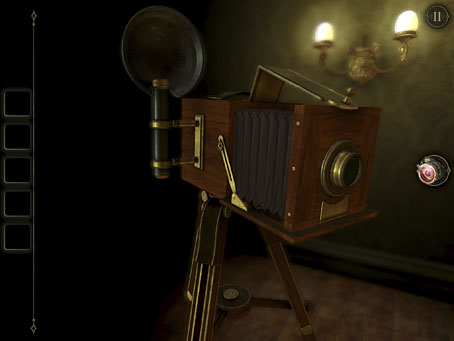
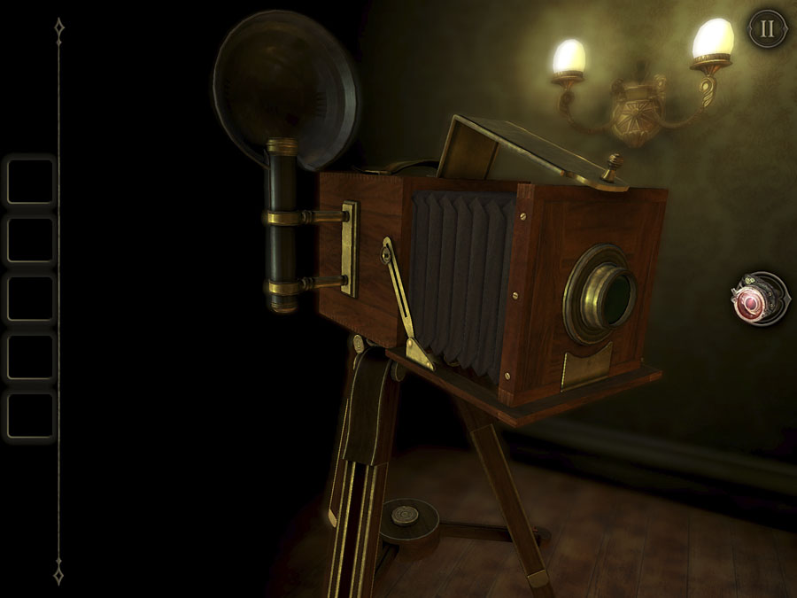
The Room 2: the camera.

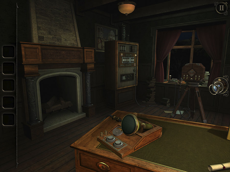
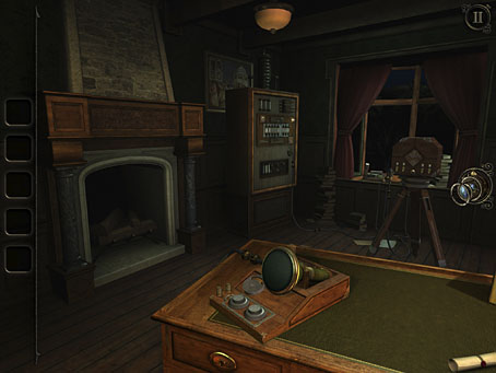
The Room follows the template established by Myst in presenting you with a number of mechanical artefacts, all of which have to be examined and opened or operated before you can proceed to the next stage. The dominant aesthetic is 19th-century-mechanical—there’s a lot of wood and brass to these devices—but to call it steampunk would be a mistake; there’s little steam involved, and most of the cogs are kept inside their cases. There is a hint of Jules Verne, however, in the notes from an absent inventor whose initials, “A.S.”, may be a nod to Journey to the Centre of the Earth. As the title suggests, the location is a single room, while in the sequels, The Room 2 and The Room 3, you’re presented with a series of connected spaces. The third installment is the closest to the original Myst with a central hub that leads to other areas of a rambling complex of buildings, not all of which are revealed at the outset. The main structure is based on William Beckford’s Fonthill Abbey which pushes things into Gothic territory even without the developments outlined below.

room3.jpg

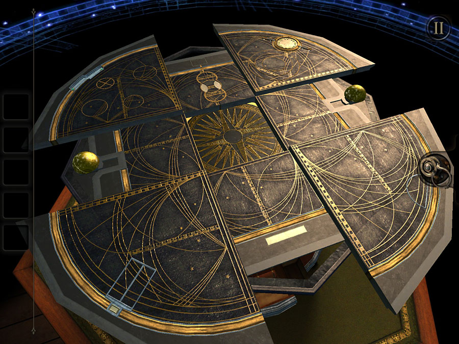
The Room 3: the oscilloscope is one of several which need to be powered up and manipulated in order to open the Null portals.

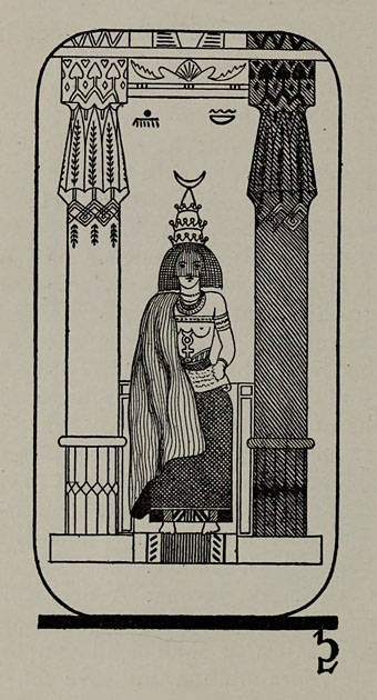
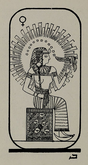
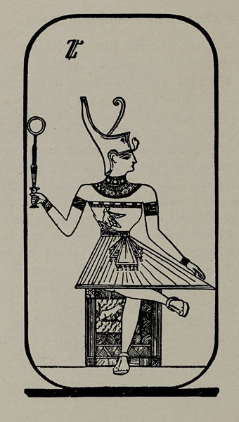
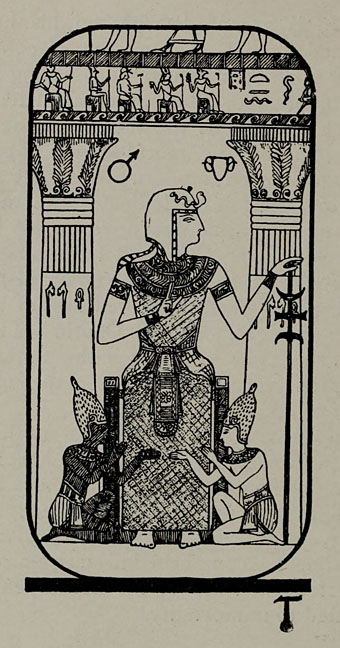
The MacGuffin for all the games is a new element, the Null, whose discovery and potential obsesses the creators of the games’ devices, and whose manipulation of space creates many of the portals that lead to new rooms. As the series progresses, the Null becomes a growing menace that leads to full-on cosmic horror, with oil-slick Tentacles From Beyond writhing around the interdimensional portals you have to travel through. This development was surprising and, for this player, very welcome, turning the games from a series of eleborate puzzles into something much more sinister. The aesthetic evolves accordingly, with an increasing profusion of occult sigils and pentacles, and, in The Room 2, Tarot cards and séance devices. (Fireproof have a set of their Tarot designs available as a free download.) In the second game there’s a further requirement to piece together mundane machines—a camera or a typewriter, say—before they will function properly. This process reaches a peak in The Room 3 where you’re faced with a succession of increasingly complex tasks, from woodworking and metal forging to electro-mechanical engineering and astronomy. As with the Myst universe, there are no monsters here (although there is the occasional ghost), nothing needs to be fought with weapons, it’s just you, a room full of objects and a continual background murmur of unnerving whispers and distant sounds. The gameplay in The Room 3 is sufficiently non-linear to lead to a variety of different endings, not all of which may be survivable. I managed to escape the Tentacles From Beyond when they finally destroyed the house but I also missed finding an important artefact. I’ll be returning, wiser and, I hope, more attentive to the half-hidden details.

room4.jpg

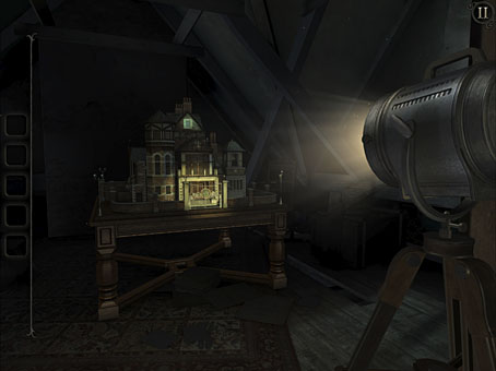
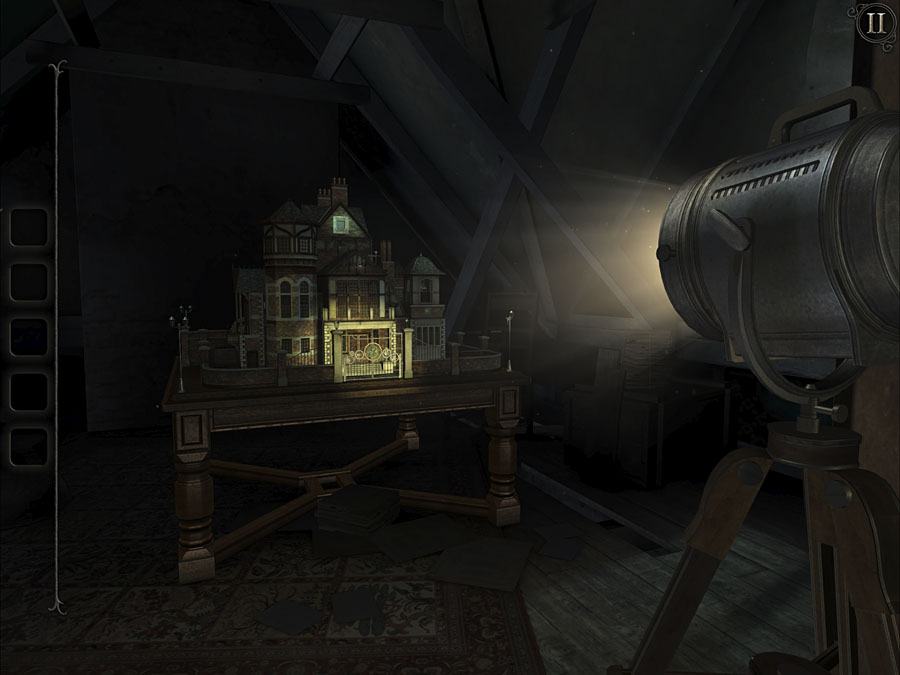
The Room—Old Sins: the haunted doll’s house as seen at the beginning of the game.

I’m currently playing the fourth game in the series, Old Sins, which returns you to a single room but plays with scale via a large doll’s house. The exterior of the building is all detailed model work, while the interiors—accessed through Null physics—are scaled-down replicas of the rooms in a house where another Null investigator and his wife have gone missing. It’s not clear yet whether the attic where the toy house is stored is also the attic of the real house the model is based upon but having dealt with a similar model in The Room 3 this seems likely.

While I enjoyed the surface details of Riven I was never very interested in the fantasy background of the Myst universe. The Room series is much closer to my own core preoccupations, a beguiling blend of antique technology with borderline occultism and those Tentacles From Beyond, a scenario that wouldn’t be out of place in an issue of Weird Tales. Just the thing for the darkening days of October.

Jodorowsky times three, or The box that never was

jodorowsky1.jpg

The first three feature films by Alejandro Jodorowsky—Fando y Lis, El Topo and The Holy Mountain—are released this week on Region B blu-ray by Arrow Video, but the box they’re packaged in won’t look like any of the designs shown here. It was almost three years ago that Arrow asked me to create something for this box set, but backstage wrangles meant the project moved out of my hands in the early stages. This was a great disappointment since Jodorowsky’s interests and aesthetics align with my own much more than many other directors whose work has been released by Arrow. And having written the notes for the Arrow release of Henri-Georges Clouzot’s The Mystery of Picasso, I was looking forward to working with the company again.

In preparation for the work I rewatched almost all of Jodorowsky’s films (I still haven’t seen Tusk or The Rainbow Thief), then drew up a detailed proposal with sketches, something I seldom do for commissions. Arrow releases all have double-sided inserts in the boxes that hold the discs, one side of which shows a poster design from the film’s original release, the other a new design. My idea for the new art was to connect the three films using Tarot-like iconography (the director is a Tarot scholar, among other things), with each film also being assigned a symbol of some kind. The Surrealist fable of Fando y Lis lacks any suitable graphics so for this I chose a yin and yang symbol to represent the film’s opposed-yet-connected brother and sister characters; El Topo was to be represented by a cross-section through a revolver chamber, while the seven characters from The Holy Mountain are represented by the enneagram that Jodorowsky himself wears in the film. All three symbols are connected by the eye-in-a-triangle from El Topo, a symbol that worked while a three-film box was being planned but which wouldn’t have worked for the final release which adds Jodorowsky’s most recent film, Psychomagic, A Healing Art. For the box design I suggested metallic inks (or foils) either as highlights or in other combinations. The font was a further suggestion, Roberta being one of the typefaces of the occult revival of the 1970s. The art for each film didn’t go further than the sketch stage although I was asked to work up the El Topo design into a final piece; I wasn’t very satisfied with the end result so it isn’t posted here. One problem with the extended negotiations was they were taking place at a time when I was extremely busy with other projects, including contracted illustration work for Editorial Alma. There was no contract for the Arrow commission so it had to take second place even though it was the work I most wanted to be concentrating on at the time. Collisions such as these are an occupational hazard when you’re working freelance.

jodorowsky2.jpg

As things turned out the stumbling block wasn’t my art and design suggestions (which Arrow liked) but the parties described in communications as “the rights-holders”. These individuals apparently disliked the Arrow Video aesthetic and wanted something more directly connected with the films, preferably photographic material which is what you now see on the discs and the box art. It should be emphasised that the rights-holders are not the director, whose wishes for the presentation of his work were never part of the discussion. Given the previous activities of the rights-holders we should probably be grateful that the first three films have been reissued at all. For details of Jodorowsky’s difficulties with one rights-holder in particular, see this interview by Jay Babcock.

On the upside (there is one!), the box set is a typically high-quality Arrow release, with new transfers of the films approved by the director. The bonuses include Jodorowsky’s short films (including his explanation of Tarot symbolism), Louis Mouchet’s feature-length documentary, La Constellation Jodorowsky (1994), soundtrack CDs of El Topo and The Holy Mountain, a small poster and set of postcards, and a substantial booklet. In the end the most important thing is that the films are available for home viewing once again, not their exterior decoration.

Previously on { feuilleton }
Fabulas Panicas by Jodorowsky
• Alejandro Jodorowsky’s Dune
• Jodorowsky on DVD

The Egyptian Tarot

tarot01.jpg

I: The Magus

While looking at Tarot designs for work purposes (again) I remembered a book I used to own that demonstrated the symbolism of the Major Arcana by using side-by-side comparisons of cards from the more well-known decks: the Tarot de Marseille, Aleister Crowley’s Thoth deck, the Rider-Waite-Smith cards, and so on. One of the decks shown wasn’t so familiar, a 19th-century design that purported to depict the Ancient Egyptian figures from which the modern Tarot is derived. Like much occult history, this is an invention but I liked the look of the cards with their simple line drawings and clever matching of Egyptian motifs with the traditional symbols. My book was borrowed years ago and never returned (the second Tarot book I’ve had this happen to; don’t lend people your Tarot books!), so I couldn’t look for a reference, but this account of the history of the so-called Egyptian Tarot supplies all the relevant details and more.

tarot02.jpg

II: The Gate of the Sanctuary

The examples shown here are from Practical Astrology (1901), a book by Edgar de Valcourt-Vermont writing under the preposterous pseudonym “Comte C. de Saint Germain” (a real person, albeit dead by 1901, with a long history of appropriation by writers and charlatans). The drawings are reworkings of the first appearance of the Egyptian designs in an earlier book, Les XXII Lames Hermètiques du Tarot Divinatoire (1896) by R. Falconnier, the drawings there being the work of one M.O. Wegener. In addition to copying the designs Valcourt-Vermont filled out the set with a Minor Arcana of his own devising that looks distinctly amateurish next to the Wegener set. Since then the cards have continued to evolve, a more recent version being the Ibis Tarot which colours the drawings in a manner that doesn’t really suit this type of art. The cards shown in my errant book were memorable in part because they stood out from their vividly-coloured counterparts.

tarot03.jpg

III: Isis-Urania

It’s good to see these again, and also surprising to discover a further detail, that the Wegener drawings had been based on descriptions by Paul Christian in another occult study, Histoire de la Magie (1870). Christian’s book was the subject of a previous post for also being the source of an illustration of a witches’ sabbat that turns up all over the place, usually without credit. Not for the first time, the occult world is smaller than it seems.

tarot04.jpg

IV: The Cubic Stone

Wikipedia has copies of the drawings from the Falconnier book which may also be seen at Gallica, although the copy I found there was incomplete. The Valcourt-Vermont designs were published as a complete deck, The Egyptian Tarot, by Müller in 1978.

tarot05.jpg

V: Master of the Arcanes

Continue reading “The Egyptian Tarot”