First Papers of Surrealism, 1942

surrealisme.jpg

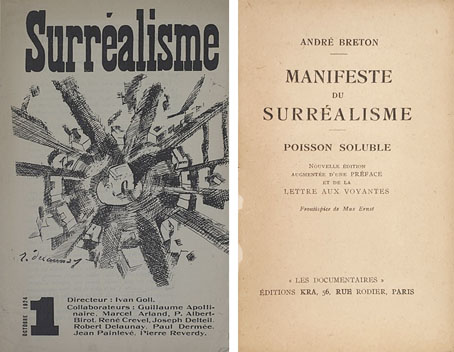
As I was saying a couple of weeks ago, Surrealism will be 100 years old this year, if you mark the movement’s birth from the first manifestoes (there were two different ones) published in October 1924. Surrealism doesn’t really have a definite beginning, however, either in 1924 or earlier on; the movement evolved over several years, with different factions competing for followers while squabbling over intentions. After a great deal of ferment the manifestoes from the opposed groups led by Yvan Goll and André Breton were a declaration that something substantial had been happening that required definition. I’m not sure why all of this interests me as much as it does just now, but I’m looking forward to seeing where the interest leads. Don’t be surprised to see more posts on the subject in the coming months.

firstpapers1.jpg

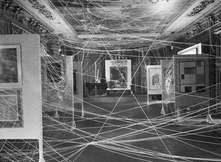
So, then… Fast-forward to 1942 and First Papers of Surrealism, an exhibition of paintings staged in New York City by the Coordination Council of French Relief Societies in October of that year. The exhibition was curated by André Breton with the assistance of Marcel Duchamp, Breton having recently arrived in the United States after escaping from Nazi-occupied France together with a small group of Surrealist artists, some of whom were represented in the show. Duchamp’s main contribution was His Twine, an installation of a large quantity of string threaded around the exhibition space through which the visitors had to peer in order to see the paintings. Duchamp also invited a group of children to play ball games inside the gallery on the opening night. This wasn’t the first Surrealist exhibition to be held in New York—Julien Levy had introduced the city to the latest art movement at his own gallery in 1933, and had been showing Surrealist paintings and Joseph Cornell’s artworks in the years that followed—but First Papers on Surrealism was an important event, with many major artists represented.

firstpapers2.jpg

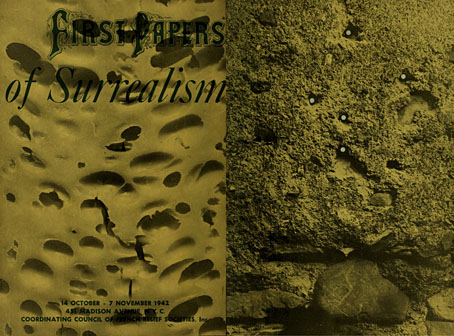
What you see here are pages from the exhibition catalogue, a publication which is more like one of the smaller Surrealist magazines than a mere list of the pictures on display. Marcel Duchamp designed the die-cut cover (those holes make me wonder whether these were also originally threaded with string), while the catalogue interior contains an intriguing collection of quotes, captions, photographs and illustrations. Breton’s “Great Transparent Ones” raise their invisible heads again, while the artists and curators are all depicted in a series of “compensation portraits” which stand in for an absence of suitable photos.

Continue reading “First Papers of Surrealism, 1942”

Weekend links 649

chihuly.jpg

Niijima Floats: Mottled Blue Black Float with Silver Leaf (1991) by Dale Chihuly.

• “Blue whale songs fall below the range of human hearing. If you want to listen to one, to actually hear its ethereal patterns of wobbly pulses and haunting moans, you have to speed it up by at least two-fold. But according to Hildebrand and McDonald’s instruments, the tonal frequencies of the songs had been sinking to even greater depths for three straight years. ‘This is weird,’ Hildebrand thought. To figure out if it was just an anomaly or something more, Hildebrand and McDonald embarked on a quest to find some really old songs. Eventually they got their hands on some of the earliest known recordings, created by the Navy in the 1960s and stored on analog cassettes. They were floored. The frequencies had declined by 30 percent over 40 years.” Kristen French on a mysterious development in blue whale songs.

• “She didn’t see it as a game, or for divination, but as a model of the universe.” Joanna Moorhead on the Tarot designs of Leonora Carrington.

• “A collection of blogs about every topic”: ooh.directory. (Ta to whoever added this place to the list.)

• New music: Pop Ambient 2023 by Various Artists, and Aeolian Mixtape by Quinta.

• At Public Domain Review: The Tanzmasken of Lavinia Schulz and Walter Holdt.

• At Wormwoodiana: Mark Valentine on mazes and labyrinths. (Previously)

• At Spoon & Tamago: Paper-cut cityscapes by kirie artist Hiroki Saito.

• At Smithsonian Magazine: The Unrivaled Legacy of Dale Chihuly.

• Mix of the week: Neo-Medieval Mix by Moon Wiring Club.

• Old music: Back To The Woodlands by Ernest Hood.

• At Dennis Cooper’s: Jacques Rivette Day.

Weyes Blood’s favourite music.

(Gorgeous Curves Lovely Fragments Labyrinthed On Occasions Entwined Charms, A Few Stories At Any Longer Sworn To Gathered From A Guileless Angel And The Hilt Edges Of Old Hearts, If They Do In The Guilt Of Deep Despondency.) (2004) by Akira Rabelais | The Private Labyrinth (2008) by The Wounded Kings | Labyrinths (2018) by Jonathan Fitoussi & Clemens Hourrière

Weekend links 639

alphaville.jpg

Japanese poster for Alphaville (1965).

Peter Bogdanovich: I think we’d better have your thoughts on Godard.

Orson Welles: Well, since you’re so very firm about it. He’s the definitive influence if not really the first film artist of this last decade, and his gifts as a director are enormous. I just can’t take him very seriously as a thinker—and that’s where we seem to differ, because he does. His message is what he cares about these days, and, like most movie messages, it could be written on the head of a pin. But what’s so admirable about him is his marvellous contempt for the machinery of movies and even movies themselves—a kind of anarchistic, nihilistic contempt for the medium—which, when he’s at his best and most vigorous, is very exciting.

• RIP JLG. I was watching Alphaville again just two weeks ago after a DVD turned up in the local charity shop. Still the only Godard film I like 100% but “liking” seems beside the point. His influence today is everywhere, so fully absorbed into the language of cinema that people barely notice it.

• “The things that cause my gaze to linger are usually the portraits or landscapes that spark a feeling of unease, disquiet and discomfort. A shadow amongst the summer trees, a lurking silhouette reflected in a perfect blue iris, a vibrant flower in the early stages of decay.” S. Elizabeth talking to Beautiful Bizarre about her new book, The Art of Darkness: A Treasury of the Morbid, Melancholic and Macabre.

• Allow John Waters (again) to dictate your film viewing with a Letterboxd list of his favourite films, based on comments in his writings and interviews. On the subject of Godard, Waters’ Crackpot book contains a whole chapter about Hail Mary.

• Astor’s Electrical Future: Iwan Rhys Morus explores a vision of the year 2000 recounted in A Journey in Other Worlds (1894), a “scientific romance” by John Jacob Astor IV, with illustrations by Daniel Carter Beard.

• Strange Attractor has announced a Kickstarter campaign to fund the publication of an Austin Osman Spare Tarot deck.

• At Wormwoodiana: The Parrot, the Unicorn and the Golden Dragon: Some 17th Century Booksellers’ Signs.

• At Bandcamp: Andy Thomas on Chris Watson‘s post-Cabaret Voltaire career in nature recordings.

• A new outlet for cinematic obscurities: Radiance Films.

Alphaville (1978) by Klaus Schulze | Alphaville (1979) by The Monochrome Set | Alphaville (1999) by Scanner

Led Zeppelin IV: Jimmy Page versus Little Bo-Peep

lz4.jpg

Background graphics by Aubrey Beardsley, 1893.

You’d think by now that everything would be known about an album with a Godzilla-sized cultural footprint like Led Zeppelin IV. I certainly thought so until last week when I turned up the source of something that the more obsessive Zepp-heads have been pondering for years. If this puts a bustle in your hedgerow then read on.

symbols.jpg

Led Zeppelin’s fourth album has been around now for half a century which means there really is a lot known about every detail of its production. Mysteries that used to confound friends of mine when we were teenagers have long been solved, questions such as what the hell the four symbols assigned to each member of the group actually signified; not only do we know the origin and meaning of those symbols, the enigmatic “Zoso” sigil chosen by Jimmy Page has an entire website dedicated to its various manifestations. We know where the photo on the cover was taken (Birmingham), and why the sleeve is devoid of identification (Page was annoyed with the press reaction to the previous album); we know that the hermit painting inside the gatefold is based on the Tarot card by Pamela Colman Smith, and we also know a great deal about the writing and recording of Stairway To Heaven. Erik Davis logged much of this in his 33 1/3 study of the album, and while he examines the band symbols in some detail he doesn’t say much about the rest of the hand-written inner sleeve beyond this comment:

Is there a meaning to the nifty Arts and Crafts typeface that Page lifted for the Stairway To Heaven lyrics on the other side of the sleeve? Or just a vibe?

The source, if not the meaning, of this script has been intriguing Zeppelin fans for many years, but I wasn’t aware of this until I happened to be reading the Wikipedia entry about the album and found myself equally intrigued. The game was afoot, Watson.

soh1.jpg

It makes them wonder: the hand-lettered lyrics.

A persistent question you see in fan circles is “What font was used to create X?” People will ask this question even when the design is a one-off, like Syd Mead’s logo for Tron, or something that’s obviously been lettered by hand. Led Zeppelin IV is an album guaranteed to raise the “What font?” question because the lyrics of the group’s most famous song, Stairway To Heaven, cover an entire side of the inner sleeve. On one of the fan forums I was reading someone was eager to identify “the font” because they wanted to apply the words to a bedroom wall. Many more people must have copied out those lyrics since 1971; I once had to do this myself for a female friend who was so besotted with Jimmy Page that she wanted the lyrics in a frame on her own bedroom wall.

tracks.jpg

According to the Wikipedia entry, Page revealed the source of the lettering to be an issue of The Studio, the British art and design magazine which helped launch Aubrey Beardsley’s career and did much to develop and promote the Art Nouveau style in the 1890s. I’m very familiar with The Studio, many posts here refer to it, and I happen to have a complete collection of issues downloaded from the journal archive at Heidelberg University. Seeing the magazine mentioned in this context immediately made me want to find the design that Page had adopted, but before I started flicking through thousands of pages I looked around to see if any of the Zepp-heads had tried searching for the magazine themselves. Evidently not; all the discussion I’ve seen about the inner sleeve tends to recycle the Wikipedia entry, nobody seems to have bothered looking for copies of the magazine. Okay then…

Continue reading “Led Zeppelin IV: Jimmy Page versus Little Bo-Peep”

Weekend links 607

cadmus.jpg

Jerry (1931) by Paul Cadmus.

• “I wanted to photograph naked young men as opulently and as attentively as those professional ladies appearing in Playboy-type magazines.” RIP James Bidgood, photographer and director of no-budget gay-porn classic Pink Narcissus. Also in the obituary notices this week: Monica Vitti and John Appleton, composer of electronic music and inventor of the Synclavier sampling keyboard.

• “…the Sola Busca deck is limited in its use for divinatory purposes today, and yet, since its enigmatic imagery irresistibly invites decoding, the deck nonetheless beckons twenty-first century cartomancers into a game of high imagination.” Kevin Dann on the mysteries of the world’s oldest complete Tarot deck.

• “This Missouri company still makes cassette tapes, and they are flying off the factory floor.” Jennifer Billock reports.

He attended to his own talent, not in the interest of bombast or self-aggrandisement, but rather like a faithful watchman. He had the fixity of the great and therefore no need of vanity. He estimated that three shillings would be a reasonable price for Ulysses. A tiresome book, he admitted. At the same time he was dogged by fear that the printing house would be burnt down or that some untoward catastrophe would happen. He assisted Miss Beach in wrapping the copies, he autographed the deluxe editions, he wrote to influential people, he hawked packages to the post office. He knew that the illustrati would change their minds many a time before settling down to a final opinion and that many another would know as much about it as the parliamentary side of his arse.

Edna O’Brien on James Joyce

• At Wormwoodiana: Mark Valentine on The Secret Glory by Arthur Machen, another novel now in its centenary year.

• At Aquarium Drunkard: It Is Not My Music, (1978) an hour-long Swedish TV documentary about Don Cherry.

• At Bandcamp: The transportive psychedelia of Moon Glyph records.

• Mix of the week: Fact Mix 844 by A Psychic Yes.

• Steven Heller’s font of the month is Show.

• At Dennis Cooper’s: Guitar.

Mumblin’ Guitar (1960) by Bo Diddley | Electric Guitar (1979) by Talking Heads | Impossible Guitar (1982) by Phil Manzanera