Heliotropic

heliotropic9.jpg

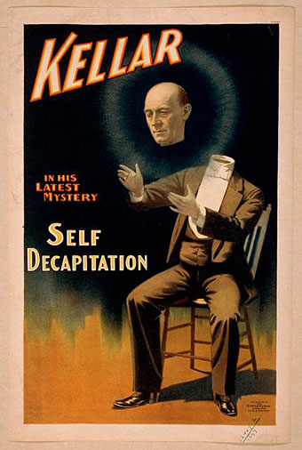
Arriving in the post this week was a catalogue for a Maison & Objet exposition of design and decoration which includes one of my paintings among the listed “Inspirations“. The event was held in Paris at the end of January but I’ve been so busy for the past few of months I forgot to see when it was on. Not that I could have said much about it since this is a showcase event you have to attend rather than experience remotely.

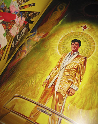
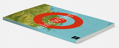
Catalogues for big art and design events often tend to the lavish and expensive but the Elsewhere book is the most lavish I’ve ever encountered. The production runs the gamut of the many expensive options which modern printing can provide: metallic inks, varnish effects, iridescent and translucent sheets, embossing, die-cutting, tipped-in inserts, and variable page sizes. The inflexible icing on the cake comes in the shape of a small square of polished marble glued to one of the pages. Excess aside, the print quality is excellent, and I’m very pleased with the way my Elvis painting appears.
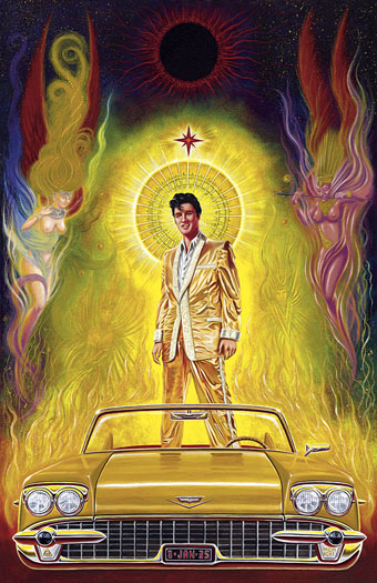
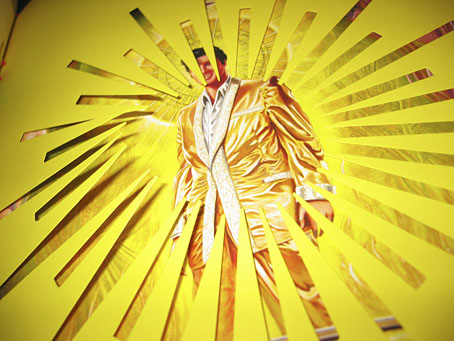
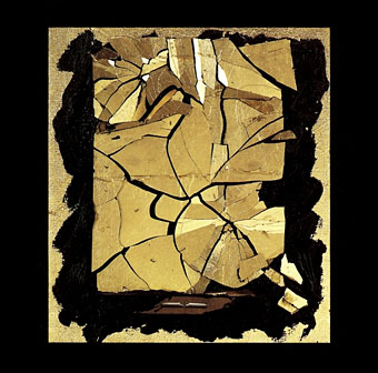
sunking.jpg

Sun King (1996).

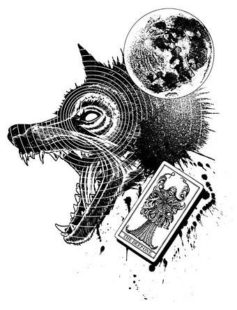
Sun King was commissioned by Creation Books in 1996 as cover art for a Jeremy Reed novel which ended up being dropped by the company. The concept was the author’s, and while I’m pleased with the way it turned out I always felt it should have had more of a Gustave Moreau quality. This is the first time the picture been used anywhere although I did reuse the Elvis-in-a-Cadillac idea recently for one of the Alas Vegas Tarot cards.

heliotropic1.jpg

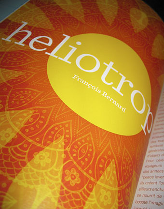
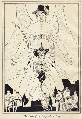
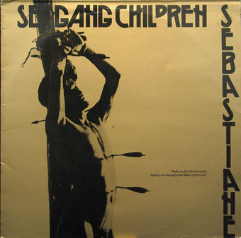
My painting is included in the Heliotropic section of the book which shows some of François Bernard’s inspirations. I’m pleased they placed one of the die-cut overlays before my piece. The photos below show some of the pages from the other sections which concern the inspirations of Elizabeth Leriche—her section includes the chunk of marble—and Vincent Grégoire whose section features futurism, space scenes, metallic effects, and Daft Punk.

heliotropic2.jpg

heliotropic3.jpg

Continue reading “Heliotropic”

Weekend links 201

kettelwell.jpg

An illustration by John Kettelwell for The Story of Aladdin and the Wonderful Lamp (1928).

• “The strain in everything I write, of not being taken with the bounteousness of humankind, was also the attitude of both my parents.” Jonathan Meades talking to James Kidd about his forthcoming memoirs.

• 7 Trumps From the Tarot Cards and Pinions (1969), and album of electronic music by Ruth White, is being given a limited vinyl reissue. Related: Ruth White—An American Composer.

• 82 minutes of Michael Moorcock talking in 1972 to Jean-Pierre Turmel, co-founder of the Sordide Sentimental record label.

If Verne’s protagonists often seem to stop short of revelation, it’s because the revelation is not meant to be known. Revelation has a way of putting man back at the front of the evolution chart, moving neatly toward a happily progressing future, out of the darkness and into the light. The characters who embark upon the Voyages Extraordinares move backward and forward and all about, spun around like blindfolded children trying to pin the tail on the donkey. The point of the adventure, after all, is not to have a conclusion; it is to get knocked off your feet.

Stefany Anne Golberg on Journey to the Center of the Earth at 150.

• Photographs of pre-Haussmann Paris by Charles Marville, and photographs by Amy Heiden of industrial ruins.

• Mixes of the week: FACT Mix 427 by Wild Beasts, and Secret Thirteen Mix 108 by Kangding Ray.

• Hear Italo Calvino read selections from Invisible Cities, Mr Palomar and others.

William S. Burroughs in Dub conducted by Dub Spencer & Trance Hill.

• Cycles, Returns & Rebirth: Alexander Tucker on Derek Jarman.

Harold Budd: the composer with no urge to make music.

The Museum of Imaginary Musical Instruments.

• 80 minutes of Monolake playing live in 1999.

• At 50 Watts: Dyl’s Dance.

Owls And Flowers (2006) by Belbury Poly | Learning Owl Reappears (2011) by The Advisory Circle | The Owls (2013) by Félicia Atkinson

Derek Jarman album covers

sexgang.jpg

Sebastiane (1983) by Sex Gang Children. A 12″ single using a still from Jarman’s film.

A final post for this Jarman week. Derek Jarman sustained his film career with regular music promo commissions (see this earlier post) but he never produced any album covers as such. What you have here are music releases which happen to feature his artwork or stills from his films. One thing I like about these cover art posts is the disparate music lists they create; the process of investigation also turns up surprises such as a Jayne County album for which he supplied the lettering.

coil.jpg

How To Destroy Angels (1992) by Coil. Painting: Fine Balance (1986).

Coil’s album of remixes and digital mangling of one of their earliest recordings. A great collection of rumbling ambience, some of which I used in my Night Music mixes.

county.jpg

Goddess Of Wet Dreams (1993) by Jayne County. Graphics by Derek Jarman, painting by Michael Spencer Jones, design by Warren Heighway.

towering.jpg

Kaddish (1993) by Towering Inferno. Painting: Modern Times.

An odd album. Towering Inferno were Richard Wolfson and Andy Saunders, who on this album are joined by a large cast of musicians including well-known names such as Márta Sebestyén, Jocelyn Pook, Elton Dean, Chris Cutler, and others. The album is described as “a dream history of Europe in the wake of the Holocaust”, and received great praise on its release although I wonder how often anyone listens to it today. Beautiful pieces of music spoiled throughout by surprisingly hamfisted use of vocal samples.

Continue reading “Derek Jarman album covers”

Lovecraft’s Monsters

Lovecraft's Monsters

Graphic for the title page and ends of chapters.

I don’t usually post things so far away from publication, but editor Ellen Datlow put these pictures on her Facebook page a few hours ago so I may as well do the same here.

Back in February I bought a Wacom Intuos drawing tablet, something I’ve been using with regularity for the past few months. The Alas Vegas Tarot cards I designed in the summer were the first major attempt at getting used to working with it; Lovecraft’s Monsters, a forthcoming fiction anthology for Tachyon is the second, and I now feel very comfortable working with it. More than that, I’m increasingly pleased with the way it’s possible to combine the drawing techniques I’ve been using for years with the additional possibilities provided by working in Photoshop. As always, it’s the end result that counts but arriving at an end result can be easy or difficult. Some of these illustrations look no different than they would have done had I used ink on paper but they took half the time to create, a considerable benefit when a deadline is looming.

The stories Ellen Datlow has chosen for this collection all present different aspects of monstrosity seen through the lens of Lovecraft’s fiction and his cosmic menagerie. Some are full-on extensions of the Mythos, others are more allusive; all the pieces bar one have been published before but I’d not read any of them so for me this was fresh material. Having spent the past few years saying I was finished with Lovecraft’s fiction I was excited to be working on this book. The stories are good, and I welcomed the challenge of having to illustrate such a variety of material.

Larger copies of all the pictures can be seen here.

The star-headed thing at the top of this page is another amalgam of elements plundered from Haeckel’s Kunstformen der Natur and other sources. I’ve leaned rather heavily on Haeckel in the past, something I wanted to avoid here; this serves as a kind of visual punctuation separating the stories.

Lovecraft's Monsters

Cthulhu.

The drawing I’ve called Cthulhu is a piece for the introductory pages. Having already produced a lot of Cthulhoid art I didn’t want to repeat myself. The initial idea was of a tiny human figure faced with something enormous and nightmarish; that could be a vast eyeball or it could be a mouth or some other organ/aperture, the vagueness was intentional. Lovecraft continually impresses upon his readers how difficult things are to describe or apprehend but you seldom find this quality in art based upon his stories. Cthulhu especially has devolved into little more than an outsize man-in-a-rubber-suit à la the Creature from the Black Lagoon. In The Call of Cthulhu the figure on the mysterious statuette is described as having a humanoid shape but Lovecraft doesn’t describe the appalling reality in any detail at all. When Cthulhu is struck by a ship at the end of the story it breaks apart and is then seen recombining, the implication being that the creature is corporeally amorphous.

Lovecraft's Monsters

Only the End of the World Again by Neil Gaiman.

Neil Gaiman’s entry concerns a werewolf private detective in Innsmouth. Lovecraft’s decaying fishing village and its inhabitants turn up in several of the stories so care was taken to avoid repetition.

Lovecraft's Monsters

Bulldozer by Laird Barron.

A great story about another detective, a Pinkerton agent this time, hunting his quarry through the Old West. Collin de Plancy’s Dictionnaire Infernal is mentioned so I used some of Louis Breton’s illustrations from the third edition.

Continue reading “Lovecraft’s Monsters”

Magicians

magic01.jpg

The stage variety rather than occult practitioners. The levitating Mephistopheles above is the one I borrowed earlier this year for the Alas Vegas Tarot designs. “Kellar” was Harry Kellar (1849–1922), a popular American magician blessed with some talented poster designers who stripped away the superfluous text to concentrate on his name and the recurrent motif of a red devil. Considering their age (they date from around 1900) these posters are surprisingly elusive, with no indication on some of them that Kellar is a stage performer at all. He retired in 1908 so by this time his name alone was evidently enough of an audience draw.

Howard Thurston was Kellar’s appointed successor, hence the continuity of the red devils and type design. Devils and imps weren’t the sole property of the pair as the other examples here demonstrate. “Miss Baldwin” is a rare example of a woman achieving parity with her male colleagues, at least in the poster department. All these posters are from the collection at the Library of Congress where many more examples may be seen. A detail from the horizontal Kellar poster below appears on the cover of the recent lavish Taschen volume Magic: 1400s–1950s by Mike Caveney, Jim Steinmeyer, Ricky Jay and Noel Daniel.

magic02.jpg

magic03.jpg

magic04.jpg

Continue reading “Magicians”