More book design

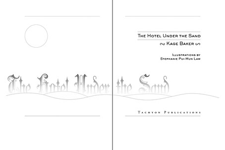
hotel.jpg

Yes, it’s been a busy year. These are books three and four respectively of the titles I’ve been designing for Tachyon Publications, and there are more on the way.

Kage Baker’s The Hotel Under the Sand is a charming fantasy for children concerning the hotel of the title and its curious inhabitants, which include a ghost bellboy and a pirate captain. The illustrations were by Stephanie Pui-Mun Law and I tried to complement these with the lettering design and graphic elements. I always enjoy working on illustrated books.

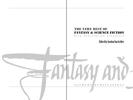
fandsf.jpg

The Very Best of Fantasy & Science Fiction is a very different beast, a big (480 pages) selection by Gordon Van Gelder of some of the many first-class stories from the sixty-year history of the fiction magazine. F&SF has published so many classic stories over the years the book could easily have been twice as big. As it is there are pieces by Alfred Bester, Ray Bradbury, Shirley Jackson, Philip K Dick, Harlan Ellison, Stephen King and Neil Gaiman, among others. The design in this case came from studying a copy of the magazine from 1967; I was already thinking of using Bodoni for the story titles and that choice was confirmed when I saw it used for the same purpose in the magazine. The calligraphic titles were also scanned from there, their design going back to the very first issue.

Both these books are on sale now, and Keith Brooke gave a glowing appraisal to the latter in The Guardian at the weekend.

Previously on { feuilleton }
Medicine Road by Charles De Lint
The Best of Michael Moorcock

Science fiction and fantasy covers

covers.jpg

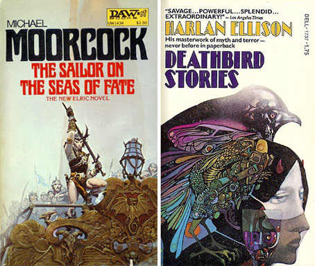
Two samples from a great Flickr set of science fiction and fantasy paperback covers. Both these titles were first published in 1976 and, unlike many Flickr postings, this set gives credit to the cover artists where known. The Moorcock book is one of his Elric volumes and while it isn’t a favourite of mine, the painting by Michael Whelan certainly is. Whelan produced several Elric covers in the 1970s of which this is easily the most successful, and one of the few works by any artist after Jim Cawthorn to capture the weird inhumanity of the Melnibonéan.

The Ellison collection, on the other hand is one of his finest, with a wraparound cover by the author’s favourite artists Leo & Diane Dillon. Just last week I completed the interior design for Tachyon’s forthcoming The Very Best of Fantasy & Science Fiction which included among a host of great stories The Deathbird by Harlan Ellison, a remarkable piece of writing and one of the best pieces in the entire book. That’s now gone off to the printer so I’ll be posting samples of the pages here shortly.

Elsewhere on { feuilleton }
The book covers archive
The illustrators archive

Previously on { feuilleton }
Groovy book covers
Jim Cawthorn, 1929–2008
Harlan Ellison: Dreams with Sharp Teeth
Revenant volumes: Bob Haberfield, New Worlds and others

Medicine Road by Charles de Lint

delint.jpg

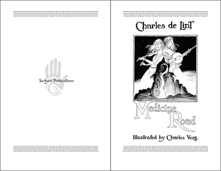
The second of my book designs for Tachyon Publications is published this month and it was good to receive a copy in the same week as getting a load of new CDs. Medicine Road is a contemporary fantasy of shape-shifting and shamanic magic set in the American South West. This job was particularly pleasurable for being illustrated by Charles Vess, celebrated among other things for his many collaborations with Neil Gaiman, including Stardust. I embellished the opening pages with designs based on Native American petroglyphs, a couple of which are from the tribes mentioned in the text.

Laurel and Bess Dillard are charismatic bluegrass musicians enjoying the success of their first Southwestern tour. But the Dillard girls know that magical adventures are always at hand. Upon meeting two mysterious strangers at a gig, the red-headed twins are drawn into a age-old, mystical wager along the Medicine Road.

One day, seeing a red dog chasing a jackalope, Coyote Woman gave them human forms. They became Jim Changing Dog and Alice Corn Hair. In return, both of them must find true love within a hundred years or their “five-fingered” forms will be forfeit. Alice has found her soul mate, but trickster Jim is unwilling to settle down — until he sets eyes upon free-spirited Bess Dillard.

Yet time is running out for the red dog and the jackalope. In just two weeks they will journey to their reckoning at the Medicine Wheel. Meanwhile, a motorcycle-riding seductress and a vengeful rattlesnake woman are eager to meddle, and Bess and Laurel, caught in a web of love and lies, must find their own paths into the spirit world.

Next up from Tachyon will be a book by Kage Baker. More about that later.

Previously on { feuilleton }
The Best of Michael Moorcock

The Best of Michael Moorcock

mm1.jpg

The first of the books I’ve been designing for Tachyon Publications appears this month. Two more are due to follow and I’m working on another at the moment; more about those titles later.

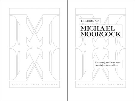
The Best of Michael Moorcock was a pleasure to be involved with not only because I’ve been reading Moorcock’s fiction for a very long time but I’ve also been fortunate during that time to get to know the writer and Linda Moorcock, his wife. Mike likes the work I’ve done in the past for Savoy Books and we did have an anthology of his favourite pieces by other writers planned for Constable & Robinson back in 2005. That book didn’t work out so this makes up for its cancellation. This is an excellent anthology, put together initially as a private enterprise by editor John Davey who managed the difficult task of compiling a collection which ranges over forty years of writing. Ann and Jeff VanderMeer came aboard as co-editors for the Tachyon edition.

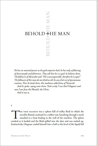
I’ve been working mainly on the interior design of the Tachyon volumes (although I’ve also done the cover for Jeff VanderMeer’s forthcoming Booklife) and for this title I took a cue from Ann Morn’s cover design which features a pair of gates emblazoned with large letter Ms. The title spread above takes the letter M from the typeface used for the author’s name and multiplies that to create an equivalent set of gates for the reader to pass through. I try to play down the pyrotechnics for fiction—the words are the important thing, not the graphic design—but since this was a story collection I thought I’d try illustrating each piece using the title typography alone. Most of these are done by using a suitable typeface but for a few pieces I managed to create an arrangement that reflected the story. Behold the Man (below) is the Nebula Award-winning story of a journey back in time to find the historical Jesus. The cross shape not only relates to the Biblical theme but also implies the crossed time streams and Moorcock’s layered, cross-cut narrative.

mm2.jpg

The Best of Michael Moorcock is available now from the usual sources and received a glowing review in the Guardian. Later this month, and other work permitting, I’m hoping to make a start on what will effectively be a companion volume, Savoy’s long-delayed Into the Media Web, another collection by John Davey which this time collects the best of Moorcock’s copious essays, reviews and other non-fiction.

Previously on { feuilleton }
Designing Booklife
The Sonic Assassins
Revenant volumes: Bob Haberfield, New Worlds and others
An announcement redux