Body Shocks

bodyshocks.jpg

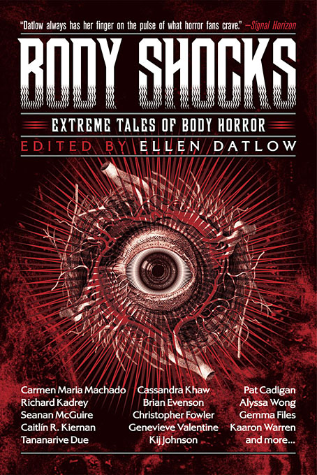
Presenting my latest cover design for Tachyon Publications, and one which it hardly needs stating is another collection of horror stories edited by Ellen Datlow. Body horror is the general theme but these aren’t all accounts of evisceration and dismemberment of the type that made the later Pan horror collections an increasingly dismal read. Several of the stories are outright science fiction, while the final entry, Tissue Ablation and Variant Regeneration: A Case Report by Michael Blumlein, is a Ballardian critique of a former US President that unnerves with its dispassionate medical tone.
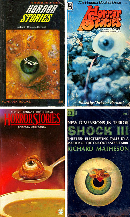
eyeballs.jpg

The cover design for this one went through many drafts before everyone was satisfied, the placing of the solitary eyeball being the crucial element. This is something of a stereotype on horror covers, a feature I’ve seen often enough to have it mentally tagged as “the Eyeball of Horror” (see above). But design stereotypes evolve because they serve their purpose so well, as this one does. Some of the earlier drafts incorporated anatomical diagrams but none of the results were really satisfying, especially when a large amount of text also needed to be placed on the cover. In the past I might have posted one or two of these early versions but I was dissuaded from doing this when Jonathan Barnbrook wrote about the gentle rebuke he received from David Bowie after he showed the preliminary stages of his cover design for Bowie’s The Next Day. Bowie’s attitude was that making public a working version changed the audience’s perception of the end result, a comment that comes to mind every time Spine has a new post showing drafts of recent cover designs.

Body Shocks will be published in October.

Previously on { feuilleton }
The Monstrous
Lovecraft’s Monsters unleashed
New work: Two forms of darkness

Robot Artists and Black Swans

robotartists.jpg

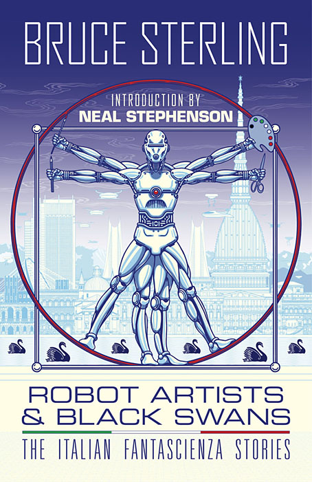
Four years ago I designed and illustrated a book for Tachyon written by Bruce Sterling, Pirate Utopia. Robot Artists and Black Swans is a kind of sequel, being the work of the same author for the same publisher, and with a similar geographical focus on southern Europe. The new book differs from the earlier one by being a collection of stories rather than a single piece, many of which are set in or near the city of Turin where Sterling and his wife, Jasmina Tesanovic, spend much of their time. Sterling has been living in Europe for many years, long enough to have cultivated an alter-ego, Bruno Argento, an Italian science-fiction writer who is offered as the real author of the stories in Robot Artists and Black Swans.

Pirate Utopia was an easy book to design because of the Futurist theme which I illustrated by adapting graphics by artist and designer Fortunato Depero. For the cover of the new volume I considered trying something similar with another Italian artist/designer, Franco Grignani (1980–1999). In addition to having studied in Turin, Grignani was commissioned by David Pelham to create cover art for a handful of Penguin science fiction titles in the late 1960s. Much of Grignani’s artwork is heavily indebted to the Op Art style popularised by Bridget Riley and Victor Vasarely, especially the early Riley formula of dazzling arrangements of parallel lines, a formula he made his own after Riley’s work evolved in other directions. Despite these favourable qualities, Grignani’s art proved too abstract for my purposes, and for Tachyon’s who wanted something more illustrative, so I ended up co-opting a very different Italian artist/designer, Leonardo da Vinci. The figure of Da Vinci’s Vitruvian Man has been parodied and pastiched many times so this isn’t remotely original (I’ve also used the original drawing on a pastiche book cover I designed for the Lambshead Disease Guide), but making the figure a robot was a convenient way of combining the title with Italian history. One of the stories in the collection, Pilgrims of the Round World, concerns the inhabitants of Turin during the Renaissance years, and mentions Leonardo (or “the Vinci boy”) several times, so the figure does have some actual relevance beyond being recognisably Italian. The background is, of course, the city of Turin given a slightly futuristic tweak, although it’s more Turinesque than a match for the place itself.

As usual, I’ll save discussion of the book’s interior until after publication which will be in March, 2021. Watch this spacetime.

Previously on { feuilleton }
Pirate Utopia by Bruce Sterling
Futurismo!

Hazardous design

watts16.jpg

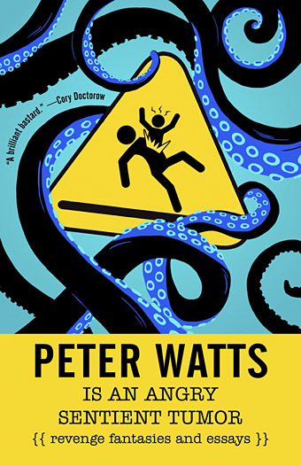
Cover design by Elizabeth Story.

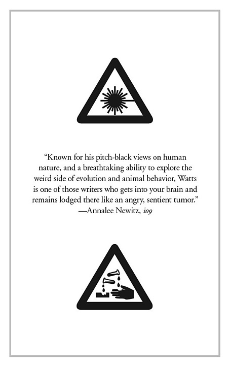
Our present viral moment reminded me that I hadn’t written anything about Peter Watts is an Angry Sentient Tumor, a collection of essays by Canadian science-fiction writer Peter Watts whose interiors I designed for Tachyon last autumn. Watts has a special interest in biology, and several of the pieces in the collection are partly or wholly concerned with pandemics; needless to say, when I was adding a biohazard symbol to one of these pages six months ago I didn’t expect such a situation to be the event that defined the coming year, although for anyone who’s read enough SF (or horror, for that matter), potentialities like this tend to lurk in the back of your mind. Watts’ essays are mostly blog entries—much more substantial ones than the brief things I usually file here—together with a few articles from print sources. The contents range from polemics about police violence and the creeping surveillance state to personal entries covering his late brother, his father’s closeted sexuality, his beloved cats, and a near-fatal experience with a flesh-eating virus. There are also film reviews, scientific speculations and musings/warnings about global calamities, especially the climate variety. His writing is consistently witty, engaging and thought-provoking. The book was a pleasure to read as well as work on.

watts14.jpg

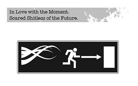
As with other interiors I’ve designed for Tachyon, I took the design cues from the cover, which in this case was the work of Elizabeth Story. The internal graphics are a combination of writhing tentacles and hazard/warning signs, the latter being taken unaltered from public information sets or adapted to suit the content of the piece. In a way they’re a sequel to the Tarot symbols I designed in 2006 based on graphics from the international symbols commonly used in public buildings. The bespoke designs were fun to create, and required some ingenuity in places: how do you show global warming in a simple, wordless symbol? My solution was to put a globe in a frying pan. There are 50 essays in all so the examples shown here represent a fifth of the book.

For an idea of Watts’ writing together with his thoughts about the pandemic, his most recent post is here. He’s not the only person who’s been saying we should expect more events like this one in the future.

watts02.jpg

watts04.jpg

watts05.jpg

Continue reading “Hazardous design”

Of Mice and Minestrone

lansdale.jpg

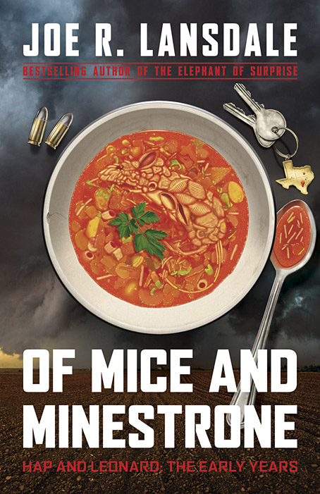
I’ve done a lot of cover work this year, and there are still more designs waiting to be announced. Of Mice and Minestrone isn’t my usual line of work but it’s actually the third cover I’ve done for a Joe R. Lansdale book, although the previous titles were horror and steampunk respectively. The latest volume is a collection of crime stories, and an addition to Lansdale’s Hap and Leonard books, a series about a pair of Texan detectives whose popularity now extends to a TV show.

Crime presents many of the same challenges you find in other genres, all of which come with their own set of clichés which you can either choose to engage with or avoid. In the case of crime there’s a tendency for degraded typefaces to proliferate, along with variations on a red/black/white colour scheme. One of the early drafts of this design did use a red/black/white arrangement but I was told that Joe Lansdale was (unsurprisingly) tired of seeing this scheme applied to his own books. The title of the collection comes from the opening story which concerns the young Hap’s involvement with an older woman and her abusive husband; the marital abuse is resolved via a bowl of soup which has been poisoned with a dead rat, hence the title and the cover image. I like using pareidolia when I can, and the slightly unusual imagery pushed the appearance away from generic clichés (if you discount the bullets) towards the marvellously surreal covers that Tom Adams painted for Agatha Christie’s novels.

The background photo is a rare example of my using a stock image. The soup bowl looked fine from the outset but the background lacked a suitably ominous quality, and was at risk of looking too much like a recipe book. (As it happens there are some recipes by Kasey Lansdale following the fiction although I don’t think any require the use of dead rats.) After trying a number of different table surfaces I decided on a lateral approach so went searching for pictures of Texan storm clouds. The image we eventually used—a tornado over farmland near Patricia, Texas by John Finney at Getty Images—was the second one I tried and it worked so well we decided to keep it.

Of Mice and Minestrone will be published by Tachyon in March 2020 but is available for pre-order now.

Previously on { feuilleton }
The Gods of HP Lovecraft
Lovecraft’s Monsters
Ten titles and a cover
Steampunk overloaded!
New things for April

Weekend links 351

burgkmair.jpg

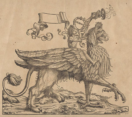
Herald on Griffin (1516-1518) from The Triumphal Procession of Emperor Maximilian I series by Hans Burgkmair the Elder.

• My design and illustration work for Pirate Utopia by Bruce Sterling continues to gain favourable comments, a novelty when reviewers often pass over the visual component of the books under their consideration. One of the most recent examples is in the latest edition of Locus Magazine; this can only be read in full by subscribers but the Tachyon Tumblr has an extract.

Paul La Farge on the complicated friendship of HP Lovecraft and Robert Barlow. Related: The Night Ocean, a short story by Barlow & Lovecraft. Meanwhile, Lovecraft enthusiasts are still raising money for a Providence statue (spot my art and design work in the photo of the Lovecraft Art and Sciences Council).

• At The Quietus this week: Children Of Alice talk to Patrick Clarke about audio collage and English Surrealism, Lottie Brazier enters The Strange World of Annette Peacock, and Manuel Göttsching tells Robert Barry how Ash Ra Tempel became the loudest band in Berlin.

• “Mind the doors!” Eight reviewers pick ten films featuring the London Underground. Not a bad list but choosing a Doctor Who film while ignoring the great Quatermass and the Pit (1967) is an error.

• Mixes of the week: Swedenborgian Hobos by acephale, Secret Thirteen Mix 214 by Fabio Perletta, and a mix for NTS by Six Organs Of Admittance.

• More Surrealism: Leonor Fini, Surrealist Sorceress, a lecture by Dr Sabina Stent, will take place at Treadwell’s Bookshop, London, on 19th May.

• “Michael Chapman’s road-weary guitar resonates with a new generation,” says Joel Rose.

A Journey Round my Room (1794), a book by Xavier de Maistre.

Lyrical Nitrate (1991), a film by Peter Delpeut.

The Sorcerer (1967) by Miles Davis | Impressions Of Sorcerer (1977) by Tangerine Dream | Venom Sorcerer (2014) by Cultural Apparati