My latest cover for Swan River Press was made public last week so here it is. Atmospheric Disturbances is a collection of short horror stories by Helen Grant, a British writer with a finely-tuned sense of the sinister:
A glimpse of a grotesque illustration combined with the onset of fever instigate a descent into a hellish nightmare. In the wine cellar of an abandoned mansion, something alluring yet ominous is sealed inside a vintage bottle. At the end of a claustrophobically narrow alley lies a gilded façade opulent enough to tempt a thief. And forty miles out to sea, a naturalist on a lonely island hears voices through the radio telling stories of unimaginable disaster—and hope. In her second collection, award-winning author Helen Grant visits Flanders, Paris, and the remotest parts of Scotland, examining themes of transgression, repercussion, and revenge.
The design for this one breaks with the usual form for story collections where you’re often trying to find a single image or pictorial arrangement that can summarise the book as a whole. The title suggested a meteorological chart but this alone wouldn’t communicate anything of the book’s contents so the full wrap features thirteen squares, each of which contains a pictorial detail related to one of the stories. None of the squares are spoilerish, a couple of them could even refer to more than one story. Taken together they’re like a dark advent calendar mapped across a chart that shows an Atlantic storm approaching the British Isles.
On a technical level the design was a tricky one to work out. It’s easy to think “Atlantic map”, “isobar chart” but when you go looking for suitable reference material you discover that a) all the meteorological charts are very small things, you can’t simply resize a pre-existing chart to fill the space. And b) navigation maps of the North Atlantic only show small areas in the detail that I required. Once I’d accumulated all the relevant material, which included four different navigation maps extending from Nova Scotia to the Baltic Sea, I had to piece everything together then trace new vector outlines. The same with the meteorological chart which was redrawn from scratch over a very crude map of the same region. The colours in the background suggest the tones of the Aurora Borealis which is one of the atmospheric disturbances referred to by the title.
The printed paper case continues the theme with a different isobar map showing stormier conditions. The book itself will be out in mid-October, the time when the atmosphere in this part of the world grows increasingly restless.
Previously on { feuilleton }
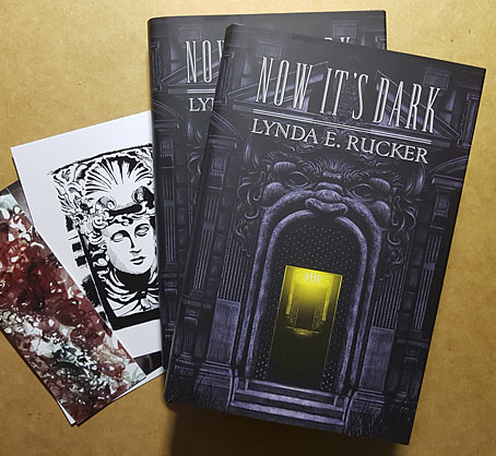
• Now It’s Dark


