Heartbreak Hotel

hh01.jpg

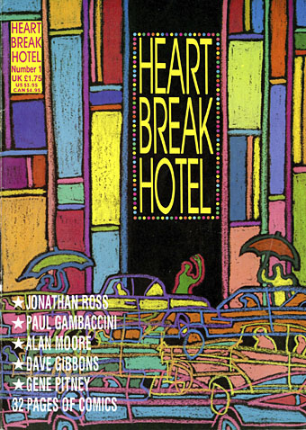
Number One: Teen Angels in Anguish. Cover by Barry Kamen.

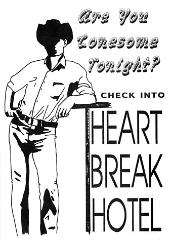
Among the recent uploads at the Internet Archive is a complete run of Heartbreak Hotel, a British magazine six issues of which were published in 1988. (More or less…I think the first issue may have appeared at the end of 1987.) Heartbreak Hotel differed from other bi-monthly publications by being predominantly a comics magazine, but it also differed from other comics magazines by a) having the contents of each issue themed to follow a different musical genre, b) running articles by and interviews with people who had little or no connection to the comics world, and c) being a lot more openly sympathetic towards gay men and lesbians than any other magazine aimed at a general readership. The latter stance was a political one in 1988. This was the year when the Thatcher government, growing hubristic after a third election win, passed a Local Government Act whose notorious Section 28 prevented authorities from “promoting homosexuality”. The clause was designed to prevent Labour-run councils from funding gay and lesbian support groups, as well as to stop teachers from mentioning homosexuality in sex education lessons. The editors of Heartbreak Hotel, Don Melia and Lionel Gracey-Whitman, were a gay couple, so the magazine stood against the repressive atmosphere of the time without being too polemical or too serious. The polemic was more overt in affiliated publications Strip AIDS, a benefit comic for the London Lighthouse (a residential and daycare centre for people with AIDS), and AARGH (or Artists Against Rampant Government Homophobia), a collection of comics taking a stand against Section 28 which was the first publication from Alan Moore’s Mad Love imprint.
hh07.jpg

The other notable feature of Heartbreak Hotel was the attention it gave to new artists, to women artists, or to people who weren’t drawing generic action/adventure strips. The first two issues appeared while I was working on the last pages of my adaptation of The Call of Cthulhu so I sent the magazine some sample pages and was subsequently invited to meet the editors at the launch of the next issue in London. I spent a somewhat nervous weekend in the capital; this was my first introduction to the wider comics world, and my introversion in those days was a lot more pronounced among strangers than it is today. I met Alan Moore and Melinda Gebbie for the first time (separately—they weren’t a couple at that time), and was amused when Don made a point of telling me that he and Lionel were gay, something he evidently felt he had to declare even though it had been (for me, at least) quite obvious from the editorial stance of Heartbreak Hotel, as well as the camp graphics scattered throughout the magazine’s pages, and the fact that the publisher was co-named “Willyprods”.

hh08.jpg

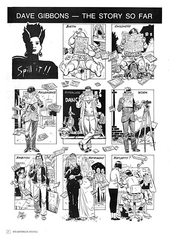
Dave Gibbons spills the beans in issue one.

The format of the magazine was established in the first issue: five or six strips based on songs that suited that issue’s theme, together with interviews or features, some of which also matched the theme. “Spill It!!” was a regular feature in which a different artist had a page to create an autobiographical piece in strip form, and there was also a column about comics and related matters by artist/writer Trina Robbins. I’d initially hoped to draw something for the psychedelic issue but by the time I posted my photocopies that number was already being prepared for print. I did turn up in the fourth issue, however, in a short news piece which announced the publication of the Caemaen Books edition of my Haunter of the Dark strip.

hh09.jpg

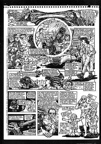
Also from issue one, Alan Moore recounts his trip to the USA.

A more important outcome from my journey to London was Lionel’s offer to run The Call of Cthulhu in BLAAM, a spin-off comic that Willyprods/Small Time Ink was planning. Heartbreak Hotel had been inundated with work by talented newcomers so rather than make them wait for a slot in the parent magazine the editors decided to launch another title to provide an additional outlet for new creators. Lionel had been very impressed with my Lovecraft story, and also assisted with its conclusion when he suggested that I add an extra page to help the pacing near the end, something I did, and which I’ve been grateful for ever since. The first issue of BLAAM, printed on tabloid-size newsprint sheets, came bundled with issue five of Heartbreak Hotel. The idea was that BLAAM would continue separately as a free publication thanks to a combination of low production costs, advertising, and Don Melia’s contacts at Titan Distribution. This was all very exciting, especially when two more issues of BLAAM appeared soon after. My strip was slated to run in number four or five but Willyprods/Small Time Ink didn’t publish anything more after December 1988. I was disappointed by this but not for long. A year later I’d started working on the Savoy comics, and Steve Bissette offered to publish the Cthulhu strip in Lovecraft Lives, a book he was planning for Kevin Eastman’s new enterprise, Tundra Publishing. That one didn’t work out either—the stars weren’t right for a variety of reasons—but all this attention, and the enthusiasm shown by everyone involved with Heartbreak Hotel, made the comics world seem like a good place to be. For a while, anyway.

Continue reading “Heartbreak Hotel”

The horror

Last year I was asked to write something about my favourite horror comics for Nørd Nyt, a Danish comics zine. I’d pretty much forgotten about this until the printed copy arrived, so here’s my piece in English, a choice of three favourite horror stories.

breccia.jpg

The Dunwich Horror by Breccia (1973)

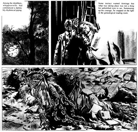
The October 1979 issue of Heavy Metal magazine came as a revelation. I’d only bought a few issues prior to this, and seeing an entire magazine devoted to HP Lovecraft seemed far too good to be true. Lovecraft art is so common now that it needs to be emphasised how scarce this kind of illustration used to be, the most you saw was paperback art of varying quality. There had been a few comic-strip adaptations but they were mostly in American publications or foreign editions I hadn’t seen. As it turned out, Heavy Metal‘s great JK Potter cover promised more than it actually delivered: at least half the magazine was taken up with continuing strips that had nothing to do with Lovecraft, or strips that did little but borrow a few Lovecraftian motifs for a slight horror tale. The one really outstanding piece was Alberto Breccia’s The Dunwich Horror, one of several Lovecraft adaptations the artist produced in 1973. Breccia’s style was sketchy, shadowy and replete with period details. The faces of his characters looked absolutely right for what I still consider to be one of Lovecraft’s darkest stories (people tend to miss the implication that a backwoods magus very nearly destroys humanity). Until I encountered the artists in Heavy Metal I’d given up on comics as an artistic medium, having no time at all for superheroes or the poor science fiction of 2000AD. Artists like Breccia, Moebius and Druillet showed that there was more than one way of drawing imaginative work, that you could use the refined techniques of illustration to tell a story.

yeux.jpg

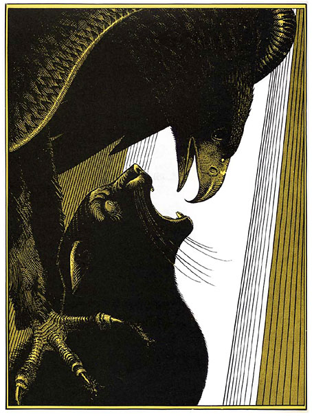
Les Yeux du Chat (The Eyes of the Cat) by Jodorowsky and Moebius (1978)

This story came to my attention when it received its first English translation in the pages of Steve Bissette’s Taboo anthology. It was printed in black on yellow paper, the original French edition having been yellow and black with white highlights. Compared to Jodorowsky’s customary flights of fancy the story is a very simple one, if typically grotesque: a silhouetted figure stands at a tall window overlooking a futuristic (or alien) city, directing with its thoughts the action of an eagle who hunts down a cat in the streets below. The horror comes from the shocking predicament revealed at the end, and the final line of dialogue, although this remains secondary to the formal perfection of the drawing and storytelling. Even by the standards of Moebius’s meticulous draughtsmanship this is a superbly controlled piece of work. Each spread operates as a kind of split-screen, with the left page showing the dialogue and the silhouetted figure, while the full-page illustration opposite shows a simultaneous moment of action somewhere in the city. One thing I immediately liked about this was Moebius’s architecture which even more than usual manages to seem otherworldly yet completely convincing. Everything we see in this brief tale poses questions that remain unanswered. And like many of the best short stories, a few carefully chosen details can imply an entire world.

fromhell.jpg

From Hell by Alan Moore and Eddie Campbell (1991–1996)

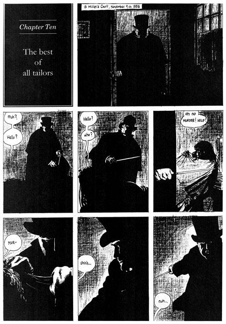
Horror doesn’t have to be delivered within genre stereotypes, in fact these days it’s often better if it isn’t when so many of those stereotypes—vampires and zombies, for example—have been diminished by over-familiarity. From Hell isn’t a horror story per se—it’s self-described as “a melodrama in sixteen parts”—but it debuted in Steve Bissette’s anthology Taboo where the brief was to offer the reader something dark or challenging that they hadn’t seen before. From Hell certainly fulfilled that brief: Alan Moore’s writing has never shied from the dark—consider the nihilistic Rorschach chapter of Watchmen—but this is as black as he gets. Eddie Campbell has been vocal about his dislike of horror stories but he was the perfect artist here with his long experience drawing ordinary human beings rather than posturing superheroes. Together the pair delivered a story that was novelistic in scope and minute in its attention to detail. Most people would have thought they knew more than enough about Jack the Ripper but no other representation has been this thorough in its exploration of all aspects of the case.

Watchmen had already aimed for a panoramic range of characters—from the president to a newspaper-seller—but From Hell went much further and in greater detail, with a scope that ranges from a group of homeless women to the head of the British Empire and all the classes in between. One of the most impressive aspects of the story was its exposure of the awful gap at the heart of previous dramatisations, namely the reduction of the lives of the murdered women to a cast of frequently nameless unfortunates who we glimpse for a moment sidling up an alley before their blood splashes on a wall. Moore’s script showed us (as much as is possible) the real women behind the roll-call of victims, crushed by poverty yet still distinct individuals. Looking for human detail has always been a feature of Moore’s writing, it’s why his work seemed so fresh in the 1980s compared with lesser writers who were simply recycling clichés as though there was no other way to behave. So too with Campbell’s artwork which has never been subject to the exaggerations of the superhero genre. One of my favourite moments in the entire story was utterly human and utterly trivial: the scene in Chapter 3 when Walter Sickert and Annie Crook meet. Annie says “I need a wee” so she hitches up her shift and squats in the road. It’s the accumulation of numerous human moments such as this—the moments that genre comics invariably avoid—that makes From Hell such a powerful and memorable piece of work. Eddie Campbell’s art shows us the true London dark, a city as black and terrible as it would have been in the days before electric light.

Previously on { feuilleton }
Heavy Metal, October 1979: the Lovecraft special

Watchmen

watchmen.jpg

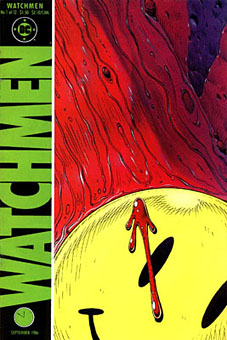
This year sees the 20th anniversary of the publication of Watchmen by Alan Moore and Dave Gibbons. The landmark comic book, one of the few to deserve the designation “graphic novel”, remains a particular favourite of mine, and one that still excites for its consummate command of the comics medium. The following is a very long round table discussion with Watchmen‘s creators from issue 100 of Fantasy Advertiser, first published in March 1988. It’s surprising that this doesn’t seem to have been posted anywhere else on the web as it’s an excellent discussion about this great book.

Spoiler warning: this piece discusses in depth just about every revelation in the story so you’d be advised to skip it if you haven’t read the book.

MARTIN SKIDMORE: Alright, let’s have a starting point… just what is it about Watchmen that distinguishes it from other…
STEVE WHITAKER: Cream cheeses?
MS: …superhero comics on the market?
DAVE GIBBONS: Is this in the form of direct questions to us, or…
FIONA JEROME: No, we’re all gonna talk.
DG: Well, I’ll have a schnoozle then…
SW: The thing that I think distinguishes Watchmen from other comics is that the series holds together more like a novel. Your climax isn’t in the last 3 panels in Watchmen 12. There are long quiet tracts with exciting bits or…moderately exciting bits (LAUGHTER) In terms of Jack Kirby Wham! Smash! Pow! it’s all very quiet. There’s a lot of suffering but…
MS: …it’s all emotional rather than physical suffering.
ALAN MOORE: It’s a difficult question for me and Dave to answer, probably one that you could answer better, but if I had to say anything then it’s the degree of structure that me and Dave have applied to it—I can’t think of many examples of that degree of structure, that degree of layering.
FJ: I was going to say: especially visually you don’t get such a use of motif certainly not in American comics.
MS: Doug Moench has used it occasionally.
FJ: But not with the same complexity and not filling-in with written structure as well.
PETER HOGAN: The thing is: you’re given a world. The characters, alright, they’re based on the Charlton Characters but they’re new as of page 1. Even so, they’re characters with a history that comes out over the course of the thing… Their world has a history… it has a cohesion to it.
SW: Something that quite interests me now we’re talking about structure and stuff, is the symmetry—there is a real symmetry to Watchmen and the way the characters are set up.
DG: Two arms… two legs. (LAUGHTER)
MS: Perhaps the Comedian and Rorschach…
SW: I was thinking more of Osterman and Ozymandias.
MS: That’s right—the intellectual and physical, chaos and law…
AM: It’s difficult pinning down what’s symmetrical to what—I mean to me, at least to some extent, there’s an equally good case for contrasting Nite Owl and Rorschach.

Continue reading “Watchmen”