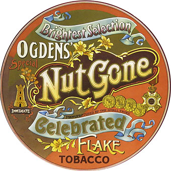
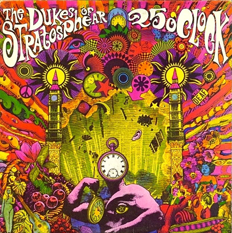
More psychedelia (there’s always more psychedelia). Listening to this Small Faces album this week I couldn’t remember whether my vinyl reissue from the 1980s had survived the vinyl purge I instituted a few years ago. It turns out I do still have the vinyl copy, a facsimile of the original circular sleeve. Ogdens’ Nut Gone Flake was released in 1968. Despite the innovative sleeve design and the generally tripped-out atmosphere (especially on side two) it seldom gets included in retrospectives of psychedelic album art. This is surprising since for design and execution it’s far better than the sleeves for Their Satanic Majesties Request and Magical Mystery Tour, the latter a great album with a really awful cover. I suspect the Small Faces’ album gets overlooked because the most typically psychedelic aspect of the artwork—the drawing/collage below—is hidden inside, the rest of the cover being a careful imitation of an “Ogdens’ Nut-brown Flake” tobacco tin. XTC borrowed the circular sleeve idea for their 1984 album The Big Express.
Interior panel. Illustration by P. Brown.
The drawing is credited to one “P. Brown”; the sleeve design, we’re told, was the work of Mick Swan who did nothing else in this area. If I’m vague about the details it’s because my copies of the album (CD and vinyl) contain no information other than the label copy. I imagine recent reissues which have had booklet notes will are more enlightening. This page has some comments from the band as to how the tobacco tin idea came about.
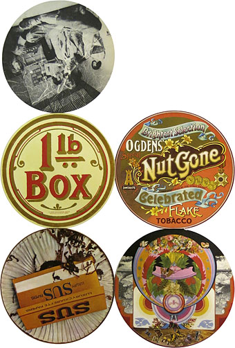
The opened-out sleeve.
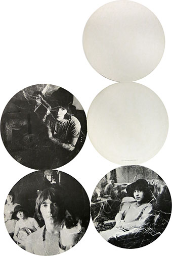
Original copies of this album used to command high prices (so to speak) since the fragile nature of the hinges holding together each part of the sleeve meant they rapidly wore out. Subsequent editions tended to be in regular square sleeves. My CD edition from 1989 was the first to make the most of the tobacco tin concept by packaging the whole thing in a tin. Inside you get a small reproduction of the fold-out sleeve and six somewhat redundant beer mats or coasters.
The band played two-thirds of the album on the BBC’s Colour Me Pop in 1968, complete with an appearance by Stan “The Man” Unwin who provides the “loony links” on the second side of Ogdens’ Nut Gone Flake. Most editions of Colour Me Pop are lost but that episode survived, and may be watched here.
The opened-out sleeve (obverse).
Elsewhere on { feuilleton }
• The album covers archive

