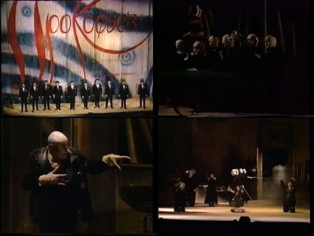
Given the time of year, and last week’s Quays-themed post, this seemed like a good follow-up. Opera North’s production of Prokofiev’s The Love for Three Oranges was broadcast by the BBC during the Christmas holiday of 1989. The opera isn’t quite as saccharine a Christmas entertainment as The Nutcracker Suite but the libretto is still light-hearted fare, being based on a Neopolitan fairy tale in which the son of the King of Clubs is afflicted by melancholy after reading too much tragic poetry. The King stages an entertainment to cheer the Prince but the only thing that makes him laugh is the witch, Fata Morgana, falling over and revealing her underclothes. This humiliation provokes the witch into cursing the Prince to fall in love with three oranges. These he immediately sets off to find, and thereby hangs the tale. Richard Jones directed the production, with the English Northern Philharmonia providing the music. The opera is also sung in English, the translation being by David Lloyd-Jones.
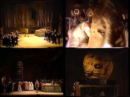
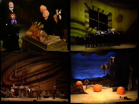
The stage decor for the Opera North production was designed by the Quay Brothers, one of several operas they worked on around this time. The opera may be a comic one but the design emphasis is on gloom and decay, a feature that extends to Sue Blane’s costumes, many of which seem to have been styled with the Quays’ films in mind. In addition to a Nosferatu-like Leander (the sinister Prime Minister), a company of children appear from time to time wearing masks which make them look like the Quays’ doll-headed puppets. The chorus, meanwhile, wear antique gas-masks of a style which people would now refer to as steampunk. The most overt reference to the Quays films occurs during the King’s entertainment when a vast mutant creature is wheeled onto the stage, the creature’s head being the colossal cousin of the twitching cyclops from Rehearsals for Extinct Anatomies. The cumulative effect of the grotesquery combined with absurd comedy is of an opera equivalent of Mervyn Peake’s Gormenghast, all of which makes me wonder what the BBC’s Gormenghast might have been like if the corporation had hired the Quays and Sue Blane to work the same magic they do here. (There is a Gormenghast opera by Irmin Schmidt but I’m not keen on the music and what I’ve seen of the staging it looks a lot less like Peake than this one does.)
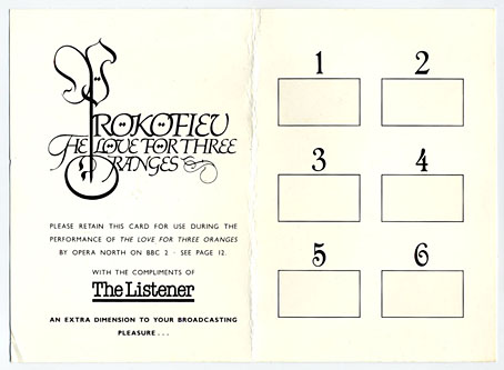
Decor aside, the most notable feature of this production, and the broadcast itself, was the scratch-and-sniff card which was provided to every member of the audience, and to any viewers who bought a copy of the BBC’s Listener magazine before the screening. Each time a numbered card appeared on the stage the audience had to scratch and sniff the relevant panel. The scents—which include orange, of course—are less offensive than those for John Waters’ Polyester (1981) although the audience is still surprised into sniffing the farts of the demon, Farfarello.
Elsewhere on { feuilleton }
• The Quay Brothers archive

