Several Salomés

fowler.jpg

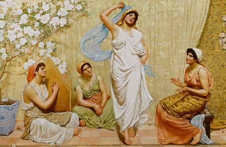
The Dance of Salomé (1885) by Robert Fowler.

There’s always more to find… Unfortunately, Robert Fowler’s academic tableaux is a prime example of bad Victorian art: carefully modelled but overlit, dull and lifeless. And worst of all for the subject at hand: deeply unerotic. We’re supposed to believe that this woman wrapped in a bedsheet would exude enough eros to drive her father to lustful recklessness. This was the bloodless “good taste” against which Oscar Wilde and the Aesthetes set themselves.

moreau.jpg

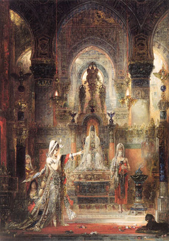
Salomé Dancing before Herod (1876) by Gustave Moreau.

Wilde’s idea of Salomé can be seen here in one of Gustave Moreau‘s many paintings on the theme. Wilde would have preferred Moreau’s paintings, or something similar, to adorn his published play but he ended up with Aubrey Beardsley instead. You only have to compare Beardsley’s Stomach Dance with Fowler’s painting to see why Aubrey’s art made such a dramatic impression in the 1890s.

pell.jpg

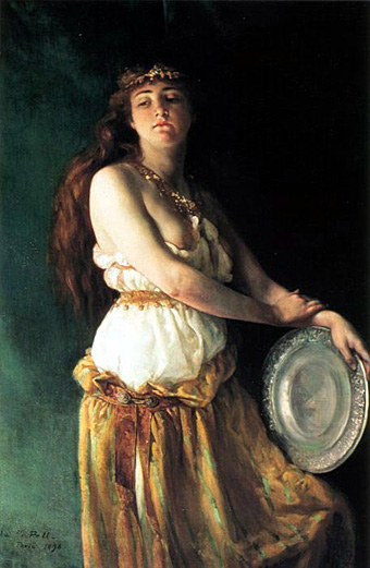
Salomé (1890) by Ella Ferris Pell.

Ella Ferris Pell’s painting isn’t the only portrait of Salomé by a female artist of this period but it’s the one which Bram Dijkstra chose as the cover image for his excellent study Idols of Perversity: Fantasies of Feminine Evil in Fin-de-Siècle Culture (1986). Of this work Dijkstra writes:

In Pell’s painting a number of the most characteristic turn-of-the-century attributes of the biblical temptress are absent. She does not glare at us with a look of crazed sexual hunger; she does not have the wan, vampire features of the serpentine dancer; nor does she show herself to be a tubercular adolescent … Pell’s Salomé, a real life-woman, independent, confident, and assertive, was far more threatening, far more a visual declaration of defiance against the canons of male dominance than any of the celebrated viragoes and vampires created by turn-of-the-century intellectuals could ever have been. Such a woman could not be disposed of in as cavalier a fashion as the evil women in man’s mind. Her indomitable reality was this feminist Salomé’s most formidable weapon, far more dangerous than any imaginary decapitating sword.

henri.jpg

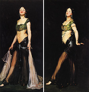
Salomé (1909), two paintings by Robert Henri.

Finally, there’s this pair of paintings by American artist Robert Henri whose work resembles John Singer Sargent’s in its shadowed backgrounds and light brushstrokes. Salomé was no longer a perennial theme by this point but Maud Allan’s improvised dance performance, Vision of Salomé, was proving enormously popular at the time Henri painted these pictures which may explain his choice of subject. There’s little in the rest of his oeuvre along similar lines.

Elsewhere on { feuilleton }
The Salomé archive

Beardsley’s Rape of the Lock

pope1.jpg

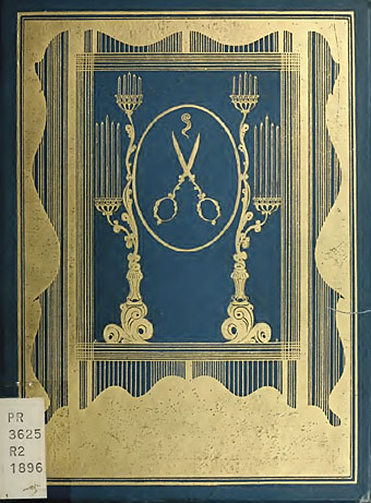
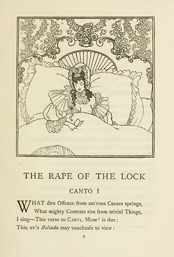
This week’s reading has been Virginia Woolf’s Orlando, a capricious novel which features in its 18th century scenes encounters with some of the great poets of the era, including Alexander Pope. A number of references are made to Pope’s satiric The Rape of the Lock (1717), one of his most notable works which received an equally notable set of illustrations in 1896 from Aubrey Beardsley. The pictures here are from a copy of the first edition published by Leonard Smithers which can be seen at the Internet Archive where the collection features a large number of books created by or written about the artist. Even though Beardsley’s illustrations are endlessly reprinted I do like to see how they were first presented to the world, how the pages were typeset and so on. One detail from this first edition is that we see the credit on the title page: “Embroidered with nine drawings by Aubrey Beardsley.” The cover design is often reproduced in its original black-and-white state which fails to convey the intended effect of those great slabs of gold, while the illustrations within are some of the finest and most detailed of the artist’s career. If the PDF doesn’t really do them justice there are better copies to be found, here and here, for example.

pope2.jpg

Leonard Smithers was notorious in Victorian London for his publishing of pornography but he tried to use the proceeds to occasionally produce works with a better reputation such as this. Beardsley had also been tarred as a pornographer, of course, but here he restrained himself in order to do justice to a book he admired. There is one possible exception in the cover design; I’m afraid I couldn’t find the reference but one of Beardsley’s critics asserts that the open scissors and fatal lock of hair shown in the mirror create a surreptitious image of the female pudenda. With many other artists this interpretation might be dismissed as fanciful but Aubrey filled his early drawings with phalluses and breast shapes, and his unfinished novel, the erotic fantasy Under the Hill, has a title referring to the mons pubis. No other artist of the time would be so daring even with a pornographer for a publisher; it was just this sort of impudence which infuriated his more staid contemporaries. Under the Hill is far more overt in its sexuality and its writing style owes something to Pope’s era which Aubrey adored. The posthumous edition of that book, containing other Beardsley ephemera, can be found here.

Elsewhere on { feuilleton }
The Aubrey Beardsley archive
The illustrators archive
The book covers archive

Charles J Strong’s Book of Designs

strong1.jpg

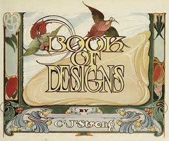
Another gem from the cornucopia of scanned books at the Internet Archive, Charles J Strong’s Book of Designs was a style guide and motif resource for artists and amateur craftspeople tasked with the creation of advertising show cards or shop display signs. The book was first published by the Detroit School of Lettering in 1910, hence the heavy reliance on Art Nouveau flourishes which by this stage had degenerated from their Mucha-derived elegance into unbridled, and frequently undisciplined, rococo embellishments.

strong9.jpg

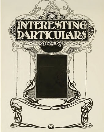
If a few of the designs lack Mucha’s care there are still some great examples here of generic Art Nouveau in its final days before Art Deco streamlined all those curves away. In the examples below a poster suggestion shows everyone’s favourite fin de sìecle gal, Salomé, while the final example shows one of Strong’s typeface designs. For anyone who likes the look of these pages but would prefer them in better quality, Dover Publications have a reprint scheduled for later this year.

Continue reading “Charles J Strong’s Book of Designs”

The Thief of Bagdad

thief2.jpg

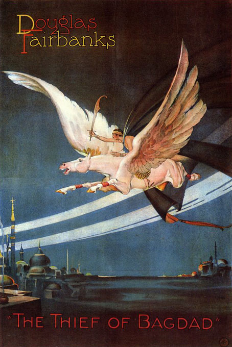
It’s the poster for the 1924 film version we’re concerning ourselves with here, not the more popular 1940 adaptation directed by Michael Powell. Both films are great but I have a special affection for Raoul Walsh’s silent version and this poster design has long been a favourite for the way it manages to condense the film’s blend of storybook graphics and Art Deco exotica. I’d wondered for years who was responsible for this design; according to various poster sites it’s the work of the film’s art director Anton Grot (1884–1974). This is one of several variations (there another here and one here) and there’s also a less interesting design which is far more typical of the period.

I often recommend the 1924 Thief of Bagdad as an introduction to silent cinema, especially if you can find a decent print. Fairbanks’ production had William Cameron Menzies as production designer and his sets are enormous Arabian Nights confections replete with minarets, onion domes and filigree screens like something from an Edmund Dulac illustration. Fairbanks gives a tremendously athletic performance and the marvellous Anna May Wong plays a Mongolian slave girl. There’s a lengthy description of the film’s production here while you can find a copy of the entire film at the Internet Archive although it really ought to be seen in a version which isn’t blighted by a company logo throughout.

Previously on { feuilleton }
More Arabian Nights
Edward William Lane’s Arabian Nights Entertainments
Alla Nazimova’s Salomé
Metropolis posters

Julius Klinger’s Salomé

klinger1.jpg

Salomé (1909).

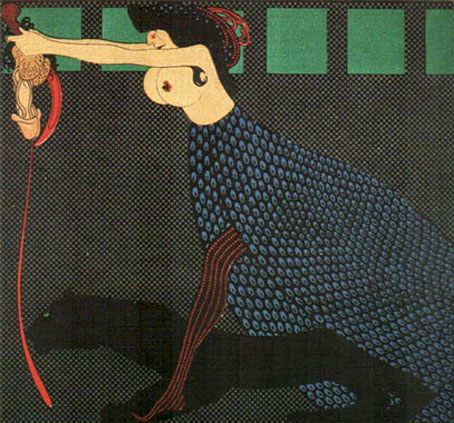
I thought this current thread was finished yesterday but it seems not. Julius Klinger (1876–1942) was an Austrian artist and designer whose early work can be found in the first numbers of Jugend magazine. Subsequent work includes a number of erotic illustrations such as top-heavy Salomé here, a depiction which startles when you notice she’s carrying a set of severed genitals in place of the more usual human head. Given that many feminist and Freudian art critics tend to see the Salomé story as an emasculation metaphor this is perhaps appropriate.

klinger2.jpg

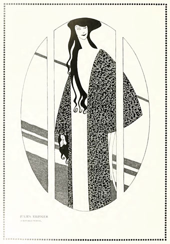
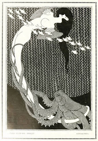
This pair of untitled pieces are from a feature on Klinger’s black-and-white work in #21 of Deutsche Kunst und Dekoration (1907), the entire edition of which can be downloaded here. The picture above may be another Salomé but is more likely that other decapitating heroine, Judith, with the head of Holofernes. The picture below, meanwhile, is entirely mysterious, and another fine addition to the artistic sub-genre of human/cephalopod encounters. Thanks to billy for pointing the way to all of these.

klinger3.jpg

Elsewhere on { feuilleton }
The illustrators archive
The Salomé archive