Aubrey fakery

nichols2.jpg

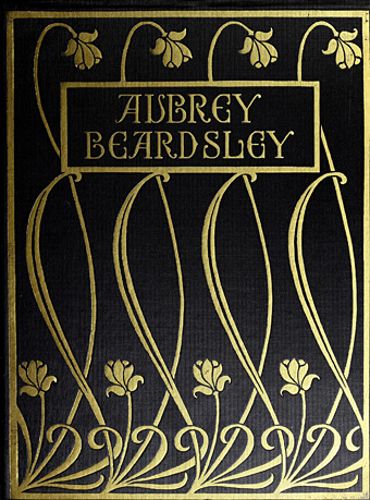
Cover of Fifty Drawings by Aubrey Beardsley (1920).

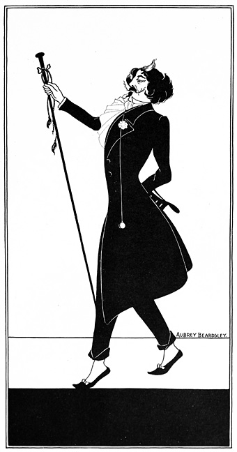
I’ve long been fascinated by fakes and forgeries especially those one finds in the art world, when the ability to imitate another artist’s work succumbs to the temptation to defraud. Artistic forgeries succeed best when there are convenient gaps in an artist’s career, and when the historical record is vague enough to plausibly allow the existence of a lost or neglected work. The fake Aubrey Beardsley drawings that were presented by HS Nichols to the New York art world in 1919 are unusual for offending both these criteria. Beardsley and his work will be subject to renewed attention in March when Tate Britain stages the largest exhibition of his drawings for 50 years, and it was news of this that reminded me of the Nichols fakes. I know the drawings from an appendix in The Collected Works of Aubrey Beardsley (1967), edited by Bruce S. Harris, which presents almost everything that Nichols published in a subscriber-only collection, Fifty Drawings by Aubrey Beardsley, in 1920. Nichols had been in the Beardsley milieu in the London of the 1890s, and was for a short time a partner of Leonard Smithers, the publisher and pornographer who not only published Beardsley’s later works along with The Savoy magazine, but also commissioned the notoriously “obscene” Lysistrata drawings. Smithers was, by Victorian standards, a scoundrel, but also an aesthete, whereas Nichols seems to lack any redeeming qualities. One of the curators of the Tate exhibition, Stephen Calloway, describes Nichols in his 1998 study, Aubrey Beardsley, as “scurrilous”, and provides an account of the Nichols fakes:

That Beardsley’s style was more or less inimitable was sadly proved by almost all those, and there were many, who attempted to fake his work. From the period immediately after the First World War, at a time when AE Callatin and a number of other American collectors were beginning, really for the first time, to make Beardsley originals more valuable, forgeries began to abound. In 1919 a celebrated fraud was attempted when HS Nichols reappeared on the scene, claiming to have an important and sizeable cache of previously unknown Beardsley drawings. They were put on a show in New York. Considerable excitement was generated, especially when doubts about the authenticity of the works began to be voiced in several important quarters.

Denounced as fakes by Callatin, Joseph Pennell and other connoisseurs, these hopelessly inept specimens of the forger’s pen were vigorously defended by Nichols, who claimed in the New York Evening Post, “I know a great deal more about Beardsley than either Mr Pennell or Mr Callatin, but I absolutely decline to make known to the world what I do know”. In fact, he claimed to have had more intimate dealings with the artist than even his erstwhile partner Smithers. The drawings, fifty in number, were published in an expensively produced album, like the Van Meegeren Vermeers; it is difficult now, with hindsight, to see how anyone could possibly have been taken in even then. But, in spite of a useful essay on How to Detect Beardsley Forgeries by the great Beardsley scholar RA Walker, which specifically alludes to these efforts at deception, examples from this very group and others of their like still circulate and surface from time to time.

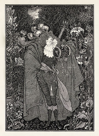
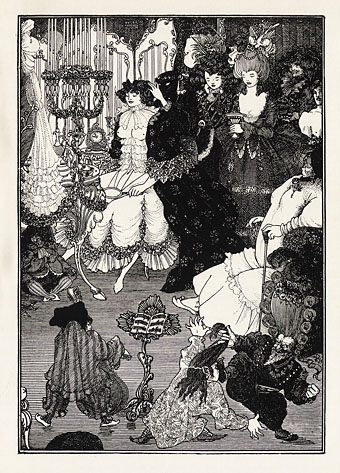
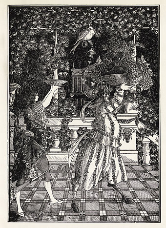
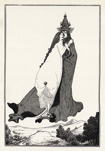
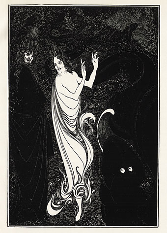
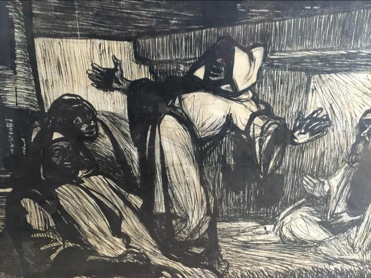
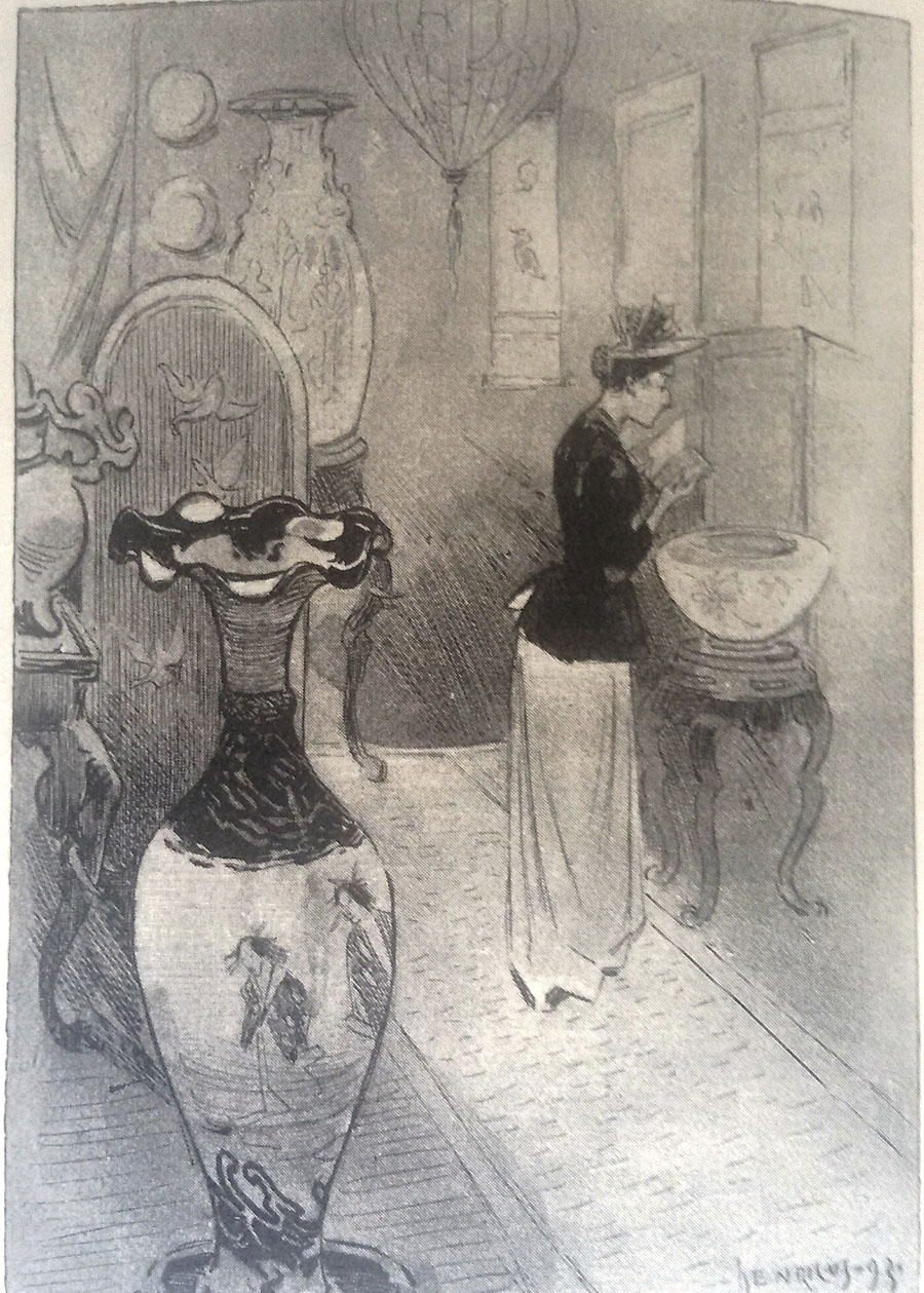
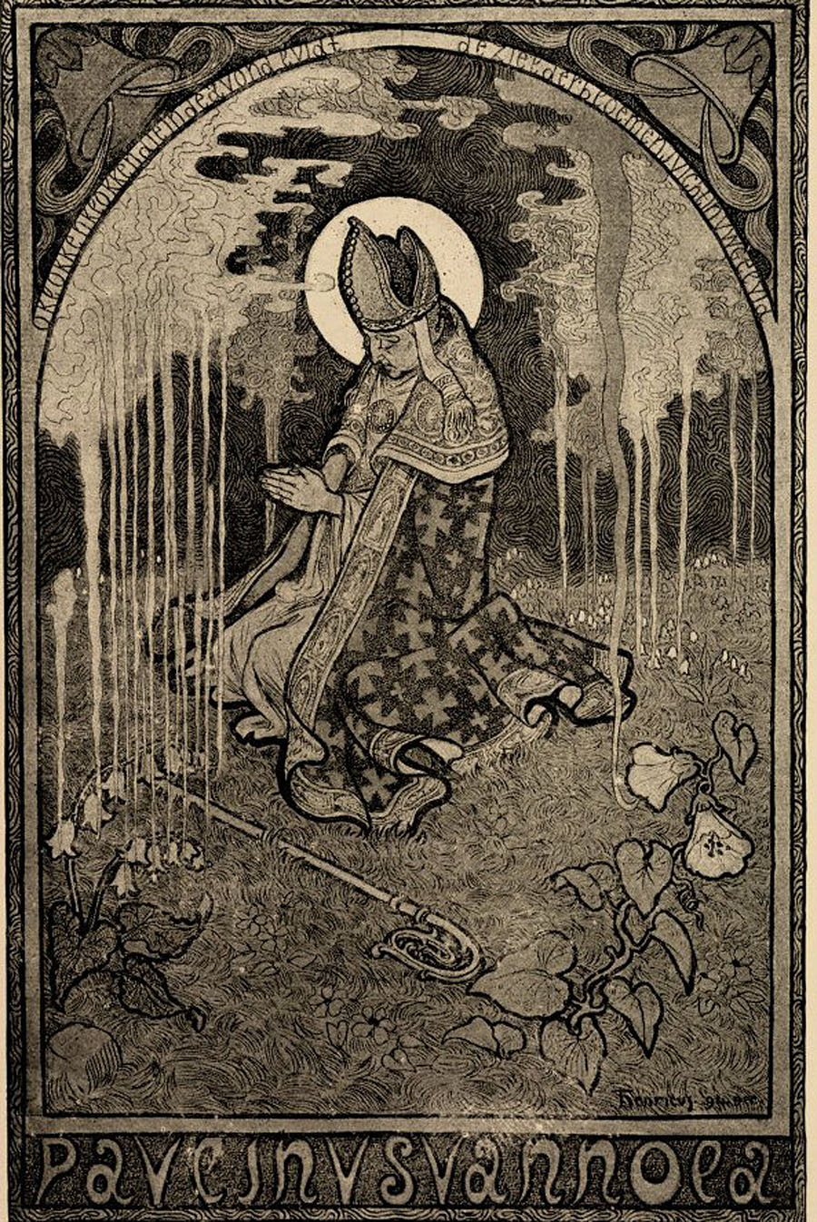
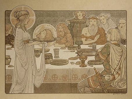
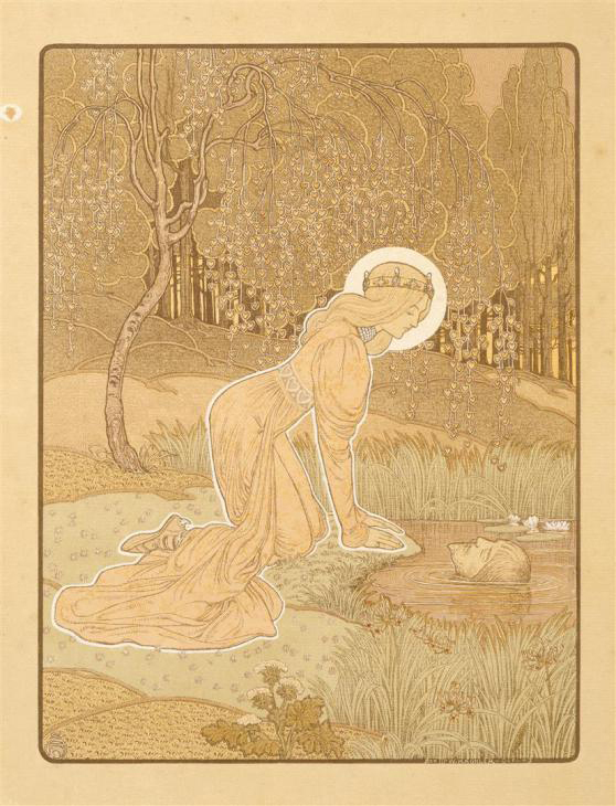
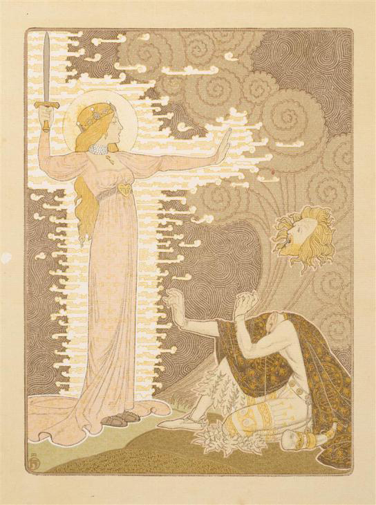
The note in the Harris book refers to a dismissal of the fakes by Oliver Brenning in the September 1919 edition of Vanity Fair, an article which may be read here (PDF). As for the Nichols book, this turned up recently at the Internet Archive so it’s now possible to see all the fakes in one place. Whoever was responsible for the Nichols drawings (I’ve seen Nichols himself credited) isn’t merely a bad imitator but is also a bad artist, with many of the drawings being remarkably graceless and inept. Beardsley’s art, especially his early work, is often grotesque (“I am nothing if I am not grotesque,” he once said) but it is never ugly. When they’re not being ugly the Nichols fakes assault one’s credulity by showing a pair of young women wearing clothes of a style unknown in the 1890s (Plate 15: “The Twins”), or plagiarising Alphonse Mucha (Plate 49: “Design for a Church Window”). I haven’t checked but I think another of the drawings may be a copy of a piece by Eugène Grasset.

nichols1.jpg

Whistler by unknown artist (not by Aubrey Beardsley, despite the signature).

Stephen Calloway is correct when he says that the fakes continue to circulate today, mechanical (and digital) reproduction having given them a life they really don’t deserve. (This post might be accused of extending that lifespan.) The Whistler portrait above is one of the more convincing examples which no doubt explains why it was credited to Beardsley in Nick Meglin’s The Art of Humorous Illustration (1973), a book from a reputable New York publisher, Watson-Guptil.

egerton.jpg

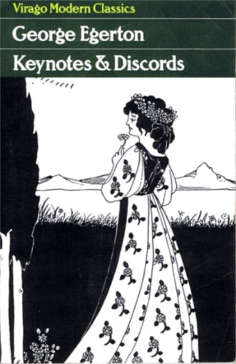
When Virago published Keynotes & Discords by George Egerton in 1995 they used another of the fakes on the cover. This was particularly ironic when Egerton’s stories had been first published in John Lane’s Keynotes series, a line of books that not only took their name from the first Egerton volume but which were illustrated by Beardsley himself. The worst example of proliferation I’ve seen in print was the Beardsley postcard book published by Taschen in the 1990s which scattered the Nichols fakes among genuine Beardsleys, thus ensuring that the uninitiated would continue to litter the world with the things. Today we have Pinterest, home of the erroneous credit. I doubt the Tate exhibition will draw any attention to the fakes but now that Nichols’ book is online it’s easier for those who suspect an attribution to assuage (or confirm) their suspicions.

Elsewhere on { feuilleton }
The Aubrey Beardsley archive

Under the Hill by Aubrey Beardsley

ab1.jpg

Aubrey Beardsley’s drawings are reprinted endlessly but his writings receive less attention even though he lavished as much care on his literary efforts as he did on his illustrations. The major work is his unfinished novel, Under the Hill, a book whose descriptive filigree is as detailed as the drawings which accompany the text, and whose erotic passages ensured that the story was never published in full during his lifetime. Extracts appeared with illustrations in The Savoy, the magazine for which Beardsley was art editor; after Beardsley’s death a longer expurgated version was published by John Lane in 1903, together with Beardsley’s other writings including two pieces of verse, The Three Musicians and Ballad of a Barber.

ab2.jpg

The Lane volume is a recent arrival at the Internet Archive, and while most of the material is familiar to me it does feature a few pages of Beardsley’s table talk which I’d never seen before. The expurgated Under the Hill is worth reading as an introduction to Aubrey’s florid writing style (and his obsession with clothing) but so much is missing that it can’t be considered representative of the author’s intentions. Under the Hill was published in full in 1907 in a private edition by Leonard Smithers, but the book had to wait until 1959 to receive a more public presentation when Olympia Press added it to their famous Traveller’s Companion series. The Olympia edition has the additional benefit of being completed by John Glassco, a bisexual Canadian poet, and accomplished pasticheur of erotic literature. Glassco not only matches Beardsley’s style while completing the story, he also provides a detailed history of the text, and a defence of its value as literature. If you’re a Beardsley enthusiast who already has most of the artwork then the Olympia book is worth seeking out.

glassco.jpg

New English Library reprint, 1966.

ab3.jpg

ab4.jpg

ab5.jpg

ab6.jpg

Elsewhere on { feuilleton }
The Aubrey Beardsley archive

The art of Henricus Jansen, 1867–1921

henricus0.jpg

This week’s post is another by Sander Bink about a neglected artist of the Dutch fin de siècle. Once again, this is an artist whose work was new to me. The Mucha-like style of the later pictures (and the one above from the same series) are especially good. My thanks again to Sander for the post.

* * *

Henricus Jansen (1867–1921) was a Dutch painter, graphic artist and illustrator who used ‘Henricus’ as his artist’s name, ‘Jansen’ being a very common and decidedly unsexy surname. He originated from The Hague where Art Nouveau and symbolism flourished in the 1890s more than any other Dutch city.

In the little that has been written about Henricus he is usually considered not to be avant-garde or progressive enough to be an ‘important artist’ (whatever that may mean). He is, however, mentioned in the standard reference work Symbolism in Dutch Art by Polak from 1955. Extensive studies have never been published about him and my main source of information about his life and work is an unpublished university thesis from 1988 by Louis Baeten of which I happen to have a copy. Baeten had spoken to Henricus’s daughter who was then still alive. According to the thesis Henricus must have made hundreds of drawings and paintings but they seem to be quite rare nowadays and seldom come to auction.

henricus1.jpg

For example, Henricus visited Tunisia in 1901 where Baeten says he produced more than 67 pastels and drawings of which “only seven survive”. These were exhibited in The Hague in 1901, and Leiden in 1907. One of these is depicted here from a private collection: a charming, somewhat cartoon-like ink drawing of three Tunisian male figures.

henricus2.jpg

From 1887 till 1892 Henricus lived in Paris where he mingled in the bohemian and artistic circles around Le Chat Noir, and knew people like Rodolphe Salis and Paul Verlaine. The drawings and illustrations he produced from around 1890 are strongly influenced by Parisian graphic artists like Steinlen, Grasset and Willette, uncommon models in Dutch art of the 1890s. Examples like the drawing of a lady in an antique market (above) are to be found in his illustrations for a book by Johan Gram, ‘s-Gravenhage in onzen tijd (The Hague nowadays) from 1893.

henricus3.jpg

More Symbolist in style, and therefore probably more of interest to { feuilleton } readers, are his illustrations for the popular magazine Elsevier’s. The picture shown here is a lithograph he made for the poem ‘Paulinus van Nola’ by the Flemish poet Pol de Mont, published in 1895.

henricus4.jpg

But his chef d’oeuvre is a series of lithographs inspired by the medieval folk song Heer Halewijn (Lord Halewijn), published in 1904 and exhibited in The Hague the same year, of which three are depicted here (from the collection Van der Peppel.) The most famous of the series is plate number sixteen in which Lord Halewijn’s head is decapitated by a charming lady. It is obviously inspired by Beardsley’s Salomé but is made with an entirely different technique and in colours. There is also a touch of Puvis de Chavannes and Carlos Schwabe to them. They are among the finest examples of Dutch fin de siècle graphic art.

Sander Bink

henricus5.jpg

henricus6.jpg

Previously on { feuilleton }
The art of Antoon van Welie, 1866–1956
The art of Simon Moulijn, 1866–1948
René Gockinga revisited
Gockinga’s Bacchanal and an unknown portrait of Fritz Klein
More from the Decadent Dutch

Weekend links 427

davis.jpg

Inside an O’Neill Cylinder, an orbital megastructure. Painting by Don Davis, 1975.

• RIP Lindsay Kemp: dancer, actor, choreographer and (if we have to drop names) mentor to David Bowie and Kate Bush. Kemp’s work has been featured here on a number of occasions, particularly his landmark productions of an all-male Salomé, and Flowers, A Pantomime for Jean Genet. There was also considerable overlap with Kemp’s troupe and the films of Derek Jarman via appearances by Kemp himself, David Haughton and the irrepressible Jack Birkett. The Genet production was filmed in 1982, and is now available on DVD. (There’s also a rougher copy with unmatched audio and video.) From 1970: Pierrot in Turquoise, or The Looking Glass Murders, a Commedia dell’arte performance for Scottish TV featuring David Bowie. And reversing roles, Mick Rock’s video for Bowie’s John, I’m Only Dancing featuring Kemp and company.

• At Expanding Mind: Erik Davis in conversation with activist and writer David Nickles about “the DMT Nexus, psychedelic militancy, extraction tek, the Statement on Open Science for Psychedelic Medicines, MAPS, and the trouble with for-profit psilocybin companies”.

• From the end of August to January 2019: Spellbound at the Ashmolean; “Spellbinding stories, fascinating objects…from crystal balls and magic mirrors to witch bottles and curse poppets”.

On Earth, as on the International Space Station, the collective misperception of a flat plane helps build community and culture. We are all equal in our geometric relationship to one another. The reality, of course, is that we do not stand parallel. Each of our bodies corresponds with a distinct radial vector on the surface of a sphere, pointing away from a common center that we can never perceive or occupy. Our vectors diverge by imperceptible angles.

In “inside-out” worlds like the Bernal Sphere and the concave Earth, the situation is reversed. Our feet all point outward, into an inaccessible, but technologically habitable void, while our heads point inward, some of us apparently “upside-down.” Standing, we rise toward a visible center, which can be reached simply by climbing a hill, strapping on wings, and jumping into the air, as low-tech as Icarus.

The Shape of Space by Fred Scharmen

Michael Moorcock again, interviewed this time by Bernard Braden in 1968. I think this one was for a Braden TV series which was never broadcast.

• “Stupid things are best”: Neil Fox on Conny Plank: The Potential of Noise, a documentary about the great music producer.

• Mixes of the week: XLR8R Podcast 556 by Helios, and An Ode to Eris with An Other Ode to Eris by The Ephemeral Man.

• A monstrous primer on the works of HP Lovecraft by Emma Stefansky. With illustrations by Michael Bukowski.

Silent Agents by Julius-Christian Schreiner: photographs of hostile architecture from around the world.

• Back to the Futuro: Mark Hodgkinson on the spaceship house that landed in Yorkshire.

• The Great Chinese Art Heist by Alex W. Palmer.

Rhizome: a new recording by Drew McDowall.

The Starman Tarot

Mad Pierrot (1978) by Yellow Magic Orchestra | Spellbound (1981) by Siouxsie And The Banshees | Sphere (2011) by Emptyset

Aubrey Beardsley and His World

beardsley.jpg

This US TV programme isn’t the greatest quality, and it’s blighted throughout with a large watermark, but it’s a revelatory piece both for Aubrey Beardsley enthusiasts and Oscar Wilde aficionados. Camera Three was a CBS arts show which presented Aubrey Beardsley and His World on 12th March, 1967, as a preview for the Beardsley exhibition which had just opened in New York. This was the same landmark exhibition that made such a splash the year before at the V&A in London, and V&A curator Brian Reade appears in the programme to discuss Beardsley’s importance with host James Macandrew. It’s good to see Reade again (he was also in a later BBC documentary) since his Beardsley monograph is a great favourite of mine; as is typical of the period, he looks and sounds very upper class but his scholarship is always authoritative.

Ordinarily this would be enough to satisfy me, even though the programme only runs for 27 minutes and doesn’t tell me anything about Aubrey that I didn’t know already. The great revelation comes near the end with the appearance of Vyvyan Holland, the younger son of Oscar Wilde. Holland not only admired Beardsley’s work but actually met him in 1895 shortly before the artist’s untimely death. Holland was 9 years old at the time, and was taken to visit Aubrey by his mother; he was 81 in 1967, and died himself later that year so we’re very fortunate that he was captured on tape at all. The programme also includes a short extract from Alla Nazimova’s 1923 film of Salomé, with costumes and decor all based on Beardsley’s drawings. Watch it here.

Elsewhere on { feuilleton }
The Aubrey Beardsley archive