Bookplates from The Studio

studio01.jpg

Cyril Goldie.

Selections from Modern Book-plates and their Designers, an overview of British, American and European designs published by The Studio magazine in 1898. These small Studio books are always good to see, not least for the period ads in the opening and closing pages. A couple of the designs are familiar from later reprints, notably Cyril Goldie’s remarkable accumulation of thorns and skulls. Many others are in the swirling and tendrilled style of Art Nouveau which The Studio did much to promote in Britain. Also of interest are a few entries from well-known fine artists who are seldom associated with this kind of design. Among these is Belgian Symbolist Fernand Khnopff who contributes a design of his own and an article about Flemish bookplate design.

studio02.jpg

Charles Robinson.

studio03.jpg

PJ Billinghurst.

Continue reading “Bookplates from The Studio”

Robert Anning Bell’s Herodias

herodias.jpg

Artist Robert Anning Bell (1863–1933) chooses to depict Salomé’s mother rather than the more usual daughter in a slightly Pre-Raphaelite take on the familiar theme. This print appears in volumes 8–10 of Studio International, and seeems to have been a one-off although I’ll be happy to be hear of any other depictions of the story by Mr Bell.

Elsewhere on { feuilleton }
The illustrators archive

Previously on { feuilleton }
The Tempest illustrated
Book-plates of To-day
Robert Anning Bell’s Tempest

The Tempest illustrated

tempest.jpg

“Such stuff as dreams are made on”: Heathcote Williams and Toyah Willcox.

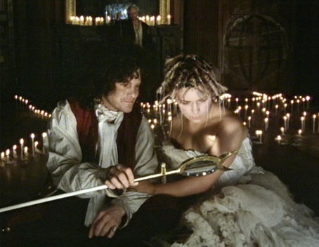
DVD viewing earlier this week was Derek Jarman’s wonderful adaptation of The Tempest which he directed in 1979. This is my favourite of Jarman’s films, partly because the play is my favourite Shakespeare (along with its polar opposite, Macbeth) and also because it’s a film infused with an occult sensibility which comes directly from the director’s own interests, rather than being the usual film or theatre conventions of what magic entails. An example of this is the grimoire which Prospero (Heathcote Williams) is seen leafing through which Jarman reveals in his autobiography, Dancing Ledge, to be his own 17th-century edition of Cornelius Agrippa’s Occult Philosophy. In his account of the filming he also describes his conception of Prospero as being based on Dr John Dee, the Elizabethan occultist who Shakespeare would certainly have known of, and may even have met since the pair both had business with Elizabeth I’s court. The most explicit reference to Dee comes in the shape of Prospero’s magical glass (above), based on Dee’s Monas Hieroglyphica, and a prop I’d dearly love to own. Dee was also a character in Jarman’s Jubilee (1978), and his Angelic Conversations gave a title to Jarman’s later filming of Shakespeare’s sonnets.

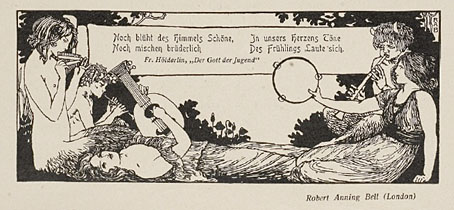
Seeing Jarman’s adaptation again had me thinking about the various representations of the characters. Ariel is generally depicted as a fairy type although he’s a lot more powerful than the fairies in A Midsummer Night’s Dream. As for Caliban, like Grendel in Beowulf, he’s an all-purpose monster whose predominant attributes seem to be whatever Ariel isn’t: ugly, earthbound, stupid, treacherous, and so on. I’d be tempted to propose the island’s quartet as representing the four elements—Prospero: water; Miranda: fire; Caliban: earth; Ariel: air—but I’m sure that’s not an original idea given the amount of academic trawling through the Bard’s corpus. Rather than dig for symbolism, what follows is a few pictures found during another trawl of my own through the Internet Archive, where the books aren’t drowned but patiently await their rediscovery.

Continue reading “The Tempest illustrated”

Book-plates of To-day

plate1.jpg

A design by Harold Nelson.

That title probably requires a (sic) for those unaware that “today” was commonly hyphenated until about 1920. Wilbur Macey Stone’s Book-plates of To-day (1902) is a small overview of the art of the bookplate at the Internet Archive. Among the artists flourishing the Art Nouveau foliage are a couple of familiar illustrators such as Robert Anning Bell (below), and there’s also a plate by the Belgian Symbolist Fernand Khnopff, the first such work I’ve seen by that artist.

plate2.jpg

Elsewhere on { feuilleton }
The illustrators archive

Previously on { feuilleton }
Louis Rhead bookplates
Pratt Libraries Ex Libris Collection
Robert Anning Bell’s Tempest
The Evil Orchid Bookplate Contest
David Becket’s bookplates

Jugend, 1900

jugend-1900-01.jpg

Continuing the rake through back issues of Jugend magazine, the German fin de siècle periodical of “art and life”, this post covers the year 1900 and will be the final Jugend image trawl. I mentioned in the post for 1899 that the magazine loses its Art Nouveau dynamism as the years pass. 1900 represents the point where all the graphics which make Jugend valued today—and which gave the name to the German manifestation of Art Nouveau: Jugendstil—are being pushed aside by the burgeoning nationalist and militarist fervour which led eventually to the First World War. At this point a couple of the notable Art Nouveau stylists such as Otto Eckman and Julius Diez are still present, and the work of Hugo Höppener, aka “Fidus” is increasingly prominent. In subsequent years the eccentric Fidus is mostly on his own, pursuing his obsession with naked figures, and his work seems even more curious in such staid surrounds. As before, anyone wanting to see more of these graphics is advised to explore the bound volumes at the Heidelberg University archive. The two books for 1900 can be found here and here.

jugend-1900-02.jpg

A picture by the Symbolist and Secession artist, Max Klinger.

jugend-1900-03.jpg

Nymphs and satyrs by English artist and illustrator Robert Anning Bell.

Continue reading “Jugend, 1900”