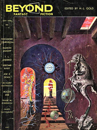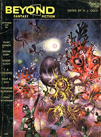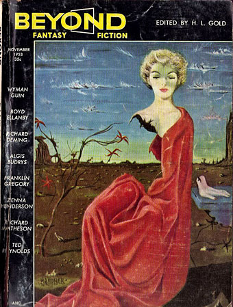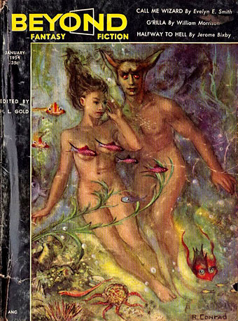
Covers for Beyond Fantasy Fiction

Beyond01.jpg

Cover by Richard Powers.

Beyond Fantasy Fiction was an American magazine edited by HL Gold that ran for only 10 issues, from July 1953 to January 1955. The title was intended to be a fantasy-oriented companion to Gold’s Galaxy Science Fiction, and with a similar design to its cover layouts. Beyond differed from Galaxy, however, by leaving its cover art consistently free of text, and it differed from other genre magazines by offering a range of art styles that were a little more adventurous than its contemporaries. Richard Powers could get away with semi-abstract weirdness on his book covers but the magazines forced him to be much more conventional. A few months before the first issue of Beyond, a very uncharacteristic painting by Powers appeared on the cover of Fantastic showing a naked woman being pawed by giant insects.

Beyond02.jpg

Cover by Richard Powers.

A couple of the other Beyond covers approach the diluted Surrealism that was still percolating through the US media in the 1950s, while the cover for July 1954 wouldn’t be out of place in a fashion magazine, at least until you notice all the witchy details. The cover by Arthur Krusz for May 1954 features the same combination of disjunctive perspectives you find in Hollywood dream sequences and Paul Julian’s designs for the 1953 animated version of The Tell-Tale Heart. If the magazine had lasted longer we might have seen more like this.

Beyond03.jpg

Cover by René Vidmer.

Beyond04.jpg

Cover by Rupert Conrad.

Beyond05.jpg

Cover by Scott Templar.

Continue reading “Covers for Beyond Fantasy Fiction”

August Heat

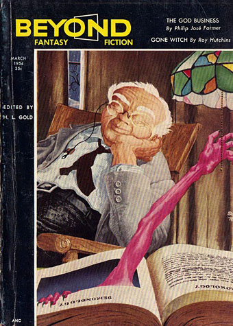
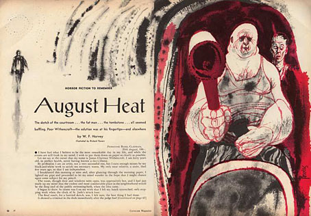
powers.jpg

Richard Powers (no date) in Cavalier magazine.

Here in The North we may not be sweltering as much as they are in the infernal South but the temperature today is still reaching 28C. Anything higher than this and work becomes impossible when my brain starts to malfunction.

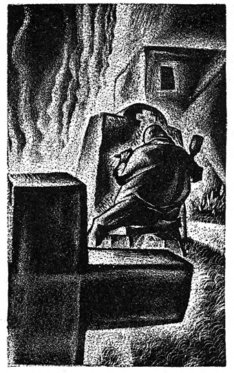
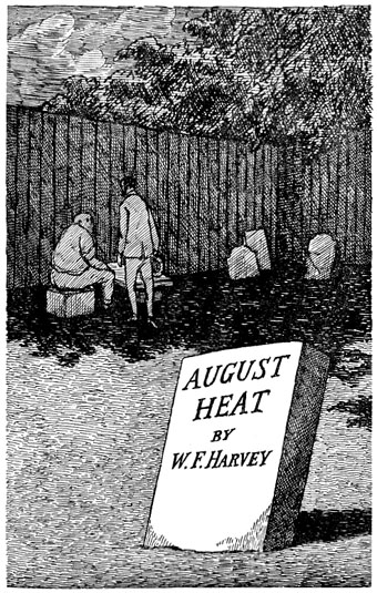
William F. Harvey (1885–1937) wrote two stories that have been anthologised many times: The Beast with Five Fingers is a tale of a disembodied hand; August Heat concerns a fateful encounter at the end of a day like today. Read it here.

ward.jpg

Lynd Ward (1937).

gorey.jpg

Edward Gorey (1959).

coye.jpg

Lee Brown Coye (1976).

Picturing Vermilion Sands

knight2.jpg

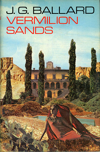
First UK edition, 1971. Art by Brian Knight.

Vermilion Sands (1971) is a story collection by JG Ballard which maintains a cult reputation despite being overshadowed by its author’s more popular (and notorious) novels. Most of the stories were written in the 1960s—a couple of them are among Ballard’s earliest works—but where many of his other short stories can read like the work of a writer with bills to pay, the tales of Vermilion Sands are much closer to Ballard’s core interests, filled with symbolic resonance and literary allusion.

Vermilion Sands, the place, is a near-future resort with a desert climate and an unspecified location; a locale where the Côte d’Azur meets Southern California but the ocean is a sea of sand. While each story has a different artistic or cultural theme, all the stories are populated by the idle midde-class types found in the rest of Ballard’s work. Ballard was more receptive to visual art, especially painting, than many authors, particularly the SF writers of his generation for whom art was less interesting than science and technology. There is science and technology in these stories (some of the latter is now inevitably dated) but it doesn’t dominate the proceedings. The stories derive less from scientific speculation than from Ballard’s desire to create a future he would have been happy to inhabit himself, an alternative to the grim dystopias which proliferate in science fiction. The background furnishings also reflect the author’s ideal, owing much to the Surrealist landscapes of Salvador Dalí and Max Ernst, a pair of artists whose works are often referenced in Ballard’s fiction. Given all of this you’d expect that cover artists might have risen to the challenge more than they have. What follows is a look at the most notable attempts to depict Vermilion Sands or its population, only a few of which are covers for the book itself.

Continue reading “Picturing Vermilion Sands”

Things

thing01.jpg

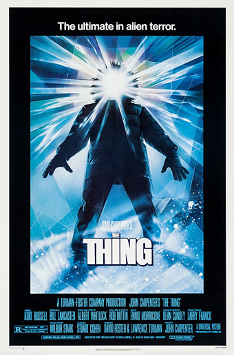
Art by Drew Struzan.

One of my current commissions is a piece of art for a book based on John Carpenter’s The Thing, due to be published next year. This was a request I agreed to immediately, having been astonished by the film when it appeared in 1982 (I saw it three times), and having rated it ever since as Carpenter’s best and also one of my all-time favourite horror films. I haven’t started on the planned piece just yet but the commission encouraged me to upgrade my DVD copy of the film to the Blu-ray version, and to also read for the first time John W. Campbell’s Who Goes There? (1938), the short story that was the origin of Carpenter’s film and also the 1951 adaptation directed by Christian Nyby. Reading the story set me hunting around for other interpretations of Campbell’s alien.
thing02.jpg

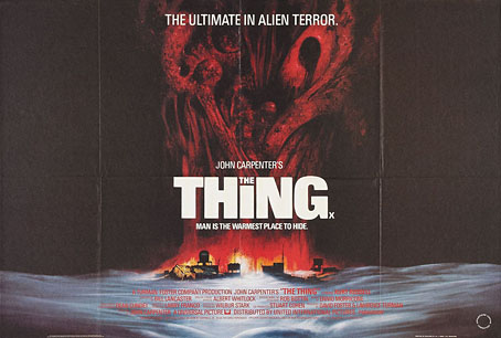
UK poster. Art by Les Edwards.

The story was instructive in several ways, the first being how closely Bill Lancaster’s script for the Carpenter film follows the story’s outline. The paperback collection I was reading has an introduction by James Blish which complains about the Howard Hawks/Christian Nyby production turning the polymorphous alien into another clone of Frankenstein’s monster. That’s true but the Nyby film still scared me to death when I first saw it aged 11 or so, and it has its merits. Lancaster not only stayed closer to the original shape-shifting premise but also kept many of the character names, plus details such as the blood test and the Thing’s attempt at the end to build a machine to escape from the encampment. The unforgettable opening, however, with the lone helicopter pursuing the dog, is all Lancaster’s.
thing03.jpg

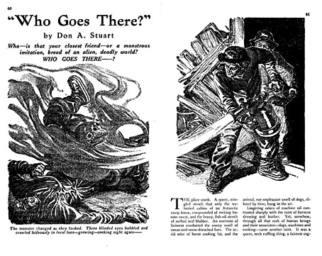
Astounding Science-Fiction, August 1938; artist unknown. “Don A. Stuart” was a pseudonym for John W. Campbell, at that time the newly appointed editor of Astounding. Campbell’s editorship changed the name of the magazine from Astounding Stories to Astounding Science-Fiction.

It was face up there on the plain, greasy planks of the table. The broken haft of the bronze ice-axe was still buried in the queer skull. Three mad, hate-filled eyes blazed up with a living fire, bright as fresh-spilled blood, from a face ringed with a writhing, loathsome nest of worms, blue, mobile worms that crawled where hair should grow—

Campbell’s description of the ice-bound alien is better than some of his writing elsewhere. I’m used to tempering my judgement when visiting stories written for the pulps but Campbell’s writing is really awful, and a reminder of why I never got very far with the early SF writers. Weird Tales magazine had its share of ham-fisted journeymen (and women) but Campbell’s contemporaries such as Clark Ashton Smith and HP Lovecraft read like the most finessed and mandarin prose stylists in comparison. But The Thing isn’t the first great film to be based on a poor-quality story so we can at least thank Campbell for his scenario, although how much of it was his own has never been clear. The idea of ancient aliens in Antarctica (some of which are amorphous shape-shifters) had already been explored by HP Lovecraft in At the Mountains of Madness; Lovecraft’s story was published in 1936 by Astounding Stories, the same magazine that published Who Goes There? two years later. This lineage, and the possible influence, makes The Thing one of the foremost Lovecraftian films even without all of its tentacled abominations.
thing04.jpg

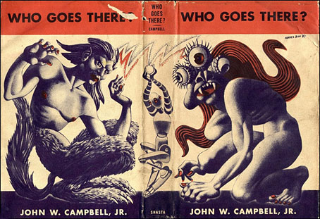
Art by Hannes Bok.

The story provided the title of Campbell’s debut collection of short fiction in 1948. I’ve known the Hannes Bok cover art for many years but hadn’t realised until recently that the three-eyed monster on the front was a Bokian rendering of Campbell’s alien. The figure on the back is presumably a human/husky hybrid, while I’d guess the robot relates to one of the author’s other stories.

Continue reading “Things”

Le labyrinthe and Coeur de secours

kamler1.jpg

Le labyrinthe (1969).

Among the new arrivals at Ubuweb there’s the very welcome addition of more animated films by Polish director Piotr Kamler. Kamler’s incredible Chronopolis (1982) was posted there late last year, a longer work than these shorter films which are nonetheless fascinating in themselves. For a start they show the range of Kamler’s animation which differs radically from film to film. Le labyrinthe is the kind of thing SF artist Richard Powers might have made had he been offered an animation commission: a human figure paces through increasingly threatening corridors and empty spaces until the winged creatures that haunt the zone bear down on him. Coeur de secours is more a sequence of events than anything that might be easily summarised; I’d seen this one years ago on Channel 4 but didn’t remember a thing about it. Chronopolis was notable for its electronic score by Luc Ferrari, and both the earlier films have similar soundtracks created by Bernard Parmegiani and Francois Bayle respectively. All these films, Chronopolis included, are collected on a recent DVD which I’ll definitely be buying. Kamler’s work, like that of Patrick Bokanowski and the Quay Brothers, goes places that films with much larger budgets can never reach.

kamler2.jpg

Coeur de secours (1973).

Previously on { feuilleton }
Chronopolis by Piotr Kamler