Golden apples and silver apples

yeats.jpg

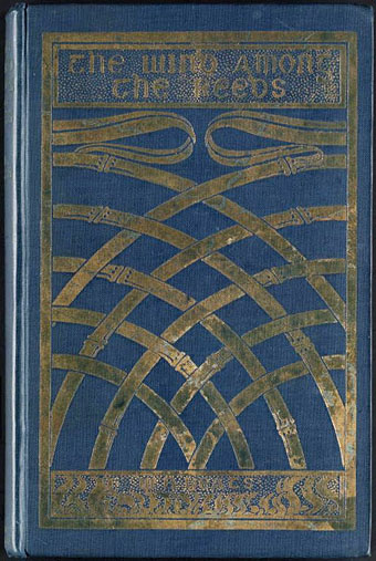
The Wind Among the Reeds (1899). Cover design by Althea Gyles.

1: The Song of Wandering Aengus by WB Yeats.

I went out to the hazel wood,
Because a fire was in my head,
And cut and peeled a hazel wand,
And hooked a berry to a thread;
And when white moths were on the wing,
And moth-like stars were flickering out,
I dropped the berry in a stream
And caught a little silver trout.

When I had laid it on the floor
I went to blow the fire a-flame,
But something rustled on the floor,
And someone called me by my name:
It had become a glimmering girl
With apple blossom in her hair
Who called me by my name and ran
And faded through the brightening air.

Though I am old with wandering
Through hollow lands and hilly lands,
I will find out where she has gone,
And kiss her lips and take her hands;
And walk among long dappled grass,
And pluck till time and times are done,
The silver apples of the moon,
The golden apples of the sun.

bradbury.jpg

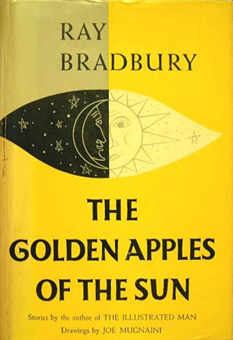
Illustration by Joe Mugnaini.

2: The Golden Apples of the Sun (1953), a story collection by Ray Bradbury.
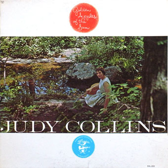

judycollins.jpg

Cover design by William S. Harvey.

3: Golden Apples of the Sun (1962), the debut album by Judy Collins. The first track is her setting of The Song of Wandering Aengus.
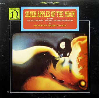

subotnick.jpg

Cover design by William S. Harvey. Artwork by Anthony Martin.

4: The Silver Apples of the Moon (1967), an album of electronic music by Morton Subotnick.
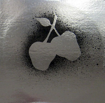

silverapples.jpg

Artwork by Anonymous Arts.

5: Silver Apples (1968), an album of electronic music by Silver Apples.
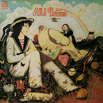

donovan.jpg

Art Direction by Sid Maurer. Artwork by Patrick.

6: HMS Donovan (1971), a double album of poems for children set to music by Donovan. The second song on side four is The Song of Wandering Aengus.
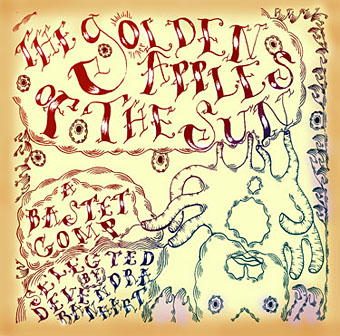

goldenapples.jpg

Cover by Devendra Banhart.

7: The Golden Apples of the Sun (2004), a freak folk compilation selected by Devendra Banhart for Arthur magazine‘s Bastet label.

Previously on { feuilleton }
The Golden Apples of the Sun

Ray Bradbury, 1920–2012

bradbury.jpg

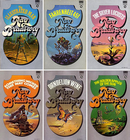
I always liked these paperback covers, a very of-their-time series published by Corgi Books in the UK from 1969 to 1970. A sea of metallic silver ink surrounded the paintings by Bruce Pennington. Seeing them together makes me wish I had the full set.

Mr. Electrico was a beautiful man, see, because he knew that he had a little weird kid there who was twelve years old and wanted lots of things. We walked along the shore of Lake Michigan and he treated me like a grown-up. I talked my big philosophies and he talked his little ones. Then we went out and sat on the dunes near the lake and all of a sudden he leaned over and said, I’m glad you’re back in my life. I said, What do you mean? I don’t know you. He said, You were my best friend outside of Paris in 1918. You were wounded in the Ardennes and you died in my arms there. I’m glad you’re back in the world. You have a different face, a different name, but the soul shining out of your face is the same as my friend. Welcome back.

Ray Bradbury’s life was like a Ray Bradbury novel. From an amazing interview at the Paris Review.

Some memorial links:
The New Yorker unlocked two Ray Bradbury stories.
• Evan says “Loves, did you know Bradbury was a poet? Now you do.”
A man who won’t forget Ray Bradbury by Neil Gaiman.

Elsewhere on { feuilleton }
The book covers archive

Previously on { feuilleton }
The fantastic and apocalyptic art of Bruce Pennington

Directed by Saul Bass

bass1.jpg

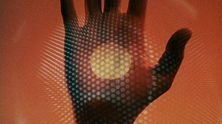
Phase IV (1974).

It’s been a thrill recently poring over the Saul Bass monograph, Saul Bass: A Life in Film & Design by Jennifer Bass & Pat Kirkham, a large volume that weighs a ton and is as revelatory about the career of a great designer (and his wife and frequent collaborator, Elaine Bass) as you’d hope. One pleasure was getting to read about Bass’s film work from his own viewpoint for once. The curious science-fiction film he made in 1974, Phase IV, is well-known enough to have a cult reputation but too often his long involvement with Hollywood is passed over as a footnote to the careers of the directors for whom he worked. In addition to his celebrated title sequences, Bass was also a visual consultant responsible for the planning and filming of what used to be called “special sequences” within films, the most notorious of which is the endlessly argued-over shower scene in Hitchcock’s Psycho (1960). (See this authoritative post by Pat Kirkham on Bass’s special sequences, and the disputed history of those few seconds of black-and-white film.)

bass3.jpg

Phase IV (1974).

All of which sent me to YouTube looking for some of the shorter films that Bass directed from the mid-60s on. The monograph explores these and Phase IV in some detail, for the latter showing pages of sketches for unfilmed sequences. I’m not sure these would have improved a film which I find flawed and occasionally ludicrous but it’s good to see what the director had in mind. The film on DVD has no extras at all but a trailer can be found on YouTube that shows off some of the startling imagery, and also includes a few shots that were cut by distributors foolishly eager to try and sell it as a horror film. It’s ironic that a man who gained world recognition for his poster designs wasn’t allowed to design the poster for his own film.

bass2.jpg

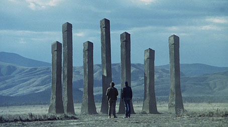
Quest (1984).

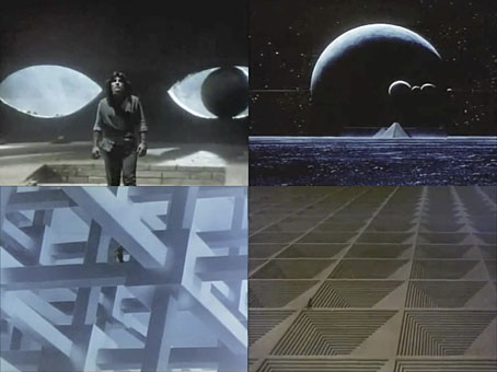
Of the short works there’s Why Man Creates (1968) here and here, an examination of the creative impulse that’s been so popular with art teachers over the years that it’s probably been seen by a lot more people than his marauding ants. Both this and The Solar Film (1980), a documentary about solar energy, utilise Bass’s hand-drawn animation. The latter is also of note for its final shot of a baby walking into a sunset, a still of which was turned by Bass into an album cover for Stomu Yamashta in 1984. Also that year, Saul and Elaine produced their strangest work, Quest, a half-hour piece of science fiction based on a Ray Bradbury short story whose quest theme is overly-familiar from a dramatic point-of-view but which typically yields a wealth of memorable visuals. In Phase IV there was a nod to Dalí with the dead man’s hand filled with burrowing ants; in Quest we find imagery borrowed from Magritte (a floating castle-topped mountain) and MC Escher (his Cubic Space Division). The copy on YouTube is rough quality but it’s certainly worth a watch. I’m amused to discover how much Saul & Elaine were prog-rock heads (not that there’s anything wrong with that…): Phase IV has Stomu Yamash’ta and David Vorhaus from White Noise on its soundtrack, The Solar Film features a dubious cover version of Tubular Bells, while the score for Quest is mostly original music (with some borrowings from Holst) that sounds much of the time like Tangerine Dream when they were leaning on their Mellotrons.

Previously on { feuilleton }
Saul Bass album covers
Pablo Ferro on YouTube

More book design

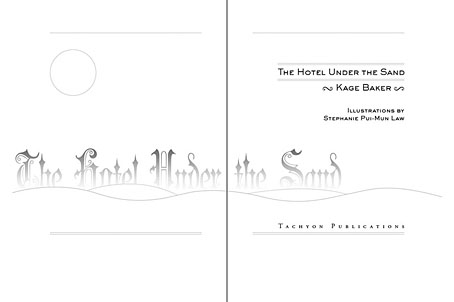
hotel.jpg

Yes, it’s been a busy year. These are books three and four respectively of the titles I’ve been designing for Tachyon Publications, and there are more on the way.

Kage Baker’s The Hotel Under the Sand is a charming fantasy for children concerning the hotel of the title and its curious inhabitants, which include a ghost bellboy and a pirate captain. The illustrations were by Stephanie Pui-Mun Law and I tried to complement these with the lettering design and graphic elements. I always enjoy working on illustrated books.

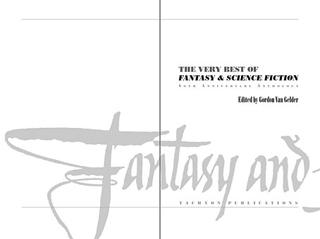
fandsf.jpg

The Very Best of Fantasy & Science Fiction is a very different beast, a big (480 pages) selection by Gordon Van Gelder of some of the many first-class stories from the sixty-year history of the fiction magazine. F&SF has published so many classic stories over the years the book could easily have been twice as big. As it is there are pieces by Alfred Bester, Ray Bradbury, Shirley Jackson, Philip K Dick, Harlan Ellison, Stephen King and Neil Gaiman, among others. The design in this case came from studying a copy of the magazine from 1967; I was already thinking of using Bodoni for the story titles and that choice was confirmed when I saw it used for the same purpose in the magazine. The calligraphic titles were also scanned from there, their design going back to the very first issue.

Both these books are on sale now, and Keith Brooke gave a glowing appraisal to the latter in The Guardian at the weekend.

Previously on { feuilleton }
Medicine Road by Charles De Lint
The Best of Michael Moorcock