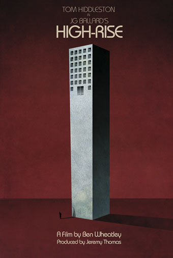
High-Rise posters

highrise.jpg

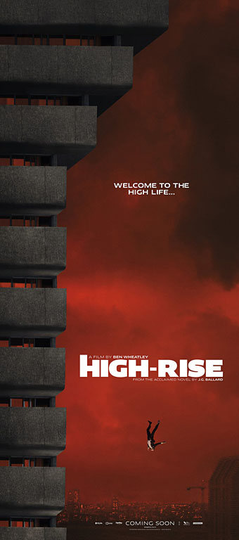
An early promotional poster from 2014 by Jay Shaw.

Ben Wheatley’s film of the novel by JG Ballard approaches. As is my custom, I’ve been avoiding the trailers of this and any other film of interest but the posters are increasingly impressive. Ben Wheatley and fellow Brit filmmaker Peter Strickland (whose The Duke of Burgundy was produced by Wheatley’s Rook Films) have distinguished themselves not only by the quality of their films but also by caring about the designs used to advertise their work. Last month I linked to a story about the dire state of the US poster world where design-by-committee is the order of the day. The designs for Wheatley’s films have been a welcome riposte to this trend. Can the film live up to its posters? Find out in March.

highrise1.jpg

The first poster shows the doomed jeweller heading earthwards for his rendezvous with a parked car. Easy to imagine this design giving a Hollywood marketing committee the vapours.

Continue reading “High-Rise posters”

Design as virus 15: David Pelham’s Clockwork Orange

clockworkbook.jpg

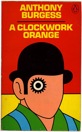
Design by David Pelham (1972).

Continuing an occasional series. Pity the poor designer who has to create a new cover for Anthony Burgess’s novel when David Pelham’s Penguin cover—created in haste forty years ago—is more visible than ever. Pelham’s design is a familiar sight on these pages but it’s also an increasingly familiar sight elsewhere, having become the primary visual signifier not only of the novel itself but also the novel’s entanglement with Stanley Kubrick’s film. Burgess came to resent the cult power of the film and the way it inflated the status of one of his early novels whilst overshadowing the rest of his work. The book still overshadows his other novels but what’s interesting now, fifty years after it was published, and forty years on from Pelham’s cover design, is seeing the novel clawing back some of the territory ceded to the film, in part because of that memorable cog-eyed face. What follows is a look at some of the subsequent reworkings of Pelham’s design.

clockworkposter1.jpg

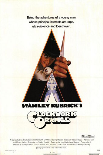
Artwork by Philip Castle, design by Bill Gold (1971).

It’s necessary to mention the original poster art first since the fat title typography gets reused more than any other part of the film’s publicity. The poster was also indirectly responsible for Pelham’s cover design when Kubrick denied Penguin any use of his promotional material:

Barry Trengove had designed a delightful cover for the Penguin edition of A Clockwork Orange and then the movie came along. While the Penguin marketing department was desperate to tie in with the film graphics, the director of the movie Stanley Kubrick wasn’t at all interested in tying in with the book. Consequently I was given the task of commissioning an illustration that gave the impression of being a movie poster. Sadly I was subsequently let down very badly by an accomplished airbrush artist and designer (whose name I will keep to myself), who kept calling for yet more time and who eventually turned in a very poor job very late. I had to reject it which was a hateful thing to have to do because we were now right out of time.

[…]

Well there I am, late in the day and having to create a cover for A Clockwork Orange under pressure. Already seriously out of time I worked up an idea on tracing paper overnight, ordering front cover repro from the typesetter around 4.00 am. I remember that my type mark-up was collected by a motorcycle messenger around about 5.00 am. Later that morning, in the office, I drew the black line work you see here on a matt plastic acetate sheet, specifying colours to the separator on an overlay while the back cover repro was being pasted up by my loyal assistants who had the scalpel skills of brain surgeons. I had wonderful assistants, absolutely wonderful.

Then more motorcycle messengers roaring around London in large crash helmets; and some days later I would see a proof. In those days, that was quick! Since those times I have often been amused to notice that my hurried nocturnal effort of so long ago appears to have achieved something of iconic status, for I’ve seen this cog-eyed image on fly-posters in Colombia, on t-shirts in Turkey, and put to a variety of uses in Canada, Los Angeles and New York. Because I did it, I spot it. Its like walking into a room where a party’s going on and, although the room is buzzing with conversation, if somebody simply mentions your name in conversation you immediately pick it up because it’s so familiar.

Penguin by Designers: David Pelham

clockworkposter2.jpg

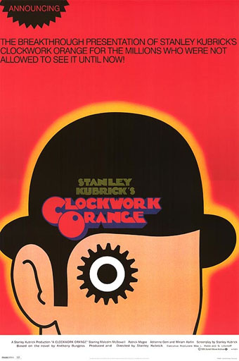
A scarce item, allegedly from 1972 (although it may be from a year later), which surprisingly uses the book design with the film poster titles. According to a film memorabilia site “This rare alternate style R-Rated poster was designed for wild posting exclusively in New York and Los Angeles”. In the US the film was given an X rating on its first release meaning that many theatres wouldn’t have shown it. Following a few edits it was reissued with an R rating. On the back of the 1972 Penguin paperback there’s notice of a copyright restriction against selling that edition in the US so Pelham’s design wouldn’t have been familiar there until much later.

Continue reading “Design as virus 15: David Pelham’s Clockwork Orange”

Helmets

fmj.jpg

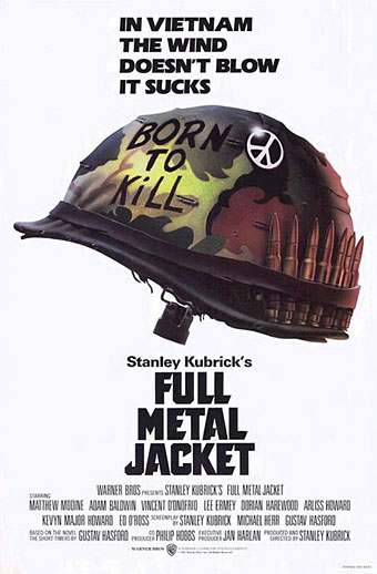
Full metal Jacket poster (1987). Illustration by Philip Castle.

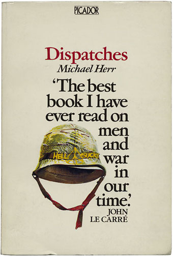
Watching Stanley Kubrick’s Full Metal Jacket on Blu-ray recently I was wondering again whether anyone has noted the similarity between the film’s poster design and the cover for the UK edition of one of its source books, Michael Herr’s Dispatches. At the risk of repeating some common piece of Kubrick lore, here goes.

Airbrush artist Philip Castle painted the helmet that’s become the perennial image used to promote the film. Kubrick often reused the services of people he trusted, and had earlier employed Castle as poster artist for A Clockwork Orange. Kubrick also oversaw the design of publicity materials for his later films so we can be reasonably sure this idea was one of his.

herr.jpg

Dispatches (1979). Illustration by Steven Singer.

Michael Herr’s collection of reports about the Vietnam war was first published in the US in 1977 with a UK edition following a year later. The cover of the US first edition is unremarkable compared to this typically excellent Picador design from 1979 (no designer is credited). That year saw the release of Apocalypse Now for which Herr wrote the narration. Kubrick was eager to turn Herr’s book into a film but neither of them could find a suitable story to provide a structure for Herr’s reportage until the director decided to weld Dispatches to the first two thirds of Gustav Hasford’s novel The Short-Timers (1979). Full Metal Jacket mixes episodes and speech/dialogue from both books: Hasford’s sniper attack on a jungle trail gets transplanted to Herr’s description of the fighting in Hue City.

hasford.jpg

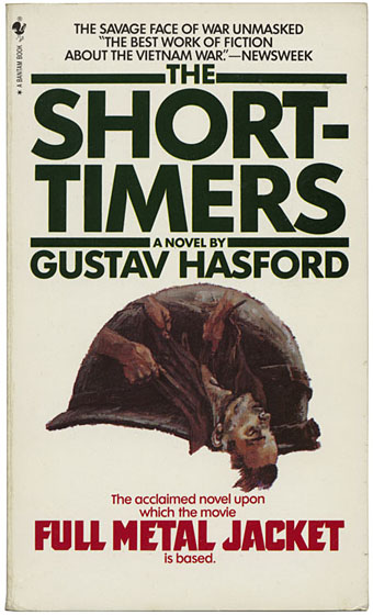
The Short-Timers (1987). No illustration credit.

Hasford’s novel was first published in the UK in this shoddy tie-in version with some generic war painting badly cropped into helmet shape in order to match the film poster. Such a good book really deserved better than this hack design. Much as I like Full Metal Jacket, when you read Herr and Hasford you have to admit that the film only captured a fraction of the horror and madness in the books. Herr’s writing is justly celebrated while Hasford’s novel seems to have been forgotten again. Anyone who likes Kubrick’s film ought to search it out, it’s an indelibly memorable and disturbing read. The sniper scene is far more brutal and chilling than its cinematic equivalent, and is delivered by stark prose like this:

The snipers zero in on us. Each shot becomes a word spoken by death. Death is talking to us. Death wants to tell us a funny secret. We may not like death but death likes us. Victor Charlie is hard but he never lies. Guns tell the truth. Guns never say “I’m only kidding.” War is ugly because the truth can be ugly and war is very sincere.

Also worth searching out is Herr’s short memoir, Kubrick, published the year after the director’s death, in which the writer describes his three-year collaboration on Full Metal Jacket‘s screenplay. It’s a generous and insightful piece of writing, worlds away from Frederic Raphael’s condescending and mean-spirited Eyes Wide Open.

Elsewhere on { feuilleton }
The book covers archive

Previously on { feuilleton }
Kubrick shirts

Weekend links 46

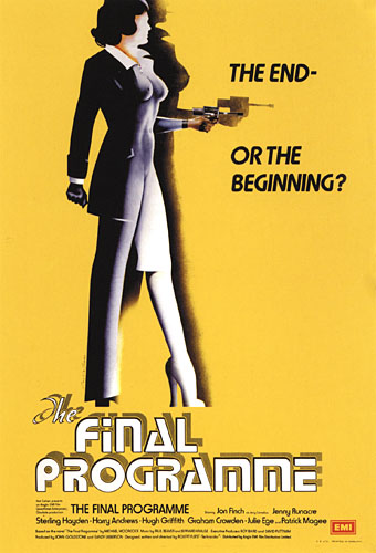
finalprogramme.jpg

The Final Programme (1973). Philip Castle’s poster art implied the androgynous finale of Moorcock’s novel which the film itself evaded.

They were musty-smelling 10p messages from the futuristic past, complete with cover designs (and content) that were unlike anything I’d seen before. I’m fairly certain that this was how I first came across Michael Moorcock, in an early-70s Mayflower paperback, with a psychedelic cover by Bob Haberfield.

(…)

Moorcock steered New Worlds towards a set of concerns that chimed with the times; this was the period ruled by Marshal McLuhan and RD Laing, and the exploration of “inner space” seemed just as interesting as the “outer space” of satellites and moonshots. This turn was controversial, not just with die-hard pulp fans, but, surprisingly, with people such as the pop artist Richard Hamilton, another denizen of the London scene. “He thought we were turning science fiction into something namby-pamby, losing its roots,” Moorcock says. “He wanted explosions and spaceships and robots.”

When Hari Kunzru met Michael Moorcock, a major feature on a great writer and cultural catalyst. Kunzru posted the full transcript of their conversation here. Jovike’s Moorcock Flickr set has many of the lurid Mayflower covers.

• Moorcock is among the contributors to the forthcoming Thackery T. Lambshead Cabinet of Curiositities. io9 posted a list of contents (and one of my pics) while co-editor Jeff VanderMeer added some detail.

• So long to The White Stripes whose dissolution was announced earlier in the week. We know they’ll be back one day. Jay Babcock gave them their first major interview for the LA Weekly in 2000 which he’s reposted here.

Mister Blues (1962) by Lasry-Baschet aka Structures Sonores, a rare 7″ single showcasing the unique glass-and-metal sounds of the Cristal Baschet. Young Teddy Lasry on clarinet was playing in prog-jazz outfit Magma a few years later. Related: John Payne on Magma and The Mars Volta.

Here’s one thing that changed me: a close reading of Flannery O’Connor’s Mysteries and Manners. In it, she says that, “it is the business of fiction to embody mystery through manners,” manners being those concrete details — depictions of the real — in story. “Mystery through manners…” I had never heard a modern author seeking deep metaphysical mystery through realism before. Well, sure, Robert Musil, Bruno Schulz, Robert Walser, and a handful of other personal faves. By deep mystery I mean, mystery about our relationship with the planet, not anthropocentric mystery. I get sick of thinking about humans quickly, as we only constitute about 1% of what’s happening in our universe, if that much, and it was refreshing to me to hear O’Connor critiquing Henry James’ idea that modern people should aspire to know nothing of mystery, to be completely rooted in humanity. That notion makes me feel like hurling myself off a cliff. In her opinion, great literature seeks to embrace and express mystery through its mimicry of actual mannerisms. Mystery — fantasy — through the real. And with that, the borders between fantasy and realism were completely transgressed in my brain. Suddenly, I saw them as two good means to the same end. This made me excited to write real human situations again.

Trinie Dalton is interviewed here.

• And speaking of mystery through the real, there’s London Intrusion, a sequence of metropolitan adumbrations by China Miéville. Am I the only person to spot an intrusion of a different kind in the presence there of one of Eugène Atget’s Parisian views? There’s a doorway to Viriconium in that curious wedge of buildings but nobody can tell you where.

Rupert Murdoch—A Portrait of Satan. Adam Curtis on top form looking at the Dirty Digger’s career and a reminder of why some of us have always called one of his rags The Scum. A key point for me: Murdoch’s insecure railing against “elites”, a favourite term of aspersion on his Fox News network.

• Rick Poynor asks What Does JG Ballard Look Like? Related: “…only two people in Bucharest are going to read this.” Eduardo Paolozzi in conversation with JG Ballard and Frank Whitford, 1971.

How many days does Bill Murray’s character really spend reliving Groundhog Day?

• Silent Porn Star explores The Translucent Beauty of Androgyny.

Ballets Russes brought back to life on film, and also here.

Dewanatron Electronic Music Instruments.

RIP Tura Satana. Remember her this way.

Warm Leatherette (1978) by The Normal | Warm Leatherette (1982) by Grace Jones | Warm Leatherette (1998) by Chicks On Speed.
A Clockwork Orange: The Complete Original Score

aco_sleeve.jpg

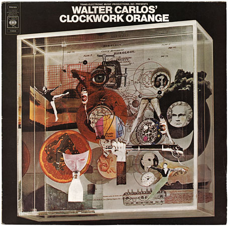
CBS 73059; construction by Karenlee Grant, photo by David Vine (1972).

A1 Timesteps (13:50)
A2 March From A Clockwork Orange (7:00)
B1 Title Music From A Clockwork Orange (2:21)
B2 La Gazza Ladra (5:50)
B3 Theme From A Clockwork Orange (1:44)
B4 Ninth Symphony: Second Movement (4:52)
B5 William Tell Overture (1:17)
B6 Country Lane (4:43)

Viddy well the stuff of obsessions, O my brothers: Kubrick, cover design and electronic music in one convenient 12-inch package. Those of us in Britain who were too young to see A Clockwork Orange during its initial run had to wait a long time for its re-release after Stanley K withdrew the film from circulation. Until bootleg VHS copies started to turn up in the 80s I knew the film mostly from the MAD Magazine parody and the soundtrack album which was ubiquitous in secondhand record shops. Having become familiar with the score, an additional layer of frustration was added when it became apparent that two soundtrack albums had appeared in the 1970s, the “official” one, which was a mix of the orchestral and electronic music used in the film, and another which contained all the music Walter (later Wendy) Carlos recorded.

The Wendy Carlos music was the principal attraction for this electronic music obsessive and I fretted for a long while trying to find a copy of her Complete Original Score album which was paraded in all its elusive glory on old CBS vinyl inner sleeves. Half the tracks are present on the official release but the omissions are crucial: Timesteps, the incredible composition which accompanies Alex’s first deprogramming session was edited down from thirteen to five minutes, there was Carlos’s Moog version of Rossini’s La Gazza Ladra (an orchestral version is used in the film) and also an original piece, Country Lane, intended to accompany Alex’s police brutality session at the hands of his former droogs. The score was one of the first projects to successfully incorporate a vocoder into electronic compositions; Rachel Elkind, Carlos’s regular collaborator, provided the vocalisations. Finally securing a copy was no disappointment, in fact I was overwhelmed. This is still my favourite Wendy Carlos album and one of my top five favourite analogue synth albums. The transcription of La Gazza Ladra is nothing short of miraculous, thundering away with the power of a full orchestra yet created by laboriously recording one note at a time. (Wendy Carlos’s very thorough website goes into detail about the recording process.)

Continue reading “A Clockwork Orange: The Complete Original Score”