Weekend links 527

equus.jpg

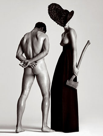
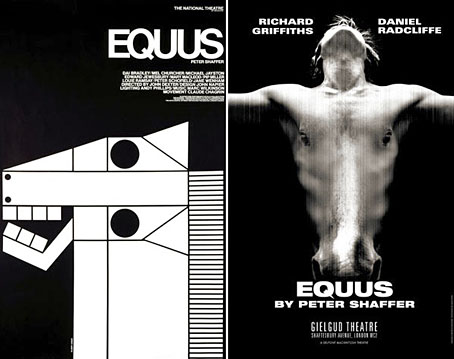
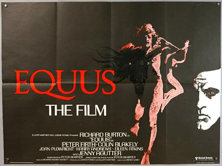
Poster art by Bob Peak.

• Sidney Lumet’s 1977 film of Peter Shaffer’s Equus receives a limited blu-ray release by the BFI in August. Richard Burton’s performance has always received a mixed response (I’ve never been in the anti-Burton camp) but the film is serious and well-made. And, as with The Offence (1973), there’s the thrill of seeing Lumet turn his attention away from his beloved New York City to examine British lives.

• “Astronomer claims to have pinpointed date of Vermeer’s View of Delft.” Yes, but how long did it take Vermeer paint the view? Speaking as someone who used to paint a lot, I’d say two or three days at least. Then there’s that awkward thing known as “artistic licence”…

• “I was taken aback by the antic side of Borges. He was irreverent, funny, insistent on his ways, and brilliantly talkative.” Jay Parini on Jorge Luis Borges, and his experience as the writer’s chauffeur in the Scottish Highlands.

• Strange Islands: Benjamin Welton on a favourite cinematic micro-genre I explored here a few years ago: the mysterious tropical island that’s a home to fearsome beasts and outsized (often deranged) personalities.

Greydogtales on The Sapphire Goddess of Nictzin Dyalhis, the Weird Tales writer with a name like a character from one of his stories.

• “I came for the giant phalluses and stayed for the joy of being a gay person.” Eight artists on the influence of Tom of Finland.

Tamsin Cleary on Nobuhiko Obayashi’s House (1977) which she calls “the world’s most demented haunted house film”. It really is.

The Gone Away, a short film by Sean Reynard for the forthcoming album from Belbury Poly.

Moorcography: the beginnings of an online Michael Moorcock bibliography.

• “Our sound engineer got a death threat”: Andrew Male on Olivia, a lesbian record label.

Bajo el Signo de Libra explores the art of Aubrey Beardsley.

• At Dennis Cooper’s: Hans-Jürgen Syberberg Day.

The secret drawings of Great Britain’s UFO Desk.

Wyrd Daze Lvl.4 is here.

The Four Horsemen (1971) by Aphrodite’s Child | All The Pretty Little Horses (2004) by Coil | When The Horses Were Shorn Of Their Hooves (2018) by Dylan Carlson

Weekend links 128

wrongeye.jpg

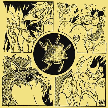
Seven-inch sleeve design by Savage Pencil for Wrong Eye (1990) by Coil.

• “Can you use sensory deprivation to explore ESP? And then make music from the process?” Drew Daniel and MC Schmidt of Matmos decided to find out for their new EP. Related: Occult Voices—Paranormal Music, Recordings of Unseen Intelligences, 1905–2007 at Ubuweb. Details of the original CD release can be found here.

Gorgeous Gallery: The Best in Gay Erotic Art is a new book by David Leddick featuring the work of contemporary gay artists. Howard G. Williams has a review at Lambda Literary.

Trip or Squeek by Savage Pencil, a book collection of the artist’s comic strips for The Wire magazine, forthcoming from Strange Attractor Press.

The novels of the middle period are Burgess’s most vital because it was in these that he forged what we might now recognize as the Burgessian – the antic puns and wordplay, the etymological digressions, the opacity, the glamorous pedantry, the tympanic repetitions, and an alliterative, assonantal musicality that makes every sentence seem vivid and extrovert: “Seafood salt with savour of seabrine thwacking throat with thriving wine-thirst”; “the lucent flawlessness of the skin, of the long fleshly languor that flowered into visibility”; “he was in a manner tricked, coney-caught, a court-dor to a cozening cotquean”. This is Burgess’s description of an Elizabethan brothel: “He entered darkness that smelled of musk and dust, the tang of sweating oxters, and, somehow, the ancient stale reek of egg after egg cracked in waste, the musty hold-smell of seamen’s garments, seamen’s semen spattered, a ghost procession of dead sailors lusting till the crack of doom”.

Ben Masters on A Clockwork Orange and its creator, fifty years on

• A streaming album for the beginning of autumn, the self-titled debut by Eraas, available in a range of formats at Bandcamp.

• “How Collecting Opium Antiques Turned Me Into an Opium Addict.”

Ted Hughes reads from Crow. Related: Raptors by Leonard Baskin.

• Janitors of Lunacy: Jonny Mugwump remembers Coil.

equus.jpg

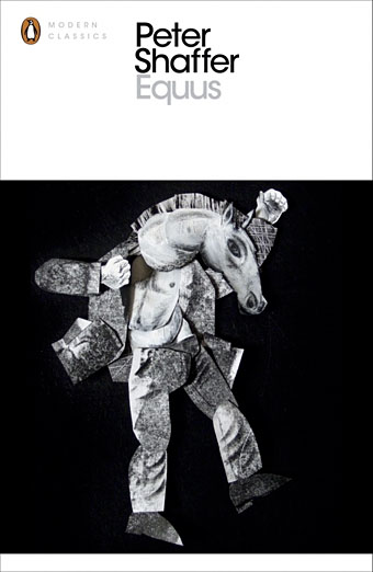
Back in June I suggested Clive Hicks-Jenkins’ paintings as potential artwork for Penguin’s Modern Classics series. Last week Clive revealed that Penguin will be using one of his painted maquettes for a new edition of Equus next year.

150 Years of Lesbians and Other Lady-Loving-Ladies

Color Sound Oblivion: a Coil/TG/related Tumblr.

Tune in, psych out: the new black psychedelia.

The Hills Are Alive (1995) by Coil | QueenS (2012) by THEESatisfaction | Goldblum (2012) by Oddience.

The art of Ron Rodgers

rodgers1.jpg

Century of Progress.

While the web has given many artists a visibility they wouldn’t have had in the past, too many artists’ sites are blighted by the dreaded “Artist’s statement” in which people who express themselves visually are forced to try and articulate for the paying customers what it is they’re doing with all this art stuff. Nowhere will you find anyone saying “I don’t know what I’m doing” or “I do this because I’m compelled to but don’t know why” or even “I do this to make a living”. All too often what you get is a rifle through the favourite jargon phrases of the social sciences where the polysyllabic words seem important but are as worn out and redundant as any of the examples George Orwell complained about sixty years ago in ‘Politics and the English Language‘.

All of which is a very long-winded and polemical way of saying I loved Ron Rodgers’ artist’s statement:

“That’s what his stare has been saying to me all this time:
‘At least I galloped – when did you?'”
– Peter Shaffer, from “Equus”

Here’s hoping more artists follow his example. There’s more of his art at the Glass Garage Gallery. Via Monsieur Thombeau who has a knack for finding good things.

rodgers2.jpg

Phoenix.

Previously on { feuilleton }
Geoffrey Haberman’s brass insects
The art of Arnaldo Pomodoro
The art of Sergei Aparin
Sculptural collage: Eduardo Paolozzi
The art of Igor Mitoraj

Equus and the Executionist

equus.jpg

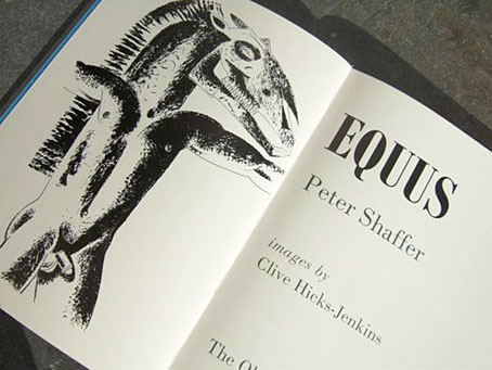
I wrote about Peter Shaffer’s fascinating play, Equus, in September last year, and in passing touched on the horse and Mari Lwyd-inspired paintings of Clive Hicks-Jenkins which seemed to complement the play’s themes of sexuality and passionate obsession. Callum James had been having similar thoughts about Clive’s art and urged his friends at The Old Stile Press to bring play and artist together. Clive was in touch last week to let me know that his illustrated edition of the play is now in print. The Old Stile Press produce limited collectors’ editions of books to the highest standard. Consequently these are expensive works but then they’re as much art pieces as books, as you can see from the care which has been lavished on this particular volume. Nice to see one of my favourite typefaces, Bodoni, used for the text.

scott.jpg

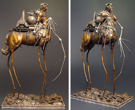
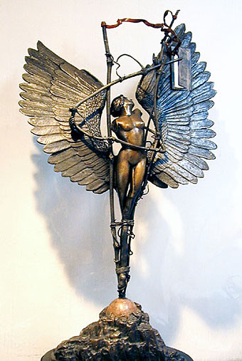
Also in touch last week was photographer Gray Scott with news of this striking picture entitled Executionist which also happens to be a limited edition print. This is another expensive piece—as limited prints tend to be—but there’s no law that says the best things have to be cheap, is there?

Elsewhere on { feuilleton }
The illustrators archive

Previously on { feuilleton }
Dark horses
Gray Scott

Dark horses

equus1.jpg

A juxtaposition of old and new theatre posters in the New York Times caught my eye this week, part of a feature about the current Broadway run of Peter Shaffer’s play. The news there, of course, has been Daniel Radcliffe’s on-stage nudity; understandable, perhaps, but celebrity trivia has overshadowed appraisal of Shaffer’s work as a piece of art.

What struck me seeing these was the two very different approaches to the same design problem. Given the subject matter, using an image of a horse is somewhat unavoidable as well as being immediately attractive since horses nearly always look good. The freight of historical and cultural association they carry is also one of the themes of the play. I really like the spare treatment of Gilbert Lesser’s 1976 poster for the National Theatre (left) and much prefer it to the new version used for the London and New York shows. The Lesser poster has the quality of a puzzle, matching the psychological piecing together of the story and Alan Strang’s accusation that Dysart the psychiatrist is always “playing games”. It also has a sinister quality lacking in the contemporary version; Shaffer’s Equus is an unforgiving god and the black eyes could refer to the blinded horses. The Photoshop horse looks altogether too mundane and is it my imagination or is the horse head misshapen slightly in order to fit the torso?

Continue reading “Dark horses”