Peter Christopherson Photography & The Art of John Balance Collected

coil1.jpg

Look at it this way / In ten years’ time / Who’ll care? / Who’ll even remember?

Coil, The Dreamer Is Still Asleep

Coil’s John Balance died ten years ago today, bringing an end to two decades of a project that, in its earliest stages, was his own solo musical venture. Ten years on, Coil and Balance have hardly been forgotten: in addition to Coil’s continuing influence in the music world, Jeremy Reed & Karolina Urbaniak recently announced Altered Balance: A Tribute to Coil, a memorial volume whose publication is followed this week by two Coil-related art books from Timeless Editions:

Peter Christopherson: Photography

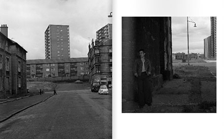
The legendary unpublished photographic work of Peter Christopherson. The b/w photos featured in the book run the gamut from personal fetishes to social commentary on 1970s UK, portraits of bands, friends and strangers. There are both snapshots and highly staged scenarios. Approximately 95% of this material is published here for the first time ever. Foreword by Claus Laufenburg and a short personal reminiscence by Thighpaulsandra. B/W hardbound, 27 x 33.5 cm, 284 pages.

Bright Lights And Cats With No Mouths: The Art of John Balance Collected

The first ever extensive overview of art (drawings, paintings and sketches) created by John Balance. The artworks featured in the book are both finished elaborate hallucinatory pieces as well as quick sketches with a good sprinkling of Balance’s often underestimated humour. Homages to idols and inspirations next to idiosyncratic magical dreamscapes executed in a wide variety of styles and mediums Compiled by Liam Thomas and Thighpaulsandra. With text by Val Denham and Jeremy Reed. Full colour throughout. 29 x 29 cm, 248 pages.

Both books are limited editions, and given the obsessive nature of Coil collectors they’ll probably sell out very quickly. Both volumes are significant, albeit for very different reasons. Peter Christopherson had a long career as a photographer, famously as one-third of the Hipgnosis design partnership, but outside his professional work, and publicity shots for Throbbing Gristle, Psychic TV and Coil, his personal work was always more alluded to than seen. One of the Hipgnosis books mentions his involvement with a group who staged realistic accident and trauma scenes for medical workers but little of this material has been seen until now. Elsewhere in the collection there are shots that resemble some of those that did surface occasionally, also some recurrent obsessions: thuggish youths, violent death, urban dereliction and male bodies. Still no sign of the photos of the Sex Pistols that (we’re told) Malcolm McLaren deemed too heavy.

The John Balance book fascinates simply for showing work that was even more hidden, and hardly alluded to at all. John and I did talk about his artistic endeavours once during our sporadic communications—the 3D scenes on the Musick To Play In The Dark albums were his creations using some PC program whose name I forget—but there was never a hint that he’d produced so much. The publisher sent me a link to their preview pages (here & here) so a few samples follow.
pc1.jpg

Continue reading “Peter Christopherson Photography & The Art of John Balance Collected”

Weekend links 171

bossi.jpg

Jeune moine à la Grecque (1771) by Benigno Bossi. Via Monsieur Thombeau.

Victoriana: The Art of Revival is an exhibition which will run throughout the autumn at the Guildhall Art Gallery, London. Some of my steampunk work will be included. Related: Rick Poynor on Soft Machine’s Dysfunctional Mechanism.

• “The egg glows and hovers in the middle of a field of mesmerizing color. The spell is broken when the guard finally says, “Everybody up off the floor.'” Morgan Meis on Aten Reign by the amazing James Turrell.

• Mix of the week: a “heatwave mix” of psychedelic songs compiled by Jaime Williams. Anything that includes Vacuum Cleaner by Tintern Abbey gets my vote.

Because sex is so compartmentalized — it’s often considered separate from the rest of life and hidden away — porn performers, who have sex publicly, are in a unique position to consider and talk about integrating private and public aspects of life.

Writer and porn performer Conner Habib on the issue of nomenclature in the porn business.

• Still Hopscotching: Peter Mendelsund posts some unused cover designs for Julio Cortázar.

A Hymn For Megatron, an hour-long drone work, and a free download, by The Black Dog.

• Vagrancy and drift: Sukhdev Sandhu on the rise of the roaming essay film.

• A Flickr set of Peter “Sleazy” Christopherson’s musical instruments.

mwc.jpg

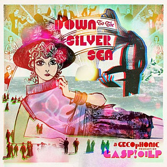
“Whether flower-pressing in the garden, hallucinating in the summerhouse, fainting inside stifling sites of historical interest, pirouetting along the promenade, or even sea-cruise thalassophobia complications, barely a moment will pass that isn’t made all the sweeter by obsessively listening to Down to the Silver Sea.”

The TM Research Archive: sate yourself on Swiss graphic design.

• A Lecture on Johnson and Boswell by Jorge Luis Borges.

• Words, sounds and robots from Sarah Angliss.

Never Built Los Angeles

Nautilus (2012) by Anna Meredith | Nature Of Light (2012) by Isnaj Dui | Popcorn (Ealing Feeder Mix) (2012) by SpacedogUK (Sarah Angliss)

Storm Thorgerson, 1944–2013

hipgnosis1.jpg

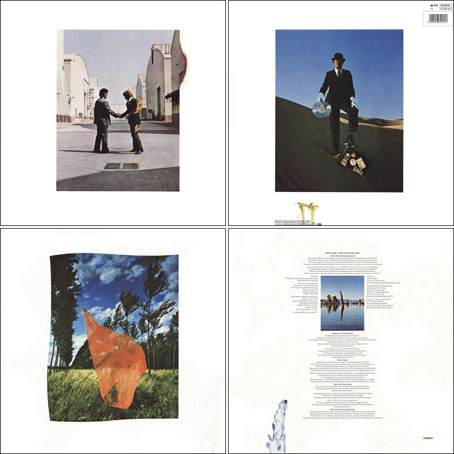
Wish You Were Here (outer and inner sleeve, 1975) by Pink Floyd.

Whenever people ask questions about your work, at some point the subject of influences always turns up. Influences for me are usually few, they’re those things which skew your perception to such a degree—or which enlarge the range of possibilities—that they make you follow a path you might otherwise have never pursued. I’ve said on many occasions that the window of our local record shop in the 1970s was an art gallery whose contents changed every week, with gatefold sleeves offering an endless variety of fantastic visions and smart designs. I was often indifferent to the music the sleeves were intended to advertise, if a favourite band happened to have a great record sleeve then so much the better. It wasn’t that I wanted to be a record sleeve designer as such, more that the views (as Roger Dean called his first book) were incredibly stimulating, and they excited me enough that I wanted to have the creation of images like that in my future.

hipgnosis2.jpg

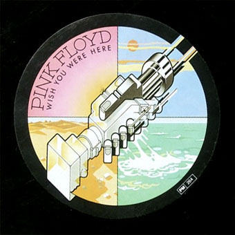
Wish You Were Here shrinkwrap and George Hardie’s sticker design.

I’ve written at some length about Roger Dean and Barney Bubbles but it was Hipgnosis that dominated those window displays during the golden age of record sleeve design. Obituaries of Storm Thorgerson have rightly been acknowledging the contributions of his Hipgnosis design partners Aubrey Powell and Peter Christopherson, but Thorgerson always came across as the driving force, a position reinforced by his text for the group’s first book collection, An ABC of the Work of Hipgnosis: Walk Away René (1978), and by his post-Hipgnosis career which continued to generate even more startling images. Walk Away René is like the designs of Hipgnosis themselves: witty, clever, and beautifully produced, while Thorgerson’s commentary is refreshingly honest both about the details of album production, and in its lack of the affectation which afflicts many design books. Working in the music business probably helped maintain a no-bullshit attitude; it’s difficult to imagine many other designers cheerfully announcing in their first public showcase that their studio is so primitive that everyone has to piss in the sink. Or, as I noted in December, drawing attention to your least favourite covers in an even more lavish showcase.

hipgnosis3.jpg

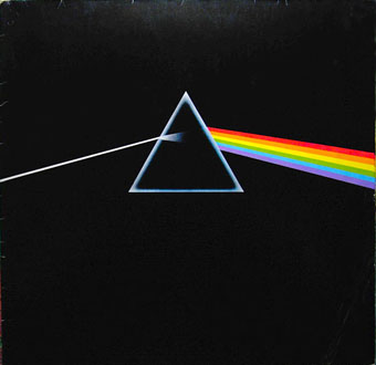
The Dark Side Of The Moon (1973) by Pink Floyd.

The cover examples here have been chosen via the essays in For the Love of Vinyl: The Album Art of Hipgnosis (2008) where several people were asked to choose their favourite sleeves. I’d find it impossible to choose a favourite, although at a push I’d probably go for Wish You Were Here. With its absence/four elements concept, in its original package—the postcard insert, the unlabelled sleeve shrink-wrapped in black cellophane then stickered with a George Hardie drawing which I once laboriously copied—it comes close to perfection when you’re discussing album designs as works of art.

hipgnosis4.jpg

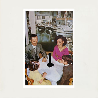
Presence (1976) by Led Zeppelin.

The Hipgnosis Covers site is the place to see more work by Storm Thorgerson and company.

Storm Thorgerson, Pink Floyd and the final secret of the world’s greatest record sleeve designer
The Guardian: “The best album designer in the world”
Storm Thorgerson remembered by Aubrey Powell
Adrian Shaughnessy at Creative Review
Mark Blake at MOJO
Telegraph obituary

hipgnosis5.jpg

Go 2 (1978) by XTC.

Elsewhere on { feuilleton }
The record covers archive

Previously on { feuilleton }
Hipgnosis turkeys
Peter Christopherson, 1955–2010
Storm Thorgerson: Right But Wrong
Battersea Power Station

Hipgnosis turkeys

turkeys.jpg

Here in Britain there’s no Thanksgiving so turkey as a seasonal meal is a Christmas dish. Turkey also has another meaning which the OED can supply:

6.6 U.S. slang. a.6.a An inferior or unsuccessful cinematographic or theatrical production, a flop; hence, anything disappointing or of little value.

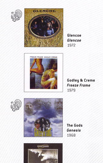
This post concerns the latter—turkeys for the turkey season—being a series of bad or merely lacklustre album covers produced by the Hipgnosis design partnership throughout the 1970s. If the label seems unfair it should be emphasised that “turkey” is the designation applied by Storm Thorgerson himself in the appendix to the third Hipgnosis book, For the Love of Vinyl: The Album Art of Hipgnosis (2008). The following are all covers that he says Hipgnosis disliked, although not necessarily because they were bad designs:

There are some designs we would rather like to forget altogether and have been awarded turkeys to denote — no disrespect is intended for the blame lies mostly with us, save for the twin spectres of release schedules and rock egoism — “That’s a jolly interesting idea chaps but… hmm… actually we’d rather have a picture of our good selves.”

A consistent feature of the Hipgnosis books is a refusal to adopt the Olympian attitude that radiates from many design monographs. Thorgerson has always been happy to describe the history of Hipgnosis, and the practice of album cover design, in warts-and-all anecdotal detail, so it’s no surprise if he also admits to failings. You’d be hard-pressed to find other designers who would draw attention to poor work in this manner, especially in a book dedicated to the highlights of a lauded career. Most designers are self-conscious types who can be relied upon to bury their mistakes as thoroughly as possible.

I wrote a brief post years ago about bad cover design but I usually try to avoid such things, there’s already enough junk in the world without compiling lists of it. But this post is instructive for showing that not everyone gets things right however good they might be, and also that everyone has to start somewhere. Most of my early album covers are various degrees of terrible so I try to spare others the accusatory finger. That said, you have to wonder what on earth Thorgerson and partner Aubrey Powell were thinking of with some of these designs.

01gods.jpg

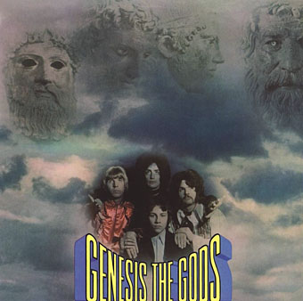
Genesis (1968) by The Gods.

Thorgerson’s introduction to For the Love of Vinyl explains the haphazard beginnings of Hipgnosis, pretty much two guys and a couple of cameras. They had no design training but a lot of luck (not least having Pink Floyd as friends), and were learning on the fly, something you can see happening with these early covers. It’s unfair to compare a design like the Gods sleeve to work they were producing a few years later when they had access to a range of professional illustrators, retouchers and models, and also budgets from record companies that paid for flights to exotic locations.

02gun.jpg

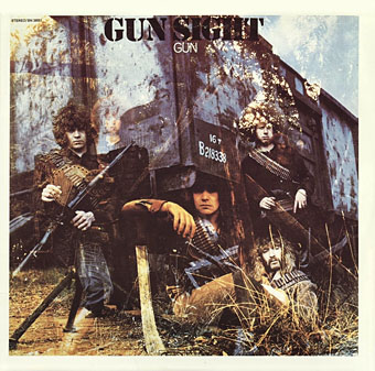
Gun Sight (1969) by Gun.

This was Gun’s second album. The cover for the first happened to feature the first album cover art by Roger Dean whose career in the music business would run parallel with that of Hipgnosis. Most of the early Hipgnosis covers are simple photos that are occasionally processed in some way. This one didn’t really work out, however, the Roger Dean cover is better.

03prettythings.jpg

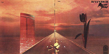
Parachute (1970) by The Pretty Things.

But at least the Gun cover doesn’t look like this bizarre attempt at Surrealist collage. Hipgnosis often tried to illustrate the album title but I can’t see how you get “parachute” from this one. The collage approach worked a lot better on the Quatermass album produced the same year.

04pepejaramillo.jpg

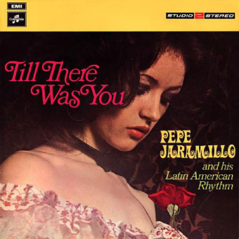
Till There Was You (1970) by Pepe Jaramillo.

This was the only cover singled out in the first Hipgnosis book, Walk Away René (1978), as something they didn’t like:

…straight down the line and utterly tasteless as a result — it doesn’t even work as a genteel piece of middle class tweeness.

Continue reading “Hipgnosis turkeys”

Witkinesque

supervert.jpg

Arriving in the post this week, a Christmas gift from Supervert, a chapbook featuring a new piece of writing that purports to be the unauthorised biography of American artist/photographer Joel-Peter Witkin. The premise is that the facts of the real Witkin’s life are far too mundane to account for his extraordinary photo tableaux so Supervert supplies details such as “Mary Witkin [his mother] worked as a bookkeeper in a DDT plant, slowly saving to enrich the unfathomable reservoirs of the absurd.” A metaphysical portrait of the artist, then, with echoes of David Lynch or Bruno Schulz. Inside the chapbook was a promo postcard bearing pictures of the delightful Ms. Stoya whose reading of Necrophilia Variations has now gained over four million YouTube views.

The Witkin book isn’t for sale but copies are available to those who enter the Supervert contest which is running throughout December. All you need do is enter an email address here then keep your fingers crossed.

witkin.jpg

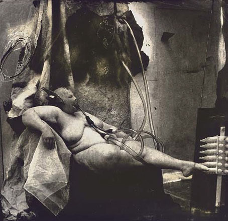
Sanitarium, New Mexico (1983) by Joel-Peter Witkin.

Witkin’s tableaux made an immediate impression circa 1993 when I bought a copy of PhotoVision, a Spanish photography journal which had devoted an entire issue to his work. This arrived at a point when I was halfway through drawing the Reverbstorm comic series, and Witkin’s parade of unorthodox humanity, crucified apes and sundry body parts seemed an ideal complement for the parade of similar grotesqueries (and sundry body parts) we were putting into the comic pages. I also liked the way Witkin worked his own variation on familiar scenes from art history, something we were doing throughout Reverbstorm (Witkin’s Vase: Study For the Base of the Crucifix just happens to combine a partly dissected human skull with Picasso’s Guernica, a recurrent motif throughout the series).

reverbstorm1.jpg

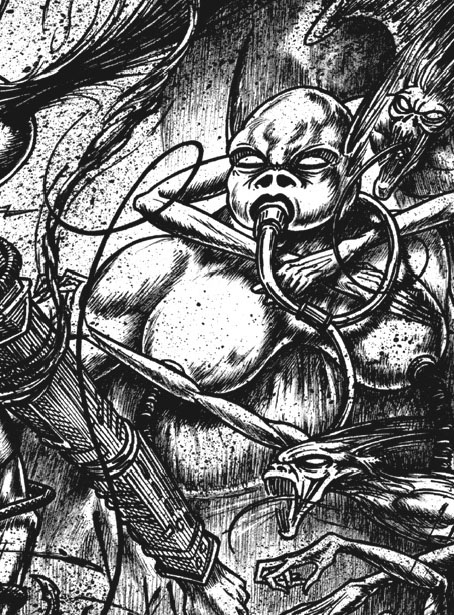
Above and below, some of the more Witkinesque details from part seven of Reverbstorm. The main figure above was a direct reference to Witkin’s Sanitarium, New Mexico. Many figures in other drawings are given Witkin-like blindfolds.

Continue reading “Witkinesque”