Alan Aldridge: The Man With Kaleidoscope Eyes

wind_from_nowhere.jpg

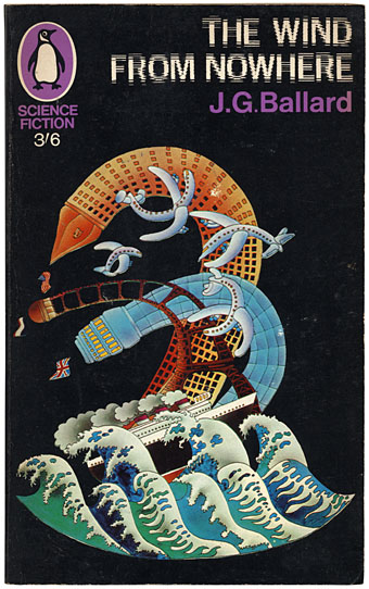
I’ve never been all that keen on Alan Aldridge‘s brand of psychedelic art but it’s worth noting here the (London) Design Museum retrospective which runs from 10 October to 25 January, 2009. Aldridge’s work as a designer and illustrator for Penguin Books in the Sixties impresses me more than his subsequent illustrated Beatles lyrics and The Butterfly Ball and the Grasshopper Feast (1973), a pair of books which seemed ubiquitous in the 1970s. Flickr has a decent selection of his book covers which included a run of sf paperbacks in 1967. Ballard’s The Wind from Nowhere is the very slight debut novel which the author prefers to forget. Where Ballard in Penguin is concerned, David Pelham’s work a few years later was a far more suitable match.

Seeing Aldridge honoured with a big retrospective make me wonder why Roger Dean hasn’t yet been given the same accolade. Dean for me is by far the better artist in terms of distinctive and memorable imagery; he’s also a better draughtsman and far more imaginative designer (not to mention having always been a speculative architect). I suspect Dean’s reputation is still blighted by his associations with Yes and the general antipathy which that band’s name generates in a certain middle-aged sector of Britain’s cultural commentariat. Ballard’s name was equally blighted in literary circles by his science fiction associations and it was Barcelona, not London, which honoured him with a major exhibition recently. There may be some home-grown reappraisals in the offing but I won’t hold my breath.

Elsewhere on { feuilleton }
The book covers archive
The illustrators archive

Previously on { feuilleton }
Ballard in Barcelona
The New Love Poetry
Penguin Labyrinths and the Thief’s Journal
Penguin designer David Pelham talks
Barney Bubbles: artist and designer
The World’s Greatest Detective

sh1.jpg

Coralie at Penguin Books sent through these cover designs today, a splendid “collect the set” republication of the Sherlock Holmes stories which should be on the shelves early next month. This follows last year’s collection of similarly repackaged Edwardian thrillers which included Conan Doyle’s dinosaur tale, The Lost World. Having recently watched the Granada TV adaptations of the Holmes stories now would be a good time to go back to the books, especially since I only recall ever having read The Sign of Four and a couple of the stories.

sh2.jpg

And on the technical side, I’ll note that my typeface mania identifies the font used for the titles of these books as Gable Antique Condensed, a contemporary design by Jim Spiece based on a Bauer typeface from around 1900. Unless it’s one of the variants mentioned by Identifont….

Elsewhere on { feuilleton }
The book covers archive

Previously on { feuilleton }
“The game is afoot!”
Boys Own Books

Penguin Labyrinths and the Thief’s Journal

labyrinths1.jpg

Detail from La Havane by René Portocarrero; photo by C. Marker.

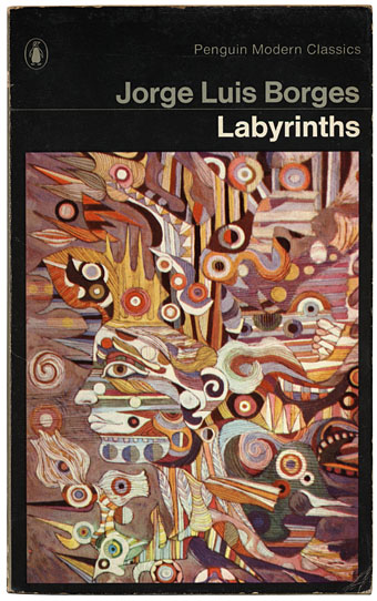
This week’s book finds are a pair of titles I hadn’t come across before in these particular editions, another haul from the vast continent that is the Penguin Books back catalogue. Labyrinths I’ve had for years in a later edition (see below) but the cover of this one seems more suited to Borges (as much as he can be illustrated) than the somewhat bland Surrealism of illustrator Peter Goodfellow. René Portocarrero (1912–1985) was a Cuban painter with a post-Picasso style who specialised in hallucinogenic profiles like the one here. And it’s a guess but I’d bet the “C. Marker” who photographed the painting is French filmmaker Chris Marker (who I compared to Borges last year), director of La Jetée and Sans Soleil. Marker worked as a photo-journalist for many years and made a documentary entitled ¡Cuba Sí! in 1961.

Continue reading “Penguin Labyrinths and the Thief’s Journal”

Penguin book covers

clockwork_cover.jpg

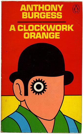
Nice collection of old covers for Penguin Books on Joe Kral’s Flickr pages. Looking over these, many of which are very familiar even though I’ve never owned them, makes me aware of how many hours of my life must have been spent in secondhand bookshops. The David Pelham cover for A Clockwork Orange has always been a favourite Penguin design. Pelham did a number of great covers for Penguin’s SF titles in the 1970s but the Burgess volume proved the most durable, unusually for a cover design surviving many reprintings. Via Boing Boing.

Elsewhere on { feuilleton }
The book covers archive