Psychedelic Wonderland: the 2010 calendar

pw00.jpg

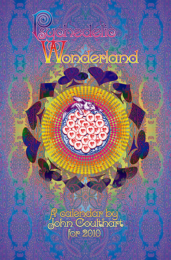
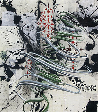
So I had a bright idea at the end of September… Instead of rehashing old work for a CafePress calendar design, I thought I’d try something new. I hadn’t done any artwork for myself all year, everything I’d been working on was a commission of some sort. In addition to that, I’d spent a large portion of the year delving deeper into the psychedelic music of the late Sixties, especially the wealth of obscure British bands to be found on the seemingly endless series of compilations which have trickled out over the past two decades. Everyone is familiar with Jefferson Airplane’s White Rabbit but, as I’ve noted before, themes from, and allusions to, the Alice books run through British psychedelia to an even greater degree. The Beatles put Lewis Carroll in their pantheon of influences on the cover of Sgt. Pepper, and Wonderland’s atmosphere of Victorian surrealism chimed perfectly with a resurgence of interest in Victorian art and design.

So at the end of September, mulling over ideas, I picked up one of my Lewis Carroll volumes and looked at the chapter list: 12 chapters…12 months…I could do a psychedelic Alice in Wonderland! The only drawback was being weighed down by ongoing work which meant that anything I did would have to be created quickly and easily. I reckoned it was manageable if I put a few rules in place first: try and rough out a chapter a day; make copious use of clip art decoration and scanned engravings; keep things bold and florid without worrying too much about fidelity to minor story points. In theory I could do the whole thing in about two weeks if I kept on schedule. As it turns out the whole thing took me three weeks as I got increasingly involved with illustrating the story. You can see the results below and larger copies of the pictures here. Two years ago I was saying I probably wouldn’t ever illustrate Lewis Carroll. That was true at the time since I couldn’t find an approach to the stories that would sustain my interest and (possibly) bring something new to the books. Seeing Alice’s adventures through the psychotropic prism of the late Sixties showed me the way into Wonderland. What’s needed now is to do the same next year for Looking-Glass Land. Watch this space.

Some notes on the pictures follow below.

Update: By popular demand, this calendar is now available again.

Continue reading “Psychedelic Wonderland: the 2010 calendar”

Marbled papers

endpapers.jpg

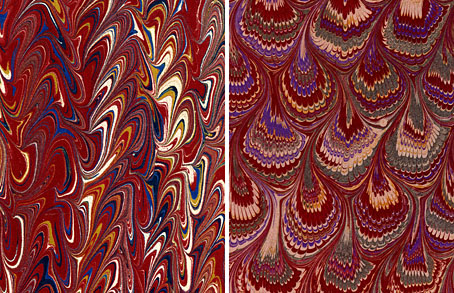
left: Serpentine pattern; right: Bouquet pattern, both 19th c.

Regular readers here will have seen a number of posts recently concerning psychedelic culture, a perennial fascination/obsession of mine. One of the notable qualities of movements such as psychedelia or Surrealism is the way they highlight what seem to be previous manifestations of themselves which, until their emergence, lacked a specific label. Borges examined the literary version of this phenomenon in his 1951 essay, Kafka and His Precursors. In art and design, the vivid and chaotic appearance of psychedelic visuals cause us to class certain products of earlier centuries as psychedelic even though they were never intended as such. The Victorian era is especially rich in this regard with its proliferation of Paisley textile designs—which saw a resurgence in the 1960s—the fractal cats of artist Louis Wain, and incredible marbled papers such as these, the samples above being from a University of Washington collection. Of particular interest is the details of their creation; the look is familiar enough but one rarely sees any mention of how paper manufacturers went about designing or even making new works. I selected a red and black marbled paper for the endpapers of The Adventures of Little Lou which we produced at Savoy Books in 2007. The sheets used for that book were handmade, not printed copies, and had to be ordered from a specialist supplier in Scotland.

Via Design Observer.

Previously on { feuilleton }
Paisley patterns
The Adventures of Little Lou

New things for April III

figment.jpg

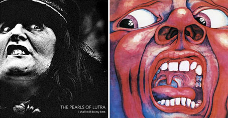
The results of the Figment album art competition have now been posted and you can see my choice of the winner on the left here. You can see the rest of the winners and read my comments on the Figment site. The winning design reminded me of the famous cover for the first King Crimson album, In the Court of the Crimson King (1969), a painting by Barry Godber. Both have an arresting quality which make you wonder what it is that’s being witnessed beyond the picture frame.

King Crimson’s debut is one of the key moments when British music abandoned the silliness of psychedelia and got down to the serious business of becoming progressive rock. For some people this means it’s also the moment when rock music Went Wrong but I’ve no time for such Spartan sophistries; Robert Fripp rules. Digressions aside, I’ve not finished with the present psychedelic obsession (no, you don’t escape that easily), and the other piece of news today comes with an alert from Valis whose radio show of psychedelic music, Trip Inside This House, runs for two hours every Tuesday morning on KBHX, St Louis, from 5am to 7am. There’s archived shows on a blog of the same name and that site currently features an interview with Matt Piucci, ex of the fantastic Rain Parade, for my money the best of the Paisley Underground bands of the 1980s. If you haven’t yet heard their finest moment, No Easy Way Down, then your life is quite simply a hollow sham.

Paisley patterns

paisley1.jpg

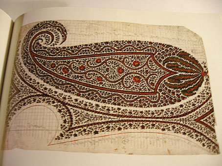
Kirking shawl design (1850).

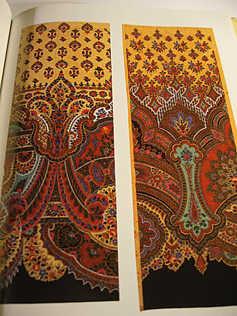
December is a month when I normally shun the secondhand shops so as to avoid being taken for a cheapskate trying to save money while Christmas shopping. Sometimes it pays to break your own rules, however, as with this discovery, Paisley Patterns: A Design Source Book (Studio Editions, 1989) by Valerie Reilly. This falls into the class of those books you didn’t know you’d wanted for years until you hold it in your hands, being a marvellous history of the evolution of the Paisley pattern from its origin in Kashmiri shawls to its development among the shawl weavers in the Scottish town of Paisley (and elsewhere) during the 19th century. With 100 colour plates it’s impossible to give a fair representation of the book’s contents but many of the examples are astonishingly abstract and worlds away from what we normally consider Victorian design.

paisley2.jpg

Silk shawl design (1860).

The pre-psychedelic splendour of Paisley (and its “Oriental” character) was what led to its popularity during the 1960s. There was plenty of Paisley clothing around in the 1970s as a result, I had a particularly garish turquoise tie when I was about 11-years old and I think it was this which first set me wondering what the design was and who invented it. As Valerie Reilly notes, the boteh teardrop shape is a motif that’s as old as civilisation and its original use in patterns can’t be pinned to a single location. One of the nice things about this book is the quantity of shawl designs taken from the Paisley Museum that have sufficient detail for you to see how the pattern makers went about creating a design. The book is out of print but a swift search on Amazon reveals a couple of similar titles. The article below is a good overview of the evolution of the shawls and their designs.

Kashmir and Shawls of Paisley Design at Victoriana.com

Previously on { feuilleton }
Flowers of Love