Seminal art and design

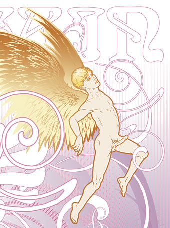
fountain.jpg

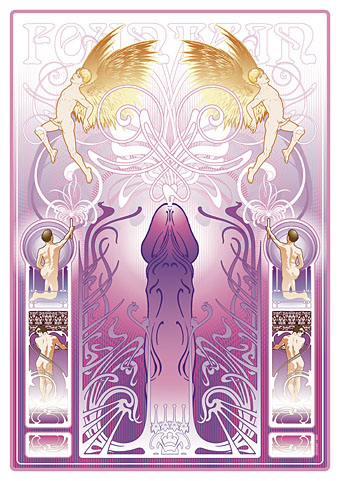
Fountain (2011) by John Coulthart.

seminal, a. and n.

A. adj. Of or pertaining to seed; of the nature of seed.

1. a. Of or pertaining to the seed or semen of men and animals (applied Phys. and Anat. to structures adapted to contain or convey semen); of the nature of semen.

Oxford English Dictionary

The Dirty Comics exhibition curated by Jon Macy opens today in San Francisco so here at last is my non-comics contribution to Jon’s erotic art show. This is something I’d had in mind for a while so it was good to have the opportunity to actually tackle the thing, and also have an outlet for it outside this website. Below I explore some of the intent and inspiration which led to the piece.

Creating some sort of gay erotica was an idea I’d had in mind for a while but it suffered from the usual syndrome whereby work with no immediate outlet gets shunted aside by the pressure of paid commissions and ongoing personal projects. It’s also the case that pieces of work I create for myself I tend to want to sell or see reproduced via a service such as CafePress. The trouble is that most of those services are based in the US which means they’re subject to that tiresome puritan attitude towards sexual content: anything other than “artistic” nudity is forbidden at CafePress, and the same applies to many other self-publishing services. There are outlets for gay erotica but I’ve not had chance to explore the best options. If anyone has any tips then please leave a comment.

closeup.jpg

This angel figure was something I’d drawn back to 2008 when I’d made a start on a similar work which fell by the wayside. One of the great things about computer graphics is being able to work on part of something which can then be picked up later and dropped into a new composition.

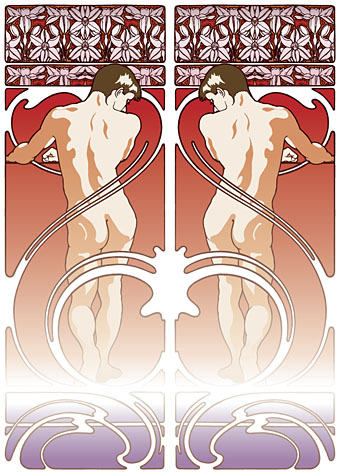
figures.jpg

So the intention was to produce a follow-up to the Dodgem Logic cover I created last year which presented a same-sex take on various Art Nouveau stylisations. The figures above are from one of the early drafts which takes a border design from Alphonse Mucha’s Documents Decoratifs (below), a series of sample borders and frames Mucha produced for the use of artists and designers.

Continue reading “Seminal art and design”

Weekend links 8

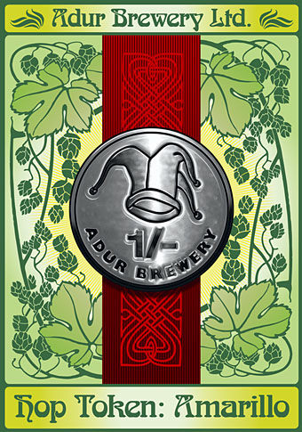
adur.jpg

Another label design of mine for the Adur Brewery. Much as I like Otto Weisert’s Arnold Böcklin typeface it’s something I’ve been reluctant to use in the past due to its lazy deployment by UK shop sign makers. The ribbon motifs and the hops are adapted from one of my Art Nouveau reference books, however, so it seemed appropriate in this case.

Dead Fingers Talk: The Tape Experiments of William S. Burroughs, a forthcoming exhibition at IMT, London, “presenting two unreleased tape experiments by William Burroughs from the mid 1960s alongside responses by 23 artists, musicians, writers, composers and curators.” Related: get a Naked Lunch t-shirt (or another cover design) at Out of Print clothing.

Ronald Clyne: American folk modernist. Rediscovering the album and book cover designer.

Better Things: The Life and Choices of Jeffrey Jones. A documentary about the work of artist Jeffrey Jones. Related: Mike Kaluta appears in the trailer and Golden Age Comic Book Stories has pages from Kaluta’s illustrated Metropolis (1988), a novel by Thea von Harbou.

• “I imagined myself as a giant penis launching off from earth like a spaceship.” WFMU’s Beware of the Blog explores Cary Grant’s use of LSD. Related: Orange Sunshine – The Brotherhood of Eternal Love and Its Quest to Spread Peace, Love, and Acid to the World, a book by Nicholas Schou.

• Britain’s armed forces have a lesson for the US: “Only 10 years ago, the Army was expelling soldiers for homosexuality. Now gay weddings get the regimental blessing.” A very modern military partnership.

Cassette tapes and their growing curiosity/fetish value. Related: Michael Stipe and Maison Martin Margiela’s sterling silver microcassette charm.

• Another week, another theremin link: Detergent bottles become theremins.

• “Edinburgh is a city built on the production of books”.

The National Archives UK’s photostream at Flickr.

Typographic playing cards.

• A song for Cary Grant: The Trip by Park Avenue Playground, an obscurity from 1967. And These New Puritans have a new video for Attack Music.

Masonic fonts and the designer’s dark materials

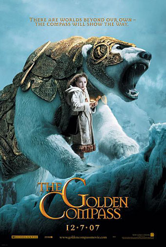
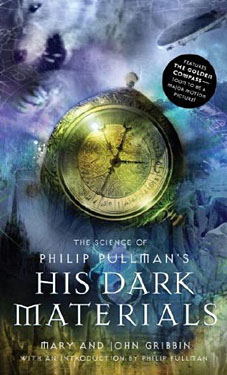
golden_compass.jpg

The trailer for The Golden Compass turned up this week, the first part of Philip Pullman‘s His Dark Materials trilogy, and I can’t help but note that the film’s designers have chosen Jonathan Barnbrook’s Mason font for the titles and the rest of the typography. This isn’t so surprising given that Mason has been used on the covers of several editions of the books already but I wonder if this flush of even greater popularity will spell (as it were) the end of a stylish typeface.

hdm.jpgMason (originally named Manson) was one of Barnbrook’s earliest published type designs, appearing in 1992 via the Emigré foundry, and over the past fifteen years has been widely imitated and become the default font for fantasy works, especially book jackets. The attraction for the genre is obvious in the way the design uses elegant and traditional serif letterforms that have been amended slightly to give them a distinctive quasi-ecclesiastical flavour, with flourishes derived from Greek, Renaissance and Biblical letters. The Gothic arch of the letter A has also helped make the font a popular choice for New Age or occult books. Mason was designed as a set of serif and sans serif variations but it’s Mason Serif Regular which is used the most. (The cover for The Science of His Dark Materials shown here is using both the sans serif variation and Mason Regular Alternate.)

Distinctive fonts take a while to get around and I don’t recall seeing Mason until at least 1994. From 1995 to 2000 it began to appear everywhere, even in newspaper ads for a while, before finding a permanent place in the book world. The trouble with this kind of ubiquity is that the novelty the design once possessed quickly vanishes and it begins to runs the risk of becoming a design cliché. Many typefaces go this way, especially in the publishing world where the choice of typeface is often dictated by genre expectations. So Orbit-B and its variants used to signify “science fiction” or “the future” in the 1970s, Caslon Antique and Rubens have become associated with horror while FF Confidential has been over-used for crime novels.

Continue reading “Masonic fonts and the designer’s dark materials”

Arnold Böcklin and The Isle of the Dead

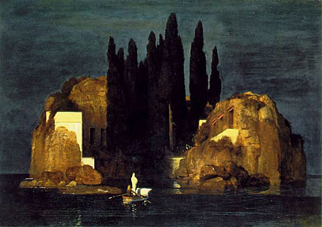
iod_basle.jpg

Another favourite painting for many years and Böcklin’s most well-known work.

Arnold Böcklin (1827–1901) produced several different versions of the painting. All versions depict an oarsman and a standing white-clad figure in a small boat crossing an expanse of dark water towards a rocky island. In the boat is an object usually taken to be a coffin. The white-clad figure is often taken to be Charon, and the water analogous to the Acheron. Böcklin himself provided neither public explanation as to the meaning of the painting nor the title, which was conferred upon it by the art dealer Fritz Gurlitt in 1883. The first version of the painting, which is currently at the Metropolitan Museum in New York City, was created in 1880 on a request by Marie Berna, whose husband had recently died.

Continue reading “Arnold Böcklin and The Isle of the Dead”