The art of Nick Hyde, 1943–2018

hyde05.jpg

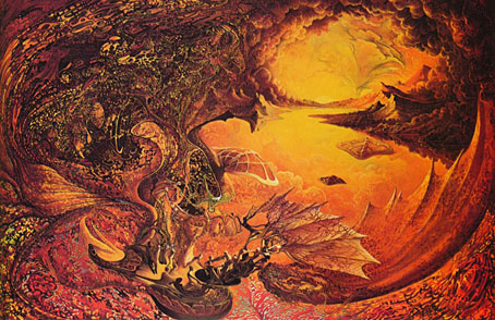
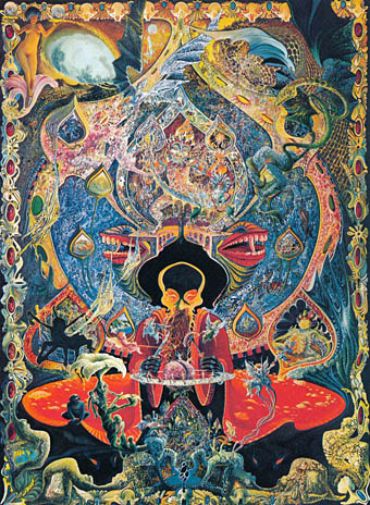
Estate of Man (1967).

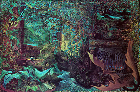
A short tribute to American artist Nick Hyde who I’ve been informed died last month. Hyde’s extraordinary paintings were featured here a few years ago after I found a copy of Visions (1977), an art book devoted to artists of the loosely-affiliated California Visionary school. Most of the paintings in the book are a type of fantastic art (not to be confused with fantasy art) that owes much to the hippy mysticism that later became codified as “New Age”, a vague term which covers a lot of territory. Several of the paintings were featured in the early issues of OMNI magazine but I don’t recall Nick Hyde’s art being among them. Hyde’s early paintings are darker and stranger than those of his Visions contemporaries, and they were ones I inevitably preferred to the rest, hence my earlier post highlighting his work. There isn’t much else I can say about him other than pointing to the official website and posting the following appraisal by Walter Hopps from Visions. All the paintings here are from Visions, and several of them (Abraxas in particular) look like they need to be seen at a much larger size.

hyde06.jpg

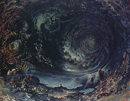
Cryptyde (1967).

I am not trying to clean myself of impurities, but to venture into a very real situation. I consider myself a true visionary—it comes to me and I flow with it. My imagery is always a dance.” Nick Hyde, 1976

The powerful nature of Nick Hyde’s art stands in certain important ways vividly apart from that presented here by his visionary colleagues. Rather than scenes of cosmic calm, serene process, or peaceful resolution, Hyde pours forth effulgent compositions of both hallucinatory intensity and tumultuous activity. The myriad visual events and details brought forth in an all-at-once total vision in Hyde’s paintings give rise to a unique tension between what seems the most violent of struggles and the most delicate of dances. In maintaining qualities of such polarity Hyde reveals a mastery of a sinuous, insinuating line structure that both divulges and dissolves images.

hyde03.jpg

Inside Out Breaking Free (1968).

In his extraordinary allegorical painting Estate of Man, human figures are disgorged from a Gothic tracery of lines that suggests the network of nerves of a livid inner eye. Closer inspection reveals the jaws of a hell-mouth that swallows these figures and assimilates them as functioning fibers in a self-conceiving infernal machine. At upper right, however, in a zone of apparent transcendence, Hyde paints a luminist landscape at the moment of sunrise. It is perhaps where one is to find redemption in the Eye of God: or is it merely the burning earth that bears man to offer him to hell?

hyde01.jpg

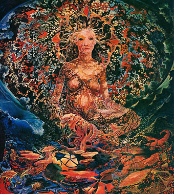
BethAnn (1969).

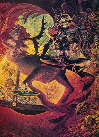
Hyde’s painting Abraxas touches on a note of subtle, mordant humor: the mythoid monster and his serpent-headed mate entwined in an infernal lair is, at the same time, a gentleman with his lady, reclining at ease, casually smoking. and telephone in hand. A clock—on the fire-place mantle at the right of the composition—is without hands, and ornamented by two barely perceptible figures. They repeat in reverse the pose of the two polymorphic companions. Abraxas, a god of good and evil, exists in a world abandoned of time, of rhythmic mimesis, of smoldering mockery. —Walter Hopps

hyde02.jpg

Urp (1970).

hyde04.jpg

Abraxas (1971).

Elsewhere on { feuilleton }
The fantastic art archive

Previously on { feuilleton }
Visions and the art of Nick Hyde
Future Life magazine

future1.jpg

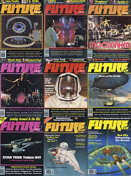
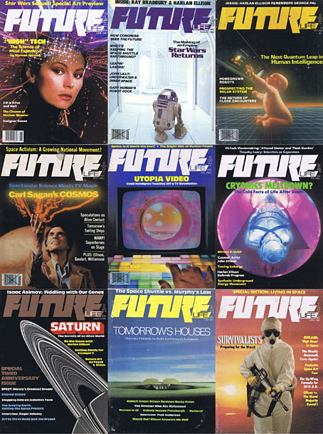
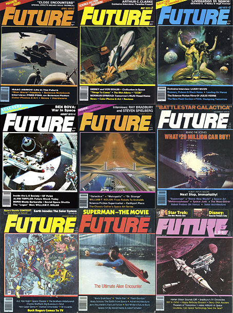
One thing I never expected about the future was that so many of my youthful enthusiasms would keep rising from the past, but here’s another, stumbling into the room reeking of cemetery earth and old newsprint. Future Life was a spinoff from Starlog magazine, and where the parent title concerned itself with science fiction and fantasy in film and television, the focus of Future Life was technology, popular science, scientific speculation, and written science fiction (all from an American perspective, of course); film and TV productions were there to attract general readers but never dominated the proceedings. Future Life ran for 31 issues from 1978 to 1981, and in many ways the magazine was a kind of OMNI-lite: not as lavish as its rival but not as expensive either. For a while this was a magazine I always looked out for (together with Heavy Metal, with whom it shared a music writer, Lou Stathis) but I missed the first nine issues, and many of the later ones before it vanished altogether, so it’s gratifying to find the complete run available as a job lot at the Internet Archive.

future2.jpg

It’s become commonplace today to regard Generation X as the first generation with no optimistic future to look forward to, but Future Life shows how much optimism there was at the beginning of the 1980s. The mood darkened just as the magazine expired, with genuine fears of a nuclear war persisting through much of the decade, and the Challenger disaster reminding everyone that leaving the planet was still a hazardous business. Future Life wasn’t blind to the problems posed by technology—there were features about the dangers posed by nuclear power and climate change—but it remained upbeat about the potentials, especially where space colonies were concerned. Most issues carried an art feature although these were generally about realistic space artists or spaceship painters, with none of the eye-popping weirdness favoured by OMNI. But this magazine was my first introduction to the work of Syd Mead, a few years before Blade Runner made him deservedly famous. On the writing side, many of the articles were by popular science fiction writers—Roger Zelazny on computer crime, Norman Spinrad on a pet theme, the future of drug-taking—which you can now read with the full benefit of hindsight. In later issues there was Harlan Ellison filing a succession of lengthy and inimitable film essays; several pieces by Robert Anton Wilson; and some good music articles with features on Larry Fast (issue 12) and Robert Fripp (issue 14), while Lou Stathis profiled and interviewed Bernie Krause (issue 18), The Residents (issue 19), Patrick Gleeson (issue 22), Jon Hassell (issue 24), Captain Beefheart (issue 25), and everyone’s favourite robots, Kraftwerk (issue 31).

future3.jpg

The Internet Archive currently has all the files stuck on a single page so most people will either have to download everything at once (I’d advise using the torrent file) or sample issues at random. Fortunately there’s a very thorough breakdown of the entire run of magazines here for those who prefer to pick through the detail. In the universe next door we’re reading these back issues while floating above the earth in our L5 space colonies.

Previously on { feuilleton }
Science Fiction Monthly

Dan O’Bannon, 1946–2009

alien.jpg

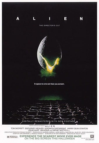
Re-release poster by Bemis Balkind.

Alien was a big deal for me when it appeared in late 1979, one of those films that seems to arrive at exactly the right moment. I’d just left school, I was eagerly reading reprints of French and Belgian comic strips in Heavy Metal magazine, and also paperback reprints of science fiction stories from New Worlds; I was listening to Hawkwind and becoming increasingly obsessed with HP Lovecraft. I was, in short, the target audience for a serious SF-themed horror film with contributions from major artists like HR Giger and Jean “Moebius” Giraud, and I went to see it three times in a row.

Watching Star Wars two years earlier (for which Dan O’Bannon created the computer displays), I’d enjoyed the special effects but been disappointed by its space-opera tone and dumb heroics. HR Giger’s large-format Necronomicon art book was published in the UK the same year and the sight of his work was a revelation for the way it pushed Dalí-esque Surrealism to a pitch of unprecedented mutation and malevolence. A year later his paintings were appearing in Omni magazine but it was Alien which exploded his popularity. Throughout 1979 you could hardly open a magazine or newspaper without finding a Giger interview or examples of his work. Alien benefited from the SF boom that Star Wars generated but Dan O’Bannon didn’t need George Lucas’s feeble mythology to point him towards science fiction, he’d already made one low-budget sf film, Dark Star, with John Carpenter, and was planning the effects for Jodorowsky’s ill-fated Dune project years before the world had heard of Luke Skywalker. Dune introduced him to Moebius, and the pair collaborated on an SF-noir strip, The Long Tomorrow, which was published in Heavy Metal in 1977. But it was Giger’s connection with the Dune project which proved crucial for Alien:

“(Dune) collapsed so badly,” O’Bannon says, “that I ended up in L.A. without any money, without an apartment, without a car, with half my belongings back in Paris and the other half in storage.”

He retreated to the sofa of a friend, screenwriter Ron Shusett, and didn’t leave it for a week. But depressed or not, O’Bannon knew he had to get back to work. He got his files and typewriter out of storage, and he and Shusett went to work on stacks and stacks of partially completed ideas.

“We pulled out one that I liked very much,” he says, “an old script called Memory that was half-finished and was basically what the first half of Alien is now. I told Ron I’d never been able to figure out the rest of the story. So he read it and said, ‘Well, you told me another idea you had once for a movie. It was the one where gremlins get onto a B-17 bomber during World War II and give the pilots a lot of trouble. So why don’t you make that the second half and put it on a spaceship?’

“That was a great idea, but then we had to figure out the monster. Well, I hadn’t been able to get Hans Rudi Giger off my mind since I left France. His paintings had a profound effect on me. I had never seen anything that was quite as horrible and at the same time as beautiful as his work. And so I ended up writing a script about a Giger monster.”

The working title was Star Beast. O’Bannon had a fortunate brainstorm late one night as he continued to write while Shusett slept. “I was writing dialogue and one of the characters said, ‘What are we going to do about the alien?’ The word came out of the page at me and I said, ‘Alien. It’s a noun and an adjective.’ So I went in the other room and shook Ron awake and told him and he said, ‘Yeah, OK,’ and went back to sleep. But I knew I had found a really hot title.”

The Book of Alien (1979) by Paul Scanlon and Michael Gross

Lest we forget, it was O’Bannon who insisted that Ridley Scott look at Giger’s work during the production of the film after artist Ron Cobb failed to produce a sufficiently nightmarish creature. O’Bannon’s script was mauled by Walter Hill who removed sub-plots, and further scenes were trimmed to speed the pace, but Alien‘s unique atmosphere remains as potent today as it was in 1979. It’s ironic that O’Bannon died in the week that James Cameron’s Avatar (which happens to star Sigourney Weaver) is released. To watch all four Alien films in sequence is to witness progressively diminishing returns, and it was Cameron’s sequel which set the pattern for the later films by dropping the adjective part of the O’Bannon’s title in favour of the noun. There had been plenty of movie monsters before but it was the inhuman quality which we label “alien” that O’Bannon and Giger brought to SF cinema. It’s a quality that few have been able to deliver since, not least in Avatar which (from what I’ve seen) looks less alien than something Frank R Paul might have painted in the 1930s. O’Bannon did a lot more after Alien, of course, but it’s his first big success which will always mean the most to me. I recommend Ridley Scott’s director’s cut from 2003 which restored scenes and shots removed from the original release.

Remembering the late, great Dan O’Bannon
The first action heroine: Ellen Ripley and Alien, 30 years on

Previously on { feuilleton }
Alejandro Jodorowsky’s Dune
The monstrous tome

The art of Mati Klarwein, 1932–2002

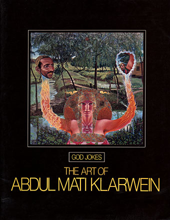
godjokes.jpg

If book collecting is frequently a waiting game, some waiting periods can be longer than others. In the case of Mati Klarwein’s God Jokes, my patience and hope have sustained themselves for 28 years until I finally acquired a copy this Thursday afternoon. God Jokes was the second book of Mati Klarwein’s work, published by Harmony Books, New York, in 1976, a slim catalogue-style collection of his paintings, some of which were featured in the early issues of Omni magazine. In 1979 and 1980 God Jokes turned up in a chain of UK remainder shops and for a while it seemed like everyone I knew owned a copy which possibly explains my unaccountable decision to avoid buying one myself. As the years passed and I became increasingly enamoured with Mati Klarwein’s work I came to regret that decision, not least because the book seemed to disappear completely. Copies have turned up since on Abe.com but at bizarrely inflated prices (£50 for a 56-page art book?!). I paid £4.99; patience sometimes pays off.

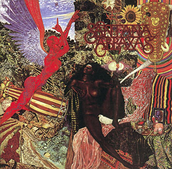
abraxas.jpg

Abraxas by Santana.

Mati Klarwein’s work has been most visible via the album sleeves of the Sixties and Seventies which borrowed his pictures for their covers. Chief among these is one of the best Santana albums, Abraxas (1970), which used his stunning 1961 painting The Annunciation (and a lettering design by Robert Venosa), and one of all-time favourite albums, the Miles Davis masterpiece Bitches Brew (1970). Miles Davis was a great Klarwein enthusiast for a while and commissioned new work for his Live-Evil album in 1971.

davis.jpg

Live-Evil by Miles Davis.

It’s not necessary to go into detail describing Mati Klarwein’s work when you can go to the web gallery maintained by his family and feast your eyes there. Klarwein is one of the few 20th century artists to have taken Salvador Dalí’s photo-realist painting style and make of it something unique to himself; his work is always immediately recognisable. That this work is still known mainly for its illustrative connections tells you more about the iniquities of the art world than it does about the value of the paintings as works of art.

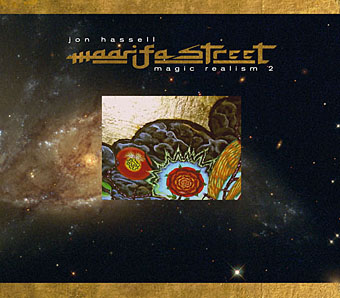
maarifa.jpg

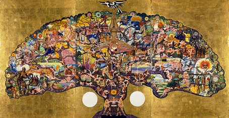
The most curious thing about having to wait so long to find a copy of God Jokes was that I ended up working with a picture of Mati Klarwein’s three years before I found the book; I would have expected to find the book one day but the latter eventuality was far less predictable. In 2005 Jon Hassell asked me to design his new CD, Maarifa Street, and Jon was keen to use a tiny video detail he made of a huge and incredible Klarwein painting, Crucifixion (1963–65). The detail is the rectangle in the centre of the cover, juxtaposed against some Hubble galaxies: the very small against the very large. We used the painting itself and further details inside the digipak. Jon was another of those who used Klarwein’s art for his album sleeves (for Earthquake Island, Dream Theory in Malaya and Aka-Darbari-Java/Magic Realism) and the two men became great friends as a result.

crucifixion.jpg

Crucifixion by Mati Klarwein.

Jon Hassell writes about Bitches Brew—and Mati Klarwein’s sleeve art—here. His site also includes a 1998 Mati Klarwein interview from The Wire in which the painter discusses his life and work. If you want a copy of God Jokes for yourself, be prepared to wait…or pay over the odds.

Elsewhere on { feuilleton }
The fantastic art archive

Elsewhere on { feuilleton }
The album covers archive

Previously on { feuilleton }
Ballantine Adult Fantasy covers
Visions and the art of Nick Hyde
The poster art of Marian Zazeela