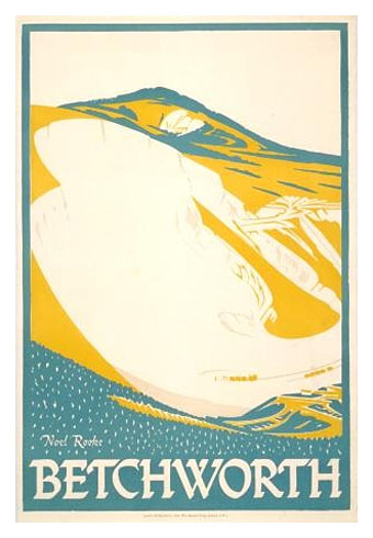
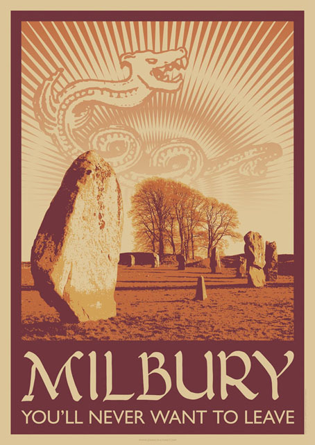
A little something I ran up this weekend inspired by a certain TV serial which has been the subject of discussion recently. This is now a new design at CafePress. The idea was to do a travel poster in the style of those produced by London Transport in the 1920s promoting their destinations outside the city. I’ve always liked the colours and bold design of those prints so this piece is based on posters by artist Noel Rooke (1881–1953).

Betchworth by Noel Rooke.
The picture of the stones was adapted from a photo by Jim Champion which is made available under the Creative Commons licence. I took the liberty of enlarging the stone on the left to give it more presence. I couldn’t find a font that was a good match for Noel Rooke’s pen lettering so I scanned an alphabet from a lettering book my mother used to use when she was at art school (thanks, Mum!). The snake design is based on a postcard seen in the TV serial; nothing else looked as effective, and the combination of the snake with the slogan adds the requisite sinister touch.
Previously on { feuilleton }
• A Journey to Avebury by Derek Jarman
• Children of the Stones
• Avebury panoramas

