Martin Sharp, 1942–2013

sharp1.jpg

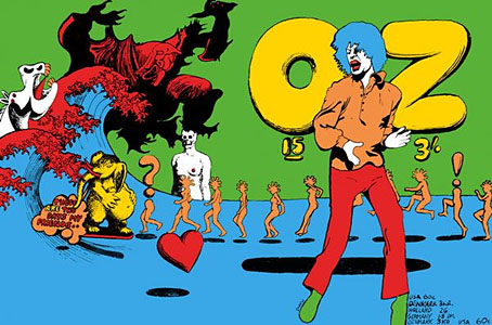
Oz magazine no. 15, October 1968.

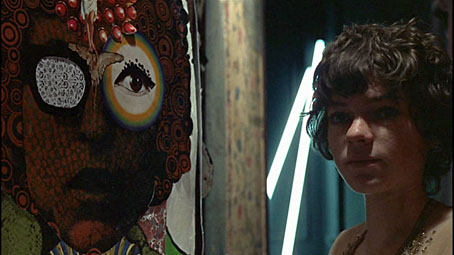
The psychedelic art of Australian artist Martin Sharp has featured here on several occasions. Unlike his British and American contemporaries who maintained a single graphic style, Sharp was a versatile artist whose work could range from loose, often cartoony drawing and painting to very detailed collage designs; he was also as happy as any other artist of the period to plunder art history, as the cover for issue 15 of Oz demonstrates. The Mick Jagger figure from that cover was later reworked as a poster for “Turner’s Purple Orchestra”, one of a number of pieces of Sharp art which can be glimpsed throughout Donald Cammell & Nicolas Roeg’s Performance (1970).

sharp7.jpg

Performance (1970): Michele Breton and a Martin Sharp collage.

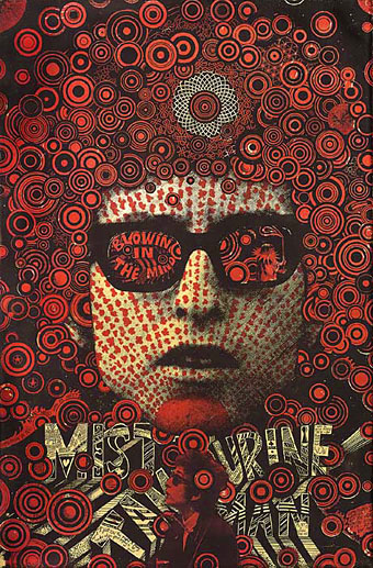
Sharp’s involvement with Oz magazine, and the creation of a handful of endlessly reproduced designs—the Bob Dylan Mr Tambourine Man poster, Jimi Hendrix in a Jackson Pollock explosion, the sleeve art for Cream’s Disraeli Gears—makes his art some of the most visible of the period. People may not necessarily know the name but they’ll recognise the work.

In 2009 Sharp’s Oz colleague Germaine Greer wrote a warm appraisal of the artist and his work. A few more examples follow. There’s a great selection of posters and other art and design here.

The GuardianMartin Sharp, Australian artist who came to symbolise the ’60s | Martin Sharp in pictures

sharp2.jpg

Mister Tambourine Man (1966).

Continue reading “Martin Sharp, 1942–2013”

Canal view

venice1.jpg

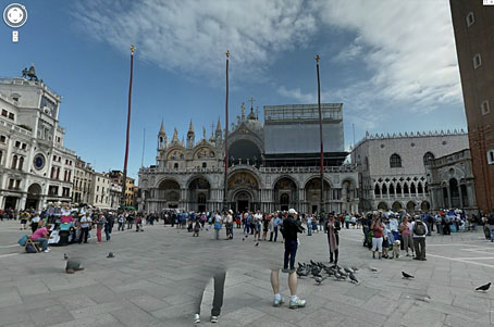
Having followed the development of Google’s Street View from the outset I couldn’t really avoid noting this new addition. The effortlessly photogenic city of Venice deserves the Street View treatment more that most cities, and while Google hasn’t explored every last corner there are enough canals, piazzas and streets photographed to allow some serious derives. If I wasn’t busy at the moment chasing an illustration deadline I’d be spending some time clicking my way around the place.

venice2.jpg

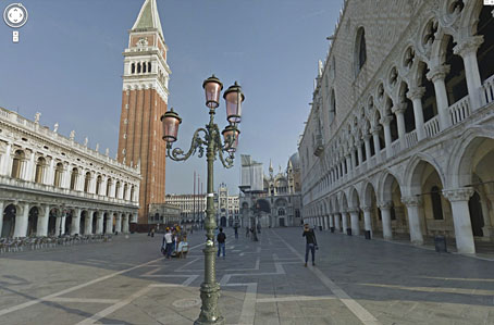
Piazza San Marco.

The Google blog has more information about the extent of the work and points the way to some less well-known areas. Below you’ll find my directions to a location from Don’t Look Now.

venice3.jpg

Piazza San Marco.

Continue reading “Canal view”

Weekend links 184

lefler.jpg

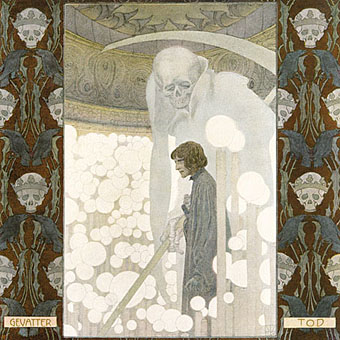
Gevatter Tod (Godfather Death, 1905) by Heinrich Lefler. Via Beautiful Century.

An inevitable hangover from Halloween this week. At 50 Watts: A Modern Dance of Death (c. 1894) by Joseph Sattler, Harry Clarke Revisited, and more Ex Libris Mr Reaper | At Design Observer: Keith Eggener on When Buildings Kill: Sentient Houses in Fiction and Film | At Dangerous Minds: An interview with horror soundtrack composer Fabio Frizzi | Clive Hicks-Jenkins on illustrating the ghost stories of MR James.

Punk 45: The Singles Cover Art of Punk 1976–80, a book by Jon Savage & Stuart Baker with an accompanying compilation album on Soul Jazz Records. Savage & Baker selected a handful of favourite covers here.

De humani corporis fabrica by Vesalius is back in print as a beautiful two-volume hardback edition. See sample pages here.

…the business of the writer is to find something out for yourself and to stick by it. To forge a new mythology out of materials pertinent to the moment. Otherwise you’re at the mercy of their mythology, which is a destruction of language, above everything else. This non-language, this bureaucratic-speak of the global corporate entities, is a horror in the world. So that strange language we started with – that piece of Kerouac – I think is more valuable than ever.

Iain Sinclair (yes, him again) talking to James Campbell about his new book, American Smoke.

Bob Mizer & Tom of Finland, an exhibition at the Museum of Contemporary Art, Los Angeles.

• From 2010: The Bridget Riley Look, The Bridget Riley Sound, Bridget Riley’s Rolling Papers.

The Strange and Mysterious History of the Ouija Board. Related: Ouija Boards at Pinterest.

Highway 62 posted some close-ups of my adaptation of The Call of Cthulhu.

• “This is not a coincidence”: Max Dax talks to Andrey A. Tarkovsky.

Anthony Lane‘s Foreword to The Big New Yorker Book of Cats.

• At AnOther: Nicolas Roeg on Mirrors and Memory.

Toys and Techniques: a blog.

Death And The Lady (1970) by Shirley & Dolly Collins | Clang Of The Yankee Reaper (1975) Van Dyke Parks | All And Everyone (2011) by PJ Harvey

The poster art of Vic Fair

fair1.jpg

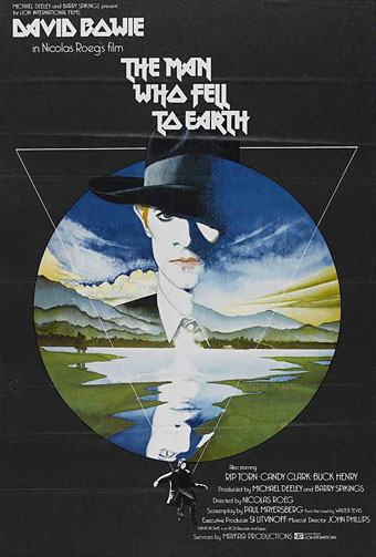
The Man Who Fell to Earth (1976).

This weekend’s viewing was The Man Who Fell to Earth on Blu-ray, highly recommended for anyone who likes the film, Anthony Richmond’s photography looks better than ever. I’ve had this for a while on DVD and what’s notable about the old and new formats is that both UK editions use Vic Fair’s poster design as the cover art. It often seems a hit-or-miss affair whether the original poster gets used for home release. This tends to happen more with older films that have acquired an artistic reputation; the recent UK release of The Conformist by Arrow Films prints four different poster designs on the inlay, with the box enclosure having a clear window that allows one or other of the designs to be facing out. A great idea which makes owning the physical copy a little more worthwhile.

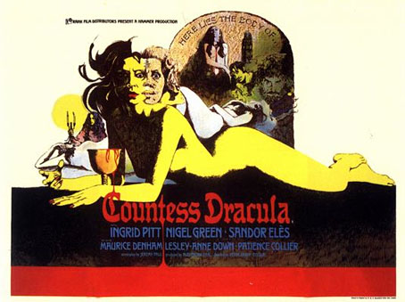
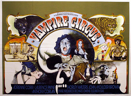
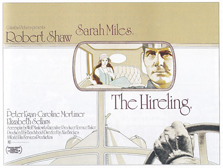
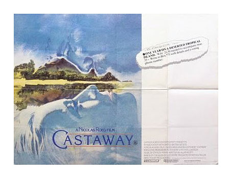
I’d known the poster for Nic Roeg’s film for years but until this weekend I’d never thought to find out who was responsible for the artwork. Vic Fair was a prolific artist for UK film releases during the 1970s and 1980s so this is a small selection of his work. Apparently he was so pleased with the Roeg poster that he signed it. As is often the case with film posters, there’s no record of the designers for these examples so we don’t know who was responsible for the type layouts.

fair5.jpg

Countess Dracula (1972).

The Countess Dracula art looks surprisingly similar to some of the promotional art that Roger Dean produced around this time for UK studios, Hammer included. A few examples appear in his Views book but it’s a side of his work that’s seldom seen or discussed. I recall being impressed by the Vampire Circus poster in the past (although the big cats look a little silly). One of the better Hammers of the 70s, with a cast including cult cutie John Moulder-Brown.

fair2.jpg

Vampire Circus (1972).

fair3.jpg

The Hireling (1973).

As with many posters of the 1970s, The Hireling is a great example of an approach that marketing departments would never allow today.

fair4.jpg

Castaway (1987).

Another Nic Roeg film, and another subtle design, possibly too subtle as I don’t recall seeing it used anywhere. First time I saw this was on the cover of a soundtrack album a few years back when I was putting together Jon Hassell’s website. There’s a piece of his music used in the film so we were trying to trace all the relevant cover art.

There’s more about Vic Fair and his contemporaries in British Film Posters: An Illustrated History by Sim Branaghan & Steve Chibnall, a book I think I ought to buy. If anything it may spare me the temptation to start collecting film posters again.

Previously on { feuilleton }
Petulia film posters
Lucifer Rising posters
Wild Salomés
Druillet’s vampires
Bob Peak revisited
Alice in Acidland
Salomé posters
Polish posters: Freedom on the Fence
Kaleidoscope: the switched-on thriller
The Robing of The Birds
Franciszek Starowieyski, 1930–2009
Dallamano’s Dorian Gray
Czech film posters
The poster art of Richard Amsel
Bollywood posters
Lussuria, Invidia, Superbia
The poster art of Bob Peak
A premonition of Premonition
Metropolis posters
Film noir posters

Petulia film posters

petulia1.jpg

Illustration by Bob Peak.

Further examples of those things you find when you’re searching for something else, these posters for Richard Lester’s Petulia (1968) are a good example of just how differently the same film can be presented by its advertising materials. Petulia (“the uncommon movie”) is a fascinating, unjustly neglected gem, a serious adult drama quite unlike the comedies (or comic dramas) Lester was making before and after. Nicolas Roeg photographed Petulia shortly before embarking on his own directing career, capturing San Francisco just after the Summer of Love in a more documentary fashion than the exploitation films of the period. There are nods to the psychedelic scene with party appearances by Big Brother and the Holding Company, and the Grateful Dead, but the narrative concerns the flipside of hippiedom with a group of middle-class professionals ensnared in adultery and marital failure.

A commonly remarked feature of Petulia is Antony Gibbs’ fragmented editing style which flashes backwards and forwards throughout, even showing events that never happen. The technique is usually taken to be derived from Alain Resnais although Gibbs had earlier edited The Knack…and How to Get It for Lester which is often as fragmented, albeit for a more comic effect. What’s notable about the technique is that Gibbs went on to edit Nicolas Roeg’s first two features, Performance (co-directed with Donald Cammell) and Walkabout, both of which take the fragmentation even further, creating the style which Roeg made his own.

petulia4.jpg

The poster that caught my attention was the marvellous one by Bob Peak who manages to depict the awkward relationship between the two leads—holding hands yet facing away from each other—whilst alluding to the psychedelic backdrop in the details. It’s difficult to tell at a small size but the sheet music design above shows that Peak’s drawing is a complex arrangement of blended faces, the reflected figure of a woman and a pattern of Bridget Riley swirls. If I was still collecting film posters I’d be sorely tempted to buy one of these.

petulia2.jpg

Illustration by Jean Fourastié.

Compared to which this pair of French designs veer off in opposite and unsatisfying directions. Jean Fourastié seems to have been under the impression that the story concerned a San Francisco flower child not a bored housewife, while Jean Mascii’s painting isn’t inaccurate but is more suited to a romance paperback. Big heads were apparently Mascii’s métier even if there were no people in the film.

petulia3.jpg

Illustration by Jean Mascii.

Petulia has been available on DVD for a while now, it’s well worth seeking out. Watch the trailer here.

Previously on { feuilleton }
Lucifer Rising posters
Wild Salomés
Druillet’s vampires
Bob Peak revisited
Alice in Acidland
Salomé posters
Polish posters: Freedom on the Fence
Kaleidoscope: the switched-on thriller
The Robing of The Birds
Franciszek Starowieyski, 1930–2009
Dallamano’s Dorian Gray
Czech film posters
The poster art of Richard Amsel
Bollywood posters
Lussuria, Invidia, Superbia
The poster art of Bob Peak
A premonition of Premonition
Metropolis posters
Film noir posters