Patrick McGoohan and The Prisoner

prisoner1.jpg

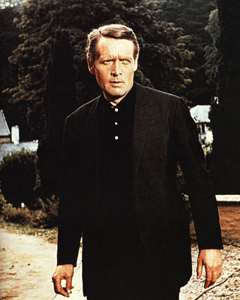
Patrick McGoohan as The Prisoner.

“I will not be pushed, filed, stamped, indexed, briefed, debriefed or numbered. My life is my own.”

The Prisoner, which ran for seventeen episodes from 1967 to 1968, was the best original drama series there’s ever been on television. Period, as Harlan Ellison would say. Best because it grabbed the format of the TV adventure series with both hands to subvert the expectations of the audience and the people who were paying for it. Best because it dared to do this at a time when there was little precedent for experiment in a medium that was barely a decade old. Best because it had something important to say while still being entertaining. And best because it had Patrick McGoohan in the central role at the peak of his acting career.

Fiction can be anything, but to look at what we’re offered by TV channels you wouldn’t know it. Cop shows, hospital shows, detective shows and soap operas proliferate, ad infinitum. The Prisoner came out of Danger Man, an immensely successful post-James Bond spy series which may have been popular but, McGoohan’s presence aside, has little to recommend it today. It lacked the camp bravura of The Avengers and couldn’t compete with the budgets of the Bond films. But it’s fair to say that without it McGoohan wouldn’t have had the chance to do something radical. ITC’s Lew Grade thought he was getting Danger Man 2 with better production values; what he received—to his eventual dismay—was the kind of television one would expect if the staff of Michael Moorcock’s speculative-fiction magazine New Worlds had been given a fat budget and free reign. Like New Worlds, The Prisoner seized familiar genre themes but took them as a means to an end, not an end in themselves. The series borrowed from science fiction and spy thrillers—brainwashing and mind control, Cold War paranoia, the limitless surveillance and duplicity of Orwell’s Nineteen Eighty-Four—and used a drama format to say something direct and personal to its audience about individual freedom, the limits and excesses of the state, and the importance of being able to say “No” when the world insists that you capitulate.
prisoner3.jpg

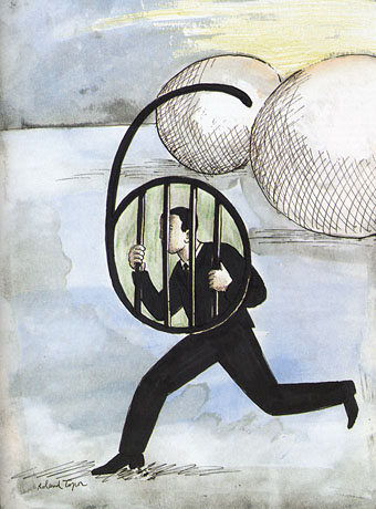
Number Six by Roland Topor.

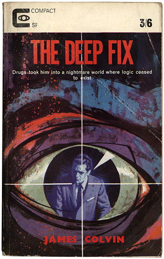
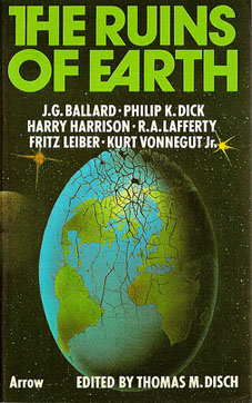
McGoohan was the driving force as well as the star. His own company, Everyman Films, produced the series for ITC; he planned everything with the writers, wrote three episodes and directed five of them himself. The Prisoner only lasted for a season and a half—cut short after Grade lost his patience—but the form was potentially endless, flexible enough to present a familiar Cold War spy story on the one hand, while having an entire episode play as a Western, on the other. In one of the later episodes McGoohan is largely absent when his mind is transferred to another man’s body and he finds himself living a new life, ostensibly a free man. (But freedom in The Prisoner is always circumscribed.) The last three episodes collapse everything that’s preceded them into intense and increasingly surreal psychodrama. Like Moorcock’s fluid character Jerry Cornelius, whose exploits were running in New Worlds while The Prisoner was being broadcast, McGoohan had found a vehicle to say what he wanted about the world using popular culture. It’s a coincidence but I’ve always found it apt that the cover illustration for Moorcock’s novella The Deep Fix (1966) included a figure obviously modelled on McGoohan’s Danger Man. The book’s tagline “Drugs took him into a nightmare world where logic ceased to exist” could be a description of a later Prisoner episode. Apt too that the first novel based on the series in 1969 was by New Worlds regular Thomas M Disch.
prisoner2.jpg

(James Colvin was a Moorcock nom-de-plume.)

The Prisoner was produced in the era of the social dramas of The Wednesday Play and Play for Today yet it remains relevant in a way its worthier contemporaries could scarcely manage. Social realism dates as quickly as yesterday’s news but allegory stays fresh. And it’s a dismal truth that the world of infinite surveillance has crept closer in a way that few would have imagined possible in 1968. The cameras that follow McGoohan’s Number Six everywhere are a familiar sight on Britain’s streets; a headline in yesterday’s Independent newspaper read: “Big Brother database a ‘terrifying’ assault on traditional freedoms“. McGoohan, who was raised in Ireland, would have appreciated the adherence of another Irishman, James Joyce, to the Luciferian cry of disobedience in Ulysses, “Non serviam!”—”I will not serve”. Joyce’s Stephen Dedalus defies God and his family; McGoohan’s Number Six defies everything else. That example, of the man who can “make putting on his dressing gown appear as an act of defiance”, is something we need as much now as we did in 1968. Hollywood is currently threatening a big-screen version but why wait for more compromised studio product when you can go to the source. Get yourself a deep fix—it’s a masterpiece.

Previously on { feuilleton }
Thomas M Disch, 1940–2008
Revenant volumes: Bob Haberfield, New Worlds and others

Jim Cawthorn, 1929–2008

cawthorn1.jpg

“Jim Cawthorn and I have been inseparable for over twenty-five years, sometimes to the point where I can’t remember which came first—the drawing or the story. It is his drawings of my characters which remain for me the most accurate, both in detail and in atmosphere. His interpretations in strip form will always be, for me, the best.” Michael Moorcock.

Jim Cawthorn—illustrator, comic artist and fantasy historian—died this week. Cawthorn was the first illustrator employed by Savoy Books and one of the key factors in drawing me to their doors in the early 1980s. His illustrations made their books special and his comics adaptation of Moorcock’s The Jewel in the Skull was a big influence on my early black and white work.

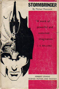
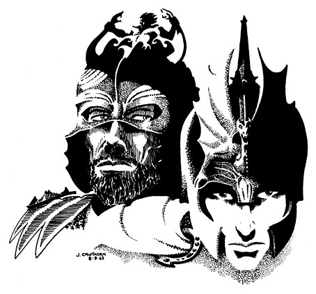
Mike Moorcock, Dave Britton and I seem to be in a minority in regarding Cawthorn as one of the finest fantasy illustrators of his generation. His carefully stipled drawings of the late Fifties and early Sixties are all miniature masterpieces and I don’t care how many artists attempt lavish paintings of Moorcock’s Elric character, for me the definitive representation remains the drawing used on the cover of the first edition of Stormbringer in 1965. Cawthorn was Moorcock’s illustrator of choice for many years and was involved with the Moorcock-edited run of New Worlds right from the start with his cover illustrating Ballard’s Equinox story. He also provided reviews for New Worlds, and his critical faculties were demonstrated to the full in 1987 with Fantasy: The 100 Best Books, an overview of the genre credited to Cawthorn and Moorcock for which Cawthorn himself wrote most of the entries.

I wrote in more detail about Cawthorn’s work for the Savoy site several years ago. For an overview of his career and influences, there’s Dave Britton’s interview from 1979.

Update: some extra pictures added.

cawthorn2.jpg

Jagreen Lern and Elric (1963).

Continue reading “Jim Cawthorn, 1929–2008”

Thomas M Disch, 1940–2008

“What sort of criticism is it to say that a writer is pessimistic? One can name any number of admirable writers who indeed were pessimistic and whose writing one cherishes. It’s mindless to offer that as a criticism. Usually all it means is that I am stating a moral position that is uncongenial to the person reading the story. It means that I have a view of existence which raises serious questions that they’re not prepared to discuss; such as the fact that man is mortal, or that love dies. I think the very fact that my imagination goes a greater distance than they’re prepared to travel suggests that the limited view of life is on their part rather than on mine.”

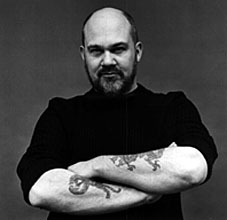
disch4.jpgThomas Disch castigating a science fiction readership which often regarded his work with a disdain born of narrow expectations. Disch (left), who took his own life a few days ago, was one of the New Worlds group of writers who frequently caused consternation among the kind of readers who only ever want to read about future technology. He was also much more than that, of course, and he wrote a lot more widely than most genre writers but it’s for his sf novels that he’ll be remembered. Rather than attempt another encomium I thought it far better to post a Charles Platt interview from 1979 which gives an insight into Disch’s character as a man as well as a writer. This was one of a number of interviews Platt conducted with leading sf writers during the late Seventies, published as Who Writes Science Fiction? in the UK (by Savoy Books) and Dream Makers: The Uncommon People who Write Science Fiction in the US.
Thomas M Disch by Charles Platt

New York, April 1979

disch2.jpgNEW YORK, city of contrasts! Here we are on Fourteenth Street, walking past The New School Graduate Faculty, a clean modern building. Inside it today there is a fine museum exhibit of surreal landscape photography, but the drapes are permanently closed across the windows because, out here on the stained sidewalk, just the other side of the plate-glass, it’s Filth City, peopled by the usual cast of winos, monte dealers. shopping-bag ladies festooned in rags and mumbling obscenities, addicts nodding out and falling off fire hydrants. Fourteenth Street, clientele from Puerto Rico, merchandise from Taiwan. And what merchandise! In stores as garish and impermanent as sideshows at a cheap carnival, here are plastic dinner-plates and vases, plastic toys, plastic flowers and fruit, plastic statues of Jesus, plastic furniture, plastic pants and jackets-all in Day-Glo colors, naturally. And outside the stores are dark dudes in pimp-hats and shades, peddling leather belts, pink and orange wigs, and afro-combs… itinerant vendors of kebabs cooked over flaming charcoal in aluminium handcarts… crazy old men selling giant balloons.., hustlers of every description. And further on, through the perpetual fanfare of disco music and car horns, past the Banco Populare, here is Union Square, under the shadow of the Klein Sign. Klein’s, a semi-respectable old department store, was driven out of business by the local traders and has lain empty for years. But its falling apart facade still looms over the square, confirming the bankrupt status of the area. While in the square itself—over here, brother, here, my man, I got ’em, loose joints, angel dust, hash, coke. THC, smack, acid, speed, Valium, ludes. Seconal. Elavil!
Union Square wasn’t always like this. Michael Moorcock once told me that it acquired its name by being the last major battlefield of the American Civil War. Foolishly, I believed him. In truth there are ties here with the American labor movement; many trades unions are still headquartered in the old, dignified buildings, outside of which stand old, dignified union men, in defensive lunch-hour cliques, glaring at the panhandlers and hustlers toting pint bottles of wine in paper bags and giant, 20-watt ten-band Panasonic stereo portables blaring more disco! disco! disco!

Oddly enough we are looking for an address, here, of a writer who is known in the science fiction field for his almost elitist, civilized sensibilities. He has moved into an ex-office building that has been converted from commercial to residential status. Union Square is on the edge of “Chelsea”, which is supposed to be the new Soho, a zone where, theoretically, artists and writers are moving in and fixing up old buildings until, when renovations are complete, advertising execs and gallery owners will “discover” the area and turn it into a rich, fashionable part of town.

Theoretically, but not yet. In the meantime this turn-of-the-century, 16-storey, ex-office building is one of the brave pioneer outposts. We are admitted by a uniformed guard at the street entrance, and take the elevator to the 11th floor. Here we emerge into a corridor recently fabricated from unpainted sheets of plaster-board, now defaced with graffiti, but high-class graffiti, messages from the socially-enlightened tenants criticising the owner of the building for his alleged failure to provide services (“Mr. Ellis Sucks!” “Rent Strike Now!”) and here, we have reached a steel door provisionally painted in grubby Latex White, the kind of paint that picks up every fingermark and can’t be washed easily. There’s no bell, so one has to thump the door panels, but this is the place, all right, this is where Thomas M. Disch lives.

Continue reading “Thomas M Disch, 1940–2008”

The New Love Poetry

love.jpg

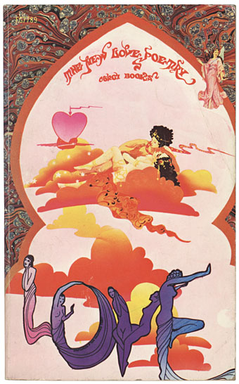
Yesterday’s book purchase was a small poetry collection from the magical year of 1967, edited by Peter Roche. Despite its Beatles cash-in title, Love, Love, Love: The New Love Poetry, not everything here is lightweight fare, Adrian Mitchell’s Peace is Milk is aimed more at the war in Vietnam than some object of affection. Among the other contributors there are the poets one would expect such as Roger McGough and Michael Horovitz, also Pete Brown who wrote lyrics for Cream and later had his own band, Piblokto. And there are contributions from Libby Houston, the wife of Mal Dean, an artist notable for his illustrations for Mike Moorcock’s books of the period and (later) some album sleeves for Pete Brown and others. Some of Libby’s poems appeared in the 50th anniversary edition of New Worlds magazine, along with an illustration by yours truly.

Contents aside, I picked this up mainly for the cover which I guessed was the work of Hapshash and the Coloured Coat, aka Michael English and Nigel Waymouth, along with Martin Sharp the leading psychedelic artists in the UK during the late Sixties. This proved to be a good guess as the book can be seen on this Hapshash page and if I’d have looked closer while in the shop I’d have seen their name written in tiny letters on the purple “O”. Not a difficult guess, their swirly lettering designs are very distinctive. See the full groovy cover here.

A Hapshash and the Coloured Coat gallery

Elsewhere on { feuilleton }
The book covers archive

Previously on { feuilleton }
Dutch psychedelia
Family Dog postcards
The 14-Hour Technicolor Dream revisited

Robert Rauschenberg, 1925–2008

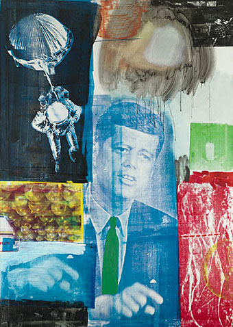
rauschenberg.jpg

Retroactive I (1964).

My youthful enthusiasm for art acquainted me with the name of Robert Rauschenberg (who died two days ago) earlier than most. Surrealism and Pop Art held an appeal that was immediate, if rather superficially appreciated at the time, and it was seeing works from both those movements which were the most memorable aspect of my first visit to the Tate Gallery when I was 13. Later on when I was reading JG Ballard’s stories and essays in back numbers of New Worlds, Rauschenberg was one of a handful of artists who seemed to depict in visual terms what Ballard was describing in words. In this respect Robert Hughes’s discussion of the “landscape of media” (Ballard’s common phrase would be “media landscape”) below is coincidental but significant. Retroactive I was painted a couple of years before Ballard began the stories that would later become The Atrocity Exhibition and it could easily serve as an illustration for that book.

There are and will be plenty of words written elsewhere about Rauschenberg’s work and influence. I’ll note here his inclusion in the list of gay artists at GLBTQ for his creative and personal partnership with another great Pop artist, Jasper Johns.

One of the artists (television) most affected in the Sixties was Rauschenberg. In 1962, he began to apply printed images to canvas with silkscreen—the found image, not the found object, was incorporated into the work. “I was bombarded with TV sets and magazines,” he recalls, “by the refuse, by the excess of the world … I thought that if I could paint or make an honest work, it should incorporate all of these elements, which were and are a reality. Collage is a way of getting an additional piece of information that’s impersonal. I’ve always tried to work impersonally.” With access to anything printed, Rauschenberg could draw on an unlimited bank of images for his new paintings, and he set them together with a casual narrative style. In heightening the documentary flavour of his work, he strove to give canvas the accumulative flicker of a colour TV set. The bawling pressure of images—rocket, eagle, Kennedy, crowd, street sign, dancer, oranges, box, mosquito—creates an inventory of modern life, the lyrical outpourings of a mind jammed to satiation with the rapid, the quotidian, the real. In its peacock-hued, electron-sweetbox tints, this was an art that Marinetti and the Berlin Dadaists would have recognized at once: an agglomeration of memorable signs, capable of facing the breadth of the street. Their subject was glut.

Rauschenberg’s view of this landscape of media was both affectionate and ironic. He liked excavating whole histories within an image—histories of the media themselves. A perfect example is the red patch at the bottom right corner of Retroactive I. It is a silkscreen enlargement of a photo by Gjon Mili, which he found in Life magazine. Mili’s photograph was a carefully set-up parody, with the aid of a stroboscopic flash, of Duchamp’s Nude Descending a Staircase, 1912. Duchamp’s painting was in turn based on Marey‘s photos of a moving body. So the image goes back through seventy years of technological time, through allusion after allusion; and a further irony is that, in its Rauschenbergian form, it ends up looking precisely like the figures of Adam and Eve expelled from Eden in Masaccio’s fresco for the Carmine in Florence. This in turn converts the image of John Kennedy, who was dead by then and rapidly approaching apotheosis as the centre of a mawkish cult, into a sort of vengeful god with a pointing finger, so fulfilling the prophecy Edmond de Goncourt confided to his journal in 1861:

“The day will come when all the modern nations will adore a sort of American god, about whom much will have been written in the popular press; and images of this god will be set up in the churches, not as the imagination of each individual painter may fancy him, but fixed, once and for all, by photography. On that day civilization will have reached its peak, and there will be steam-propelled gondolas in Venice.”

Robert Hughes, The Shock of the New (1980).

Previously on { feuilleton }
Transfer drawings by Robert Rauschenberg
Jasper Johns
Michael Petry’s flag
JG Ballard book covers