Weekend links 338

lee.jpg

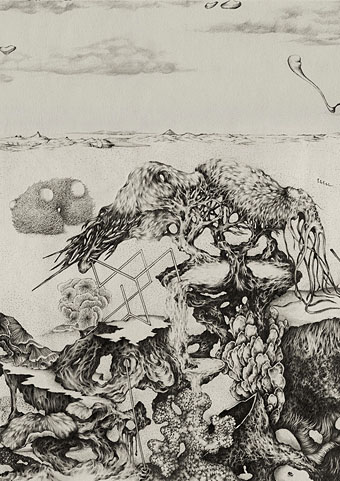
At the mountains of madness, fragment I (2014–16) by Céli Lee.

Spirits of Place, edited by John Reppion: new writings from Bryndís Björgvinsdóttir, Vajra Chandrasekera, Maria J. Pérez Cuervo, Warren Ellis, Alan Moore, Silvia Moreno-Garcia, Kristine Ong Muslim, Dr. Joanne Parker, Mark Pesce, Iain Sinclair, Gazelle Amber Valentine and Damien Williams.

• “Are we wrong to neglect [Jean Cocteau]? We are.” Kevin Jackson reviews Jean Cocteau: A Life, a biography by Claude Arnaud that’s finally available in an English edition (translated by Lauren Elkin & Charlotte Mandell). Related: Jean Cocteau speaks to the year 2000.

Void Beats / Invocation Trex by Cavern of Anti-Matter has been one of my favourite music releases this year. Tim Gane talks about the inadvertent origin of the group, and there’s also the welcome news of a reissue for the scarce first album, Blood Drums.

• Pauline Oliveros: 1932–2016; Geeta Dayal looks back on the life of US composer Pauline Oliveros, including reflections from, amongst others, Betsey Biggs, Fred Frith, Terry Riley, and Morton Subotnick.

• The relaunched Jayde Design website is selling copious Moorcock publications and ephemera, back issues of New Worlds magazine, and much else besides, including rare works of my own.

• New from Mute Records: Richard H. Kirk #7489 (Collected Works 1974–1989) and Sandoz #9294 (Collected Works 1992–1994).

• Drawings by Austin Osman Spare are on display for the next two weeks at the Atlantis Bookshop, London.

The Architecture of the Overlap: Sir John Soane’s Museum, London, scanned in three dimensions.

• Mixes of the week: Secret Thirteen Mix 201 by Félicia Atkinson, and FACT mix 579 by Jenny Hval.

• “No one has the slightest idea what is and isn’t cultural appropriation,” says Fredrik deBoer.

• I’m never keen on end-of-year lists but I’ll read any list that John Waters writes.

• “The Driller Killer and the humanist behind the blood and sickening crunch”.

• More Lovecraft: Stories to make you say UGH! by Pete Von Sholly.

Alan Moore talks to Stewart Lee.

At The Mountains Of Madness (1968) by H.P. Lovecraft | Mountains Falling (2001) by Bluebob | Mountains Crave (2012) by Anna von Hausswolff

Old Weird and New Weird

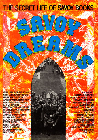
savdreams.jpg

Savoy Books, 1984.

A couple more recent arrivals that feature my work. These are of minority interest but worth noting since academic articles don’t always travel beyond a small audience of subscribers.

A recent issue of Foundation (The International Review of Science Fiction), Volume 45.1, number 123, contains an article by Mark P. Williams, Underground Assemblages: Savoy Dreams and The Starry Wisdom. This examines the legacy of New Worlds magazine under the editorship of Michael Moorcock (from 1964 to 1974) via two writing collections, Savoy Dreams (Savoy Books, 1984) and The Starry Wisdom (Creation Books, 1994). The two collections are very different: Savoy Dreams, edited by David Britton and Michael Butterworth, was an eclectic overview of Savoy’s publishing endeavours up to that point. Among the original writing there’s fiction by Butterworth, M. John Harrison (the first publication of the Viriconium story, Lords of Misrule) and others, plus a reaction by Michael Moorcock to William Burroughs’ Cities of the Red Night, a book that Savoy had contracted to publish before police harassment forced the company’s bankruptcy. The rest of the book is taken up with press reviews of Savoy books.
starrywisdom.jpg

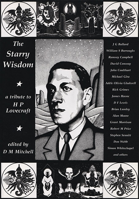
Creation Books, 1994. Cover art by Peter Smith.

The Starry Wisdom should require less of an introduction since the book has been in print since 1994, and has a small, possibly notorious, reputation among HP Lovecraft enthusiasts. Editor DM Mitchell felt that the assembling of post-Lovecraftian fiction up to that point had been too cosy and insular: too many story collections were being edited and written by groups of friends in the genre fiction “community”, with the result that the stories were often stale and complacent. The startling newness of Lovecraft’s imagination in comparison to many of his contemporaries in Weird Tales seemed to have been bled away into pastiche, a process that began soon after Lovecraft’s death. Mitchell’s solution was to commission original pieces of Lovecraft-inspired work from writers outside the genre world, notably Alan Moore, Grant Morrison, and newcomer David Conway; he also reprinted pieces that would never appear elsewhere as Lovecraftian fiction, including Wind Die. You Die. We Die. by William Burroughs, and Prisoner of the Coral Deep by JG Ballard. Burroughs and Ballard connect directly to New Worlds, of course (Ballard wrote about Burroughs for the magazine), while the pair cast a shadow over many of Savoy’s book productions. Both Savoy Dreams and The Starry Wisdom featured comic strips; Tales of the Cramps by Kris Guidio appeared in Savoy Dreams, while The Starry Wisdom contained strips by Mike Philbin & James Havoc, Rick Grimes, and the first publication of my own adaptation of The Call of Cthulhu.

I was surprised—and pleased—that my comic strip receives a fair amount of scrutiny in Williams’ piece. My Lovecraft strips have received almost no attention from the comics world, a consequence of having been printed by book publishers and distributed to book shops. (A rare exception was this recent piece by Matt Maxwell.) When you’ve been overlooked in this manner it’s a surprise to find your work receiving serious evaluation from an entirely different quarter. Mark P. Williams’ essay examines the contents of both collections, my strip included, as “assemblages”. This is a valid critique in the case of the Cthulhu strip since Lovecraft’s story is itself an assemblage of what seems at first to be unrelated data. The comic adaptation assembles a range of cultural references—some genuine, others invented—to parallel the narrator’s investigation, and even uses genuine documents in places, including columns from The New York Times. I don’t know if Williams has seen the blog post I made that points out many of the cultural references but he notes some of the more overt ones, such as Joseph Conrad appearing as the doomed Professor Angell, Arnold Böcklin’s The Isle of the Dead, and so on. While I was drawing the strip I was trying to imagine the story as an RKO production, a hybrid of two island films—The Most Dangerous Game and King Kong—and Orson Welles’ unmade Heart of Darkness. These references, many of which aren’t very obvious, were largely for my own amusement. The series I created with David Britton that followed the Lovecraft strips, Reverbstorm, puts assemblage and cultural reference at the forefront.
genre.jpg

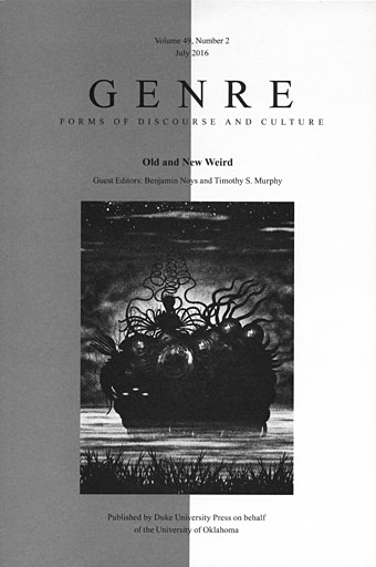
Cover art is my illustration for Remnants from Lovecraft’s Monsters, edited by Ellen Datlow.

The Cthulhu strip and the Reverbstorm series—now collected as Lord Horror: Reverbstorm—are the subject of a very perceptive piece by Benjamin Noys in the latest edition of Genre, an academic journal published by Duke University Press. This number of the journal is a kind of Weird special edited by Benjamin Noys and Timothy S. Murphy. Noys’ Full Spectrum Offence: Savoy’s Reverbstorm and the Weirding of Modernity is the final article in a publication that examines aspects of the “Old Weird” (ie: the Lovecraft-era Weird Tales) and contrasts it with the more recent “New Weird”. The latter was a short-lived label coined by M. John Harrison in 2003 for a range of fiction that was ignoring genre boundaries, and consciously developing the Weird as a project. China Miéville was one of the most visible proponents of the New Weird, and Harrison’s term emerged in part as a response to Miéville’s fiction. Miéville is interviewed in this issue of Genre where, as usual, he has some very worthwhile things to say. He prefers the term “haute Weird” for the original manifestation, possibly because it avoids the negative connotations of the word “old”.
reverbstorm.jpg

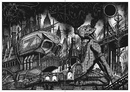
A spread from part 7 of Reverbstorm.

Benjamin Noys’ article is lengthy and resists easy summary, but it begins by investigating the way my work on the Lovecraft strips permeated the Lord Horror comics and dictated some of the imagery, in particular the architectural forms and eruptions of monstrosity. Later discussion concerns the way that Reverbstorm forces the Weird and Modernism together, a collision that I believe is still unique anywhere, never mind in the comics medium. Noys’ piece has given me a lot to think about, not least for its being the first substantial critical appraisal of Reverbstorm. The series is a difficult one, being deliberately excessive and avant-garde, and presenting the reader with a torrent of interrelating cultural references. Many of these are itemised in the appendix but the success (or not) of their working together, and the potential sparking of connections, depends very much on the prior knowledge of the individual reader. Noys is not only knowledgeable but adept at forging his own connections while situating the series in the larger context of the Weird, old (or haute) and new. Even without the inclusion of my work inside the journal and on the cover, I’d recommend this issue of Genre to anyone with an interest in the subject. One of the reasons I favour the Weird as a chosen work label is the way it evades (or ignores) generic boundaries. Years ago I realised that many of the things I liked the best in the arts were the chimeras, those works that transgress boundaries and created new hybrids. No surprise then that I enjoy a genre that refuses easy definition. There aren’t many masts I pin my colours to but the Weird is one of them.

Previously on { feuilleton }
The Weird

Weekend links 292

splendor.jpg

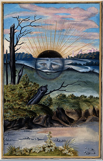
The Black Sun from Splendor Solis (1582) “attributed to the legendary figure Salomon Trismosin”.

Topic B predominates this week. The Black Sun of alchemy was the first thing I thought of when the title of David Bowie’s final album was announced late last year. The Black Sun symbolises the nigredo stage of the alchemical process when putrefaction or decomposition takes place; Carl Jung in Psychology and Alchemy equates the nigredo with the dark night of the soul. At the time I didn’t seriously think that the Bowie of 2015 would have had this in mind as a primary reference even though the Bowie of the early 1970s was immersed in Golden Dawn occultism, the Kabbalah, and a reader of Pauwels & Bergier’s The Morning of the Magicians, a book that informs the lyrics of the Hunky Dory album, and which contains a great deal of discussion about alchemy and other esoteric matters. And yet… Of all the outfits that Bowie might have worn in his final video the one that he chose for Lazarus is a match for the one he wore during the Station To Station Kabbalah-drawing photo session. At Sol Ascendans Alex Sumner and his commenters explored this twilight zone.

Back in the sublunary world, Jonathan Barnbrook’s cut-out sleeve design for the Blackstar album gained additional resonance this week: the black star as the hole that’s left when a more familiar star has been removed from its setting. Hindsight also makes poignant the observation that this was the only album without a picture of the artist on the cover. Elsewhere there were speculations about the title being a reference to Black Star by Elvis Presley (who shared a birthday with Bowie) or a term from oncology, two suggestions that fit so well they’re hard to ignore.

He began to develop a science fiction sensibility, drawing on the New Wave SF movement of Michael Moorcock and JG Ballard, other writers who used the genre such as Anthony Burgess and William S Burroughs, and an older fantasy tradition found in HP Lovecraft and Edward Bulwer-Lytton (whose The Coming Race is name-checked in Oh! You Pretty Things, 1971).

Jake Arnott on David Bowie’s literary influences

• In something-else-also-happened-this-week news, 2016 may see the long-awaited release of Andrei Tarkovsky’s films on Region B Blu-ray. Fingers crossed.

• International posters for The Man Who Fell To Earth. More Nicolas Roeg (and more shiny discs): Eureka (1983) will receive a Blu-ray release in March.

• Cracking the codes of Leena Krohn: Peter Bebergal on the Finnish writer of strange stories.

• Anthems for the Moon: Jason Heller examines David Bowie’s connections to science fiction.

• From 2013: Jon Savage on Bowie’s first meeting with William Burroughs in 1974.

• Mixes of the week: Bowie-esque Vol 1 and Bowie-esque Vol 2 by Abigail Ward.

David Bowie Doing Shit: a Tumblr

“Heroes” (1978) by Blondie & Robert Fripp | “Heroes” (2003) by King Crimson | “Helden” (2007) by Apocalyptica ft. Till Lindemann

MC Escher book covers

escher08.jpg

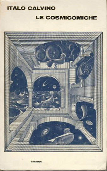
1963. Art: Other World (1947).

MC Escher’s prints have been touring the UK this year: a few months ago they were in Scotland, this month they can be seen at the Dulwich Picture Gallery in London. The renewed attention prompted the BBC to produce a documentary, The Art of the Impossible: MC Escher and Me, in collaboration with Professor Roger Penrose. One of the programme researchers saw my earlier post about the use of Escher’s work on album covers, and asked if I wanted to appear on camera talking about this, something I politely refused to do. I’m happy to hold forth from a keyboard, however, so here’s a post about some of the books that have used Esher’s work to decorate their covers. Most of these are fiction but there must be many more non-fiction titles—especially in the fields of science and mathematics—that borrow Escher’s prints.

escher09.jpg

The first edition of Calvino’s comic stories from 1965.

escher10.jpg

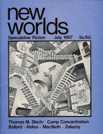
Art: Relativity (1953).

Not a book but editor Michael Moorcock has claimed that this was the first UK magazine to print any of Escher’s work.

Continue reading “MC Escher book covers”

The Chronicle of the Cursed Sleeve

blacksword7.jpg

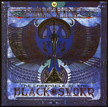
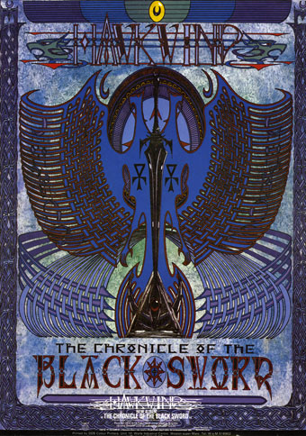
A copy of the cover art that I attempted to colour-correct some years ago to compensate for the poor print reproduction.

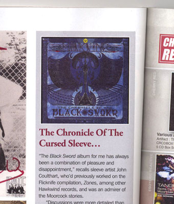
This month I’m in Record Collector magazine talking in a sidebar feature about my work on the Hawkwind album The Chronicle of the Black Sword. The issue is Hawkwind-heavy, with a Nik Turner interview, a history of Flicknife Records (the label that released COTBS), and a retrospective feature on the Black Sword album which was released in December 1985. My words were slightly cut to fit the allotted space but I can run the full text here in which I describe my ambivalent feelings towards this particular cover.

blacksword8.jpg

The Black Sword album for me has always been a combination of pleasure and disappointment. I was very pleased initially to hear that Hawkwind were writing a concept based on the Elric books, a series I’d enjoyed for many years. Cover discussions were a little more detailed than usual since this design was sketched out beforehand then approved by the Dave Brock and co. Prior to this I’d been creating something vague after equally vague requests; communication back then was all done via post and call box as I didn’t own a phone.

This was the first album where I was able to create an integrated front and back cover design. A friend had recently found me a copy of George Bain’s Celtic Art: Its Methods of Construction (1951), a study of the creation of Celtic knotwork, and I was keen to use this somehow. Rather than do a cover that looked like a fantasy paperback the idea was to use the knotwork style to create something that was suitably Hawkish whilst also fitting the Elric theme. The front cover has some nods back to earlier Hawkart in the winged sphere—which goes back to Barney Bubbles and his obsession with Ancient Egypt—and the eye-in-a-triangle, a symbol which first appeared on the cover of the Hawklog booklet in the In Search of Space album, and which I scattered throughout many of my Hawkwind designs.

All the lettering on the album was hand-drawn (not very well in places) using letterforms based on Bain’s examples from the books of Kells and Lindisfarne. I drew the track listing onto the artwork for the back cover, a decision that later proved to be a bad one when the band decided to change the running order of the songs, hence the large purple square that spoils the design. My lack of any direct contact with the record company made problems like this inevitable; I was trying to do graphic design at a distance without having any communication at all with the printers responsible for the sleeve. Before digital design, the creation of an album cover could be a complicated business involving photo-mechanical transfers, knockout areas, overlays, typesetters and more; if you weren’t in direct contact with the printer (or somebody who was) then you simply had to hope for the best.

This process of design-at-a-distance led to the disaster with the cover printing, the front of which has an unwarranted blue cast that dulled the impact of the sleeve and, for me, ruined the whole thing. You can see how the cover should have looked by comparing the background colours of front and back; the front was also printed in its true colours on the back page of the 1985 tour programme. It was this, and the messy appearance of the lettering on the back, that pushed me further towards ending my involvement with Hawkwind and doing something of my own over which I’d have complete control.

blacksword1.jpg

The retrospective feature in the magazine includes a picture of the back cover of the tour programme (above) so those familiar with the album can see the difference in reproduction. The difference isn’t so noticeable on the copies posted here after I tried altering the tones of the cover. Over the years I’ve grown used to the blueness but the back cover remains blighted by its purple boxes.

Continue reading “The Chronicle of the Cursed Sleeve”