The Best of Michael Moorcock

mm1.jpg

The first of the books I’ve been designing for Tachyon Publications appears this month. Two more are due to follow and I’m working on another at the moment; more about those titles later.

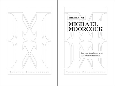
The Best of Michael Moorcock was a pleasure to be involved with not only because I’ve been reading Moorcock’s fiction for a very long time but I’ve also been fortunate during that time to get to know the writer and Linda Moorcock, his wife. Mike likes the work I’ve done in the past for Savoy Books and we did have an anthology of his favourite pieces by other writers planned for Constable & Robinson back in 2005. That book didn’t work out so this makes up for its cancellation. This is an excellent anthology, put together initially as a private enterprise by editor John Davey who managed the difficult task of compiling a collection which ranges over forty years of writing. Ann and Jeff VanderMeer came aboard as co-editors for the Tachyon edition.

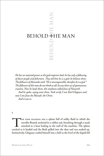
I’ve been working mainly on the interior design of the Tachyon volumes (although I’ve also done the cover for Jeff VanderMeer’s forthcoming Booklife) and for this title I took a cue from Ann Morn’s cover design which features a pair of gates emblazoned with large letter Ms. The title spread above takes the letter M from the typeface used for the author’s name and multiplies that to create an equivalent set of gates for the reader to pass through. I try to play down the pyrotechnics for fiction—the words are the important thing, not the graphic design—but since this was a story collection I thought I’d try illustrating each piece using the title typography alone. Most of these are done by using a suitable typeface but for a few pieces I managed to create an arrangement that reflected the story. Behold the Man (below) is the Nebula Award-winning story of a journey back in time to find the historical Jesus. The cross shape not only relates to the Biblical theme but also implies the crossed time streams and Moorcock’s layered, cross-cut narrative.

mm2.jpg

The Best of Michael Moorcock is available now from the usual sources and received a glowing review in the Guardian. Later this month, and other work permitting, I’m hoping to make a start on what will effectively be a companion volume, Savoy’s long-delayed Into the Media Web, another collection by John Davey which this time collects the best of Moorcock’s copious essays, reviews and other non-fiction.

Previously on { feuilleton }
Designing Booklife
The Sonic Assassins
Revenant volumes: Bob Haberfield, New Worlds and others
An announcement redux

JG Ballard, 1930–2009

crystal_world.jpg

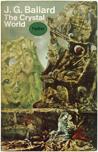
Panther Books paperback edition, 1968; cover painting: The Eye of Silence by Max Ernst.

If I can’t remember when I first encountered JG Ballard’s work, it’s not because I was reading him at a very early age, more that a childhood enthusiasm for science fiction made his books as omnipresent in my early life as any other writer on the sf, fantasy and horror shelves. I know that when I started to read the New Wave sf writers his work immediately stood out, not only for its originality but also for the numerous references to Surrealist painting which litter his early fiction, references which meant a great deal to this Surrealism-obsessed youth. Ballard was a lifelong and unrepentant enthusiast for the Surrealists, with repaintings by Brigid Marlin of two lost Paul Delvaux pictures prominent in one of his rooms (often featured in photo portraits). I always admired the way he never felt the need to apologise for Salvador Dalí’s excesses, unlike the majority of art critics who dismiss Dalí after he went to America. The paintings of Dalí, Delvaux, Tanguy and Max Ernst became stage sets which Ballard could populate with his affectless characters.

Once I’d encountered the New Worlds writers—Ballard, Michael Moorcock, M John Harrison, Brian Aldiss and company—and their American counterparts, especially Harlan Ellison, Samuel Delany and Norman Spinrad, there was no returning to the meagre thrills of hard sf with its techno-nerdery and bad writing. Ballard and Moorcock were the gateway drug to William Burroughs, Jorge Luis Borges and countless others, and I thought enough of his work in 1984 to attempt a series of unsuccessful illustrations based on The Atrocity Exhibition. It’s been an axiom during the twenty years I’ve worked at Savoy Books that Ballard, Moorcock and Harrison were (to borrow a phrase from Julian Cope) the Crucial Three of British letters, not Rushdie, Amis and McEwan. One of the books I designed for Savoy, The Exploits of Engelbrecht by Maurice Richardson, was a Ballard and Moorcock favourite, and included appreciations of Richardson by both writers. I wish Ballard could have seen the new (and still delayed) edition of Engelbrecht but he got a copy of the earlier book. Sometimes once in a lifetime is more than enough.

Ballardian.com
Pages of obits and MM comment at Moorock’s Miscellany
Ballard interview by V Vale at Arthur with an special intro by Moorcock
Jeff VanderMeer at Omnivoracious
Guardian | Times | Independent | Telegraph

Previously on { feuilleton }
Ballard in Barcelona
1st Ballardian Festival of Home Movies
Revenant volumes: Bob Haberfield, New Worlds and others
JG Ballard book covers

Patrick McGoohan and The Prisoner

prisoner1.jpg

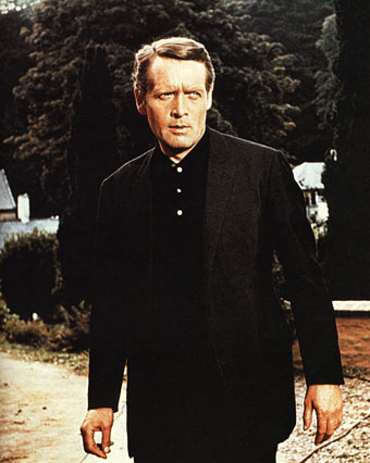
Patrick McGoohan as The Prisoner.

“I will not be pushed, filed, stamped, indexed, briefed, debriefed or numbered. My life is my own.”

The Prisoner, which ran for seventeen episodes from 1967 to 1968, was the best original drama series there’s ever been on television. Period, as Harlan Ellison would say. Best because it grabbed the format of the TV adventure series with both hands to subvert the expectations of the audience and the people who were paying for it. Best because it dared to do this at a time when there was little precedent for experiment in a medium that was barely a decade old. Best because it had something important to say while still being entertaining. And best because it had Patrick McGoohan in the central role at the peak of his acting career.

Fiction can be anything, but to look at what we’re offered by TV channels you wouldn’t know it. Cop shows, hospital shows, detective shows and soap operas proliferate, ad infinitum. The Prisoner came out of Danger Man, an immensely successful post-James Bond spy series which may have been popular but, McGoohan’s presence aside, has little to recommend it today. It lacked the camp bravura of The Avengers and couldn’t compete with the budgets of the Bond films. But it’s fair to say that without it McGoohan wouldn’t have had the chance to do something radical. ITC’s Lew Grade thought he was getting Danger Man 2 with better production values; what he received—to his eventual dismay—was the kind of television one would expect if the staff of Michael Moorcock’s speculative-fiction magazine New Worlds had been given a fat budget and free reign. Like New Worlds, The Prisoner seized familiar genre themes but took them as a means to an end, not an end in themselves. The series borrowed from science fiction and spy thrillers—brainwashing and mind control, Cold War paranoia, the limitless surveillance and duplicity of Orwell’s Nineteen Eighty-Four—and used a drama format to say something direct and personal to its audience about individual freedom, the limits and excesses of the state, and the importance of being able to say “No” when the world insists that you capitulate.

prisoner3.jpg

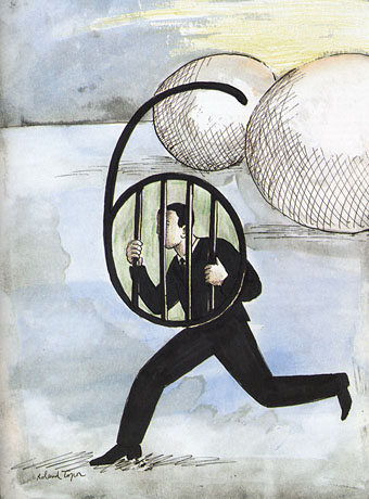
Number Six by Roland Topor.

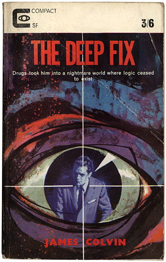
McGoohan was the driving force as well as the star. His own company, Everyman Films, produced the series for ITC; he planned everything with the writers, wrote three episodes and directed five of them himself. The Prisoner only lasted for a season and a half—cut short after Grade lost his patience—but the form was potentially endless, flexible enough to present a familiar Cold War spy story on the one hand, while having an entire episode play as a Western, on the other. In one of the later episodes McGoohan is largely absent when his mind is transferred to another man’s body and he finds himself living a new life, ostensibly a free man. (But freedom in The Prisoner is always circumscribed.) The last three episodes collapse everything that’s preceded them into intense and increasingly surreal psychodrama. Like Moorcock’s fluid character Jerry Cornelius, whose exploits were running in New Worlds while The Prisoner was being broadcast, McGoohan had found a vehicle to say what he wanted about the world using popular culture. It’s a coincidence but I’ve always found it apt that the cover illustration for Moorcock’s novella The Deep Fix (1966) included a figure obviously modelled on McGoohan’s Danger Man. The book’s tagline “Drugs took him into a nightmare world where logic ceased to exist” could be a description of a later Prisoner episode. Apt too that the first novel based on the series in 1969 was by New Worlds regular Thomas M Disch.

prisoner2.jpg

(James Colvin was a Moorcock nom-de-plume.)

The Prisoner was produced in the era of the social dramas of The Wednesday Play and Play for Today yet it remains relevant in a way its worthier contemporaries could scarcely manage. Social realism dates as quickly as yesterday’s news but allegory stays fresh. And it’s a dismal truth that the world of infinite surveillance has crept closer in a way that few would have imagined possible in 1968. The cameras that follow McGoohan’s Number Six everywhere are a familiar sight on Britain’s streets; a headline in yesterday’s Independent newspaper read: “Big Brother database a ‘terrifying’ assault on traditional freedoms“. McGoohan, who was raised in Ireland, would have appreciated the adherence of another Irishman, James Joyce, to the Luciferian cry of disobedience in Ulysses, “Non serviam!”—”I will not serve”. Joyce’s Stephen Dedalus defies God and his family; McGoohan’s Number Six defies everything else. That example, of the man who can “make putting on his dressing gown appear as an act of defiance”, is something we need as much now as we did in 1968. Hollywood is currently threatening a big-screen version but why wait for more compromised studio product when you can go to the source. Get yourself a deep fix—it’s a masterpiece.

Previously on { feuilleton }
Thomas M Disch, 1940–2008
Revenant volumes: Bob Haberfield, New Worlds and others

The Sonic Assassins

assassins1.jpg

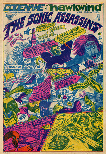
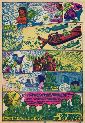
Searching through discs for scans of Jim Cawthorn art turned up this comic strip curio from a November 29th, 1971 issue of UK underground magazine Frendz. Cawthorn and writer Michael Moorcock present rock band Hawkwind as musical superheroes and although this is done largely as a promotional piece for that year’s new album, In Search of Space, the Sonic Assassins tag was one which stuck, becoming almost a secondary name for the band in later years. The name Void City also recurred later as the name of a track on the Choose Your Masques album. It may have been around this time that Cawthorn painted special T-shirt designs for Hawkwind; up to 1980 Dave Brock was still wearing his Baron Meliadus shirt on stage.

assassins2.jpg

Previously on { feuilleton }
Jim Cawthorn, 1929–2008
Design as virus #7: eyes and triangles
Barney Bubbles: artist and designer