Weekend links 752

nemo.jpg

Captain Nemo by Alphonse de Neuville, from Twenty Thousand Leagues Under the Seas (1875) by Jules Verne.

• “…physical remoteness is a category of its own. It is an enhancer: It can make the glorious better and the terrible worse. The oceanic pole of inaccessibility distills physical remoteness on our planet into a pure and absolute form. […] Point Nemo is nearly impossible to get to and offers nothing when you arrive, not even a place to stand. It is the anti-Everest: It beckons because nothing is there.” Cullen Murphy explores the remotest place on Earth. A long and fascinating read, but no mention of Point Nemo’s dreaming tenant.

• More Bumper Book business: Smoky Man has posted the second part of his analysis of the book for (Quasi) (in Italian) which includes some comments from myself about the origin of the Moon and Serpent Magical Alphabet, and why the letter Q in the alphabet is assigned to Cthulhu. Elsewhere, Panini have announced an Italian edition of the Bumper Book for May next year, while at The Beat Steve Baxi reviewed the book from a philosophical perspective.

• At the BFI: David Parkinson on where to begin with Louis Feuillade. I’d suggest starting with Fantômas rather than Les Vampires but then I’m biased.

The combination of magic(k)al, ceremonial action, vivid colour and paradoxically serious camp in Jarman’s Super 8 films of the ’70s bears the influence of Kenneth Anger, but the differences between Jarman’s sensibility and Anger’s are more striking than the resemblances. Jarman’s vision is more materialist, austere and hermetic, and less sociological; where Anger identifies the glamour of American popular culture with the Will of the Crowleyan magician, Jarman situates the discovery of the cinematographic mechanism imaginatively within the history of alchemy. Anger cast rock stars as gods and adepts with the intention of harnessing the energy of their recognition; Jarman casts Fire Island, then in its heyday as a gay resort, as a desert defined by sculptural details and occupied by a single masked figure, in scenes that both recall his landscape paintings of the ’60s and ’70s and anticipate the design of his garden at Dungeness.

Luke Aspell on Derek Jarman’s hermetic film/painting, In the Shadow of the Sun

• At Smithsonian Magazine: “Visions of nuclear-powered cars captivated Cold War America, but the technology never really worked”.

• At The Spectator podcast: host Sam Leith talks to Michael Moorcock about 60 years of New Worlds magazine.

• At Public Domain Review: “Light from the Darkness” — Paul Nash’s Genesis (1924).

• At Bandcamp: “Disco godfather Cerrone’s enduring influence on dance music”.

• At Unquiet Things: The Art of Survival: Eyeball Fodder in Dark Times.

• Mix of the week: DreamScenes – November 2024 at Ambientblog.

• New music: The Laugh Is In The Eyes by Julia Holter.

• At The Daily Heller: The College of Collage.

• RIP jazz drummer Roy Haynes.

Thermonuclear Sweat (1980) by Defunkt | Nuclear Drive (1982) by Hawkwind | Nuclear Substation (2005) by The Advisory Circle

November shirts

skullprint-shirts.jpg

Skull Print shirts.

November weather isn’t exactly suitable for T-shirt wearing when you live this far north (although it’s unseasonably mild just now) but I’ve recently added four more shirt designs to my Skull Print page. As I was saying last month, now that I’ve quit CafePress all shirts featuring my art and design will be done through Skull Print, a small business who specialise in shirt-printing, and do so with very reasonable prices: £22 (inc. postage) for the UK, £32 (inc. postage) for the rest of the world. Long sleeves, sizes 3XL and over, and tie-dye colours add a little more to the cost.

skullprint-magus.jpg

It’s always the case when creating spin-off products that I’m guessing what people may want. Three of the four new designs have been extracted from popular works of the past (the Tarot designs have been given a boost now that they’re featured in the Bumper Book of Magic). I’m always open to suggestions for new designs so long as they don’t infringe on any trademarks or copyright agreements.

skullprint-priestess.jpg

skullprint-chaos.jpg

The Chaos symbol is a new creation based on a shirt I designed for Hawkwind’s Chronicle Of The Black Sword tour in 1985 (see this post). The symbol isn’t exclusive to Hawkwind, of course. Michael Moorcock invented it for the original Elric stories in the 1960s after which it was picked up by the practitioners of Chaos magic in the 1980s.

skullprint-alice.jpg

And this is one of my popular Alice in Wonderland designs which I amended for The Graphic Canon in 2012, extending the square composition into a rectangle. I may add one or two more from this series in future although this was one was easier to adapt than some of the others.

New Worlds 224

NW-224-1.jpg
Illustration by Mark Reeve.

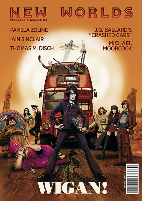
New issues of New Worlds magazine have been rare things in recent years so the announcement last week of issue number 224 was a special moment:

New Worlds Vol. 66 No. 224, ed. Michael Moorcock (to commemorate the sixtieth anniversary of his taking over editorship of the title), 09/’24, 978-0-9575764-6-9, a new full-colour A4 stapled outsized paperback/magazine, 72pp., illustrated by John Coulthart, Mal Dean, Herbert Sydney Foxwell, Allan Kausch, Mark Reeve, Julius Stafford-Baker; fiction/non-fiction anthology, contributors: John Clute, Coulthart, John Davey, Thomas M. Disch, Kausch, Roz Kaveney, Moorcock (a brand-new Cornelius story), Iain Sinclair, John Sladek, Pamela Zoline; first edition: £20.00 (for pre-ordered signed copies [while stocks last]).

N.B. This title is published on 30th September, 2024. Pre-ordered copies will be signed by Michael Moorcock and the magazine’s publisher.

See: https://jaydedesign.com/products_new.php

Copies in the U.S.A. will soon be available via www.ziesings.com @ $25 (for pre-ordered signed copies [while stocks last]).

If you’re in the mood for a spoilerish review you can see the entire issue leafed through and described here. In addition there’s also the New Worlds Annex which I’m hosting on these pages, a small repository of supplementary material.

There’s no need for me to recount the history of New Worlds, you can read about it in detail here. If you do know the history then you’ll know that the magazine under Michael Moorcock’s editorship acquired a considerable reputation in the late 1960s, upsetting politicians, the proprietors of WH Smiths, and the more conservative readers and writers of science fiction while publishing many important stories. In the 1970s New Worlds became a paperback series for a few years, managing ten numbers before resuming magazine format and increasingly sporadic publication.

NW-224-3.jpg

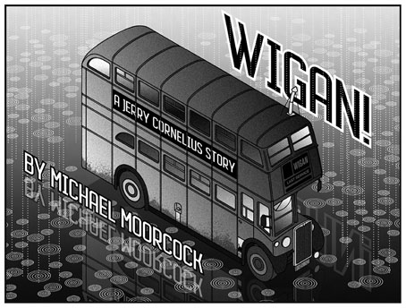
Mike Moorcock’s Jerry Cornelius story is a Holiday on the Buses scenario set in the usual Cornelius landscape of geo-political chaos. Mark Reeve and Allan Kausch also illustrated this one. I think my piece may be the first time I’ve ever had reason to draw a bus despite being a regular user of public transport. In order to create a contrast with the other illustrations I opted for something in the isometric manner of George Hardie. Not as severely styled as Hardie’s drawings often are but it’s heading in that direction.

The last Moorcock-edited number prior to the present one was in 1996, an issue which included a drawing of mine from the Reverbstorm comic series. The new issue sees Moorcock returning to the editor’s chair for what he insists will be the final time so I feel fortunate to be able to contribute more substantially to this issue than I did in 1996. As well as designing the magazine I’ve illustrated four of the stories, and also wrote a page about the hundredth anniversary of Surrealism which provides a loose theme for the issue as a whole. In a reversal of the usual state of affairs the writing was commissioned first, the design having been offered to other parties earlier this year. This didn’t work out, however, so Mike asked if I could take over, something I was more than happy to do. Rather than follow any pre-existing layouts I started with a blank slate, something I prefer in these situations. The erratic nature of the magazine schedule has meant that many of the recent issues have been standalone items even though each one bears an issue and volume number. The issues that followed the paperback series in the 1970s differed widely from one another, a trend that continued up to 1996; consequently I didn’t have to worry about retaining any attributes of the previous issues.

Continue reading “New Worlds 224”

Space is one trip: the Hawkwind takes off

isos1.jpg

1: The album
Back in the 1990s, when it became apparent that record companies were committed to never-ending CD reissues of their most popular albums, I suggested to a friend that this development would eventually give us releases of the unmixed recordings which the listener would then have to mix themselves: “Now you can be George Martin!” My suggestion wasn’t entirely serious, and there are many reasons why this will never happen, but the wholesale remixing of “classic” albums has been a trend now for ten years or more, and will no doubt continue. It’s easy to see endless reissues as a pernicious development—how many more copies of The Dark Side Of The Moon does the world need?—but I can think of one or two albums which would benefit from a reappraisal of their original mixes. The first two sides of Amon Düül II’s Dance Of The Lemmings, for example, have always sounded sonically inferior to the group’s other albums. The first side in particular is swamped by bass, and the drums, which are so prominent on the previous album, Yeti, are buried in the mix. Given the overtly psychedelic nature of the cover art I sometimes wonder whether anyone in the studio was drug-free during the recording.

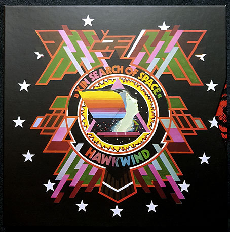
Hawkwind shared a record label with Amon Düül II for their first six albums, and the groups are further connected by bass player Dave Anderson who played on Düül’s Yeti in 1970 and Hawkwind’s In Search Of Space in 1971. The latter has just been reissued by Cherry Red in a variety of formats which include the three-disc package (2 x CD and a blu-ray disc) that arrived here at the weekend. The set features two new mixes of the entire album (one of them being the de rigueur 5-channel surround mix), a couple of outtakes, both sides of the Silver Machine single, plus the promo film for the single. The set also contains a substantial booklet which incorporates a reprint of the 24-page logbook that came with early pressings of the album. More about that below.

isos2.jpg

Hawkwind didn’t arrive as fully-fledged cosmic voyagers on their self-titled debut in 1970, it’s here on their second album that the group myth takes flight, presenting the band as travellers through time and space, or “Sonic Assassins” as they were depicted shortly before the album’s release in Codename: “Hawkwind”, a two-page promotional comic strip created by Michael Moorcock and Jim Cawthorn. Many British bands were playing with space themes in 1971 but Hawkwind were the only group to adopt the trappings of science fiction as essential elements of their persona, elements that persisted from one album to the next. In Search Of Space is loosely spacey on the musical side—You Shouldn’t Do That is the earliest example of a future Hawkwind staple, the extended mantra-like groove over which synthesizers swoop and burble—but it’s the album package created by Barney Bubbles and (in the logbook) Robert Calvert that dispels the ambiguity of songs like Master Of The Universe and Adjust Me in a science-fiction scenario where the “space” referred to by the title is dimensional as well as cosmological, with the group’s flattened spacecraft embodied by the physical album. None of this is suggested by the music, you need to read the logbook as well, but the book and the die-cut record sleeve help to frame what would otherwise be a collection of disparate rock songs into a complex artistic statement.

When it comes to the remixing of albums I’ve been sceptical of the benefits of the trend. For the past few years Steven Wilson has been the prime remixer of music from the 1970s and 80s; among other things he remixed Hawkwind’s Warrior On The Edge Of Time and the albums on last year’s Days Of The Underground set, all of which are worth hearing. Less essential have been his new mixes for King Crimson and Tangerine Dream, the latter especially where there’s little discernible difference between the old and new versions. I think the main attraction for many listeners will be the 5-channel surround mixes, especially in the case of Tangerine Dream, but I don’t have a 5-channel sound system so can’t say how effective they are. The new In Search Of Space mixes are the work of another Steve, Stephen W. Tayler, whose reworking of the album has taken me by surprise, giving it a radically different sound rather than the discreet adjusting of levels and instrumentation that I was expecting. Dave Brock has said in interviews that he always dropped acid before making the final mix of the Hawkwind albums up to Warrior On The Edge Of Time, which may explain why In Search Of Space has always sounded rather thin and dry, while the album that followed it, Doremi Fasol Latido, is a bludgeon by comparison, with everything compressed into the wall of sound which Hawkwind had developed in their live performances. Tayler’s new mix of Master Of The Universe is revelatory, bolstering the bottom end and emphasising the inverted echoes on Nik Turner’s voice, while You Shouldn’t Do That explodes into jet-propelled life. Everything sounds more substantial, and possibly more cosmic; I’ve not done a side-by-side comparison yet but I think Tayler has given greater emphasis to the effects throughout the album, especially all the swooshing and burbling electronic instruments. If you’ve ever shared my scepticism about the remixing trend then Tayler’s work here should be considered an argument in its favour.

Continue reading “Space is one trip: the Hawkwind takes off”

The Parade and Baron Verdigris

parade01.jpg

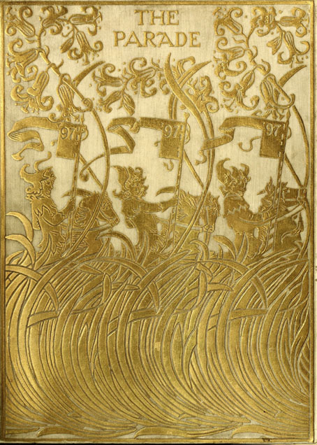
Design by Paul Woodroffe.

The Parade, subtitled An Illustrated Gift Book for Boys and Girls, is something that children with wealthy parents or relatives might have received as a Christmas present in December 1897. The contents are an unusual mix of fairy tales, frivolous seasonal fare—A Christmas Mummery, complete with songs and music—and adventure stories set in other parts of the world. The collection was edited by Gleeson White, an art critic whose former position as editor of The Studio magazine explains the very Studio-friendly choice of illustrators.

parade02.jpg

The design on the title page is a curious piece by Aubrey Beardsley, one with less authority than the most of the other drawings he was producing in his penultimate year. Those dots filling out the arabesque plant forms are the kinds of things that amateurs do when they’re uncertain about whether or not to decorate a design. The tendril which terminates in a tasselled confection is, however, a typical example of the artist’s bizarre invention, the kind of caprice that used to infuriate the critics who disliked his work. Beardsley’s career had been launched four years earlier with a profile in The Studio, but by 1897 he was often struggling for money after being fired from The Yellow Book in the wake of the Oscar Wilde scandal. Gleeson White is to be commended for supporting him at a time when many others refused to do so.

parade03.jpg

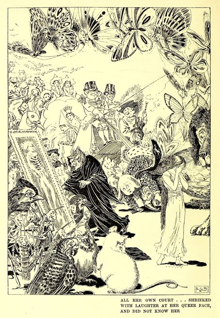
L. Leslie Brooke.

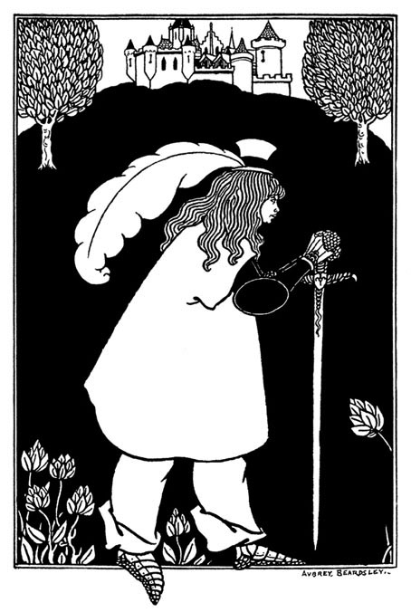
Elsewhere in The Parade there are contributions both written and pictorial from Beardsley’s friend, Max Beerbohm; also a story by Richard Burton, a writer you wouldn’t usually expect to find in a book aimed at children. The list of illustrators includes Charles Robinson, Laurence Housman and Manchester’s own Alfred Garth Jones. Beardsley didn’t draw anything else for The Parade but he’s mentioned again in a list of titles advertised in the book’s final pages as having provided a frontispiece for Baron Verdigris, “A Romance of the Reversed Direction” by one Jocelyn Quilp. The title was unfamiliar, and I wasn’t sure at first whether I’d seen the illustration, but the drawing shown below appears in two of my Beardsley books—albeit at small sizes—including the copious Brian Reade collection from 1967.

beardsley.jpg

“Baron Verdigris” sounds like a minor character from Michael Moorcock’s Dancers at the End of Time trilogy, while the improbable “Jocelyn Quilp” turns out to be a nom de plume of Halliwell Sutcliffe whose book is described as a “singular novella, a curious amalgam of parodies based on a time-travelling theme“; shades of the Dancers again. It’s tempting to think that this may be the sole example of Aubrey Beardsley illustrating science fiction (or something like it)—the book is generic enough to be listed at ISFDB—but Brian Reade describes the story as “pseudo-mediaeval and facetious”, “dedicated to ‘Fin-de-Siécle-ism, the Sensational Novel, and the Conventional Drawing-Room Ballad'”. That does at least explain the peculiarities of the drawing. Maybe the Moorcock comparison is an apt one after all.

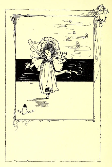
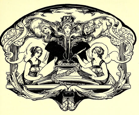
More illustrations from The Parade:

parade04.jpg

Charles Robinson.

parade05.jpg

Léon V. Solon.

Continue reading “The Parade and Baron Verdigris”