Six of the enigmatic capitals.
After writing about my occasional and not very diligent search for the origin of an unidentified set of calligraphic capitals, Jacob Filipp resolved the whole matter for me very quickly. The mystery dates back to 1997 when I bought a Pepin Press book, Ornamental Type, a substantial overview of historic lettering which contains many quality reproductions but no information at all as to the origin of the alphabets. One set of calligraphic capitals were immediately attractive even though many of them had their flourishes cropped by their containing frames. I’ve since used these letters a number of times in print designs, and also used them as page backgrounds for the very first version of my website. In 2002 there was still a tendency in web design for things to look streamlined, cybernetic or futuristic, qualities I was happy to ignore. After ten years or so of using and reusing the letters the question of their origin began to nag at me, hence my recent attempts to resolve the mystery.

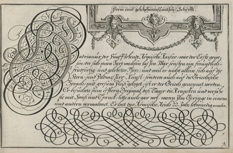
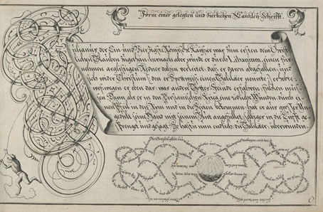
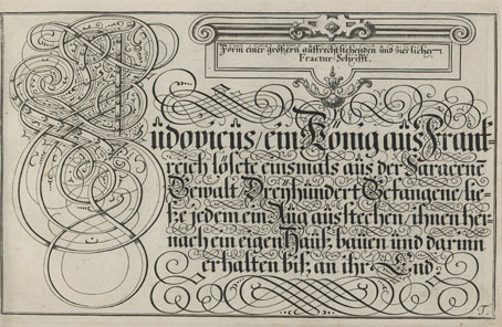
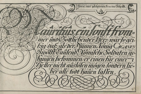
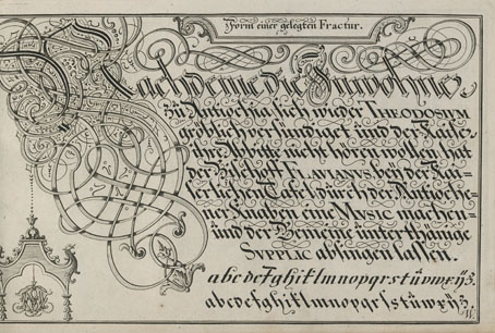
From Baurenfeind’s Schreib-Kunst at the Letterform Archive.
It turns out that the capitals were the work of Michael Baurenfeind (1680–1753), a German calligrapher whose exceptional work appeared on these pages just over a year ago. Had I been more observant I would have noticed that one of the pages in the 1716 edition of Baurenfeind’s Schreib-Kunst is the alphabet in question (I even posted the page here!) but the copy of the book at the Internet Archive is missing the page that shows the first half of the alphabet. Every time I’d gone searching for the capitals I’d been using the letter A as a guide, looking for the reflected flourishes at the foot of the letter in other alphabets. The obvious thing to do would have been to look for more of the letters using image searches, which is what Jacob did, eventually locating a capital D on a deleted post at Design Observer.
I’m pleased to have Michael Baurenfeind revealed as the creator of the capitals, his work stands out even among his equally talented contemporaries. The cropped flourishes mean they aren’t ideal for print purposes—in the past I’ve used them in backgrounds where the cropping goes unnoticed—but I’ve thought a few times of making a new set with the cropped sections restored. Now that I know Baurenfeind is the designer this would be easier to do. Any hesitation about how to properly complete a flourish or fill in a missing area could be resolved by consulting Baurenfeind’s other lettering designs. My thanks again to Jacob for resolving the mystery!
Previously on { feuilleton }
• Mira Calligraphiae Monumenta
• Liber Artificiosus Alphabeti Maioris
• Michael Baurenfeind’s extravagant calligraphy
• Bergling’s Art Alphabets
• Grand capitals
• Costume capitals
• Paulini’s mythological alphabet
• Joseph Balthazar Silvestre’s Alphabet-album
• Johann Theodor de Bry’s Neiw Kunstliches Alphabet
• The Book of Ornamental Alphabets
• Paul Franck’s calligraphy
• Gramato-graphices
• John Bickham’s Fables and other short poems
• Letters and Lettering
• Studies in Pen Art
• Flourishes