Weekend links 30

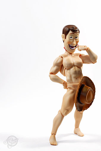
woody.jpg

Did someone say “woody”? Plenty more toy antics at TheOneCam.

• And yet more Haeckelisms: Praying in Haeckel’s Garden, recent works by artist Mary O’Malley.

Seasons of the Peacock, the perennial showoff as depicted by a handful of Art Nouveau artists. A couple of examples there I hadn’t seen before.

• Dorian Cope presents On This Deity, “Commemorating culture heroes and excavating world events.”

• At long last, Fantagraphics will be publishing Ah Pook is Here, the comic strip collaboration between William Burroughs and artist Malcolm McNeill. Something to look forward to for next year. Related: Malcolm McNeill’s website.

David Lynch Dark Splendor: “Der große Filmemacher David Lynch als Fotograf, Maler, Zeichner und Grafiker.”

More on the forthcoming album from Brian Eno, Leo Abrahams and Jon Hopkins. With this degree of hype the end result is going to be a disappointment.

Book design by Richard Hollis, including John Berger’s essential Ways of Seeing.

A fistful of Vignellis: the work of Lella and Massimo Vignelli celebrated.

• Berni Wrightson’s Frankenstein at Golden Age Comic Book Stories.

Jimi Hendrix, Philip José Farmer reader.

Imagerie du Chemin de Fer.

El UFO Cayó (2005) by Ry Cooder.

Radical architects and their magazines

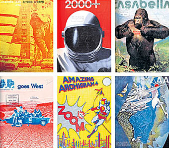
archimags.jpg

Such Cheek! Those Were the Days, Architects
by Nicolai Ouroussoff
New York Times, February 8th, 2007

IF YOU ARE revolted by today’s slick and fashion-obsessed architecture scene, hurry over to ‘Clip/Stamp/Fold: The Radical Architecture of Little Magazines‘ at the Storefront for Art and Architecture. You’ll feel even worse.

Organized by the architectural historian Beatriz Colomina, the show examines the world of those small magazines from the early 1960s to the end of the 1970s, when the field of architecture was still marked by a playful intellectual and political independence. It’s packed with gorgeous cover images, from copulating robots to an elephant attacking the Solomon R. Guggenheim Museum in Manhattan to a skyscraper made of Swiss cheese. Often thrown together on a shoestring budget, the magazines have an intoxicating freshness that should send a shudder down the spine of those who’ve spent the last decade bathed in the glow of the computer screen.

But this is not an exercise in nostalgia. It’s a piercing critique, intended or not, of the smoothness of our contemporary design culture. These magazine covers map out an era when architecture was simmering with new ideas. You’re bound to leave the show with a nagging sense of what was lost as well as gained during the electronic juggernaut of the last three decades.

Part of the magic of this show, which was recently extended for three more weeks, is in the works’ crude immediacy. One side of the gallery is wallpapered in hundreds of colorful magazine covers. On the opposite wall a more detailed timeline maps out the evolution of the culture of architectural magazines, from an obsession with politics and pop culture to a descent into increasingly abstruse and self-involved theoretical debates. The rarest magazines are encased in clear plastic bubbles (made of cheap plastic skylights that the show’s curators bought on Canal Street), evoking time capsules descended from outer space.

Continue reading “Radical architects and their magazines”

Helvetica: the film

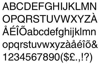
helvetica.jpg

Yes, a documentary about a typeface by Gary Hustwit. And why not, say I? More films about typography, please. I paid homage to the ubiquitous Swiss font with my design for Savoy’s A Serious Life which used Helvetica Neue in various weights throughout.

Helvetica is a feature-length independent film about typography, graphic design and global visual culture. It looks at the proliferation of one typeface (which will celebrate its 50th birthday in 2007) as part of a larger conversation about the way type affects our lives. The film is an exploration of urban spaces in major cities and the type that inhabits them, and a fluid discussion with renowned designers about the choices and aesthetics behind their use of type.

Helvetica encompasses the worlds of design, advertising, psychology, and communication, and invites us to take a second look at the thousands of words we see every day.

The film was shot in high-definition on location in the United States, England, the Netherlands, Germany, Switzerland, France and Belgium. It is currently in post-production and is slated to begin screening at film festivals worldwide starting in early 2007.

Interviewees in Helvetica include some of the most illustrious and innovative names in the design world, including Erik Spiekermann, Matthew Carter, Massimo Vignelli, Michael Bierut, Wim Crouwel, Hermann Zapf, Stefan Sagmeister, Jonathan Hoefler, Tobias Frere-Jones, Experimental Jetset, and many more.

Via Typographica.