Weekend links 533

calvino.jpg

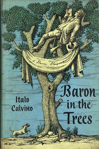
Cover art by Domenico Gnoli, 1959.

• After decades of ignoring the output of Tangerine Dream it feels strange to be interested in the group once again; musicians you’re compelled to dismiss seldom manage to recapture your attention later on. Stranger still when the group itself is now completely detached from its origins following the death of founder Edgar Froese in 2015. But it was Froese’s departure, and with it the disappearance of many years of poor aesthetic choices, that helped renew my interest. At FACT the group take up the against-the-clock challenge in which musicians are given 10 minutes to create a new piece of music.

• “We were both working at Sounds at the time and we thought that instead of listening to these terrible ’80s records like Haircut 100 we’d go off and look for Montague Summers books, so off we went!” Savage Pencil (Edwin Pouncey) on his enthusiasm for Summers, Austin Spare and Louis Wain.

• At the Paris Review: Valerie Stivers bakes pies for Italo Calvino. I’d like to see someone create a series of dishes based on every location from Invisible Cities. Elsewhere there’s William N. Copley on Joseph Cornell: “No art historian ever prophesied the coming of the box.”

• On the experimental realism of an eccentric Russian Anglophile: “For Sigizmund Krzhizhanovsky, strangeness was a matter of perspective,” says Caryl Emerson.

Nova Reperta: John Boardley on a series of 16th-century prints showing new inventions.

• RIP David Graeber. From 2014: “What’s the point if we can’t have fun?

• “Damn your blood”: John Spurr on swearing in early modern English.

• At Wormwoodiana: Mark Valentine maps the esoteric in Britain, 1920.

• At Dennis Cooper’s: Seijun Suzuki Day.

Big Fun/Holly-wuud (Take 3) (1972) by Miles Davis | Funtime (1977) by Iggy Pop | Funny Time Of Year (2002) by Beth Gibbons and Rustin Man

Foiled at last

foil.jpg

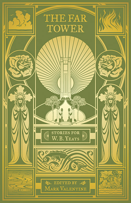
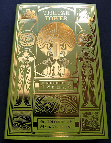
I’ve already written about the design for this story collection from Swan River Press but the gradient layout does nothing to convey the splendour of the foil-embossed printing. In the past when I’d suggested to publishers that foil printing might be an option the idea was always turned down for reasons of cost. My original intention for The Far Tower was for the design to be printed in a metallic ink so it might resemble the gold-on-green cover of the Yeats book which was the model for this volume. Metallic inks don’t always work too well, however, especially on a darkish background, so I said to Swan River “Or we could do it in gold foil…” To my surprise and delight they said “Why not?” So here’s the result. A great end to the year. The book is available here.

lansdale.jpg

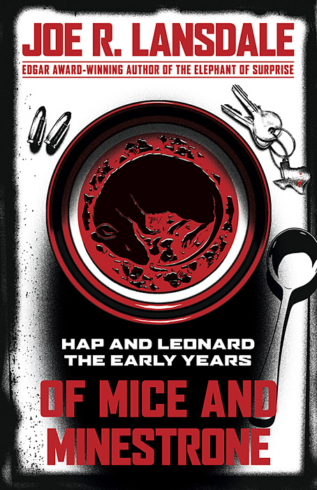
And back in October, I posted what everyone thought at the time was the final design for Of Mice and Minestrone, a new book of Hap and Leonard stories by Joe R Lansdale. The Hap and Leonard books are popular works (there was a TV series based on them a while back) so they’re subject to the demands of the marketplace which in this case required a cover more in line with the red/white/black arrangement of some of Lansdale’s related titles. I’d already done most of this as an additional draft during the work on the first design so the reworking wasn’t too time-consuming. The rodent in the soup is more visible in this version which is another point in its favour. Of Mice and Minestrone will be published by Tachyon in May next year.

Previously on { feuilleton }
The Far Tower: Stories for WB Yeats
Of Mice and Minestrone

The Far Tower: Stories for WB Yeats

tower.jpg

I said a couple of weeks ago that I had more cover designs waiting to be revealed, and this was one of them, arriving two years to the week after my earlier cover for The Scarlet Soul: Stories of Dorian Gray. Both books are collections of original fiction edited by Mark Valentine for Swan River Press, and both offer variations on works by Irish authors prominent during the 1890s:

“All Art that is not mere story-telling,
or mere portraiture, is symbolic…” — WB Yeats

Stories of magic and myth, folklore and fairy traditions, the occult and the outré, inspired by the rich mystical world of Ireland’s greatest poet, WB Yeats. We invited ten contemporary writers to celebrate Yeats’s contributions to the history of the fantastic and supernatural in literature, drawing on his work for their own new and original tales. Each has chosen a phrase from his poems, plays, stories, or essays to herald their own explorations in the esoteric. Alongside their own powerful qualities, the pieces here testify to the continuing resonance of Yeats’s vision in our own time, that deep understanding of the meshing of two worlds and the talismans of old magic.

Yeats had a career that extended beyond the fin de siècle, of course, and the title of The Far Tower alludes to The Tower, a collection of poems that Yeats published in 1928. (The first poem in the book, Sailing to Byzantium, is the origin of the phrase/title “no country for old men”.) Yeats’s poetry is very different to the Modernists, however, and remained infused with mystical resonances, something I tried to reflect in the cover design. In addition to the very Yeatsian symbol of the rose there are symbols for the four elements, and a pair of robed figures who can be taken as adepts of one sort or another, either the Golden Dawn (who Yeats was involved with for a time) or the various Theosophists and Rosicrucians of the period who fed his imagination.

The green-and-gold colour scheme matches the gold on green design that Thomas Sturge Moore created for the first edition of The Tower. Sturge Moore produced covers for a number of Yeats’s books but it was his splendid design for Axel by Auguste Villiers de L’Isle-Adam that gave me the nested circles and vertical division of the board. That edition happens to have a preface by Yeats so as an influence it isn’t too remote.

The Far Tower will be published in December but is available for pre-order now.

Previously on { feuilleton }
The Scarlet Soul: Stories for Dorian Gray
Form and Austin Osman Spare
Golden apples and silver apples
A Book of Images by WT Horton
The Savoy magazine

Something from Below

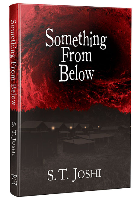
My first encounter with author, editor and Lovecraft biographer ST Joshi was in the form of an artwork request that arrived out of the blue in the late 1980s. My comic-strip adaptation of The Haunter of the Dark had just been published in a large-format edition by Caermaen Press, a small imprint run by Roger Dobson and Mark Valentine, and this prompted a flurry of interest among weird-fiction enthusiasts in Britain and the USA. Joshi was editing Lovecraft Studies for Necronomicon Press at the time, and asked if I’d be willing to contribute illustrations, something I ended up not doing for a variety of reasons. I always felt bad about this, and admitted as much when we eventually met at the Providence NecronomiCon in 2015, so my cover art for his new cosmic-horror novella may be regarded as a kind of recompense.

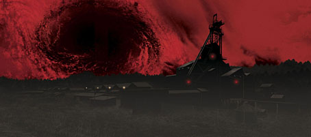
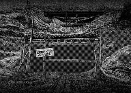
Something from Below is horror with an industrial setting and a Lovecraftian slant, hence the sinister coal mine dominating the artwork:

When 22-year-old Alison Mannering returns to her home in northeastern Pennsylvania after college, she finds a troubling situation. Her father, Guy Mannering, a longtime coal miner, has died recently under suspicious circumstances, and her mother refuses to provide any details of his passing. Alison feels she has no option but to investigate the matter herself, enlisting her high school sweetheart, Randy Kroeber, as well as Randy’s twin sister, Andrea called Andy, to assist her… (more)

The brief for this one was to create a wraparound cover without showing anything overtly monstrous, something I was happy to do since I dislike horror covers that reveal too much. In addition to the wrap I also produced a black-and-white piece for the inner boards. As is evident from the pictures above, the artwork was flipped around in the design but that’s okay, it works both ways. The coal mine is the central location, however.

Something from Below is published this month by PS Publishing in signed and unsigned hardcovers.

Elsewhere on { feuilleton }
The Lovecraft archive

Weekend links 466

maar.jpg

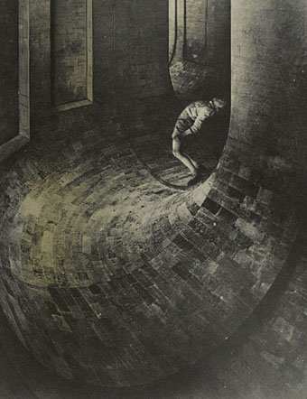
The Simulator (1936) by Dora Maar.

• Surprise of the week for me was the discovery of a new album, Kshatrya – The Eye Of The Bird, by cult French composer Igor Wakhévitch. This had been out for a while but I’d managed to miss the announcements. The music was recorded in 1999 so isn’t exactly new but it’s the first new Wakhévitch release (as opposed to a reissue or compilation) since Let’s Start in 1979. Very good it is too, almost completely electronic but not as discordant as his synth-dominated Hathor album.

• “Popol Vuh is a Mass for the heart.” Gerhard Augustin talks to Florian Fricke about Popol Vuh’s music in a “rare” (lost? previously unseen?) interview. Undated but the City Raga album is referred to as a recent release so it’s probably around 1995.

Brian Dillon on the voraciousness and oddity of Dora Maar’s pictures. Related: Rick Poynor on The Simulator by Dora Maar.

The Secret Ceremonies: Critical Essays on Arthur Machen, edited by Mark Valentine and Timothy J. Jarvis.

Juliette Goodrich on the tale of the Buchla synthesizer, the repair engineer, and a dormant drop of LSD.

Scott Tobias on Midnight Cowboy at 50: why the X-rated best picture winner endures.

• A Hidden History of Women and Psychedelics by Mariavittoria Mangini.

• Previews of Chords, the new album by composer Ellen Arkbro.

• Mix of the week: Secret Thirteen Mix 290 by Mark Stewart.

• “Somehow I became respectable,” says John Waters.

• At Dennis Cooper’s: Walerian Borowczyk Day.

• The Bandcamp Guide to Earth.

Gén #1 by Ray Kunimoto.

Secret Ceremony (Theme From Brond) (1987) by Scala (Bill Nelson & Daryl Runswick) | Healing Ceremony (1990) by African Head Charge | Ceremony Behind Screens (1995) by David Toop