A profusion of Peake

gormenghast_box.jpg

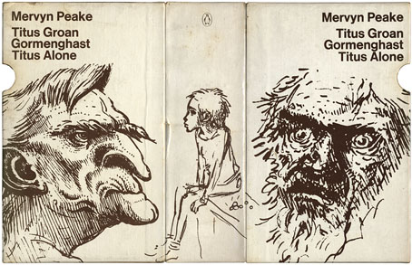
Bellgrove, young Titus and Barquentine by Mervyn Peake. Case designed by Robert Hollingsworth.

I’d thought about posting the covers of my boxed set of Gormenghast paperbacks a couple of years back when there was a flurry of blogospheric attention being given to Penguin cover designs…thought about it then never got round to it. The reason for doing so now is twofold: firstly I’ve been re-reading the books, and secondly some Gormenghast-related news emerged this week which gives this post an additional relevance.
gormenghast1.jpg

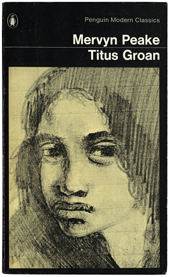
Fuchsia by Mervyn Peake.

The set of Peake paperbacks which Penguin published in 1968 (and their subsequent reprints) were the first editions of Peake’s trilogy which I encountered so I can’t help but regard them as the ones, the only copies I could countenance reading. That may change, however (see below). I’ve no idea how scarce the boxed edition is but the books are reprintings from 1970 so I presume Penguin put out a boxed gift set to make the most of Peake’s posthumous success. I always liked the presentation which is the standard Penguin Modern Classics format of the period, it leaves to you how much you want to regard the books as works of fantasy or simply novels of a rather grotesque and highly imaginative reality. Titus Groan‘s sketch of a glowering and thoroughly unglamorous Fuchsia was a daring choice for a cover intended to lure a newer, younger audience to Peake’s work. The drawing says a great deal about the author’s unsentimental attitude towards his creations; compared to the florid and often delicate covers of the fantasy books being published by Ballantine in the late Sixties (a series which included the Gormenghast trilogy), it seems shockingly unpleasant.

Continue reading “A profusion of Peake”

Bruegel in winter

bruegel1.jpg

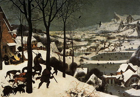
The Hunters in the Snow (1565).

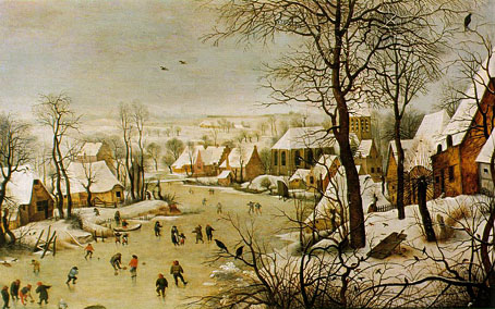
Most of the snow here in Manchester melted over Christmas but it’s likely there’ll be more on the way given the unusually low temperatures. Whatever the complaints about the weather, the empty-handed hunters painted by Pieter Bruegel the Elder (c.1525–1569) had it worse. Of the two paintings, Winter Landscape with a Bird Trap is the lesser composition but seems slightly more optimistic.

bruegel2.jpg

Winter Landscape with a Bird Trap (1565).

I upgraded WordPress a few hours ago with the result that the latest version of the software no longer works with a couple of the plug-ins I was using. I try to keep WP plug-ins to a minimum but fell foul on this occasion so there’s now no tag cloud at the foot of the page until I work out a way to restore it by other means. If anything here seems awry or broken over the next couple of days, that’s the explanation.

Previously on { feuilleton }
Winter panoramas
Winter music
Winter light
La Tour by Schuiten & Peeters

Queer Noise and the Wolf Girl

queer_noise.jpg

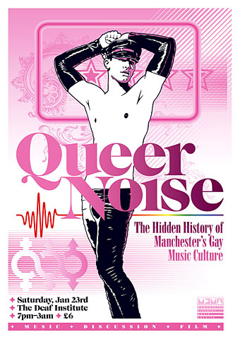
Two recent pieces of work which were being created at the same time so they share some similarity of style (and the same baroque flourish). Queer Noise is a music-related event taking place in Manchester (UK) next month. Music journalist Jon Savage will be leading the discussion and some may recognise the event title as relating to his Trikont CD compilation Queer Noises 1961–1978: From the Closet to the Charts. There are further details about the event at the MDMArchive.

Designing for gay content can be a fraught business since it’s almost inevitable that someone will disagree with your choices. Best then to abandon any thought of trying to please everyone and follow your own instincts. Making this a riot of pink seemed like a good way to offset the fetishised figure as well as making an eye-catching design. My first impetus had been to try an arrangement of pink and black on white similar to that used by Barney Bubbles in one of his Ian Dury designs. In the end this evolved away from that idea but it was a useful starting point. And while we’re on the subject of pink, there’s a growing backlash against the way the colour is forced on young girls:

Back in the 1800s, most children were dressed alike. Gender differences weren’t really apparent until they could walk, or later: boys and girls both wore dresses or skirts until they were six or so. By the end of the century, as the Ladies’ Home Journal noted, boys’ and girls’ clothing styles began to diverge. According to Professor Jo Paoletti of the University of Maryland, pink emerged as an appropriate colour for boys because it was “a close relative of red, seen as a fiery, manly colour”. Blue was considered better suited for girls because of its associations, in art, with the Virgin Mary. (More.)

curse.jpg

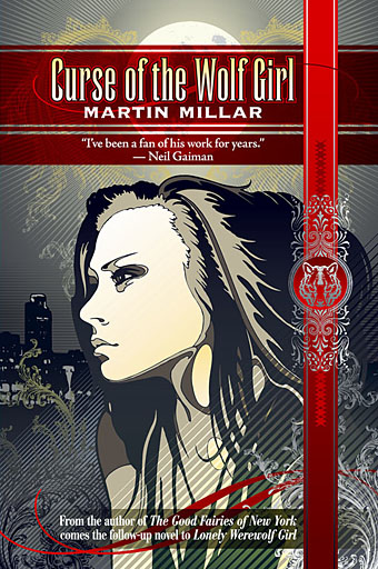
Curse of the Wolf Girl is a young adult title by Martin Millar about which I can tell you very little at the moment other than I’ve finished the cover and the book will be out some time in the new year from Underland Press. More about that when it happens.

Previously on { feuilleton }
Coming Out Day
Over the rainbow
Queer Noises

Jack Rose, 1971–2009

rose1.jpg

It was a shock this weekend to hear of the sudden death (heart attack, apparently) of American guitarist Jack Rose. I think I saw him perform four times in all, the first occasion being at Spaceland in Los Angeles, 2005, where I snapped this photo which I used for a poster design when he played in Manchester a few months later. His shimmering extemporisations on blues and folk themes that evening were simply stunning and I rushed to buy his Kensington Blues CD as soon as he’d finished. There’s no need to attempt futile descriptions of his talent when you can go to YouTube and discover it for yourself. He was only 38. A great loss to family, friends and music.

rose2.jpg

Previously on { feuilleton }
The Golden Apples of the Sun
Jack Rose returns
Jack Rose in Manchester

The art of Ralph Koltai

koltai.jpg

Ralph Koltai‘s contrasting of panels of corroded metal with smooth objects makes for some attractive combinations, reminding me of similar rough and smooth juxtapositions by artist and designer Russell Mills, notably on one of his Samuel Beckett covers and his design for Harold Budd and Brian Eno’s The Pearl. Koltai’s site also includes a gallery of his designs for theatre. Digital rust infiltrates my own work now and then via some photos I took of a Manchester railway bridge, the most recent use being in the background of the cover for Finch.

Previously on { feuilleton }
Finch posters
Samuel Beckett and Russell Mills
The art of Jo Whaley