Weekend links 664

warburton.jpg

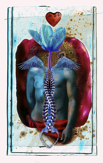
Caduceus: Tarot Card Study – Love by Holly Warburton.

• The week in stage magic: Ken Carbone, writing about playing cards and graphic design, points the way to an hour of Ricky Jay demonstrating his miraculous abilities with a pack of cards. Elsewhere, Erik Ofgang asks “Who was Mr. Electrico, the sideshow magician who inspired Ray Bradbury—then vanished?”

The 1980 Floor Show – Uncut / Unedited: 8 Hours of David Bowie in Ziggy Stardust guise performing for American TV cameras at The Marquee, London, in October 1973. That’s more Bowie than most people would want—there’s a lot of repetition—but it’s good to know things like this can still surface.

• “A supernova has gone out,” says David Grundy about the late Wayne Shorter. Also this: “Sci-fi fan Shorter suggested the title to [Weather Report’s] second album I Sing The Body Electric, taken from Walt Whitman via Ray Bradbury.”

• “We need to get away from thinking of ourselves as machines… That metaphor is getting in the way of understanding living, wild cognition.” A long read by Amanda Gefter about the secret life of plants, and “4E” cognitive science.

• “…why take a soft approach to safety when you can scare the sensible into the next generation with some of the most effective horror shorts of all time?” Ryan Finnegan on the notorious PIFs (public information films) of the 1970s.

• “I am increasingly of the Lynchian mindset of ‘never explain’…” Lynda E. Rucker talking to Steven Duffy about her latest story collection, Now It’s Dark.

• James Balmont presents a brief introduction to the mind-altering cinema of Sogo Ishii.

• At Spoon & Tamago: Hidari: An epic wooden puppet samurai stop-motion film.

• Old music: Musique De Notre Temps (1976) by Éliane Radigue.

• Steven Heller’s font of the month is Juma.

Body Electric (1982) by The Sisters Of Mercy | Super-Electric (1991) by Stereolab | Electric Garden (Deep Jazz In The Garden Mix) (2013) by Juan Atkins & Moritz von Oswald

Now it’s here

rucker1.jpg

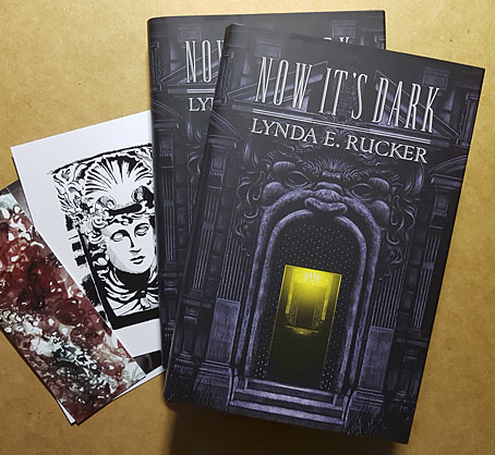
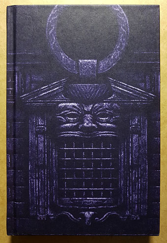
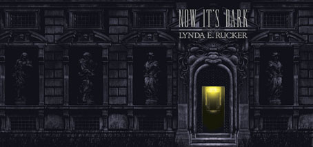
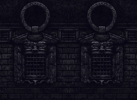
Arriving in the post this week, the Lynda E. Rucker story collection with my art on the dustjacket and the printed boards. This is a typically high-quality production from Swan River Press which comes with the usual complement of postcards and bookmark. I’ve already written something about the art but now the book is in print you can see the texture of the stock that covers the boards. I like the way this works with the texture of the drawing.

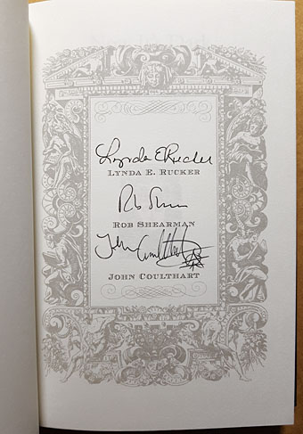
The book is available now. All copies are signed by the author, by Rob Shearman (who wrote the introduction), and by myself.

rucker2.jpg

rucker3.jpg

Now It’s Dark

dark1.jpg

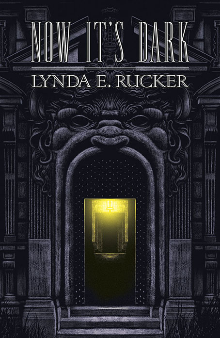
Now It’s Dark by Lynda E. Rucker; cover art by John Coulthart; jacket design by Meggan Kehrli; introduction by Rob Shearman; edited by Brian J. Showers and Timothy J. Jarvis; copyedited by Jim Rockhill; typeset by Steve J. Shaw; published by Swan River Press.

Hardback: Published on 27 January 2023; limited to 400 copies of which 100 were embossed and hand numbered; signed by Lynda E. Rucker, Rob Shearman, and John Coulthart; xii + 225 pages; lithographically printed on 90 gsm paper; dust jacketed; illustrated Wibalin boards; sewn binding; head- and tail-bands; ISBN: 978-1-78380-043-8.

dark2.jpg

Dust jacket.

dark3.jpg

Printed boards.

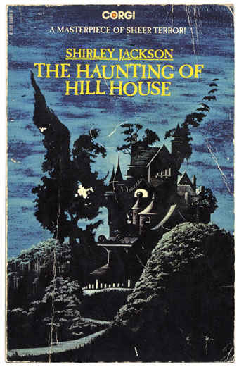
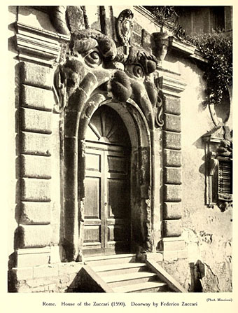
This is the last of the books I was working on last year, and being another design for Swan River Press means that once again the artwork is a wraparound cover with printed boards under the wrap. Now It’s Dark is a collection of horror stories (or possibly “strange stories” à la Robert Aickman), and a very fine collection it is. I was given carte blanche with this one so the cover is a mood piece rather than anything directly illustrational. One of the stories concerns the god Pan, which tempted me at first to do something with a satyr-like face, possibly as an architectural feature like a mascaron. But focusing on a single story in this way usually makes me worry about giving that story too much attention if it hasn’t also provided the title of the collection. Thinking about mascarons and their positioning above arched doorways led to the design you see here, a gesture towards a minor trend in horror illustration that makes use of the Arcimboldo effect, as with my battered Shirley Jackson paperback.

haunting.jpg

Corgi Books, 1977. No artist credited.

zuccari1.jpg

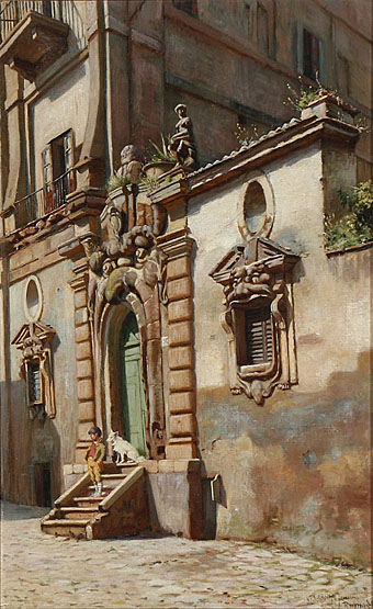
A Boy and His Dog on a Staircase in Rome (1886) by Niels Frederik Schiøttz-Jensen.

My cover is a variation on a real place, the “House of Monsters” entrance of the Palazzo Zuccari in Rome which today houses the Bibliotheca Hertziana. I placed the portal into an extended Baroque facade while moving the monstrous windows to the boards of the book. Given the way the grotteschi concept was a common feature of the Baroque you’d expect there to be more doorways like this but the palazzo street entrance seems to be unique. Equivalents such as the Ogre’s Head at Bomarzo are more like theme-park attractions than architectural features. I’ve never seen Umberto Eco mention the Palazzo Zuccari but I imagine he would have enjoyed seeing an infernal mouth as an entrance to a library.

zuccari2.jpg

Previously on { feuilleton }
Infernal entrances