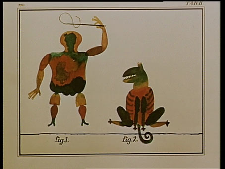
Et Cetera (1966).
A little more on the music of Czech soundtrack composer Zdenek Liska (1922–1983). Liska seems to stand in relation to Czech cinema as Ennio Morricone does to that of the cinema of Italy, being similarly prolific, highly regarded, and idiosyncratic to a degree that makes his work immediately recognisable. Both men could also draw on their experience outside the film world to fuel their scores: Morricone for many years was a performer with Gruppo di Improvvisazione di Nuova Consonanza, a group of Italian free improvisers, while Liska’s work with electro-acoustic composition and early electronic music explains the frequent eruptions in his lush orchestrations of tape effects, exaggerated echoes and other forms of artificial processing. This kind of cross-pollination doesn’t seem so surprising today but it’s striking and surprising in soundtracks from the 1960s.
Good examples of the opposite poles of Liska can be found in two of Jan Svankmajer’s early shorts. Et Cetera (1966) is one of the director’s most formal exercises, a series of crude drawings (or cut-outs) coming to life to perform a repetitive routine before being interrupted by the words “ET CETERA”. The film plays with the audience by beginning with a title card that states “The End”, and the piece as a whole could easily be screened as an endless loop. Liska’s score is a combination of fairly minimal orchestration with a variety of electro-acoustic effects which are closer to Pierre Henry or Ilhan Mimaroglu than other Eastern European composers.
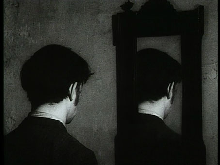
Shade of Magritte: The Flat (1968).
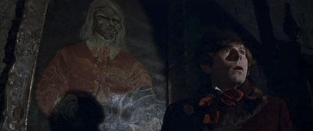
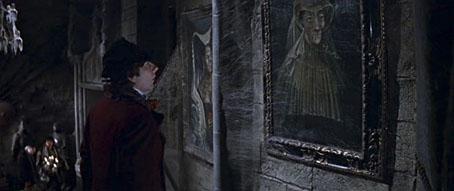
At the opposite end of the scale there’s the score for The Flat (1968), a typical piece of Svankmajer Surrealism with an unfortunate individual locked in a room where everything, from walls to furniture, contradicts his expectations. René Magritte casts a long shadow over this one, with director Juraj Herz making a brief appearance as a bowler-hatted man carrying a chicken. Liska’s score has a driving and reverberent choral rhythm that always makes me think of Krzysztof Komeda’s similar music for Roman Polanski’s Dance of the Vampires (1967). For such a short film it’s a remarkable piece of orchestration. The Brothers Quay are great Liska enthusiasts, and used some of the score from The Flat (and two other Liska pieces) for their 1984 film The Cabinet of Jan Svankmajer, an animated portrait of the director.
Previously on { feuilleton }
• Liska’s Golem
• The Cremator by Juraj Herz

