Reworking Kraftwerk (again)

kraftwerk00.jpg

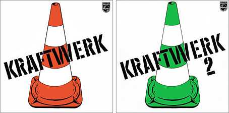
Kraftwerk (1970); Kraftwerk 2 (1972). Design by Ralf Hütter.

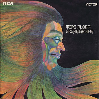
Recent posts about Kraftwerk’s design history had me wondering how the group might present the first three albums if these repudiated works were allowed back into the catalogue. Kraftwerk, Kraftwerk 2, and Ralf and Florian haven’t been officially reissued for decades now, and I remain sceptical that Ralf Hütter (or the recently departed Florian Schneider) are willing to taint their carefully cultivated discography with those awkward, experimental albums. This is highly unusual in the music world where everything by a commercially successful group tends to be reissued on a regular basis.

raf.jpg

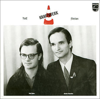
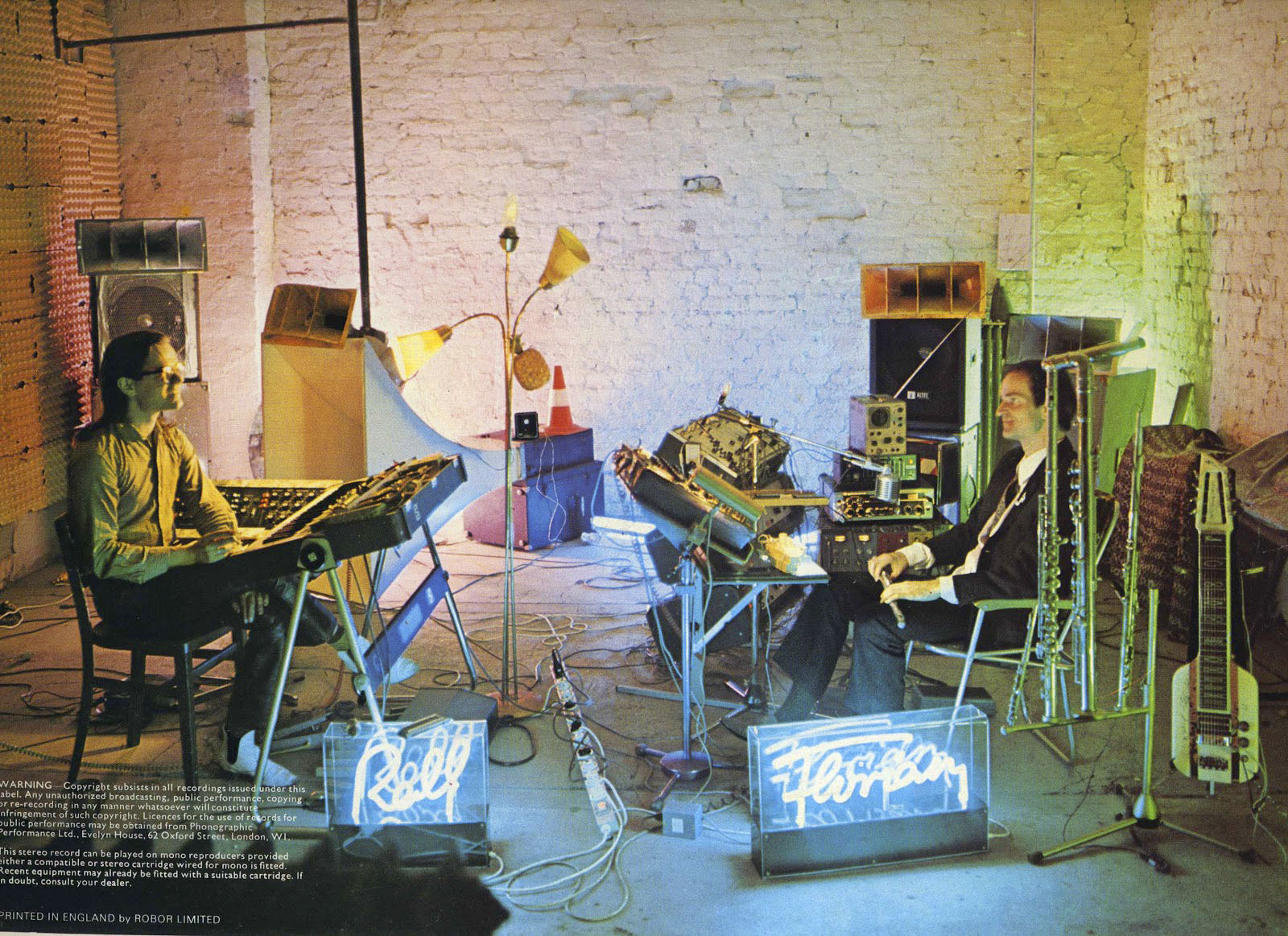
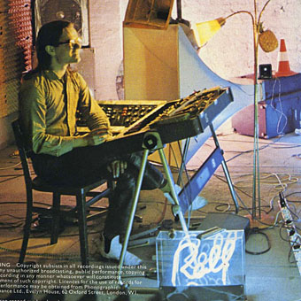
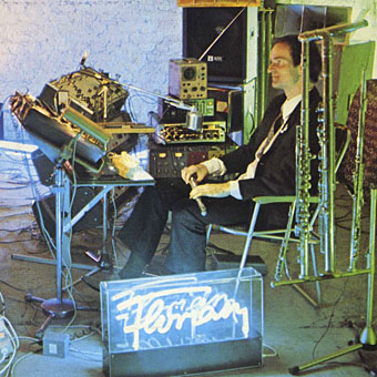
Ralf and Florian (1973). Design by Ralf Hütter & Florian Schneider. Photo by Robert Franck.

Kraftwerk are unique in this, and also in subjecting their approved releases to incremental adjustments. This was mostly strikingly seen in 2009 when the 8 albums were reissued in a box as The Catalogue. Not only had further changes been made to the cover art but two of the albums had amended titles: Electric Café was now Techno Pop (as it would have been titled if released earlier in the 1980s), and Tour De France Soundtracks had become Tour De France. The cover art changes had already been previewed in the version of The Catalogue that briefly appeared as a promo set in 2004 only now it was evident that more human traces were being removed from the albums, notably on the cover of The Man-Machine which swapped the band photo for the El Lissitzky-derived graphics. All of this needed to be taken into account when I had the idea last week of roughing out designs for how the first three albums might be reissued in a box set today.

cover1.jpg

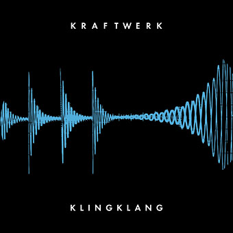
First the title: there’s no way of knowing what Ralf Hütter might call a collected set but mundane choices like Three Albums or Kraftwerk 70–73 seem unlikely. I decided on Klingklang, the name of the first piece of music on the second album, and also the name of Kraftwerk’s studio and publishing company. This would no doubt cause endless (endless) confusion but it still seems apt. The cover design uses Futura, a German typeface that’s been a feature of many Kraftwerk graphics over the years. The oscilloscope wave is taken from the front and back cover of the double-album reissue of Kraftwerk and Kraftwerk 2 on the Vertigo label in 1972. I always liked that cover, and the graphic suits the often raw electronic sound of those albums as well as the minimal nature of the current design.

cover2.jpg

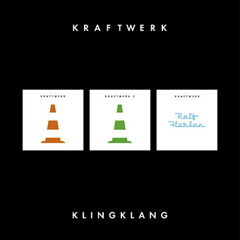
This would be the back of the proposed box, showing the albums within as The Catalogue does.

kw1.jpg

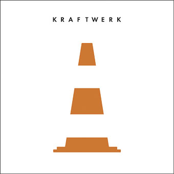
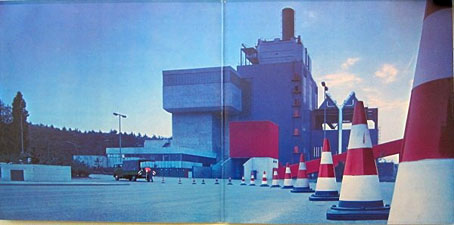
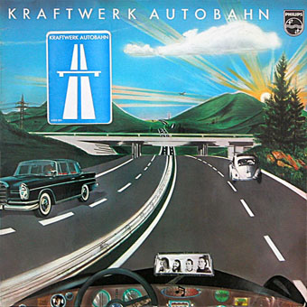
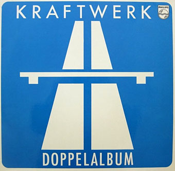
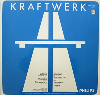
All German traffic cones still follow this standard, apparently, so the design hasn’t dated at all. (See this post for Kraftwerk’s cone obsession.) Using negative space for the white bands works well.

Continue reading “Reworking Kraftwerk (again)”

Leitkegel

autobahn12.jpg

Gatefold interior for Doppelalbum (1974), a double-disc compilation album by Kraftwerk.

More Kraftwerkiana. “Leitkegel” is the German name for traffic cones, and it’s immediately obvious to anyone browsing Kraftwerk’s pre-Autobahn recordings that Ralf and Florian had a fixation with these objects. The closest thing I’ve found for a rationale is in Tim Barr’s history of the group, Kraftwerk: From Dusseldorf to the Future (1998), which features some musings about the influence of Joseph Beuys and the Düsseldorf arts scene of the late 60s. Prior to Kraftwerk, Florian Schneider was a member of a short-lived art collective/music outfit with the very un-Kraftwerkian name of Pissoff. Recordings exist of the group performing with Beuys. A more straightforward explanation might be to look towards Pop Art (something that Barr also suggests), with the traffic cone serving as a symbolic objet trouvé that’s also the first inkling of the future Kraftwerk obsessions with roads, trains and cycling. Whatever the impulse behind its adoption, between 1969 and 1973 the traffic cone was turning up everywhere that Ralf and Florian went.

tonefloat1.jpg

Cover design by “Comus” (Roger Wooton).

tonefloat2.jpg

The first instance is on Tone Float (1970), the pre-Kraftwerk album by Organisation, a collection of freeform improvisations that’s very much of its time. The album wasn’t very successful, and matters weren’t helped by the poor cover artwork. That multicoloured head and Ringlet typeface are also very much of their time but if you look on the back of the sleeve you find a traffic cone beside the album credits.

organisation.jpg

Organisation live (1970).

Before the group split they were recorded by German TV, a performance that gives a good idea of the Organisation sound and of how odd they all look together. Ralf Hütter isn’t visible but you do glimpse a traffic cone for a moment when Florian is moving his microphone stand. I suspect the proliferation of cones around Florian (see below) is an indicator that their adoption was his doing.

Continue reading “Leitkegel”

Weekend links 245

htbag.jpg

First English-language edition of Hard to Be a God, 1973. Cover design by Alan Peckolick.

A group of scientists is sent to the planet Arkanar to help the local civilization, which is in the Medieval phase of its own history, to find the right path to progress. Their task is a difficult one: they cannot interfere violently and in no case can they kill. The scientist Rumata tries to save the local intellectuals from their punishment and cannot avoid taking a position. As if the question were: what would you do in God’s place?

Hard to Be a God is a 170-minute Russian science-fiction film based on a novel by Arkady & Boris Strugatsky, the authors of Roadside Picnic. The film was the magnum opus of director Aleksey German (1938–2013) who died shortly before post-production was complete. German’s wife and son finished the film.

“…the wonder about this exhausting, astonishing film is not that it took so long to make, it’s that it got made at all,” says Gabriel Winslow-Yost; “one of the most consistently disgusting films ever made,” says Glenn Kenny, “…not only an unforgettable individual masterpiece but probably one of the capital-G Great Films.”; “There are no bones to be made about it, Hard to Be a God is a modern masterpiece,” says Matt Thrift.

This pushes all of my cinematic buttons, of course, so now I’m itching to see it. YouTube has trailers, and (if you must) you can also find the entire film without subtitles. I’d rather wait for a disc version. Meanwhile, Chicago Review Press have republished the novel with a new translation by Olena Blumberg and a foreword by Hari Kunzru.

• At the Guardian John Doran recommends new Middle Eastern and North African music; the playlist includes a song from the forthcoming album by Melechesh which features my cover art. At the Quietus this week Doran explored Manchester’s urban wastelands with local musician Julie Campbell aka Lonelady.

• “Research into psychedelics, shut down for decades, is now yielding exciting results,” says Michael Pollan. Related: Ryan Cooper on why the [US] government should be funding mass scientific studies of Ecstasy, magic mushrooms, and LSD, and “Early humans used magic mushrooms, opium“.

Dad combined porn with all manner of genre fiction. He wrote pirate porn, ghost porn, science-fiction porn, vampire porn, historical porn, time-travel porn, secret-agent porn, thriller porn, zombie porn and Atlantis porn. An unpublished Old West novel opens with sex in a barn, featuring a gunslinger called Quiet Smith, without doubt Dad’s greatest character name. By the end of the decade, Dad claimed to have single-handedly raised the quality of American pornography.

Chris Offutt on the prolific writing career of his father, Andrew Jefferson Offutt V

The Sound Repository 2 by Wizards Tell Lies, a free collection of “rare tracks, demos, early and alternative versions” at Bandcamp.

Jennifer Rothwell‘s new fashion collection uses prints based on Harry Clarke’s stained-glass windows.

• Mix of the week: My Body Full Of Stars, an Afrofuturism mix by Oyinboy.

Terry Gilliam’s title sequence for Cry of the Banshee (1970).

Endless Endless: Kraftwerk at Tumblr.

Sehr Kosmisch (1974) by Harmonia | Walky-Talky (1975) by Harmonia | Sometimes In Autumn (1976) by Harmonia 76

German gear

Ralf and Florian, 1973. Back cover photo by Barbara Niemöller.

At that time, Kling Klang Studio was far from the technological hub it would become. “The studio was a big room in an old factory building with brick walls,” recalls [Wolfgang] Flür. “There were big home-made speakers, amplifiers and so on. Florian had his side, with his flutes and one of the very first ARP Odyssey synthesizers, while Ralf’s side had Hammond and Farfisa organs and a Minimoog synthesizer.”

Andy Gill, Mojo magazine, April 1997

Last week’s Autobahn post prompted a week of revisiting Kraftwerk’s three pre-Autobahn albums, all of which remain unreissued. The photo that fills out the back cover of the third album, Ralf & Florian (1973), has appeared here twice before so if you want an example of an obsession look no further. I only have a bootleg CD of this one, a package that doesn’t do much for the photograph so I went searching for a larger copy.

ralf.jpg

The attractions, if you have to list them, are multiple: Ralf & Florian is Kraftwerk’s most human album, and the cover photos reflect this. Trans-Europe Express originally had pictures of the group on its sleeve (now replaced by the TEE train) but they were airbrushed, idealised portraits; the showroom-dummy personas they adopt there would turn into robots on the album that followed. There’s an overt sense of camp about the Ralf & Florian cover shots that runs counter to the tenor of rock music in 1973. The charts in Britain might have been filled with glam acts but for all their flirtatious androgyny they were selling the same assertive macho sexuality as the big rock bands of the time. One of the things I enjoy about this cover photo is its refusal to follow that crowd: the neon name signs, the standard lamp from a 1950s’ living room, Florian’s semiquaver brooch; all are effete enough to give Deep Purple the vapours. (The first UK release of Ralf and Florian replaced the cover photo of the pair with a printed circuit.) The closest comparison in the same year would be the sleeve for Brian Eno’s Here Come The Warm Jets with its shelves of dead flowers and junk-shop discoveries. But this wasn’t so surprising for an ex-member of Roxy Music, and Eno’s album is still very much a rock production.

florian.jpg

Then there’s the details: the egg-box soundproofing (Can used old mattresses to soundproof their studio); the enormous white speaker; the traffic cone that nods back to the sleeves of the first two albums and forward to the automotive theme of the next; Ralf’s white shoes (and is he wearing leather trousers?); Florian’s oscilloscope, his mysterious tone generators and that peculiar stringed instrument. This diverse range of gear somehow produced the music you’re listening to.

Continue reading “German gear”

Autobahnen

1: Autobahn (1974), an album by Kraftwerk.

autobahn01.jpg

Cover art by Emil Schult.


2: Autobahn (1974), a single by Kraftwerk.

autobahn09.jpg

autobahn10.jpg


3: Doppelalbum (1974), a double-disc compilation album by Kraftwerk.

autobahn11.jpg

autobahn12.jpg

autobahn13.jpg


4: Exceller 8 (1975), a compilation album by Kraftwerk.

autobahn14.jpg

Cover by Grafad.

autobahn15.jpg


5: Autobahn (1979), an animated film by Roger Mainwood.

autobahn17.jpg


6: Autobahn (1980), a compilation album by Kraftwerk.

autobahn08.jpg


7: Possessed (1992), an album by the Balanescu Quartet. Track 3: Autobahn.

autobahn07.jpg


8: Traffic Jam On Autobahn (1993), a Kraftwerk bootleg from a live soundboard recording at Hummingbird, Birmingham, UK, on July 15th 1991.

autobahn02.jpg


9: Autobahn Tour (1998), a Kraftwerk bootleg. The Japanese release of Concert Classics, a live soundboard recording from a concert in Denver, USA on 20th May, 1975.

autobahn05.jpg


10: El Baile Alemán (2000), an album by Señor Coconut Y Su Conjunto. Track 6: Autobahn (Cumbia Merengue).

autobahn04.jpg


11: Dark Side Of The Autobahn (2003), a single by Mordant Music. The Pink Floyd/Kraftwerk/Joy Division collision that the world was waiting for.

autobahn06.jpg


12: Autobahn II (no date) by Kraftwerk. A Russian flexi-disc.

autobahn03.jpg


13: Autobahn (2009), an album by Kraftwerk. The remastered release.

autobahn16.jpg

Elsewhere on { feuilleton }
The album covers archive

Previously on { feuilleton }
Ralf and Florian
Reworking Kraftwerk
Autobahn animated
Sleeve craft
Who designed Vertigo #6360 620?
Old music and old technology
Aerodynamik by Kraftwerk