Tarotism and Fergus Hall

gille.jpg

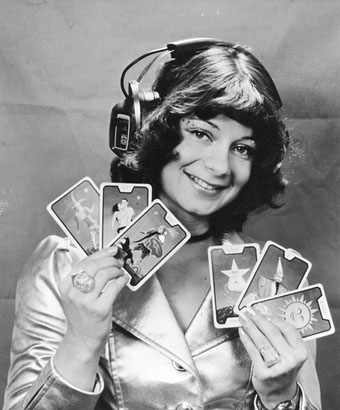
Gille Lettmann pictured in 1973 flourishing some of Fergus Hall’s Tarot cards. At the time Ms Lettmann was helping run partner Rolf-Ulrich Kaiser’s Kosmische Musik, Pilz and Ohr record labels, and thus oversaw the release of many fine albums—and a few dubious ones—before Kaiser’s empire imploded amid much bad feeling. It’s a fascinating saga, detailed at length here. Gille’s photo stood out for me in a week when I’ve been working on some new Tarot designs (about which more later) whilst listening to the latest Deutsche Elektronische Musik compilation from Soul Jazz Records which includes among its tracks a couple of Kosmische and Pilz recordings. Gille’s Tarot cards will have been a result of Kaiser’s most ambitious project, a double-disc concept album entitled Tarot (1973), and credited to Swiss artist Walter Wegmüller whose narration is backed by Ash Ra Tempel and members of Wallenstein. The album came in a lavish metallic silver box with a sheet of cut-out-and-keep Tarot trumps of Wegmüller’s own design, not the Fergus Hall cards Gille is holding. Wegmüller’s Major Arcana was expanded into a deck he calls the Gipsy Tarot. (I have the later CD box which included a complete deck of the Tarot cards.)

hall1.jpg

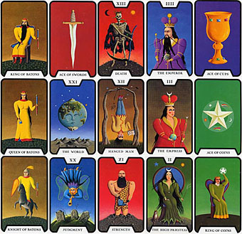
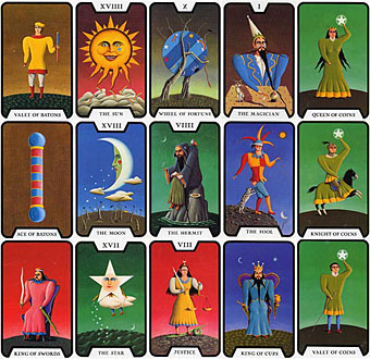
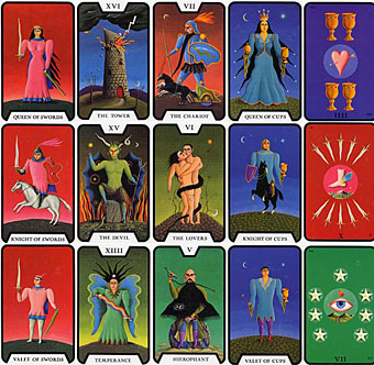
The Tarot of the Witches by Fergus Hall.

All of which gives me the opportunity to draw attention to Fergus Hall, an idiosyncratic Scottish artist who achieved worldwide prominence in 1973 when his Tarot designs were used on the cards seen in the James Bond film Live and Let Die. A complete deck called The Tarot of the Witches was later published as a spin-off from the film. I like his naive painting style which seemed a surprising choice for a blustering Bond movie; the production people could easily have used the Waite deck or something which suited the film’s vague Voodoo theme.

hall2.jpg

hall3.jpg

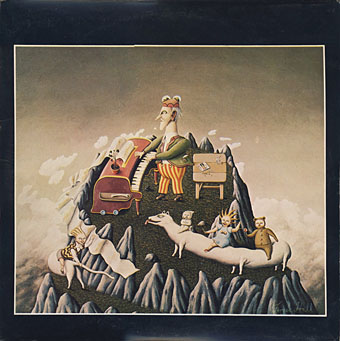
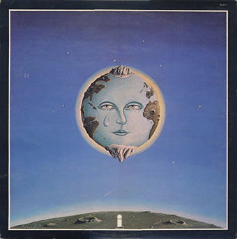
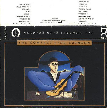
Robert Fripp liked Fergus Hall’s paintings enough to buy some of them. Two of these can be seen on the sleeve of the vinyl-only compilation A Young Person’s Guide to King Crimson (1975), while a third appeared a decade later on a King Crimson tape compilation. Despite this attention the artist’s only other major work is a book for children, Groundsel (1982), which features many more of his strange paintings. The compilations and the children’s book are all long out of print but decks of the Tarot of the Witches are still being published. As for Hall himself, his Wikipedia page says he’s now a Buddhist monk.

kc1.jpg

A Young Person’s Guide to King Crimson (front).

kc2.jpg

A Young Person’s Guide to King Crimson (back).

kc3.jpg

The Compact King Crimson (1986).

Elsewhere on { feuilleton }
The album covers archive

Previously on { feuilleton }
Giger’s Tarot
The Major Arcana by Jak Flash
The art of Pamela Colman Smith, 1878–1951
The Major Arcana

Weekend links 149

bowie.jpg

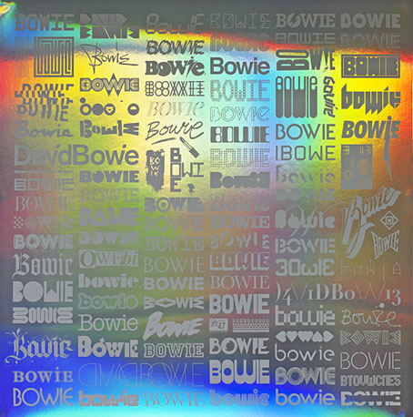
It’s not cheap but it’s rather tasty: The Changing Faces of Bowie, a limited print at the V&A shop produced for the forthcoming David Bowie exhibition. One hundred artists and designers were asked to choose or create a Bowie-related type design, the collection being printed on holographic paper. Creative Review looked at some details. Related: Bowie’s new album, The Next Day, is now streaming in full at iTunes.

• Marisa Siegel reviews The Moon & Other Inventions: Poems After Joseph Cornell by Kristina Marie Darling, “a fully enchanting if somewhat mysterious collection of poems, written entirely as footnotes”. BlazeVOX has an extract here.

• “[Clement] Greenberg came round to our house in Camden Square. He started telling Bill what he should do to improve a work. Dad lost patience and kicked him out.” Alex Turbull of 23 Skidoo on sculptor father William Turnbull.

“You get the impression that a lot of these young directors have never gained much experience of life outside their film schools or their video-rental stores.”

Anne Billson met Roman Polanski in 1995 to discuss Death and the Maiden.

• Max Beerbohm’s The Happy Hypocrite, and Ronald Firbank’s Vainglory are available in new print-on-demand and ebook editions from Michael Walmer.

• “Bring Back the Illustrated Book!” says Sam Sacks. Some of us would reply that it never went away but merely remains subject to much unexamined prejudice.

The Forest and The Trees: A blog by Genevieve Kaplan about altered texts and book art by herself and other artists.

The Homosexual Atom Bomb: Sophie Pinkham on gay rights, Soviet Russia and the Cold War.

Who’s Afraid Of The Art Of Zang Tumb Tuum? A blog devoted to the ZTT record label.

• Nigel Kneale’s TV ghost drama, The Stone Tape, is reissued on DVD later this month.

• The drawings of Victor Hugo.

David Bowie at Pinterest.

•  The Man Who Sold The World (1994) by Nirvana | V-2 Schneider (1996) by Philip Glass | ‘Heroes’ (2000) by King Crimson

Weekend links 109

magritte.jpg

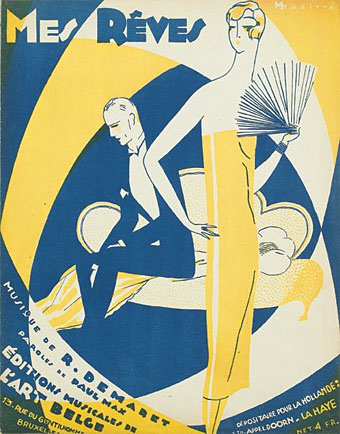
Dreams before Surrealism: a sheet music cover from 1926 by René Magritte.

• The week in music: Listen to compositions by Annea Lockwood. | At the Free Music Archive: Uncomfortable Music, a tribute to David Lynch’s Eraserhead (and, it should be said, to Alan Splet’s unique soundtrack). | Alan Licht plays a track from Trout Mask Replica then loops some Donna Summer and improvises guitar noise over it. | Music Experiments with Terror: The Spooky Isles presents Joseph Stannard‘s list of recent eldritch sounds from British musicians.

Great art, or, let’s just say, more modestly, original art is never created in the safe middle ground, but always at the edge. Originality is dangerous. It challenges, questions, overturns assumptions, unsettles moral codes, disrespects sacred cows or other such entities. It can be shocking, or ugly, or, to use the catch-all term so beloved of the tabloid press, controversial. And if we believe in liberty, if we want the air we breathe to remain plentiful and breathable, this is the art whose right to exist we must not only defend, but celebrate. Art is not entertainment. At its very best, it’s a revolution.

Salman Rushdie on the censorship of art

• All Diamond, No Rough” says the School Library Journal about the first volume of The Graphic Canon. Volume two should be out in August.

Scientific American asks: Do Psychedelics Expand the Mind by Reducing Brain Activity?

• From 2010: A Dandy in Aspic – A letter from Derek Marlowe.

Tom Phillips and A Humument: how a novel became an oracle.

Timeline Maps at the David Rumsey Map Collection.

• Happy 50th birthday, A Clockwork Orange.

Jim Dandy (1956) by LaVern Baker | Larks’ Tongues in Aspic, part one (1972) by King Crimson, live on Beat Club.

Tom Phillips album covers

phillips00.jpg

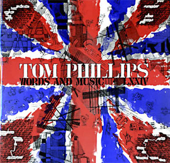
Words and Music (1975) by Tom Phillips.

Two related posts is coincidence, three is a series. Earlier posts from the past couple of weeks looked at album covers created by designers better known for their work in other areas. Tom Phillips is a British artist, writer and composer who I continue to insist is one of our greatest living artists, a figure of singular intelligence, invention and versatility whose lack of grandstanding has never raised his profile to, say, the Hockney level. Phillips’ involvement with the music world, both as composer/librettist, and his oft-cited position as Brian Eno’s art teacher in the 1960s, have led to the creation of a handful of record and CD covers from the mid-70s on. Before we get onto those I’ll note that Phillips has a piece in the latest edition of Eye magazine where he reviews a book of postcards from the Wiener Werkstätte. I happen to have a review in the same issue looking at a republished Kenneth Anger study.

Words and Music above has a January 1975 release date although the cover clearly states “LXXIV” in Phillips’ customary stencil lettering. The pressing was limited to 500 copies and doesn’t seem to have been reissued since which means that copies for sale command excessive prices. Side A comprises recordings of Phillips’ compositions while on the flip the artist/author reads extracts from A Humument, the treated book/experimental novel which is not only his most celebrated work but a project whose influence permeates all of the Phillips oeuvre, including the sleeve art.

phillips01.jpg

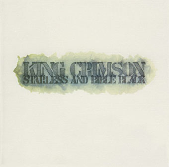
Starless and Bible Black (1974) by King Crimson.

phillips02.jpg

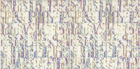
A year before Words and Music, Phillips created the cover art for this King Crimson album, and he’s also credited with the design. The fractured stencil lettering on the gatefold interior resembles similar effects in some of Phillips’ paintings while on the back cover there’s a tiny extract from A Humument bearing the enigmatic phrase “this night wounds time”. I’ve wondered for years how this cover came about: Robert Fripp often selects the art for King Crimson’s covers so was Phillips his choice as artist/designer? Or was it a result of the Fripp and Eno connection? If anyone knows the answer, please leave a comment.

Continue reading “Tom Phillips album covers”

Roger Dean: artist and designer

Kieran at Sci-Fi-O-Rama was in touch recently asking me to contribute a paragraph about a favourite Roger Dean picture for this feature about the artist. The following splurge of polemic was the result, something I’d been intending to write for a while. Since so many words would have overwhelmed the other contributions it’s being presented here while Kieran’s post has a variety of shorter appreciations and further examples of Dean’s art and design.

dean1.jpg

Pathways (1973). A slightly reworked version of the original painting.

“Science fiction is unfortunate in having a most unsatisfactory framework of existence—it’s considered literary kitsch. I believe it should be the mainstream of literature because all the books that have become important down the generations of civilisation have been books about ideas. Superficially, science fiction would seem to offer the most scope for idea content, but the promise is unfulfilled. Good ideas and good writing rarely coincide. All too often the medium is used for entertainment alone and its potential beyond this should be obvious to everyone. I don’t just mean in the sense of fantasy technology. The potential for anticipating human evolution is there and perhaps the means to bring it about and definitely the means to bring about a social evolution.”

Roger Dean, interviewed in Visions of the Future (1976).

If popularity is often a curse as well as a blessing, it’s been Roger Dean‘s curse to see his work dismissed along with many other products of a decade—the 1970s—with more than its share of cultural heroes and villains. Music journalists in Britain have for years given the impression that the arrival of the Sex Pistols in 1976 swept away all that preceded them, in particular bands such as Yes whose album covers had helped raise the visibility of Dean’s art to an international level. This is not only a lazy assumption, it’s also wrong. When Yes released Going For the One in 1977 it was their first studio album in three years, yet despite the punk explosion it went to no. 1 in the UK album charts, while a rare single release from the band made the UK top ten. Yes were playing sell-out tours in Europe and the US in 1977 and 78, as were Pink Floyd whose The Wall was massively popular worldwide in 1979. Punk didn’t sweep prog away, what happened with its advent was that progressive rock and everything associated with it—Roger Dean’s art included—became critically disreputable almost overnight, such that no music journalist would dare say anything good about it. That disrepute has persisted for thirty years despite a lasting and indelible influence. This is an old argument but some facts often need restating anew. *

dean6.jpg

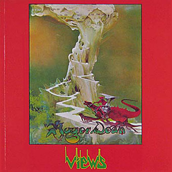
Views (1975).

I was 13 in September 1975 when Roger Dean’s first collection of his illustration and design work, Views, was published. At that time, I hadn’t heard any of the music to which his paintings and drawings were attached, and I didn’t even see a copy of the book until February 1976 when I happened to be in London on a school trip and found a big pile of what I guess was the second edition in Foyle’s book shop. This appeared at exactly the right moment. I wasn’t listening to the music but I was reading a lot of science fiction, and was starting to notice and imitate the work of various paperback artists. I recognised many of the pictures in Views from the covers displayed in the window of our local record shop, Cobweb, whose shopping-bag logo was a cowled magician figure à la Dean or Rodney Matthews. It’s difficult to say what struck me about Dean’s work at the time since you rarely articulate your preferences at that age. I think I liked the consistency of vision and the invention which blended the organic and mechanical, the architecture which looked at once ancient and futuristic, and the flat landscapes which put lone pine trees into rocky terrain familiar from Japanese and Chinese prints. For a teenager his style was also relatively easy to imitate if you forgot about basic things such as imagination and finesse, and I spent a year producing a lot of badly-drawn reptiles posed against lurid watercolour skies.

Continue reading “Roger Dean: artist and designer”