Keim & Czeschka’s Nibelungen

czeschka1.jpg

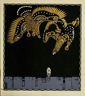
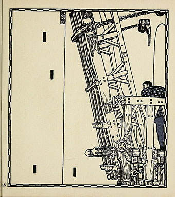
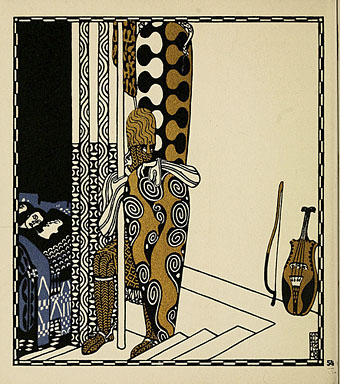
It’s all Art Nouveau again round here while I go through back issues of Jugend preparing a series of posts about the artists and graphics featured in that magazine. Just now, however, I’m too busy to do anything substantial so this will have to suffice, some of the illustrations by Carl Otto Czeschka (1878–1960) for a 1909 adaptation of the Nibelungen Saga by Franz Keim (1840–1918), for which Czeschka utilised the rectilinear style of Art Nouveau popularised by the Wiener Werkstätte.

This small, almost square volume in the popular series of children’s books is rather unassuming in its external appearance, only sporting a small vignette with the title on the cover. Carl Otto Czeschka (1878–1960) was responsible for the complete design of the text to be found inside, and interspersed it with the illustrations characteristic of his work. These reveal his credentials as an outstanding artist of the Secessionist school and the Jugendstil. The eight double-page spreads coloured in clay block technique and rare gold prints, in particular, contributed to the volume’s fame. (More.)

The rest of the pages can be seen on this great Art Nouveau site which has a wealth of material from the period.

czeschka2.jpg

czeschka3.jpg

Elsewhere on { feuilleton }
The illustrators archive

Jugend Magazine revisited

jugend1.jpg

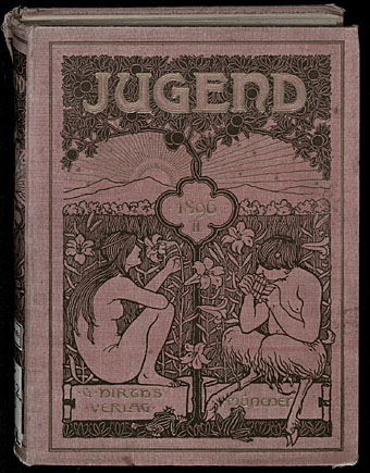
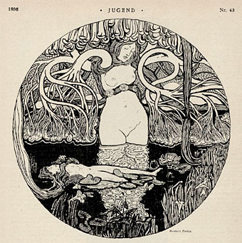
It was just over a year ago that I was wishing there was some way to see whole issues of Jugend magazine, the German periodical launched in 1896 whose Art Nouveau style gave its name to the movement in Germany, Jugendstil. Yesterday’s search for Heinrich Vogeler artwork turned up that very thing, scanned editions of Jugend at the University of Heidelberg’s digital archive. Whole numbers from 1896 to 1925! I am aghast. As well as the scanned pages being very high quality you can download the bound collections as PDFs, each one totalling over 400 pages. Leafing through pages of old magazines in a foreign language doesn’t sound very stimulating if you can’t read German but Jugend was a very visual publication. Each issue is crammed with a variety of drawings in styles which range from black-and-white Art Nouveau motifs and quasi-Symbolist illustration to humorous drawings and cartoons. Each issue also featured a large drawing or painting on a fold-out spread.

jugend2.jpg

Continue reading “Jugend Magazine revisited”

Der Orchideengarten illustrated

orchid_01.jpg

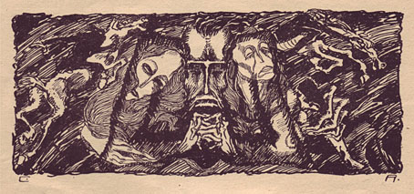
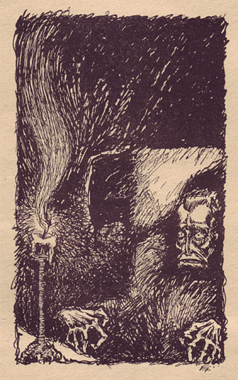
Halloween approaches and as a precursor it’s a great pleasure to be able to post a selection of interior illustrations from Der Orchideengarten, courtesy of Will at A Journey Round My Skull. Der Orchideengarten was a German magazine of weird fiction which ran for 51 issues from 1919 to 1921 and whose existence today is rarely acknowledged despite being credited as the world’s first fantasy magazine. Information is scarce and these scans come from Will’s own copies which is why I’ve posted fifteen more below the fold; you can’t see this stuff anywhere else. A Journey Round My Skull featured some covers and a different set of interior illustrations earlier this year, and there should be a new post complementing this one with more of the magazine’s stunning cover designs.

orchid_02.jpg

What strikes me about these black-and-white drawings is how different they are in tone to the pulp magazines which followed shortly after in America and elsewhere. They’re at once far more adult and frequently more original than the Gothic clichés which padded out Weird Tales and lesser titles for many years. Some are almost Expressionist in style, while the Wild Hunt series below shows a distinct Goya influence. I’d love to know how the written content matches the illustrations; I suspect there’s the same difference of atmosphere and emphasis to American weird fiction as there is in the drawings.

Update: Will’s new post is Watering the Toxic Garden which will be followed on Thursday by the results of his Evil Orchid Bookplate Contest.

Click on any of these pictures for a larger version.

Continue reading “Der Orchideengarten illustrated”

Uranian inspirations

gloeden2.jpg

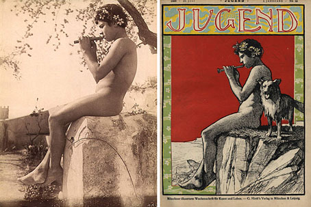
left: Sicilian boy by Wilhelm von Gloeden (no date); right: Jugend cover by Hans Christiansen (1896).

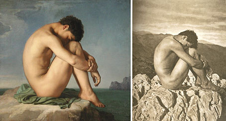
My current reading is The Secret Life of Oscar Wilde (2003), a long and fascinating study by Neil McKenna which attempts to disentangle the true nature of Wilde’s sex life from the myths and evasions of his biography and biographers. Among the pictures in the book, McKenna shows a couple of the “Uranian” photographs by Wilhelm von Gloeden (1856–1931) which Wilde owned. Von Gloeden’s views of naked Sicilian boys were described as “Classical” in a barely-believable subterfuge familiar during the 19th century, and it’s understandable why Wilde, who’d been praising the attractions of Mediterranean youth for most of his adult life, would have found these pictures worthy of purchase. Wikimedia Commons has a substantial set of the photos, although it should be noted that provenance is often uncertain; there were other photographers active in Taormina at the time who catered to a similar market. One photo in particular stood out recently when I recognised it as the possible source for the figure on a Hans Christiansen cover for Jugend magazine of 1896. The cover above has appeared here before but this is the first time I made the photographic connection.

gloeden1.jpg

left: Jeune homme assis au bord de la mer by Jean Hippolyte Flandrin (1836); right: Cain by Wilhelm von Gloeden (c. 1902).

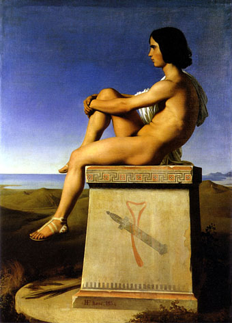
Gloeden, of course, was one of the first people to use the Flandrin pose, as I noted in the original post on that theme. I wonder if he knew he’d been copied in turn? That Jugend cover and its inspiration reminds me a little of Flandrin’s other depiction of Classical youth, his portrait of Polites, a painting which Oscar would no doubt have enjoyed.

polites.jpg

Polites, Son of Priam, Observes the Movements of the Greeks by Jean Hippolyte Flandrin (1834).

Elsewhere on { feuilleton }
The recurrent pose archive
The Oscar Wilde archive

Previously on { feuilleton }
Forbidden Colours
Jugend Magazine
Evolution of an icon

The Studio & Studio International

studio1.jpg

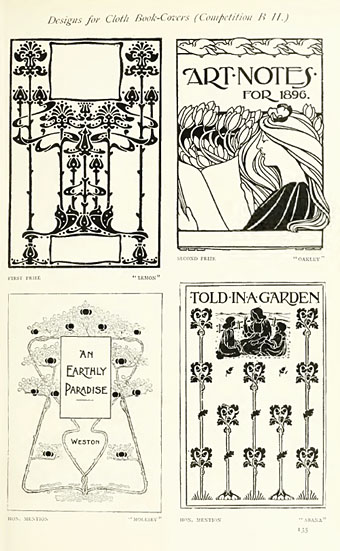
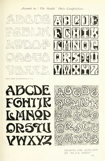
Back in February I posted some pictures from a 1971 collection of Art Nouveau illustration and design, some of which were competition entries from The Studio magazine. The Studio, which later became the long-running Studio International, can be seen from issue 11 onwards at the Internet Archive now that they’ve started uploading Google’s book scans. I’ve only looked at one of these so far, Volume 11–13 which runs over 850 pages and so takes some time to go through, as do all these rather unwieldy PDF books. The issues are missing their covers and so aren’t dated but would appear to be from around 1896 to 1898, one of the final entries being a memorial piece for Aubrey Beardsley who died that year; The Studio was the magazine which had introduced Beardsley to the public only five years earlier.

studio2.jpg

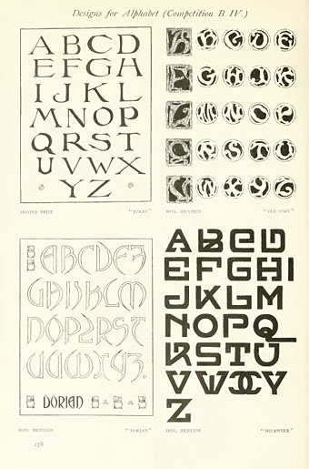
The Studio ran regular competitions among its readers and the examples shown here are from some of those. I especially like these type designs; dare we assume that the “Dorian” design below is named after Dorian Gray? As a whole the magazine is an odd mix of very dull Victorian art of the landscapes and artisans type, with occasional flares of interest when they devote a feature to the emerging Art Nouveau style or profile a Symbolist artist such as Giovanni Segantini.

studio3.jpg

A note for anyone wishing to download Google scans from the Internet Archive: some of the PDF links lead you to a Google page where they’re trying to sell you an e-text or get you to buy a book. To see the available files you need to click “All Files: HTTP”.

Previously on { feuilleton }
The Great God Pan
Art Nouveau illustration
Jugend Magazine