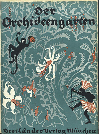
Covers for Der Orchideengarten

orchid01.jpg

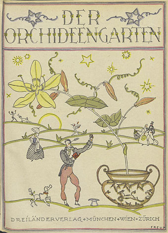
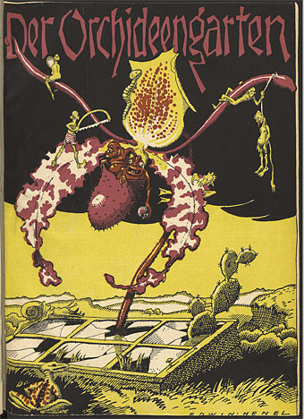
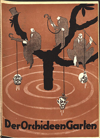
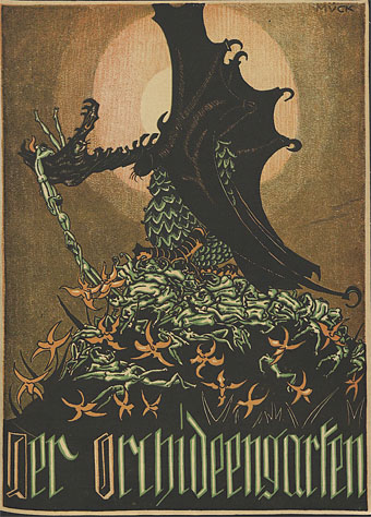
I was going to finish the year with a post showing some of the handful of product designs I’ve done recently but since some the products in question still need to be photographed that’ll have to wait. After a peculiarly dark and grotesque year it seems more fitting to end with a post of dark and grotesque artwork from an earlier epoch. Der Orchideengarten has been the subject of several posts here in the past but it’s only this week that I’ve had the opportunity to see an entire run of the world’s first magazine devoted solely to fantastic art and literature. Der Orchideengarten ran for 51 issues from 1919 to 1921; the editors were Hans Strobl and Alfons von Czibulka, and the contents comprised original fiction, book reviews and reprints in German of notable works of weird literature.
orchid02.jpg

The interior graphics (previously) are in a style similar to those found in Jugend and other German magazines of the period (plus reprints of Beardsley, Doré, and the like), while the covers follow the Jugend template of being different in style and format for every issue. All of these covers are from the wonderful resource at the University of Heidelberg where every issue of Der Orchideengarten is available for download. Even if you can’t read German the magazine is worth browsing for its very European view of the fantastic, a view which tends to be darker and more adult than the American magazines that would soon overshadow it. Some of the covers are strange in a manner that Weird Tales seldom achieved, and many of them feature an orchid somewhere in the design.
orchid03.jpg

orchid04.jpg

orchid05.jpg

orchid06.jpg

Continue reading “Covers for Der Orchideengarten”

The case of the fin de siècle fleuron

artnouveau.jpg

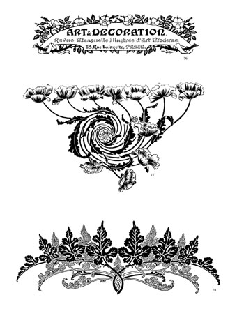
I said yesterday that poppies are a common feature of the fin de siècle magazines for the convenient way they combine long-stemmed flowers—ideal for all those Art Nouveau flourishes—with narcotic connotations that signal Decadence. The spiralling fleuron above is one example that readers of Savoy books may recognise, an occasional company logo which has been in use since the mid-1980s. David Britton chose the design from one of the Dover Pictorial Archive books, Carol Belanger Grafton’s Treasury of Art Nouveau Design and Ornament, and I later made a digital version from this page scan.

heroes.jpg

One of the earliest Savoy uses, a label design for Heroes (1986) by PJ Proby.

Having spent a great deal of time in recent years trawling through Art Nouveau magazines I was sure I was going to run into the original printing of the fleuron eventually. Some of the page decorations in Jugend are very similar but it wasn’t there or in Pan, Deutsche Kunst und Dekoration or The Studio. I don’t have a copy of the Grafton book, and Dave says his copy is lost, so I’ve no idea whether there’s a credit for the source of the designs; not all Dover books credit their source material in any detail. Earlier this week I decided to look in Art et Décoration, a magazine that was the French equivalent of The Studio, since the header at the top of the scanned page implied that the other designs might be from the same magazine. Aside from a couple of copies at the Internet Archive this means looking through the poor-quality scans at Gallica; by a fluke—because they don’t seem to have a complete run of the early issues—the January 1898 edition contained the page below showing the Savoy fleuron, an endpiece for an article devoted to another French art magazine, L’Image.

Continue reading “The case of the fin de siècle fleuron”

Cocorico covers

cocorico01.jpg

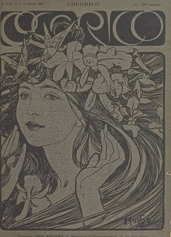
Alphonse Mucha.

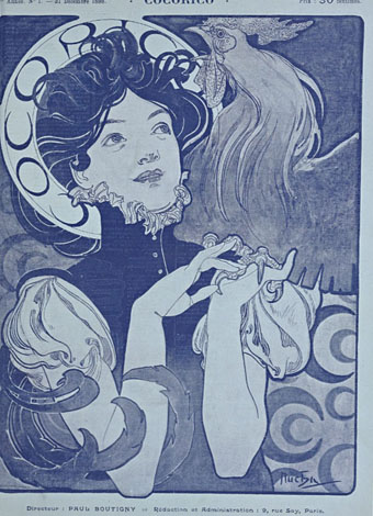
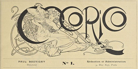
For a while now I’ve been waiting for several French journals of the fin de siècle to turn up online but humour magazine Cocorico has never been among them. I knew that Alphonse Mucha had contributed a handful of covers and some other graphics to Cocorico, notably the frontispiece (below) which ran in every issue. What I didn’t realise was that this title was effectively the French counterpart to Jugend magazine which had been running for two years when the first issue of Cocorico appeared in December 1898. Both magazines share the same mix of humorous articles, cartoons, serious art pieces and poetry, all connected by some very fine Art Nouveau graphics.

cocorico19.jpg

Alphonse Mucha.

Jugend has the edge when it comes to the graphics, some of which are very strange, but Cocorico looks much more like a humour magazine to contemporary eyes, with many cartoons that resemble those drawn today. Cocorico is also mostly free of the Jugend brand of satire which is often little more than nationalist rabble-rousing. Cocorico ran for 63 issues to 1902 by which time its format had changed and the florid graphics had been abandoned for a more sober layout. What follows is a selection of cover designs, many of which are Mucha’s work, and all of which follow the Jugend template of varying the art style and title design. There’s also one by František Kupka (or François as he was credited here) who also contributed interior illustrations in the later issues. There’ll be more about him tomorrow.

cocorico02.jpg

Alphonse Mucha.

Continue reading “Cocorico covers”

Albert Weisgerber’s Grimm Fairy Tales

weisgerber01.jpg

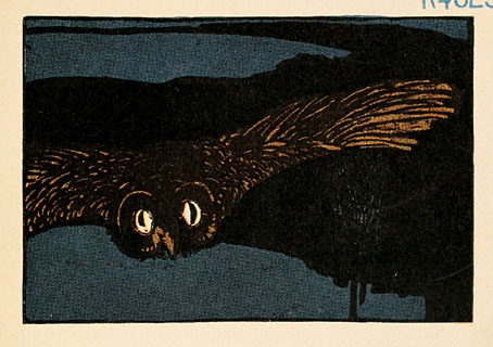
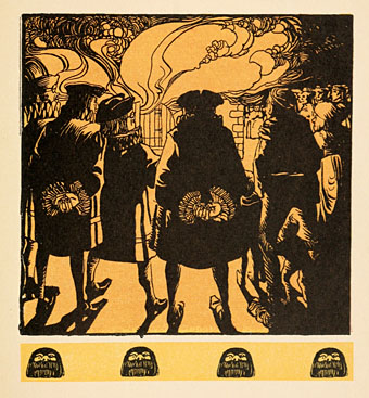
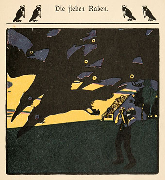
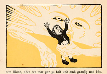
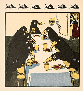
Following yesterday’s artwork by Andrea Dezsö, some illustrations from a German edition of Grimm’s Fairy Tales from around 1900. Albert Weisgerber (1878–1915) was more of a fine artist than a jobbing illustrator—Alfred Kubin was a friend—but some of his drawings appeared in Jugend magazine as well as this book. The heavy shading and blocks of colour are reminiscent of the Beggarstaffs, while the illustration choices don’t avoid the darker moments of the tales, as with the picture of Gretel pushing the witch into the oven. 50 Watts has some of Weisgerber’s other drawings. Browse the book here or download it here.

weisgerber02.jpg

weisgerber03.jpg

weisgerber04.jpg

weisgerber05.jpg

Continue reading “Albert Weisgerber’s Grimm Fairy Tales”

The art of Fritz Hegenbart, 1864–1943

hegenbart4.jpg

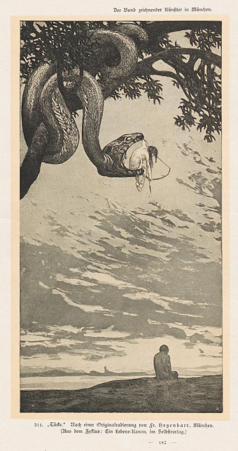
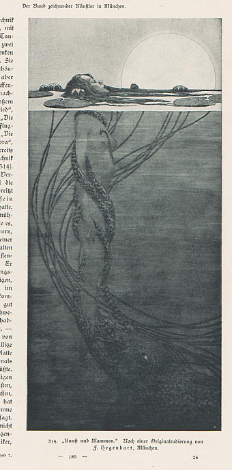
Fritz Hegenbart was an Austrian artist some of whose work has appeared here before in posts about Jugend magazine. Hegenbart provided many illustrations and embellishments for Jugend and other journals circa 1900, the examples here being mostly from a feature in the collected Kunst und Handwerk for 1902/03, a magazine I was rifling through last week. Once you’ve been through Deutsche Kunst und Dekoration and others you find the same contents repeating themselves with slight variations; that’s no surprise when there was only a certain amount of news that any arts magazine could report for a given year.

Hegenbart’s work stands out for conjuring the slightly grotesque allegories I often like to see: The woman aiming an arrow from inside a serpent’s jaws represents Malice, while the woman being dragged under the water by a tentacled monstrosity is Art falling prey to Mammon. An updated version of that picture would have to show Mammon as a bloated and triumphant abomination. Hegenbart seemed to enjoy attaching wings to whatever women he was drawing; further down the page you’ll find a wingless woman being menaced by a particularly dopey-looking dragon.

hegenbart7.jpg

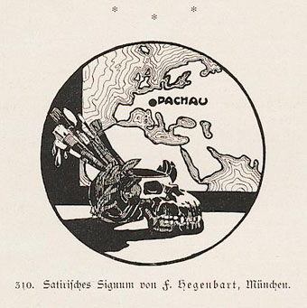
There’s also the curious ink piece below showing the location of the artist’s home in Dachau, Bavaria, and what to our eyes is a supremely inappropriate skull-shaped container for his brushes. The shadow of two world wars always hangs heavily over these magazines (especially in the nationalistic Jugend) but the imagery is seldom as prescient as this.

hegenbart3.jpg

Continue reading “The art of Fritz Hegenbart, 1864–1943”