Weekend links 174

ikuma.jpg

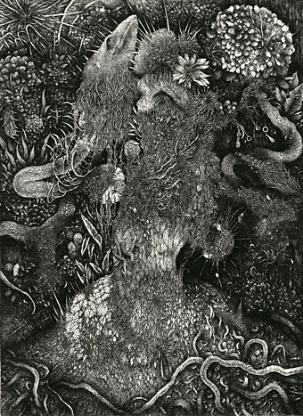
Dress (2012) by Nao Ikuma.

• Two of my Cthulhu artworks can currently be seen in the Ars Necronomica exhibition at the Cohen Gallery, Brown University, Providence, RI. The exhibition is part of NecronomiCon, and runs to September 13th. In related news, my steampunk illustration has been nominated in the Visual category of this year’s Airship Awards. Winners will be announced at Steamcon V in October.

• “…the story of how a small cabal of British jazz obsessives conducting a besotted affair with the style arcana of Europe and America somehow became an army of scooter-borne rock fans…” Ian Penman looks back at the culture of Mod for the LRB.

• “What is it about the writer in the First World that wants the Third World writer to be nakedly political, a blunt instrument bludgeoning his world’s ills?” Gina Apostol on Borges, Politics, and the Postcolonial.

If someone had designed a work regime perfectly suited to maintaining the power of finance capital, it’s hard to see how they could have done a better job. Real, productive workers are relentlessly squeezed and exploited. The remainder are divided between a terrorised stratum of the, universally reviled, unemployed and a larger stratum who are basically paid to do nothing, in positions designed to make them identify with the perspectives and sensibilities of the ruling class (managers, administrators, etc) – and particularly its financial avatars – but, at the same time, foster a simmering resentment against anyone whose work has clear and undeniable social value. Clearly, the system was never consciously designed. It emerged from almost a century of trial and error. But it is the only explanation for why, despite our technological capacities, we are not all working 3–4 hour days.

On the Phenomenon of Bullshit Jobs by David Graeber

Ron Rosenbaum talks to Al Pacino about all the usual stuff, and reveals some detail about the actor’s obsessive interest in Oscar Wilde’s Salomé.

• More queer history: The Brixton Fairies and the South London Gay Community Centre, Brixton 1974–6.

• At Dangerous Minds: Anthony Burgess and the Top Secret Code in A Clockwork Orange

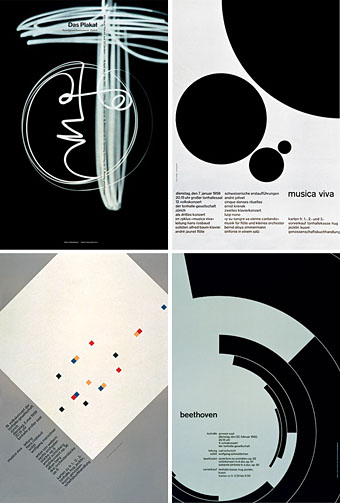
• Every day for 100 days, Jessica Svendsen redesigned a Josef Müller-Brockmann poster.

LondonTypographica: Mapping the typographic landscape of London.

• Mix of the week: Secret Thirteen Mix 083 by Demdike Stare.

• At Strange Flowers: Alfred Kubin the writer.

Derek Jarman’s sketchbooks.

Rick Poynor on Collage Now.

• Thomas Leer: Private Plane (1978) | Tight As A Drum (1981) | Heartbeat (1985)

Weekend links 142

bowie.jpg

Gratifying this week to see album cover art under discussion even if the heat-to-light ratio was as unbalanced as it usually is when pop culture is the subject. Jonathan Barnbrook, who also designed the Heathen (2002) and Reality (2003) packaging for David Bowie, wrote about the thinking behind the new cover on his blog. (And for the time being let’s note that this is still only a cover design, we don’t know what else is on its way.)

For my part I’ll point out that the artist-as-cover-image is the great cliché of album design, and the bigger the name the more the rule applies; Neville Brody complains about this in the first book of his work, as does Storm Thorgerson in the Hipgnosis books. In Bowie’s case the rule has been applied almost universally since his debut album in 1967, the only variations being illustrational ones or slight dodges like having his feet appear on the front of Lodger and his back facing the viewer on Earthling. Consequently the new design is a radical gesture from an artist who could have got away with a photo of himself du jour. By way of contrast, consider that Rod Stewart is a year older than David Bowie and presented the world with this artefact in October 2012.

Related: Hard Format responds to the cover, Chris Roberts on “Picasso resurrected in a Rolf Harris era“, and Alexis Petridis on The inside story of how David Bowie made The Next Day.

The Quicksilver typeface, designed by Dean Morris when he was only 16, bought by Letraset and now an indelible feature of pop design from the 1970s. Morris describes his experience here (“they shunned rapidographs!”) and collects examples of the print history here.

When the days are short, we are closest to the medieval world. To the avoidance of mirrors where death improves our portraits every morning with a few more lines and shadows. What would once have been a sermon, a conjuring of hellfire, a phantom slide show, is now an entertainment. But before we can begin again, we have to kick free of the embrace of our inconvenient predecessors, that compost legion of the anonymous dead. They come uninvited, requiring us to sign up for what the late Derek Raymond called the general contract: a brief turn in the light, then extinction. Eternal darkness. How to live with such knowledge? William Burroughs admired the unswerving bleakness of Beckett’s gaze, the way he reduced compensatory illusions to zero. Nowhere left to crawl. And nothing to crawl on. Last breath is last breath. Stare into the abyss and the abyss will stare right back.

Iain Sinclair reviews The Undiscovered Country: Journeys Among the Dead by Carl Watkins

Broadcast’s James Cargill on Morricone, Minidiscs and Scoring Berberian Sound Studio. Related: Melmoth the Wanderer posts a new mix, The Curious Episode of the Wizard’s Skull, and more spooky sounds are on their way from The Haxan Cloak.

• A Firm Turn Toward the Objective: Joanne Meister on meeting the great Swiss designer Josef Müller-Brockmann.

duchess.jpg

Twitter user @thisnorthernboy reworked Paul Emsley’s portrait of Kate Middleton. @barnbrook approved.

• The Beatles of Comedy: David Free on the Monty Python team.

• The history of the London Underground poster.

Impossible Architecture by Filip Dujardin.

• At Pinterest: Art Dolls & Sculpture

• Grace Jones’ Nightclubbing album has been on repeat play this week: Warm Leatherette/Walking In The Rain | I’ve Seen That Face Before (Libertango) | Demolition Man

Steampunk overloaded!

infernal.jpg

Yes, it’s the “S” word again, and if there was any doubt that this has been the Year of Steampunk here at Coulthart Towers, look at these recent works. And this is by no means everything I’ve been doing in this area, there’ll be further announcements later on.

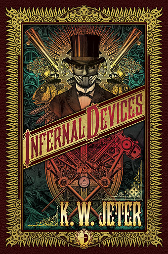
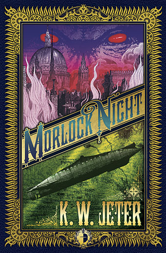
The covers for KW Jeter’s novels are a pair of reprintings from UK publisher Angry Robot whose books will shortly be available in the US and Canada. Jeter is now famous—infamous, perhaps—for having given the word “steampunk” to the world in the early 1980s. This was intended as a jest after he and a couple of other writers (including a favourite of mine, Tim Powers) had written a number of science fiction novels set in the 19th century; like many light-hearted neologisms, it gained a life of its own. Angry Robot are reissuing two of these early works as a result of the ongoing steampunk explosion.

morlock.jpg

Morlock Night (1979) is a pulpy affair which sees the Morlocks from HG Wells’ The Time Machine using the Time Traveller’s vehicle to return to Victorian London and wreak no end of havoc. Infernal Devices (1987) is a rather more substantial confection involving a great deal of clockwork mechanisms (for once the clock parts are justified!), automata, fish people, and a device capable of destroying the earth. I’ve been producing a lot of engraving collage à la Ernst and Sätty recently but the technique seemed especially appropriate here as a means of illustrating works which themselves are collages of Victorian motifs.

zeppelins.jpg

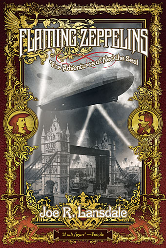
Meanwhile, over at Tachyon Publications, there’s this cover for another Victorian adventure, two in fact, from master beserker Joe R Lansdale. Flaming Zeppelins combines a pair of comic adventures, Zeppelins West (2001) and Flaming London (2006), which feature a host of notable figures including Mark Twain, Annie Oakley, Buffalo Bill Cody…and a talking seal. Publication date is November 1st.

steampunk.jpg

Then from Tachyon in mid-November there’ll be Steampunk II: Steampunk Reloaded, a 430-page anthology edited by Ann & Jeff VanderMeer which includes fiction and non-fiction from William Gibson, Caitlín R Kiernan, Jeffrey Ford, Cherie Priest, and many others. Also a comic strip, copious illustrations and a very full-on interior design from yours truly of which I’ll only show you the above page for the time being. Yes, that’s a mechanical ostrich but if you want to know what it’s doing there you’ll have to read the book. More about this later. And more later about The Steampunk Bible to which I’m also a contributor, a glossy, full-colour guide to the entire sub-culture which will be published next year by Abrams. By the time that appears I’ll probably be sick of the sight of clockwork parts, dirigibles, florid typefaces and Victorian decoration; I’ll be needing a good dose of Helvetica and Josef Müller-Brockmann minimalism to calm down.

Previously on { feuilleton }
Skeleton clocks
Vickers Airship Catalogue
The Air Ship
Dirigibles
More Steampunk and the Crawling Chaos
La route d’Armilia by Schuiten & Peeters
The art of François Schuiten
Steampunk Redux
Steampunk framed
Steampunk Horror Shortcuts
The Airship Destroyer
Zeppelin vs. Pterodactyls

The poster art of Marian Zazeela

zazeela.jpg

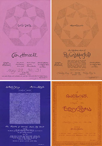
top: Jon Hassell: Solid State. Richard Maxfield: Memorial Concerts.
bottom: The Theatre of Eternal Music Big Band. Pandit Pran Nath: Evening Ragas.

Artist Marian Zazeela’s beautiful hand-drawn posters can be seen (and bought) at the MELA Foundation website. Most of these were created for the Dream House productions hosted by Zazeela and partner La Monte Young. Zazeela has also used her distinctive calligraphic design on the sleeves of recordings by La Monte Young, Terry Riley and raga master Pandit Pran Nath.

A gallery of Marian Zazeela posters

Previously on { feuilleton}
The poster art of Bob Peak
Posters by Josef Müller-Brockmann
A premonition of Premonition
Perfume: the art of scent
Metropolis posters
Film noir posters