Masonic fonts and the designer’s dark materials

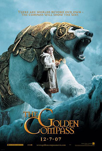
golden_compass.jpg

The trailer for The Golden Compass turned up this week, the first part of Philip Pullman‘s His Dark Materials trilogy, and I can’t help but note that the film’s designers have chosen Jonathan Barnbrook’s Mason font for the titles and the rest of the typography. This isn’t so surprising given that Mason has been used on the covers of several editions of the books already but I wonder if this flush of even greater popularity will spell (as it were) the end of a stylish typeface.
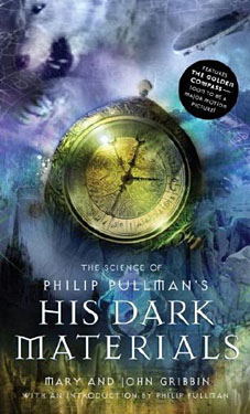
hdm.jpgMason (originally named Manson) was one of Barnbrook’s earliest published type designs, appearing in 1992 via the Emigré foundry, and over the past fifteen years has been widely imitated and become the default font for fantasy works, especially book jackets. The attraction for the genre is obvious in the way the design uses elegant and traditional serif letterforms that have been amended slightly to give them a distinctive quasi-ecclesiastical flavour, with flourishes derived from Greek, Renaissance and Biblical letters. The Gothic arch of the letter A has also helped make the font a popular choice for New Age or occult books. Mason was designed as a set of serif and sans serif variations but it’s Mason Serif Regular which is used the most. (The cover for The Science of His Dark Materials shown here is using both the sans serif variation and Mason Regular Alternate.)

Distinctive fonts take a while to get around and I don’t recall seeing Mason until at least 1994. From 1995 to 2000 it began to appear everywhere, even in newspaper ads for a while, before finding a permanent place in the book world. The trouble with this kind of ubiquity is that the novelty the design once possessed quickly vanishes and it begins to runs the risk of becoming a design cliché. Many typefaces go this way, especially in the publishing world where the choice of typeface is often dictated by genre expectations. So Orbit-B and its variants used to signify “science fiction” or “the future” in the 1970s, Caslon Antique and Rubens have become associated with horror while FF Confidential has been over-used for crime novels.

Continue reading “Masonic fonts and the designer’s dark materials”

Friendly Fire: Jonathan Barnbrook

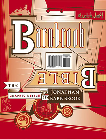
barnbrook.jpg

The Barnbrook Bible, out in September.

Jonathan Barnbrook at the Design Museum, 19 June–10 October 2007.

Jonathan Barnbrook has emerged in the past two decades as one of the UK’s most consistently innovative graphic designers. Pioneering graphic design with a social conscience, Barnbrook makes powerful statements about corporate culture, consumerism, war and international politics. Through his work in both commercial and non-commercial spheres he combines wit, political savvy and bitter irony in equal measures.

Friendly Fire traces Barnbrook’s career from early experiments in pure typography and pioneering motion graphics in the early 1990s, to recent work, including his latest projects with collaborators such as the anti-corporate collective Adbusters. Drawn from the designer’s own archive, the work represented will span the wide range of disciplines in which the Barnbrook studio work, including one of their most pioneering areas—typeface design.

Previously on { feuilleton }
Jonathan Barnbrook interviewed

It’s a pulp, pulp, pulp world

omni_7811.jpg

The (low-res) digitisation of the past continues apace on this site which is accumulating cover scans from a host of American sf and fantasy magazines. Oddly enough, I’d been looking for a place with pictures of the early Omni covers just recently, but this site didn’t come up on Google, or if it did, I missed it. I bought most of the first year’s run of Omni so it’s interesting seeing which covers I remember and which I’d forgotten about. Now, where is there a site with a complete run of New Worlds covers? Link via Strange Attractor.

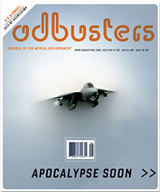
adbusters.jpg

And an item of contemporary magazine news:
Jonathan Barnbrook designs the latest issue of Adbusters.

Previously on { feuilleton }
A few thousand science fiction covers
Vintage magazine art II
Neville Brody and Fetish Records
View: The Modern Magazine
Vintage magazine art
Oz magazine, 1967–73

New work for July

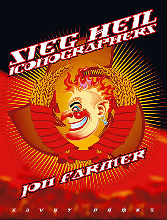
sh_cover.jpg

This new Savoy volume was an exhausting task, 608pp with illustrations on nearly every page. The book is another study of Savoy’s long career as publishers with many digressions examining the various maverick and often unsavoury characters that have fuelled David Britton’s books and the wider Savoy corpus, from real and imagined fascists to pulp writers, movie cowboys, PJ Proby and sundry rock’n’rollers. It forms a loose trilogy with two earlier books, Robert Meadley’s A Tea Dance at Savoy and DM Mitchell’s A Serious Life.

For the design I wanted to avoid the obvious that the title would imply and play around with a different brand of totalitarian imagery, namely the iconography of Soviet Russia and its accompanying propaganda. We used Jonathan Barnbrook’s Newspeak font for all of the titles and headings, a great design that has the right look while still being contemporary. The cover and interior chapter spreads borrow elements of the Soviet style, with some nods towards the general Bauhaus and Art Deco designs of the 1920s and ’30s. It was an enjoyable project even if it did seem interminable at times.

Designers take a stand

Some of the honourees of America’s National Design Awards tell the President’s wife why they won’t be attending a special gala breakfast at the White House.

Dear Mrs. Bush:

As American designers, we strongly believe our government should support the design profession and applaud the White House sponsorship of the Cooper Hewitt National Design Museum. And as finalists and recipients of the National Design Award in Communication Design we are deeply honored to be selected for this recognition. However, we find ourselves compelled to respectfully decline your invitation to visit the White House on July 10th.

Graphic designers are intimately engaged in the construction of language, both visual and verbal. And while our work often dissects, rearranges, rethinks, questions and plays with language, it is our fundamental belief, and a central tenet of “good” design, that words and images must be used responsibly, especially when the matters articulated are of vital importance to the life of our nation.

We understand that politics often involves high rhetoric and the shading of language for political ends. However it is our belief that the current administration of George W. Bush has used the mass communication of words and images in ways that have seriously harmed the political discourse in America. We therefore feel it would be inconsistent with those values previously stated to accept an award celebrating language and communication, from a representative of an administration that has engaged in a prolonged assault on meaning.

While we have diverse political beliefs, we are united in our rejection of these policies. Through the wide-scale distortion of words (from “Healthy Forests” to “Mission Accomplished”) and both the manipulation of media (the photo op) and its suppression (the hidden war casualties), the Bush administration has demonstrated disdain for the responsible use of mass media, language and the intelligence of the American people.

While it may be an insignificant gesture, we stand against these distortions and for the restoration of a civil political dialogue.

Michael Rock, Susan Sellers, Georgie Stout, Paula Scher and Stefan Sagmeister.

This story is causing some heated debate over at Design Observer, both for and against. For my part I’m glad to see it and would support their decision; the more people taking a principled stand against these despicable wretches, the better. Too often—as Jonathan Barnbrook never tires of pointing out—designers seem happy to take the money (and awards) and run, ignoring any broader context with regard to their work. Maximum respect.