Suggestions in Design by John Leighton

leighton01.jpg

Among the new book arrivals at the Internet Archive is this study of global design and ornamentation, with art by John Leighton and text (or “descriptive and historical letterpress”) by James K. Colling. Suggestions in Design was published in 1880, with the pictorial matter having been available for many years as part of Dover Publications’ Pictorial Archive series. I don’t have a copy of the reprint, however, so this was a useful find. Leighton’s illustrations are black-and-white throughout, and all separated from each other, which is what you want if you’re looking for a design you may use yourself. The illustrations are also carefully done, something you can’t always say about the smaller books of this type.

leighton02.jpg

The Victorian era is where design history begins. Suggestions in Design follows the structure of Owen Jones’ landmark study, The Grammar of Ornament, ranging across the world and through the ages to demonstrate the evolution of decoration and sculptural form. Leighton ends the book with several pages of his own designs. Browse it here or download it here.

leighton03.jpg

leighton04.jpg

leighton05.jpg

Continue reading “Suggestions in Design by John Leighton”

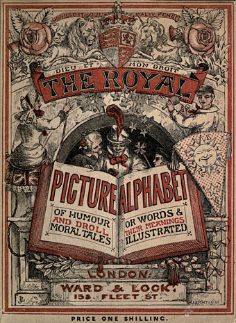
The Royal Picture Alphabet

royal1.jpg

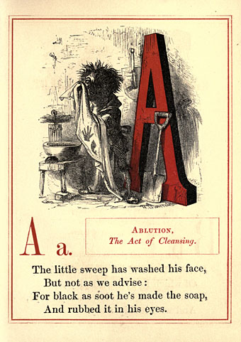
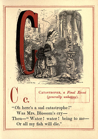
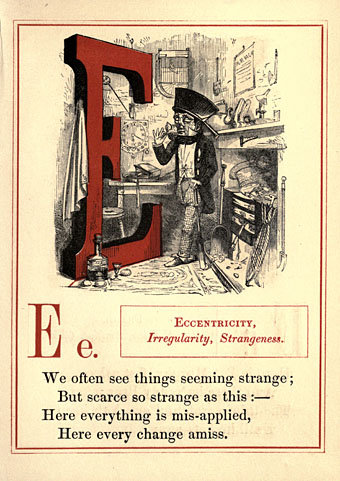
Another pictorial alphabet but no architecture this time. “Royal” is used here in the more general sense of “grand” or “first-rate”, and this isn’t the only example of an instruction book for children that calls its alphabet a royal one. John Leighton’s Royal Picture Alphabet is a finer example than others to be found at the Internet Archive, however, where the results are either very simple or, in the case of Walter Crane’s Absurd ABC, might have benefitted from additional pages. It’s surprising that Leighton’s book is a more substantial piece of work than Crane’s when Crane wrote a history of book design. Leighton’s alphabet is also surprisingly polysyllabic; you can’t imagine anyone today choosing “Eccentricity” to represent the letter E.

Books such as this always have trouble with the letters at the end of the alphabet, especially that tricky X. The Royal Picture Alphabet chooses “Xantippe”, the wife of Socrates, while its earlier counterpart has “Xanthus”, a horse from Greek mythology. (That old stand-by, the xylophone, didn’t become established until later in the 19th century.) Both books, and Crane’s volume, offer “Zany” for the letter Z.

royal2.jpg

royal3.jpg

royal4.jpg

Continue reading “The Royal Picture Alphabet”