Weekend links 531

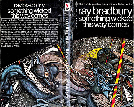
miller.jpg

Cover art by Ian Miller, 1979.

• Ray Bradbury was born 100 years ago today. Emily Temple expresses surprise that Truman Capote encouraged the publication of a Bradbury short story at Mademoiselle in 1946. I’m more surprised that Bradbury was paid $400 for his work; no wonder he was so eager to write for the non-genre magazines. Elsewhere: Ray Bradbury—The Illustrated Man: the BBC’s Omnibus arts strand profiled Bradbury in 1980 with enthusiastic assistance (narrating/reading/performing) from the man himself; Ray Bradbury book and magazine covers at Flickr.

Anna Smith asks whether Linda Fiorentino was the greatest femme fatale ever in The Last Seduction (1994). A substantial claim, especially for a neo-noir playing so self-consciously with the theme, but it’s a very good film, and one I’d like to see again.

• “Bad as a work of art, and morally bad…” Vladimir Nabokov’s Lolita being reviewed by Kingsley Amis, a writer who preferred the peerless prose and stainless morals of Ian Fleming. Dan Sheehan looks at other contemporary reactions to Nabokov’s novel.

• At Dennis Cooper’s: Mary Ellen Bute Day, and (how could I avoid it?) ClicketyClack presents…Brothers Quay Day.

• More from The Art of the Occult: S. Elizabeth offers a glimpse of the contents of her forthcoming book.

• Make the letter bigger: John Boardley on the development of the illuminated capital.

• In 1987 Anne Billson talked to Nicolas Roeg about his latest film, Castaway.

• Five controversial arthouse features from Japanese filmmaker Sion Sono.

• It’s that group again: Joe Banks on the strange world of Hawkwind.

C82: Works of Nicholas Rougeux.

Fahrenheit 451 (1982) by Hawkwind | Something Wicked This Way Comes (1996) by Barry Adamson | The Martian Chronicles (2007) by Dimension X

Motorway cities

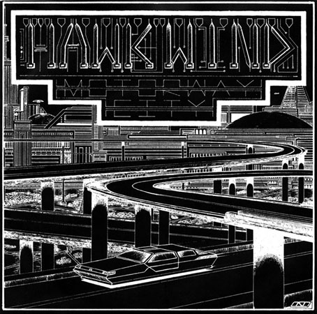
motorway.jpg

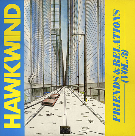
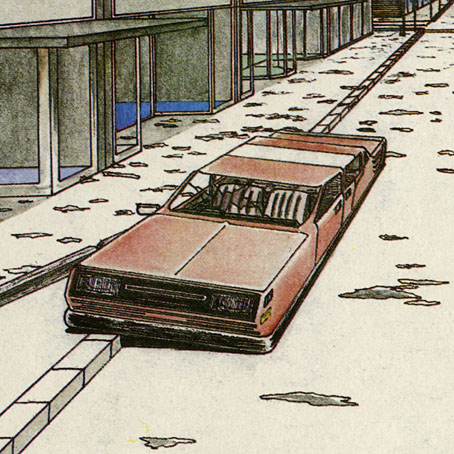
The process of updating the main website meant I had to check (and double-check, etc) every single page, so I’ve been looking at more of my old artwork than usual. This 7-inch single sleeve from 1983 made me belatedly realise that the wheel-less levitating car I put on the back of Joe Banks’ Hawkwind book has an ancestor here and on the cover of the third Friends and Relations compilation that Flicknife released in 1985. The continuity was accidental but Motorway City (the song) dates from the end of the period discussed in Joe’s book so it’s good to think that a vague reference to the Levitation era can be found on the cover art.

This odd drawing dates from 1980, a year when my life was in such turmoil I’m amazed I had time to do any drawing at all. I was 18 and had already burned my way through three dead-end jobs after leaving school the year before, by which point I was agreeing with Dave Brock’s Brainstorm ad lib on the Live Seventy Nine album, “I don’t want to be employed!” This attitude led to increasing rows with my mother which in turn led me to spend more time than usual in Blackpool library. Part of the inking on the drawing was done during one of these stress-free afternoons in the library reading room. I’d guess this was shortly after I’d met the group for the first time at their Preston concert on 20th October since most of the drawings I took with me were generic space art rather than pieces derived from Hawkwind songs. They’d played Motorway City that evening (the second song according to Setlist.fm) so I’m sure I would have made a point of showing it off. I say this is an odd drawing because I’ve no idea why I made it look so obviously like a single sleeve, but it’s possible that a single release of the song from the new Levitation album had been rumoured. Whatever the explanation, this was one of the first drawings I made using my new Rotring Variant pen which I used throughout the ensuing decade; one advantage of the dead-end jobs was they at least gave you enough money to afford expensive German technology. A year later, looking through a friend’s copy of Centigrade 232 by Robert Calvert, I was amused to discover a poetic complaint about the tendency of fine-nibbed Rapidograph pens to become blocked with ink. You have to treat them with care and respect, Bob.

void.jpg

The car on the Friends & Relations cover wasn’t intended to be a reference to the earlier vehicle but removing the wheels was the easiest way of indicating a futuristic scene without any other overt signifiers. A shame, then, that the TV in the foreground is a cathode-ray tube in a wooden case. (And while I’m being critical, the careless use of perspective makes the car much too long.) Both these vehicles look rather graceless, as did cars in general in the late 1970s/early 1980s when there was a trend for boxy design. I’m usually indifferent to the automotive world but I could at least have borrowed some of the carapace sleekness you see in paintings by Syd Mead or Peter Jones.

void2.jpg

The Friends & Relations album was reissued on CD in 2014 in one of the Atomhenge CD box sets: The Flicknife Years, 1981–1988. The set includes two other albums with covers of mine: Zones and Out And Intake. Zones was a compilation of recent live recordings and a few studio outtakes that includes the version of Motorway City released as a single, together with a Michael Moorcock song that’s unique to this album (and sung by the man himself), Running Through The Back Brain.

Previously on { feuilleton }
Reality you can rely on
Hardy art
Silver machines
Notes from the Underground
Hawkwind: Days of the Underground
The artists of Future Life
Science Fiction Monthly
The Chronicle of the Cursed Sleeve
Rock shirts
The Cosmic Grill
Void City
Hawk things
The Sonic Assassins
New things for July
Barney Bubbles: artist and designer

Hardy art

hardy1.jpg

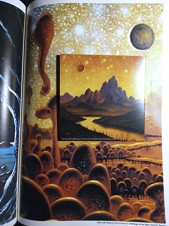
Hawkwind continue to be the overwhelming topic of the moment while I’m reading Joe Banks’ marvellously detailed account of the group’s first decade. One of the many attractions of Hawkwind for this listener was their intersection with other areas of interest: Moorcock and New Worlds, obviously (two of Robert Calvert’s poems appeared in New Worlds Quarterly), but also SF and fantasy in general. The alien planet on the back cover of the Hall of the Mountain Grill album was immediately recognisable as the work of British space artist David A. Hardy thanks to a feature in Visions of the Future (1976) a collection of artwork reprints from the art and fiction magazine Science Fiction Monthly. Hardy had a long association with astronomer Patrick Moore, illustrating the covers of Moore’s novels and later collaborating on a speculative science book, Challenge of the Stars (1972). A few of the latter paintings were reprinted in Visions of the Future, including one with the title Alien Life Forms that depicted amoeboid creatures on a remote planet. The painting would have become the back cover of the Hawkwind album if Hardy hadn’t insisted on creating a new work in a more suitable ratio.

Hardy’s association with Hawkwind extended to their stage shows, with a series of circular paintings used by “Liquid Len” (Jonathan Smeeton) on a rotating projector that covered the band in moving panoramas of ancient monuments, dinosaurs, alien landscapes and exploding worlds. Two of the paintings appear as the endpapers in Joe’s book; the dinosaurs and the monuments may be seen here.

hardy2.jpg

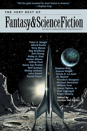
Cover design by Bryan Cholfin.

My own Hawkwind covers make very poor comparisons to Hardy’s meticulous renderings but we do have a further connection via The Very Best of Fantasy and Science Fiction, a collection of stories from the long-running magazine edited by Gordon Van Gelder. I designed the book’s interiors and Hardy contributed the cover art. Hardy painted many covers for F&SF throughout the 1970s and 80s, this shining rocket being a reworking of a cover he produced for the magazine’s 60th anniversary issue. The archetypal spacecraft of classic science fiction, and almost a definitive example. You might even call it a silver machine…

Previously on { feuilleton }
Silver machines
Notes from the Underground
Hawkwind: Days of the Underground
The artists of Future Life
Science Fiction Monthly
The Chronicle of the Cursed Sleeve
Rock shirts
The Cosmic Grill
Void City
Hawk things
The Sonic Assassins
New things for July
Barney Bubbles: artist and designer

Notes from the Underground

hawkwind1.jpg

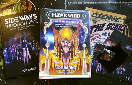
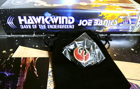
This time last year I was about to start working on the cover of Joe Banks’ Hawkwind book, and here it is at last, after a considerable delay. The special edition has been worth the wait since it comes with an additional 200-page volume, Sideways Through Time, containing the interviews that Joe used for his research. There’s also a set of cards with photos by Laurie Lewis from the session used for the cover of Space Ritual (we used some of the same photos on the book cover), and a print of the Moorcock/Cawthorn Hawklords comic strip from Frendz which further developed the group’s self-mythologising begun by the In Search Of Space “Hawklog”. And for people who pre-ordered the book last year then had to wait for months, there’s a bonus enamel pin based on the hawk design I supplied for the front board. I like badges, and I designed a few for Hawkwind in the past, but this is a better design and a nicer object than any of those I did in the 1980s.

hawkwind2.jpg

It’s a big book.

Now that the book is out I can show off the full cover wrap. As mentioned earlier, I followed Barney Bubbles’ preference for retro futurism by creating a cityscape based on the Deco-styled architecture that Frank R. Paul liked to use in his pulp illustrations. Some of the details refer obliquely to Hawkwind’s cover art or songs of the 1970s, so the speeding car can be taken as a reference to both Kerb Crawler and Death Trap, as well as the speeding Art Deco vehicle on the cover of Roadhawks. The flying saucers are a nod to those by Barney Bubbles on the inner sleeve of the Doremi album (and on one of his black-and-white posters from the same period), while the Philippe Druillet rocket refers to Barney’s own appropriation of a Druillet figure in his Hawk graphics. The combination of vehicles fleeing a burning city gives us the recurring theme in the group’s lyrics about the need to escape from a self-destructing society/planet. Welcome to the future.

Hawkwind: Days of the Underground is available now from Strange Attractor.

Previously on { feuilleton }
Hawkwind: Days of the Underground
The Chronicle of the Cursed Sleeve
Rock shirts
The Cosmic Grill
Void City
Hawk things
The Sonic Assassins
New things for July
Barney Bubbles: artist and designer

Interview with the vampire illustrator

illustration1.jpg

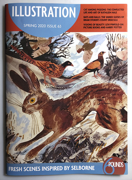
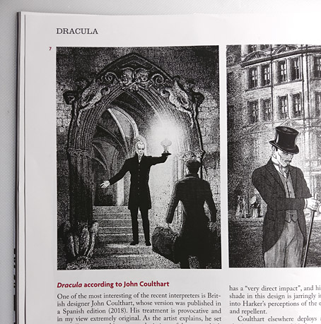
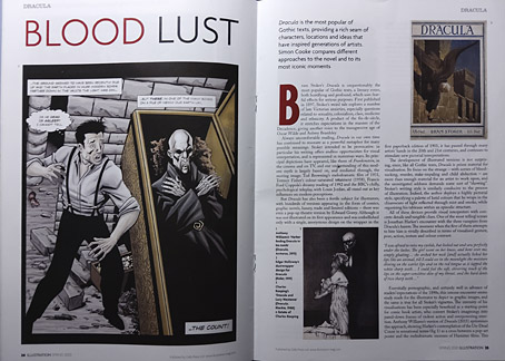
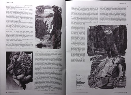
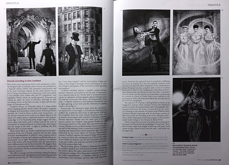
Some of the many illustrators of Bram Stoker’s Dracula are the subject of a six-page feature in the latest issue of Illustration magazine. The writer of the piece, Simon Cooke, asked me a few questions about the edition I worked on for Editorial Alma in 2018 (previously), and he devotes two pages to analysing my illustrations. I was a little unnerved by this since Alma asked me to produce 27 full-page pictures—one for each chapter—in five weeks, which isn’t the kind of deadline I prefer for work that requires so much historical research. Consequently, I still feel the book is compromised but people evidently like the end results so I should stop complaining. Illustration magazine is available from Cello Press.

illustration2.jpg

As for my work of the moment, the Joe Banks Hawkwind book will be published by Strange Attractor in the next few weeks, so everyone will finally get to see my Frank R. Paul-derived wraparound cover. And there’s more science fiction on the way with a new cover design featuring a robot as its centrepiece. Watch this space.

illustration3.jpg

illustration4.jpg

illustration5.jpg

Previously on { feuilleton }
Hawkwind: Days of the Underground
Illustrating Dracula