Strange fiction
| Another big JG Ballard feature.
Tag: JG Ballard
Robert Rauschenberg, 1925–2008
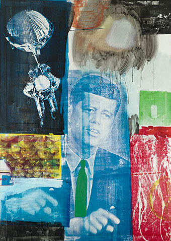
Retroactive I (1964).
My youthful enthusiasm for art acquainted me with the name of Robert Rauschenberg (who died two days ago) earlier than most. Surrealism and Pop Art held an appeal that was immediate, if rather superficially appreciated at the time, and it was seeing works from both those movements which were the most memorable aspect of my first visit to the Tate Gallery when I was 13. Later on when I was reading JG Ballard’s stories and essays in back numbers of New Worlds, Rauschenberg was one of a handful of artists who seemed to depict in visual terms what Ballard was describing in words. In this respect Robert Hughes’s discussion of the “landscape of media” (Ballard’s common phrase would be “media landscape”) below is coincidental but significant. Retroactive I was painted a couple of years before Ballard began the stories that would later become The Atrocity Exhibition and it could easily serve as an illustration for that book.
There are and will be plenty of words written elsewhere about Rauschenberg’s work and influence. I’ll note here his inclusion in the list of gay artists at GLBTQ for his creative and personal partnership with another great Pop artist, Jasper Johns.
One of the artists (television) most affected in the Sixties was Rauschenberg. In 1962, he began to apply printed images to canvas with silkscreen—the found image, not the found object, was incorporated into the work. “I was bombarded with TV sets and magazines,” he recalls, “by the refuse, by the excess of the world … I thought that if I could paint or make an honest work, it should incorporate all of these elements, which were and are a reality. Collage is a way of getting an additional piece of information that’s impersonal. I’ve always tried to work impersonally.” With access to anything printed, Rauschenberg could draw on an unlimited bank of images for his new paintings, and he set them together with a casual narrative style. In heightening the documentary flavour of his work, he strove to give canvas the accumulative flicker of a colour TV set. The bawling pressure of images—rocket, eagle, Kennedy, crowd, street sign, dancer, oranges, box, mosquito—creates an inventory of modern life, the lyrical outpourings of a mind jammed to satiation with the rapid, the quotidian, the real. In its peacock-hued, electron-sweetbox tints, this was an art that Marinetti and the Berlin Dadaists would have recognized at once: an agglomeration of memorable signs, capable of facing the breadth of the street. Their subject was glut.
Rauschenberg’s view of this landscape of media was both affectionate and ironic. He liked excavating whole histories within an image—histories of the media themselves. A perfect example is the red patch at the bottom right corner of Retroactive I. It is a silkscreen enlargement of a photo by Gjon Mili, which he found in Life magazine. Mili’s photograph was a carefully set-up parody, with the aid of a stroboscopic flash, of Duchamp’s Nude Descending a Staircase, 1912. Duchamp’s painting was in turn based on Marey‘s photos of a moving body. So the image goes back through seventy years of technological time, through allusion after allusion; and a further irony is that, in its Rauschenbergian form, it ends up looking precisely like the figures of Adam and Eve expelled from Eden in Masaccio’s fresco for the Carmine in Florence. This in turn converts the image of John Kennedy, who was dead by then and rapidly approaching apotheosis as the centre of a mawkish cult, into a sort of vengeful god with a pointing finger, so fulfilling the prophecy Edmond de Goncourt confided to his journal in 1861:
“The day will come when all the modern nations will adore a sort of American god, about whom much will have been written in the popular press; and images of this god will be set up in the churches, not as the imagination of each individual painter may fancy him, but fixed, once and for all, by photography. On that day civilization will have reached its peak, and there will be steam-propelled gondolas in Venice.”
Robert Hughes, The Shock of the New (1980).
Previously on { feuilleton }
• Transfer drawings by Robert Rauschenberg
• Jasper Johns
• Michael Petry’s flag
• JG Ballard book covers
1st Ballardian Festival of Home Movies
Via Ballardian:
In 1984 J.G. Ballard called for a ‘Festival of Home Movies’ and 24 years on we’re happy to oblige: announcing our latest competition, to promote JGB’s forthcoming autobiography, Miracles of Life. Presented by ballardian.com and HarperCollins UK, the competition will utilise ‘modern electronics’ as specified above, of an especial type that Ballard with his prodigious clairvoyant powers came close to envisaging: the mobile phone (or cell phone, for our North American cousins).
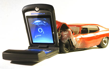
The requirement is that you shoot a one-minute film on a Ballardian theme using your mobile phone’s video camera only, no post-production allowed. That’s too much for my Motorola (above) which has never proved itself able to record more than a few seconds of continuous video for reasons unknown. The competition prize is a copy of Miracles of Life along with the forthcoming HarperCollins reissues of Ballard’s Millennium People, The Drought, The Crystal World, The Drowned World and The Unlimited Dream Company.
The constraints for this are pretty tough if all the editing has to be done in camera. I anticipate a lot of entries showing static shots of motorway traffic, windswept concrete vistas or imitations of CCTV. Anyone wishing for some offbeat inspiration can go and watch the One Minute Movies made by The Residents to accompany their Commercial Album in 1980.
Previously on { feuilleton }
• JG Ballard book covers
Penguin Labyrinths and the Thief’s Journal
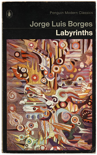
Detail from La Havane by René Portocarrero; photo by C. Marker.
This week’s book finds are a pair of titles I hadn’t come across before in these particular editions, another haul from the vast continent that is the Penguin Books back catalogue. Labyrinths I’ve had for years in a later edition (see below) but the cover of this one seems more suited to Borges (as much as he can be illustrated) than the somewhat bland Surrealism of illustrator Peter Goodfellow. René Portocarrero (1912–1985) was a Cuban painter with a post-Picasso style who specialised in hallucinogenic profiles like the one here. And it’s a guess but I’d bet the “C. Marker” who photographed the painting is French filmmaker Chris Marker (who I compared to Borges last year), director of La Jetée and Sans Soleil. Marker worked as a photo-journalist for many years and made a documentary entitled ¡Cuba Sí! in 1961.
Continue reading “Penguin Labyrinths and the Thief’s Journal”
Zeppelin vs. Pterodactyls
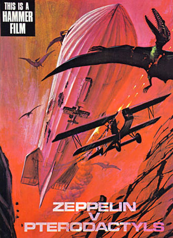
An unmade high-concept from Hammer Films’ early Seventies dalliance with pulp adventure, if you must know. Via Boing Boing via Jess Nevins via Airminded where we learn:
The story was along the lines of THE LAND THAT TIME FORGOT, with a German Zeppelin being blown off-course during a bombing raid on London and winding up at a “lost continent”-type place.
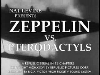
Rather like the Civil War balloon that’s blown off-course in Jules Verne’s Mysterious Island then, which ends up on Captain Nemo’s volcanic island of giant birds and insects. Of course, the mere fact that a film was never made is no obstacle for YouTube’s army of diligent mash-up artists and you can see Zeppelin v. Pterodactyls re-imagined as a 1936 Republic Serial here. (And on a pedantic professional note, an older font should have been used for the titles since Hermann Zapf didn’t design Palatino until the 1940s.)
It was another horror company, Amicus Productions, that produced The Land that Time Forgot (1975) (and its ER Burroughs-derived sequels, At the Earth’s Core [1976] and People that Time Forgot [1977]) so this Hammer concept may have been an attempt to follow Amicus’s lead and exploit the momentary flush of enthusiasm for ERB and co. Or perhaps they thought that Zeppelin movies were the next big thing after Michael York’s First World War adventure, Zeppelin, in 1971. No one in Hollywood these days would dare finance a film with a title like this. The same dumbing-down imperative that gave us Harry Potter and the Sorceror’s Stone (because Americans can’t be trusted to know what the Philosopher’s Stone is) would no doubt want “pterodactyls” replaced by “dinosaurs” or the wording of the whole thing reduced to ZvP.
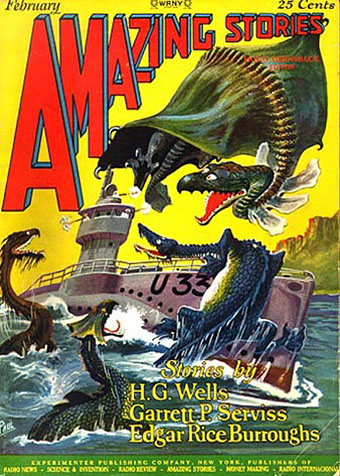
U-boat vs. dinosaurs! Illustration by Frank R Paul for a 1927 reprint of The Land that Time Forgot.
The Land that Time Forgot was scripted by Michael Moorcock and New Worlds‘ (and Savoy Books) illustrator James Cawthorn. The pair did a decent job with the story although the film as a whole is let-down by silly monster effects, the pterodactyl (or is it a pteranodon?) in this instance being a lifeless thing swinging from a crane. Moorcock and Cawthorn worked together on Tarzan Adventures which Moorcock was editing as a teenager so they appreciated the material at least. This wasn’t the only connection New Worlds had with pulp cinema, more surprisingly JG Ballard had provided a story for Hammer in 1970 with When Dinosaurs Ruled the Earth. Hammer missed an opportunity in not hiring Moorcock for something seeing as he’d just written one of the first retro-dirigible (and pre-Steampunk) novels, The Warlord of the Air, in 1971. UK film producers had some of the best writers in the world under their noses yet could only offer them trash to work on. No wonder the British film industry went down the tubes in the Seventies after the American funding dried up.
My favourite pulp adaptation from Hammer is The Lost Continent based on Uncharted Seas by Dennis Wheatley. A typical Hammer product in the way the story is frequently preposterous yet the whole thing is made with the utmost seriousness. Amazon summarises the plot, such as it is:
This film starts out like The Love Boat on acid, as a cast of unpleasant characters, all with horrible secrets, take a chartered cargo ship to escape their troubles. Unfortunately, the leaky ship is carrying an explosive that can be set off by sea water and it sinks, stranding many characters in a Sargasso Sea populated by man-eating seaweed, giant monster crabs and turtles, and some Spanish conquistadors who think the Inquisition is still on.
Eric Porter is the ship’s captain, a very good actor who was superbly sinister and convincing as Professor Moriarty in Granada TV’s Sherlock Holmes adaptations. The Lost Continent was Wheatley’s shameless plundering of William Hope Hodgson’s Sargasso Sea tales, the book being originally written in 1938 when Hodgson was less well-known than he is today. Until the Pirates of the Caribbean films this was about the closest thing on screen to Hodgson’s world of drifting weed, lost galleons and man-eating monsters, so there you have its cult value. Just be ready with the fast forward button if you try and watch it.
Previously on { feuilleton }
• Moorcock on Ballard
• Coming soon: Sea Monsters and Cannibals!
• Revenant volumes: Bob Haberfield, New Worlds and others
• Druillet meets Hodgson
• Davy Jones
• The Absolute Elsewhere

